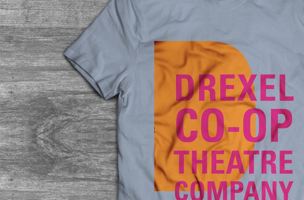
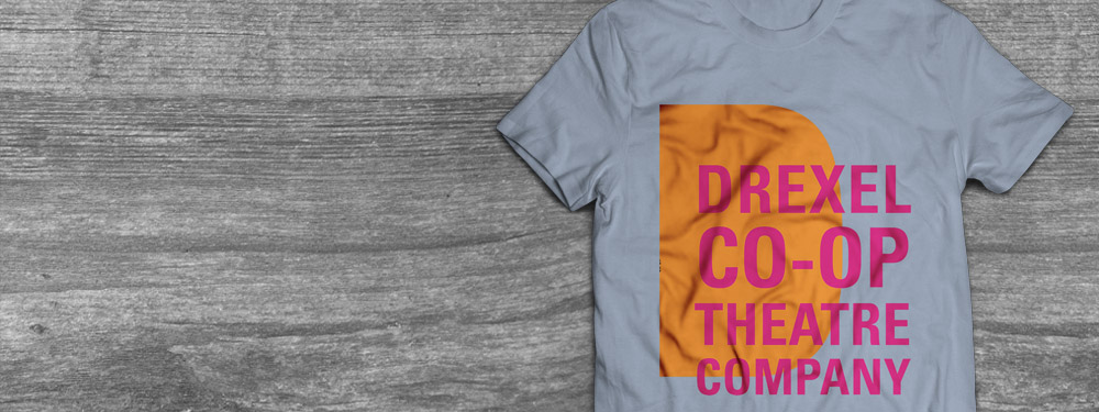
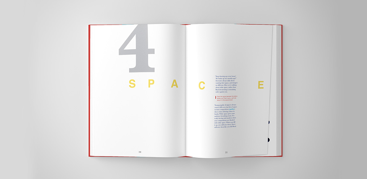
Tag Archives: 2018

Holiday Cards 2018


Holiday Cards 2018

Every year since I first started University, I’ve made an effort to design and produce my own holiday cards. In the past, I loved sending them out to friends and family to spread holiday cheer and show how I’ve grown as a designer. To be honest, I love sending them out because it encourages my friends and family to also send a card my way. Receiving my family’s Christmas photos makes it feel like we’re celebrating together – despite the fact that they’re thousands of miles away.

This year, I also wanted to send holiday cards to designers that inspire me. It’s so easy to share your work with the world now, and I find myself following a number of artists on Twitter and Instagram. Some live in cities I’ve never visited, and others speak languages I don’t know. Regardless, I wanted to reach out and send some seasonal joy their way.

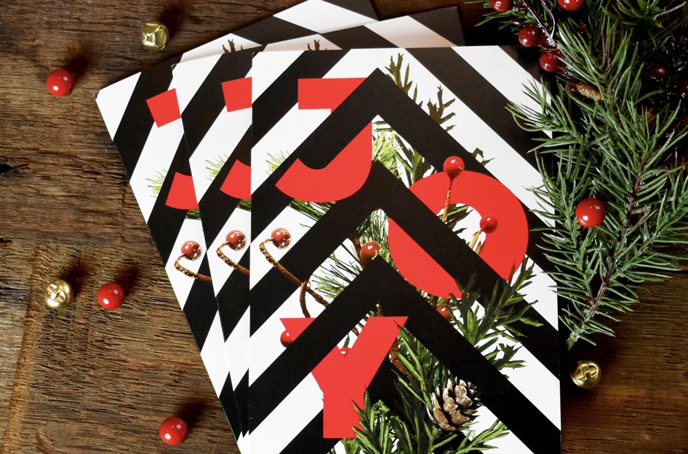
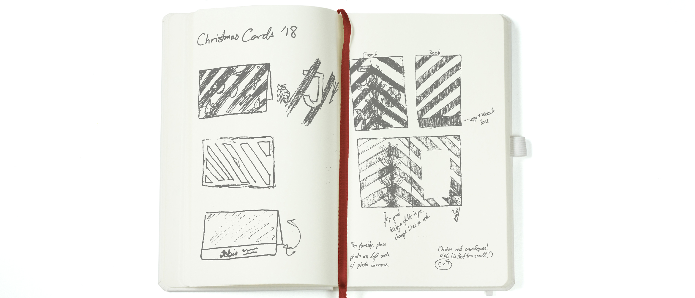
I’ve been contemplating on and off since September what I wanted the cards to look like. I was recently inspired by the line work used in optical illusions. I didn’t want my final design to make anyone’s brain throb, but I’ve been interested in the dynamic quality the lines would often have. I knew I wanted to somehow incorporate that, but I wasn’t sure how to go about it. As I was falling asleep in some time around my birthday, I finally had that eureka moment and knew what I wanted the cards to look like. At 11:30 at night, I turned on my bedside light (waking up my boyfriend in the process), and began to scribble in my notebook. I wanted to do high contrast dynamic black and white lines weaving around bold red type with some collage work.


I started the project off by visiting my local Michaels. I dug through their faux plant section hunting for cinnamon scented pine cones, pine tree branches, and currants. Because I figured out my concept in October, a lot of foliage was a beautiful orange color…or dead. Either way, it wasn’t very reminiscent of the ‘Winter Wonderland’ spirit.

That night I shot each of the pieces individually on my living room floor and mentally prepared to cut each pine needle out in Photoshop for the next few days.

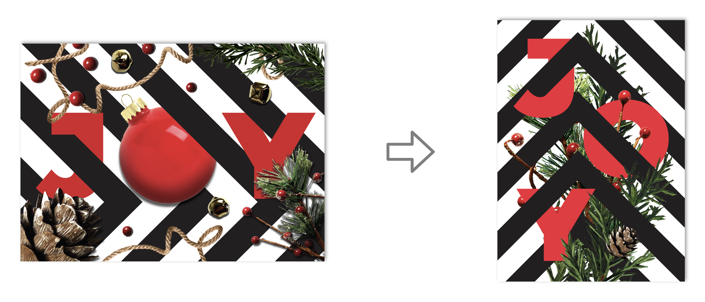
In my initial sketch, I planned on using a landscape orientation for the card. I figured I could weave the lines in and out of the text and build a border using my collaged nature. Once I had it laid out, I couldn’t help but feel unsatisfied. At the end of a project, you should feel good. You should have that prideful “I made that” moment. I knew something was wrong, but I couldn’t quite pin it down. I loved my initial concept but felt the whole thing ended up looking safe and predictable. After three years of typography and a number of years studying composition, I decided to start over with a blank sheet. I had all the elements to make a great card – I just had to use my brain.

I revisited my sketchbook and tried to disrupt my design thinking by using a portrait layout instead. By just looking at it sideways, I noticed that I liked the lines pointing upward instead of to the right. I started thinking that I could use them as a visual cue for my composition. Moving them off center helped make my composition less static, but I wanted to stagger the type to activate more of the space rather than just stacking it vertically. I also felt that using a Christmas ornament in the ‘O’ has been done about a million times. I didn’t want to follow that cliché, so I scrapped it. Pushing the foliage together and having it directly interact with the type and line work added interest to the composition and made it look less random.

The new design had something the old one lacked: purpose. The elements weren’t thrown together haphazardly anymore, they were interlocked and working together.

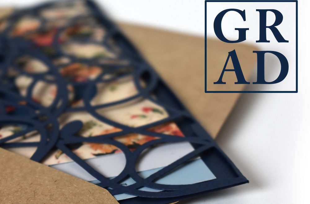
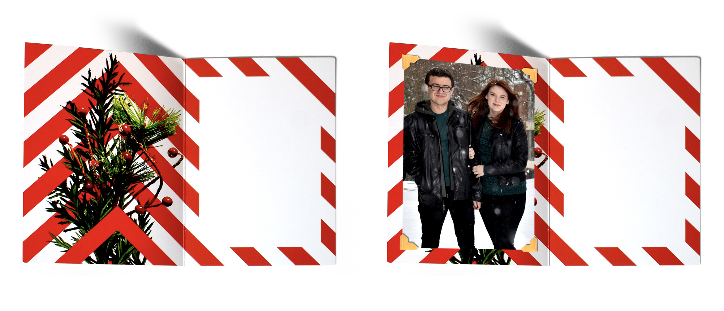
I knew I wanted the inside of the cards to have an unexpected pop of red that still felt connected to the exterior of the card. The inside has a candy cane stripe that is the direct reverse of the pattern on the exterior of the card. Because of this, I also wanted to show the back side of the foliage. Lines that were previously covered by branches in the card’s exterior now sit in the foreground. I did this to give the design a three-dimensional perspective.

As a student, I don’t have an endless supply of money. I knew that these cards would be sent out to family and to designers I admire. Most likely, those designers don’t want the annual holiday photo my mom looks forward to every year. It was important that the inside of the cards had a solution for both audiences. I still loved the brass bells I shot in the first draft of the card. They didn’t make it to the final draft, but I wanted to still incorporate their color and texture somehow. In cards sent to family and friends, we printed our holiday photo and attached it with brass colored photo corners. This allowed them to remove the picture to place it in photo albums while not disrupting the final design. This also meant that the printer only had one design to print, instead of two; thus, reducing the cost of the job substantially.

I think my favorite part about this project was that I was able to send holiday joy to friends and family, as well as strangers I admire, by making my design flexible.

Designer Gift Guide 2018

The perfect gift guide for that graphic designer in your life, or yourself! (You’ve been good this year.) 24 gifts to choose from – one for each of the 24 days before Christmas. Prices range from $5.99 to $196.00. Continue reading

xHeight by AIGA

The following is a program I designed as a Creative Enterprise assignment for my Master’s Program. It is, in no way, an extension of AIGA’s mission and should be viewed as an academic hypothetical. Continue reading

Starting My Master’s

Whenever someone talks about graduating, it’s always followed by a flood of emotions, uncertainty, and excitement – as well as a sense of achievement. For the most part, I was no different. I looked forward to it from the start of my senior year. Saying I was excited was the understatement of the century. In June, I’d finally finish a degree that took me four straight years of hard work, late nights, and SO MUCH PAPER. Not to mention, I’d also be sharing the moment with the friends and family I had to leave for University. That being said, I lacked that nervous uncertainty that comes with this monumental achievement.

In April, I was accepted into Drexel’s Arts Administration Master’s Program. After a short summer off, I already knew what I’d be doing for the next fifteen months – I’d be earning my Master’s. Out of everyone in my graduating class, very few had made the decision to pursue their Master’s so early. For me, I knew it was something I’d always wanted to do. Yes, it’s a little early, but because of my financial situation, it made sense. Not only that, but most of my mentors expressed some sort of interest in having a Master’s degree. They just struggled with the hurdles that arise when you go back to school. They have families and careers. It’s hard to add night classes to their regimen and expect them to balance it all effortlessly.

Toward the end of my senior year, I often worried and second-guessed my decision to continue with school. I kept thinking, “There has to be a reason no one else is doing this. What am I NOT seeing?”

It took me a long time to come to terms with the fact that we’re all different. This morning, I just found out one of my classmates decided to randomly move to California! I didn’t know she was thinking about making that change. It certainly isn’t the right one for me, but it may be for her. It’s always been my dream to one day own my own design studio. I know I need more education in business and financing, so why not get started learning about it now? If anything, it’ll add a new tool to my utility belt during my future job hunt.

For now, my main concern is that I continue to design during my studies. Working part-time at Michael Graves Architecture & Design helps a lot with that, but I think I may start freelancing soon as well. I loved building my best friend’s brand, and I’m excited about the new work I’m doing for Help Me Excel. Continuing design will keep my portfolio updated, my brain sharp, and my heart happy. I’d never leave design for business, and I’m sure I’ll miss it during every term paper I write and every financing equation I solve. I do know one thing, though. When I’m sitting in my office in my own design firm, my future-self will thank my past-self for all of her hard work.

Takanawa in Moonlight

Hiroshige's "Takanawa in Moonlight"

Utagawa Hiroshige was a master of Japanese woodblock printing. He had an observational, unbiased eye and captured important landscapes in Japanese history. More notably, he captured the View of Takanawa in Moonlight during the newly lifted restrictions on Japanese trade with the western world. He paints a serene scene that shows a peace that was two hundred years in the making.

Hiroshige was a master of ukiyo-e (woodblock prints) art and tradition. Also known as Ando Hiroshige, he wasn’t always known as an artist. He was raised in Edo or modern-day Tokyo. He had a heavy samurai background, which wasn’t uncommon because the Tokugawa Shogunate took control of Japan. Hiroshige’s parents passed when he was very young – about twelve years old. He belonged to a fire warden family that monitored the Edo Castle. Once his father passed, young Hiroshige took over as the fire warden. He took the job very seriously, but it came with a lot of down-time. There weren’t many fires at the Edo Castle that needed to be extinguished. In his solitude, he began to dabble in painting.

Hiroshige fell in love with painting and sought out for a formal education in it. Though he was still working as a fire warden, he also took on an apprenticeship where he’d work on illustrations for books and single-sheet ukiyo-e prints. The subject matter for these books and prints tended to be of female beauties in the red-light district and kabuki actors, but he’d developed his own personal style during the execution.

Artists have a tendency to paint what they know, and Hiroshige was no different. Because he grew up in Edo, he developed an extensive body of work focused on his home. Towards the beginning of his career, he had painted flora and fauna near modern-day Tokyo. He eventually evolved into more of a landscape painter – most likely due to his influence from Hokusai, the artist behind the incredibly popular series, “Thirty-six Views of Mount Fuji.”

Two popular prints from Hiroshige's, "Thirty-six Views of Mount Fuji"

Hiroshige decided to fully pursue his career in the arts years later. He left his job as the fire warden to his brother, Tetsuzo, and decided to travel outside of Edo to paint new landscapes. His first wife was very supportive of his endeavors and sold her clothes and ornamental combs to help pay for his travels. During his that time, he painted the collections, “Illustrated Places of Naniwa,” “Famous Places of Kyoto,” and “Eight Views of Omi,” but he would always come back home to Edo.

“View of Takanawa in Moonlight,” is a piece from Hiroshige’s series, “Famous Places in the Eastern Capital.” Here, Hiroshige designs a print of a familiar sight. “View of Takanawa in Moonlight,” is a view of present-day Tokyo Bay. This particular print is important because it depicts an early morning scene of the trading port. We know it’s early morning, rather than late at night because the sky is a hazy blue rather than a deep midnight color. Previous ukiyo-e prints depict nighttime with rich dark colors. In the bottom right portion of the composition, we see a Japanese marketplace, most likely specializing in fish due to its close proximity to the ocean. You see a number of fisherman sailing on their small boats in the water looking to get their early morning catch. Some people are carrying bountiful earnings from the boats to the market for preparation and distribution.

Modern-day Tokyo Bay

Hiroshige’s print has a few Japanese characters on it. The left side contains three different types of information. First, we see the artist’s signature. These are the three characters located on the leftmost side stacked on top of one another. To the right of them, there are two Kanji characters enclosed in circles. During the time the Tokugawas were in power, there was a strict system in place that determined what art was and wasn’t appropriate for the public. Everything needed a seal of approval before it could be released. This practice ended a few years after this print was approved. Underneath Hiroshige’s signature and the seals of approval, we see a Kanji character inside of a box. Though this character isn’t very common anymore, it signifies inner consideration and mindfulness. The ukiyo-e’s name is written in the red box to the right end of the print.

Japanese Characters from "Takanawa in Moonlight"

The most notable feature of Hiroshige’s composition is the larger boats on the horizon line. They’re much larger than the Japanese vessels used for fishing. Because the print was created in 1854, we know the ships in the horizon were most likely foreigner vessels. During the Edo period foreigners weren’t allowed to travel or trade with the Japanese. This was the case until 1853. Japan’s recent, though reluctant, choice to open their borders in certain ports, explains the European vessels in Tokyo Bay. Hiroshige’s work is mostly poetic and ambient, so it would make sense that he would portray this scene as an impartial observer. The foreign visitors don’t look threatening in any way, they just look as though they’re part of the quiet, early morning scene.

Japanese Scroll Depicting Perry Expedition Ships. USS Susquehanna, Commodore Perry's flagship, full starboard view. Drawing is on the "Susquehanna & Mississippi Scroll", depicting Perry's expedition to Japan. Watercolor drawing by Taguchi Shumpei. Image date: July 9, 1853.

In 1600, Japan was unified under the Tokugawa Shogunate with emphasis on the reestablishment of order following one hundred years of civil war. It was the civil war that created the chaos that allowed the Tokugawas to take control in the first place, and their approach to governing Japan was militaristic, to say the least. Though they were incredibly strict, Japan did live in peace and stability during their rule. The military class was demilitarized – they kept all of their practices, except the warfare.

City people became more relevant, rather than the extreme polarization we had seen before where the leaders were rich, and the citizens lived in poverty. This new rule leads to the rise of the chonin, and a more comfortable middle class.

During the time, the Japanese became weary of Europeans spreading their ideas of Christianity to the Eastern nations. The Tokugawa Shogunate was suspicious of the Dominican and Franciscan missionaries that arrived in the Philippines looking to spread the word on Christianity only to dominate the country. Because of this, Tokugawa Ieyasu decided to end all Christian practice in Japan, as well as prohibit trade with western nations. This embargo was called the “Act of Seclusion” and was established in 1636. It remained active for the next 200 years until American Matthew Perry interrupted it.

In 1853, American Commodore Matthew Perry led his fleet of ships into Tokyo Bay, looking to re-establish regular trade between Japan and the western world since Japan ended relations with persistent Europeans looking to convert them to Catholicism. Since America started using California as a trade port, pursuing trade with China and Japan would be easier and beneficial for the western nation. Not only that, but Americans were finding themselves stranded in Japan due to ship malfunctions on their way to China. They were usually greeted with hostility, and America was hoping to work out a deal where Japan offers coaling stations to Americans on their way.

The deal seemed fair, but to ensure it went in favor of America, Commodore Perry brought an armed fleet to Japan when he tried to arrange a deal. To prove he knew little about the political situation in Japan, he asked to speak to the emperor rather than Tokugawa Ieyasu. Once he was directed properly, Japan reluctantly agreed to lift the “Act of Seclusion” on their own terms. They felt that if they were forced into the decision, it may end in war. Doing it on their own accord would be better in the long run. They wanted to ease into the trade, however. They agreed to open two American coaling stations where they allowed Americans to live and operate in peace, and they opened a few ports in Japan for global trade – just not all of them.

Japan opening their ports provided them with a lot of opportunities. Unfortunately, it also meant that the art of woodblock printing would also come to an end.

In 1858, Hiroshige passed away. This would go on to be known as the beginning of the end of ukiyo-e. Toward the end of his life, trade was re-established in Japan causing it to move into a progressive era. The country faced westernization due to the tools and knowledge they were adopted from the foreigners they once tried to seclude themselves from. Today, woodblock printing is appreciated as an ancient art form and is practiced as a nostalgic look at traditional Japanese culture, but it’s lost the weight it once held in their society. Looking back, Hiroshige was one of the great masters of ukiyo-e, and his contribution and unbiased observational eye will never be forgotten.

My Bachelors in Design

Five years ago, I was sitting in my graphic design class poking about Google. I had already finished my final for the semester and decided to look at design universities. I thought about going to Virginia Tech or Pratt for a while. I wanted a school where I could learn about design, but also focus on academics. Then, I stumbled upon Drexel University. I honestly couldn’t tell you what website I was on, but it ranked Drexel in the top five schools for graphic design in the country. Once I dug a little deeper and did some research, I decided to submit my portfolio. I’d been looking at a few schools, so it wouldn’t hurt to submit my portfolio and see what would happen.

It was in April of 2014 that I received my acceptance email. I decided to pick up my life and leave my friends, family, and cat in Las Vegas. I was moving across the country to go to Drexel University in fabulous Philadelphia, PA. It was one of the best decisions I’d ever made (aside from going back for my cat).

Last week, I earned my Bachelor’s of Science in Graphic Design. I graduated Magna Cum Laude with minors in Fine Arts, Art History, and Marketing. I felt accomplished, overwhelmed, and excited to share the moment with my friends and family. I’d spent the last three months before graduation planning and prepping my small apartment for the seven people it would be holding in June. In between writing long marketing term papers about sales forecasting and revisiting my design portfolio, I’d randomly pick times to wash my walls or scrub my air vents. I was buying air mattresses between classes and scheduling every hour my guests would be here with me. What can I say – I like a good plan.

My Graphic Design Senior Showcase display

The week leading up to my graduation was a little stressful because I had to take my final final exams and get ready for my Graphic Design Senior Showcase. Once I took my last Marketing final, I was able to sit down and truly appreciate the wave of love and support surrounding me. The night before my Senior Show, my mom put my dinner together for me for the first time in four years. I sat with my best friends, who had just got off their five-hour flights, and laughed about how I ordered Qdoba catering for them because I honestly can’t be bothered to cook. Alyssa, one of my mentors at Michael Graves Architecture & Design, even drove down to visit me at my Senior Show the following day. All week I reflected on how fortunate I am to have such positive and supportive people around me.

(Left) Receiving my diploma, (Right) Austin, Jon, and I take a picture in front of our Freshman dorm

Two days later, I sat in Drexel’s gym (which had received a full HGTV makeover), in an oversized gown, jittery and excited. After a few speeches, my row was ushered to the side of the stage to wait in line. Immediately my anxiety took over and waiting in line felt like it took ages.

I was worried I’d trip and fall, or forget to walk when my name was called. Before I knew it, I heard, “Theresa Tobin!” I rushed forward, shook President Fry’s hand, hugged my Graphic Design advisor, Bill, and then immediatly became a Drexel graduate. It was so sudden.

At that point, the rest of the names were called, and the ceremony wrapped up. Before I left for the summer, there was one final thing I had to do on Drexel’s campus, though. My boyfriend, Austin, and I met one of our best friends (and roommate) during our Freshman year. We all lived in a tiny dorm room in Calhoun Hall. After hearing rumors that Drexel was thinking of tearing it down, we wanted to take one final picture in front of the building on my big day. We ran over, took a few goofy photos, and went home to our reasonably sized apartment.

(Left) Magna Cum Laude Tee, (Right) Austin and I wearing the Magna Cum Laude tee at Shofuso Japanese House & Garden

Later that day, we changed out of our formal clothes, and into one of my graduation presents. Three months ago, my roommate, Jon, came up with the hilarious idea that we should all wear matching tee-shirts on the day of my graduation. The design was inspired by the work I did for Mutant Water Babies. In the past, I had pitched a logo tee-shirt as a revenue booster for the production. Though the idea was shot down, Jon really loved my design. We took the type-treatment I used for the Mutant Water Babies logo, and spelled out, “Magna Cum Laude.” Each of my loved ones (and a stranger online) bought shirts in blue and green – making us look like a family unit.

(Left) Standing on the bridge overlooking Manayunk with Kelsea, (Right) Manayunk newsletter

While everyone was here, it was so important to me that they experience my version of Philadelphia. Among other things on the list, I wanted to take them to Manayunk. It’s a small, creative neighborhood not too far away from where I live. I spent the entirety of Spring term in my Junior year, working on my Travel Newsletter for my Typography 3 class. We went to Lucky’s Last Chance, the burger joint I wrote about and featured in the newsletter, and walked down Main Street. We ended the day watching the sunset on the large pedestrian bridge overlooking the neighborhood. My best friend, Kelsea, took so many pictures of us in the ‘magic hour’ lighting, and it was a great way to end the day.

(Left) My dad and I before I got on the plane to leave for University, (Right) My mom and I after my Commencement

It was such a privilege to be able to spend a little less than two weeks with those I care so much for. Everyone that came to celebrate with me brought so much love with them. I could never thank them enough for all of their support.

For my immediate family, my graduation had a little more meaning behind it. I’m pretty sure there wasn’t a soul alive who was more excited to see me graduate than my dad. There were times it seemed like he was more excited than I was! He’d always talk about how proud he was of me and how he couldn’t wait to see me open my own design firm – as though it would happen two days after I graduated. Unfortunately, he couldn’t sit with my mom and friends to watch me accept my diploma. He passed away this past November. It was very sudden. Every day surrounding my graduation, he was on my mind. I could picture him tearing up with joy, and it made me tear up. It was in those moments that I could feel him with me, and felt whole and proud of my accomplishment.

Graduation Invitations


Bachelors of Science Graduation Invitations

In December I sent out my graduation invitations. The process of designing them was so odd. I’ve found it’s always hard designing for yourself. It’s so easy to over-design, and there’s always something you want to change after production finishes. In my case, I didn’t have a huge budget. I’d be comping my design and sending them out by hand with my boyfriend, Austin. At every juncture of the design process, he kept production in mind. I, however, shot for the stars and designed whatever I wanted to. I didn’t think of how much effort printing and comping would take until I ended up with a three-tiered design with an intense die cut and a staple closure. I wanted to add twine as well, but you have to know when to stop.

I worked in between classes looking online for inspiration. I knew I wanted to use a gatefold that mimicked lace, but I wasn’t entirely sure what else I wanted to add to the look and feel. My school colors are navy and goldenrod. Navy is a beautiful, elegant color, but goldenrod is harsh. If I die cut my gatefold flaps to look like lace, using goldenrod in my design would look disconnected. I was interested in using a pastel yellow to reference the color, without beating you over the head with the actual color. I found a beautiful vintage wallpaper pattern online that used pastel yellow and navy together. It was floral, which I felt was appropriate for spring, and feminine – something that felt appropriate to me.

Once I had the floral motif combined with my lace, the rest of my design decisions fell into place.

The card I was sending out had to be more than just a card. I was sending it out so early because my friends and family live on the west coast, and they needed time to book their flights and hotels. Graduation season in Philadelphia is very hectic, and you have to book in advance. Otherwise, you won’t have any options. I wanted to include information about when the ceremony is, and where to RSVP, but I also wanted to include a list of hotels and where I live in reference to my graduation events. I could fit all of this on a huge sheet of paper, but I didn’t want to custom order envelopes. I needed to stick to a standard mail size, so I felt that a tiered system would be the best way to approach this. I created a tabbed system for the card so my friends and family could navigate my system easily, and kept the tertiary map information in the back.

Production was a small nightmare.

A month prior, I bought a Cricut die cutter, and it was one of the best decisions of my life. I bought textured navy paper at Michaels and ran all of my shells through my Cricut, so I wouldn’t have to sit with my X-Acto knife for days on end. The hard part came, weirdly enough, when I was printing. My file was huge and my printer kept seizing up. I couldn’t afford to buy speckle tone paper, so I simulated it in my design as an overlaid texture. Unfortunately, this made my file size huge. I tried compressing it as a PDF, turning it off and on again, and asking it nicely, but it wouldn’t budge. I needed to comp twenty cards, and one sheet of paper took thirty minutes to finish printing. There wasn’t much I could do. I decided to place two full cards on a larger sheet of paper to cut my print time down, and I sucked it up. While everything was printing, Austin and I sat at the dining room table cutting the cards out of each sheet of paper. We had the Cricut running in the background, while we stapled each card, one at a time, over the course of five hours of steady printing.

Months later, I revisited my design to shoot it for this post. I still love it (which is a good sign), but I’d be lying if I couldn’t find one more thing I want to change. I guess that’s just the struggle of a graphic designer. Luckily for me, I graduate in two weeks, all twenty invitations have already arrived at their location, and there’s nothing I can do about it. That’s the beauty of a deadline.

Drexel Theater 2018 Season

This is a compilation of the advertising designs I created for each of the performances within the Drexel Co-Op Theater Ensemble’s 2018 Season. They range from large banners and posters to small postcards. I also rebranded the Co-Op Theater Ensemble and incorporated this in their end-of-season tee-shirts. Continue reading

Writing & Designing a Book

I’ve thought about what to do for my thesis since I was in my freshman year of university. I had a lot of ideas, but ultimately I knew I wanted to do something that made me excited every day I worked on it. I knew it had to be personal, and I wanted to give it my full effort. I struggled for a while because I wanted to originally illustrate a cookbook full of my family’s recipes. That would’ve been fun, but I wanted more of a challenge. Besides, I already designed a food magazine years ago.

After careful consideration, I recognized that graphic design has been a consistent and dominating part of my identity. I’d started learning about it in 2009 and immediately fell in love. It became my major in high school, consumed my extra-curricular activities, and lead me to study at Drexel University. As I’m finishing up my senior year of university, I constantly wish I could go back in time and tell my younger self tips and tricks to help her flourish and succeed. I always wanted to grow and did everything in my power to get to where I am today. I read countless art and design books and stayed up at night working in InDesign.

Looking back, I remember a lot of my peers in high school didn’t have a large variety of design books to learn from. It wasn’t their fault, or my advisor’s for that matter. There wasn’t a huge budget for books, and we only met for a few hours a day to cover print and animation design. I always wished there was a book written for high schoolers – a book that knew our exact situation and could cut through all of the nonsense and tell us what to focus on. Then, I had no clue how important typography was, and now I know it could be a deciding factor as to what gets you a job.

I wanted to write the book I wish I had in high school.

It’s a careful line to tow when you’re writing a book for high schoolers. It seems silly, but there’s a lot to consider. Trends constantly change, and as we grow, we lose touch with who we were then. Toward the beginning of this process, I took the time to notice consistencies across generations regarding adolescence. Humor is a large driving factor when you’re writing for a younger audience. A lot of design books target college students, recent graduates, or those established in the industry because they’re more mature and have a direction for their research. I felt that, when I was a high schooler, I wished someone would sit down and be honest with me. Do I really need to understand the Pantone color system? Is identifying a counter of a letter truly important? I felt that a candid approach to learning was probably the best way to go. I wanted to read something light-hearted with all of the basic information I needed in one place.

As I mentioned before, trends are constantly changing. This is something I paid close attention to in high school. It informs where you shop, how you dress, and what you’re drawn to. There’s this exciting reemergence of some classic design approaches in the spotlight. What I’m specifically referring to, I think, has officially been called Post-Memphis design. 80’s inspired patterns and colors are becoming popular again, and I felt this would be a great way to attract my younger audience while still tapping into a classic art style.

My inspiration was based on a few pieces I found. Paramore, a band I’ve loved since middle school, just released a new album called After Laughter. The overall sound of the album taps into an early 90’s nostalgia that’s further expressed in the album artwork. The bright colors, at first glance, may appear childish. I found that stores like Urban Outfitters, Primark, and Forever21 (to name a few) were also jumping on this Post-Memphis bandwagon. It seemed that this younger generation wasn’t afraid to embrace bright colors and this nostalgic design style was making a comeback.

Once my style was established I focused on how to create an interactive experience. It’s one thing to read colorful words on a page, but you’ll learn so much more if you can make the reading a physical experience with folds and pull-outs. Throughout my research, I’d find that I’d have a random idea, and I’d write it down in my journal. This would happen often because I mostly researched other designers to influence my writing for my own book. For example, early on I knew I wanted to incorporate mylar guides into my design for the grid portion of the book. I knew it would help the reader better understand how breaking the grid still works in the modular system, and that using a grid didn’t mean you had to have boring blocks of text everywhere. It just adds structure.

I also decided in the early stages that I wanted my textbook to be more of a box set, rather than a huge book. This was because I hated my backpack in high school with a burning passion. I was enrolled in AP History and Trigonometry – and you had to carry a book around for both. I didn’t want to be the monster who wrote a 100-page book some poor seventeen-year-old would have to add to their turtle shell of a backpack. If I wrote a box set, they could pick and choose what small book they needed for the day and could leave the other pages at home.

One of the first things I settled on was my basic systems. Typography was one of the key systems I addressed because I craved consistency throughout each book and I felt type was a great way to achieve that. I knew I wanted to shift the color for each book to give each one its own look and feel, while still belonging to the same parent system. I used Helvetica and Baskerville throughout the box set. Before you think of how basic that is, I actually have very good reasons for using these typefaces and why they’re together. I chose Helvetica because it’s a universally celebrated typeface in the design community with a lot of history. I understand it can be overused (but honestly, so is Futura, and that typeface is golden), but it’s a cornerstone typeface for the history of graphic design and should be included in a book about the subject. My body copy is in Baskerville because of a really silly reason, honestly. In my senior year of high school, I read an old type book that called Baskerville one of the most friendly typefaces in the world. I wanted to share this with my reader and used it as my body copy typeface. I have a personal connection to it, and it’s just fate that it also compliments Helvetica like a match made in heaven.

My first book is called, “Design Something With… Design Basics.” It covers basic concepts like purpose and problem solving, a brief graphic design timeline, the elements of design, and Gestalt’s principles of design. It ends, much like the other books, with a ‘Words of Wisdom’ section. There I ask actual designers in the industry what their real-world advice is on tricky subjects students would prefer candid answers to. The book follows a red color palette, and starts off like any basic graphic design course: with the question, “What is graphic design?”. I knew my book had to start with this question because it’s something we always hear when we first start learning about design. I felt like Jessica Helfand had the perfect answer to this question, so I quoted her in the book here. I realize that I’m not a professional just yet, but I’ve read a lot of their advice and wanted to share the best pieces I’ve read with those who read my book.

Early on, I made the decision to include humor as a vehicle to deliver the important information I’m trying to get across. I didn’t want to try to write a comedy book, but I wanted my words to connect with my imagery so that the reader would be entertained. One of my favorite examples of this is in the ‘Space’ section of ‘Design Something With… Design Basics.’ It was the fourth element of design, and the previous spread had a bit of a sensory overload in terms of content. ‘Space’ worked to air out the book in pacing, but it also did a great job of acting as an example for the concept. One of my favorite parts of this spread is the kerning between the ‘C’ and ‘E’ in the word ‘SPACE’ mostly because there’s a note in red telling the viewer they can learn more about this moment in the second book. I worked really hard to get the books to play off of each other to make moments like this memorable and get the viewer to be curious about kerning and type spacing. Both are kinds of spacing but used in different ways.

To be honest, this is also one of my favorite jokes in the book.

“‘Stop showing up at my house! We broke up two months ago!’ Everyone always talks about wanting their space, and design’s no different. Here, we’re talking about white space, rather than Brad threatening a restraining order against you. Young designers always want to fill every last bit of space in their compositions.”

My second book is called “Design Something With… Type & The Grid.” The main color palette for this book shifts half way because of the shift in subject matter. Typography is communicated with an orange palette while The Grid shifts to a yellow. Originally I was going to cover the grid in its own separate book, but as I went on with my research, that didn’t make much sense. In my reading, I found that when you’re covering type, you first focus on the concept of the letter. This is where type anatomy comes into play, and we focus on the different classifications. Then, we move into lines of text. We focus on how much space is between letters, words, and lines of text. We learn about ragging, and how to align our quotes. After all of this, we learn how to organize a hierarchy of information, and this works as an introduction to the grid. It wouldn’t make much sense to make The Grid its own book when the connection between the two subjects is so natural. When I looked at the pacing, separating the two would feel more disruptive than anything.

‘The Body’ section of the Type side of the book took a lot of time to construct. I knew I wanted this page to act as a mental break because I made the ‘Space’ spread that follows look like a solar system. It gets a little chaotic, and I thought this could be a beautiful rest with white space before you get into the chaos that follows. Interestingly enough, this spread went through a lot of changes. Originally, I fit my body copy (get it?) into the shape of a random leg with a foot. I thought it was an interesting approach because I worried an hourglass figure would be too predictable for this part. It was just creepy. I took it through a few rounds of review and changing the severed foot into a body ultimately solved a lot of my problems. It helped with my justified rag and made my readers feel more comfortable. I guess you could say, this book cost me an arm and a leg! (Sorry)

The third book is called “Design Something With… Production.” The main color palette is comprised of different shades of blue complimented with complimentary accent colors. This book has a heavy focus on print and production, but also briefly addresses proper color and saving methods for digital design as well. I felt that when I was in high school, I fell short when it came to print and production, even though it came up often. I remember working in my high school design classes diligently making sure my JPG files were ready to print by setting their color mode in CMYK. It was a dark time – especially because I thought I was doing my due diligence! I knew I was printing, so I put the file in CMYK; however, I didn’t know JPGs were a lossy file format and should be used strictly for digital design. I also knew to add crop-marks to my printed pieces but didn’t think to include a bleed. All of my practices were half right, and a book with all the basics tied up in a neat little bow would’ve fixed a lot of my problems.

Clients are part of the production process when you start designing in the real world and I wanted to somehow add this into “Design Something With… Production.” I never had a lot of practice working with clients in high school, but I went to a Career and Technical Education (CTE) school, and they’re typically designed so you can enter your field of choice once you graduate. If I had chosen to not pursue a college degree, I’d be working as a freelance graphic designer right out of high school. Including a section on clients and the questions, designers should ask them feels appropriate to include for students choosing to start their careers right out of high school.

This is the case for each of the books, but in this one especially, I wanted to teach by example. There are so many neat tricks you can do to make your printwork a tactile experience. When I was in high school, I didn’t know the first thing about putting these finishes into place, and I couldn’t comprehend that I would ever be able to use them. This spread, in particular, is special to me because I was able to create physical examples of embossing, varnishing, debossing, die cutting, and foil. I had to laser cut each of the letters I wanted to emboss so I could press them into the paper, hand cut packing tape to mimic a spot varnish, and I actually used a die cutter to cut my holes into the right sheet. A lot of love and care went into the craft for each of my books, but this spread took a lot of time and consideration. The design is relatively simple because the page is full of custom bells and whistles.

Writing a textbook in ten weeks was a lot harder than I initially thought it’d be. I know that sounds silly, but it’s true. In ten weeks I accomplished so much, but there’s still so much more for me to do. In the time it’s taken me to write this book, I’ve reflected on my education, my adolescence, and thought about what’s next. It’s neat that I’ve written and designed every single page of this book, but I think I’m not done just yet. It’s amazing to me how short ten weeks are, and I’m somewhat saddened that I couldn’t write just one more book. I placed such an emphasis on the print side of the industry, and I didn’t begin to actually touch the ever-expanding web portion.

In my initial outline, I wanted to cover Design Basics, Type & The Grid, New Media, and Production. By the time my seventh week rolled around, it became abundantly clear I had to choose between New Media and Production for my deadline. I chose Production because I had already sketched out some concepts and written out some jokes for it. I knew the format New Media would take, but that’s all I had truly thought about it. It may have been neglectful on my part, but because of how I managed my time, New Media wasn’t going to be finished by the thesis deadline. Once thesis wrapped up, I intend on diving back in and writing one last book on new media. The project is finished and unfinished as of today, and it’s up to me to bring it up to my standards.

I want to share this book with Mr. K, my first design teacher, and send a copy to my high school. If any of his students have a love for design like me, I’m sure they’ll love it.

Portfolio
Want to know more about this project?
To learn more about the process of the project, you can access my portfolio entry, “Design Something With…”

My Best Friend’s Brand

There are some people you’d do anything for. When my best friend of ten years approached me to help her with her personal brand, I was excited to help (and exhausted from working on my senior thesis). Kelsea’s a film major at the University of Nevada Las Vegas with a dream of becoming a professional photographer. She takes on clients in the Clark County area working on graduation announcements, family portraits, and an assortment of other jobs. Kelsea didn’t really have a logo, website, actual business cards, or any brand really. She’s always so busy working towards her degree or scheduling appointments with clients, that she didn’t have enough time to take on her own personal identity. I couldn’t wait to flush out and build a concept for her.

Some of Kelsea’s favorite photos are candid moments captured at the perfect second. I know this because I grew up with her taking random pictures of me as we walked, talked, and ate ice cream. She always had a camera on her and made sure she was in the middle of the action – capturing everything. When I left Las Vegas to study at Drexel University, I took a few art history courses on photography. One day, while studying black and white photography, I learned about Henri Cartier Bresson. He was the photographer that invented the concept of the “decisive moment.” A lot of his photos look like candid snapshots, but they were taken at the perfect moment to create beautiful compositions.

Henri Cartier Bressen’s approach reminded me of Kelsea’s process. She’d want to take a picture of me jumping, and she’d make me jump several times before she’d get the perfect moment. She’d take a million photos of me walking until my hair finally fell the right way in her composition. She’s a patient photographer that would wait until the perfect moment would come. After making this connection, I was able to move in a direction to build her brand.

During the sketching process, I focused a lot on imagery found in photography. I spent a lot of time looking at film and the form of a camera. I tried a few ideas that involved an oculus because it reminded me of a camera lens, but I didn’t like the way it looked when paired with the angular letterforms that made up her initials. There was something so sharp about capital ‘K’  and ‘A’ that didn’t feel appropriate with her style. I then took a moment to remind myself that Kelsea loves shooting in nature. Some of her favorite places to shoot are in the Wetlands Park and in the Red Rock Mountains. It was at this point that I started working with lowercase lettering because the ‘a’ looked more organic and in line with her style. I liked the concept of framing her initials in a square because it acted as a nod to the elemental route I was taking for her brand as well as the framing element that goes along with photography and filmmaking.

After I established her logo, I had to work on building a branding system. As a concept, I liked, “The element of a fleeting moment.” But in all honesty, that’s really broad and hard to wrap your brain around. Whatever her identity would end up looking like, it would have to somehow visually explain that powerful concept. I asked Kelsea for any photos she’s taken that included textures. I went through bokeh effects and spider web textures, but ultimately loved a smoke texture she shot. It was delicate, strong, and went along with a series she had just shot of a model with smoke bombs. I felt like this was a great start. I worked in Photoshop to give the smoke a green coloration so it would pop on a black background. Kelsea loves dark colors, and she’s always been a fan of olive green.

Smoke references the gaseous state of certain elements, while also offering a visual representation of a fleeting form. It constantly changes and then fades away.

I flooded the back of her business card with the smoke photo but grounded her logo on the bottom of the card. The smoke texture is so light and airy. It’s important to provide these moments of negative space to really give the smoke room to breathe. On the front of the card, I carried the smoke texture up the side but grounded all of her information toward the bottom – much like what I did with her logo. I made her title and website green to give them more prevalence in the hierarchy of information. I wanted the first thing you notice to be her bold, large name, then her title and website, and all of her tertiary contact information last. I love all of the white space at the top of the card because it adds a sense of modernity as well as promoting that airy quality mentioned on the back of the card. I added a soft touch finish to the card to give the smoke a soft tactile sense. It’s always a good feeling when you get a business card that’s a little heavier, or embossed, or textured. You want to work with someone when they make a good impression, and business cards are one of the ways we accomplish that.

Building Kelsea’s website was an entirely new challenge for me. I’ve studied responsive web design in the past but building a website in the back end of a content management system felt like an entirely new animal. My main concern was making sure Kelsea’s services were clearly outlined, and that she had a portfolio and a blog that were easy to update. I’ve found in the past that when I code custom websites in HTML, it’s difficult for my clients to update their content. That can be viewed as job security on my part, but in the end that’s not what’s best for the client. Today, more than ever, it’s important to keep your websites updated and responsive. It’s the main way someone will learn about your services, and they’ll probably be doing it on their iPhone.

After a few meetings, Kelsea made it very clear that she wanted a system that allows clients to view and request her services directly from the website. She also wanted a way for them to log in, and specifically view their full resolution images. At first, I was hesitant to create a login system because importing full resolution photography into a content management system can significantly slow down the website. After doing some research and fighting to get a standard login system up and running, I found that if she keeps her site updated and only posts one client’s selected photos at a time, her website should still work seamlessly.

Putting together Kelsea’s brand was an actual pleasure. The process of sketching out her logo and building her identity felt like a labor of love – like I was baking her a sheet of cookies. The web portion was frustrating, and took some time to gather all of her content, but ended up acting as a finely tuned tool she should be able to use for years to come.

To see the full design, view Kelsea’s website today.

Click here to view Kelsea's website design.