There are some people you’d do anything for. When my best friend of ten years approached me to help her with her personal brand, I was excited to help (and exhausted from working on my senior thesis). Kelsea’s a film major at the University of Nevada Las Vegas with a dream of becoming a professional photographer. She takes on clients in the Clark County area working on graduation announcements, family portraits, and an assortment of other jobs. Kelsea didn’t really have a logo, website, actual business cards, or any brand really. She’s always so busy working towards her degree or scheduling appointments with clients, that she didn’t have enough time to take on her own personal identity. I couldn’t wait to flush out and build a concept for her.
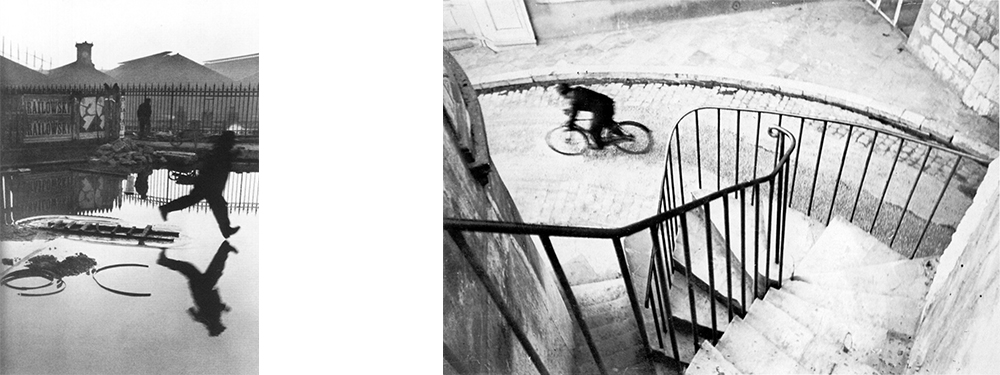
Some of Kelsea’s favorite photos are candid moments captured at the perfect second. I know this because I grew up with her taking random pictures of me as we walked, talked, and ate ice cream. She always had a camera on her and made sure she was in the middle of the action – capturing everything. When I left Las Vegas to study at Drexel University, I took a few art history courses on photography. One day, while studying black and white photography, I learned about Henri Cartier Bresson. He was the photographer that invented the concept of the “decisive moment.” A lot of his photos look like candid snapshots, but they were taken at the perfect moment to create beautiful compositions.
Henri Cartier Bressen’s approach reminded me of Kelsea’s process. She’d want to take a picture of me jumping, and she’d make me jump several times before she’d get the perfect moment. She’d take a million photos of me walking until my hair finally fell the right way in her composition. She’s a patient photographer that would wait until the perfect moment would come. After making this connection, I was able to move in a direction to build her brand.
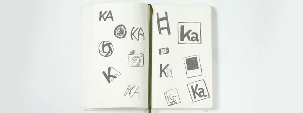
During the sketching process, I focused a lot on imagery found in photography. I spent a lot of time looking at film and the form of a camera. I tried a few ideas that involved an oculus because it reminded me of a camera lens, but I didn’t like the way it looked when paired with the angular letterforms that made up her initials. There was something so sharp about capital ‘K’ and ‘A’ that didn’t feel appropriate with her style. I then took a moment to remind myself that Kelsea loves shooting in nature. Some of her favorite places to shoot are in the Wetlands Park and in the Red Rock Mountains. It was at this point that I started working with lowercase lettering because the ‘a’ looked more organic and in line with her style. I liked the concept of framing her initials in a square because it acted as a nod to the elemental route I was taking for her brand as well as the framing element that goes along with photography and filmmaking.
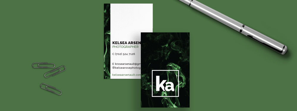
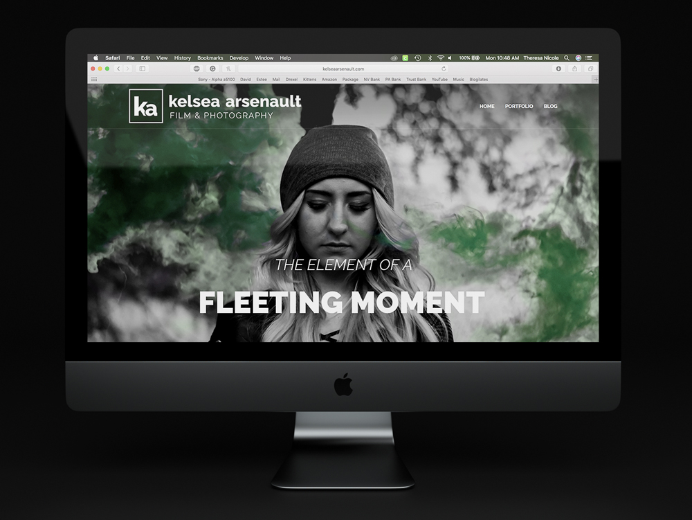
After I established her logo, I had to work on building a branding system. As a concept, I liked, “The element of a fleeting moment.” But in all honesty, that’s really broad and hard to wrap your brain around. Whatever her identity would end up looking like, it would have to somehow visually explain that powerful concept. I asked Kelsea for any photos she’s taken that included textures. I went through bokeh effects and spider web textures, but ultimately loved a smoke texture she shot. It was delicate, strong, and went along with a series she had just shot of a model with smoke bombs. I felt like this was a great start. I worked in Photoshop to give the smoke a green coloration so it would pop on a black background. Kelsea loves dark colors, and she’s always been a fan of olive green.
Smoke references the gaseous state of certain elements, while also offering a visual representation of a fleeting form. It constantly changes and then fades away.
I flooded the back of her business card with the smoke photo but grounded her logo on the bottom of the card. The smoke texture is so light and airy. It’s important to provide these moments of negative space to really give the smoke room to breathe. On the front of the card, I carried the smoke texture up the side but grounded all of her information toward the bottom – much like what I did with her logo. I made her title and website green to give them more prevalence in the hierarchy of information. I wanted the first thing you notice to be her bold, large name, then her title and website, and all of her tertiary contact information last. I love all of the white space at the top of the card because it adds a sense of modernity as well as promoting that airy quality mentioned on the back of the card. I added a soft touch finish to the card to give the smoke a soft tactile sense. It’s always a good feeling when you get a business card that’s a little heavier, or embossed, or textured. You want to work with someone when they make a good impression, and business cards are one of the ways we accomplish that.
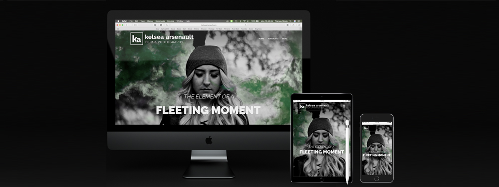
Building Kelsea’s website was an entirely new challenge for me. I’ve studied responsive web design in the past but building a website in the back end of a content management system felt like an entirely new animal. My main concern was making sure Kelsea’s services were clearly outlined, and that she had a portfolio and a blog that were easy to update. I’ve found in the past that when I code custom websites in HTML, it’s difficult for my clients to update their content. That can be viewed as job security on my part, but in the end that’s not what’s best for the client. Today, more than ever, it’s important to keep your websites updated and responsive. It’s the main way someone will learn about your services, and they’ll probably be doing it on their iPhone.
After a few meetings, Kelsea made it very clear that she wanted a system that allows clients to view and request her services directly from the website. She also wanted a way for them to log in, and specifically view their full resolution images. At first, I was hesitant to create a login system because importing full resolution photography into a content management system can significantly slow down the website. After doing some research and fighting to get a standard login system up and running, I found that if she keeps her site updated and only posts one client’s selected photos at a time, her website should still work seamlessly.
Putting together Kelsea’s brand was an actual pleasure. The process of sketching out her logo and building her identity felt like a labor of love – like I was baking her a sheet of cookies. The web portion was frustrating, and took some time to gather all of her content, but ended up acting as a finely tuned tool she should be able to use for years to come.
To see the full design, view Kelsea’s website today.