Tag Archives: Art History

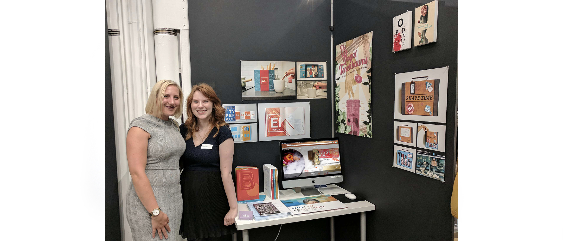
Paul Peck Gallery Exhibit

The Project Scope

My favorite course so far during my master’s degree has been my Exhibit Design class. When I was studying design during my undergraduate degree, I had taken an Environmental Graphic Design course that focused on exhibit design and placemaking. It was a lot of work, but I truly enjoyed it. Because the undergraduate course had such a heavy focus on design, we didn’t have the time to cover any of the logistics that go into getting the design approved and implemented, though. This master’s class gave me the opportunity to learn more about curating and storytelling—two things that were heavily lacking in my prior knowledge.

Over the course of the term, my class was tasked with an overarching project to design an exhibit about liberty. On week one, the scope seemed relatively simple. We’d define liberty, suggest a few works we felt connected to the theme, and we’d hang them in Drexel’s Paul Peck Gallery. By week seven, my class realized that the project was much more difficult than we had anticipated.

We all had different definitions of liberty, and each of us wanted to focus on a specific historic example. My professor was inspired by the American Revolution, while others of us were inspired by the Suffragettes and liberation on a global scale. The scope of the project was too wide, and we only had three weeks to finalize our pitch for the exhibit.

To fix this issue, our class was divided into two groups: 17–18th century, and 19th–21st century. Each group would have to create their own pitch for the space as the final project.

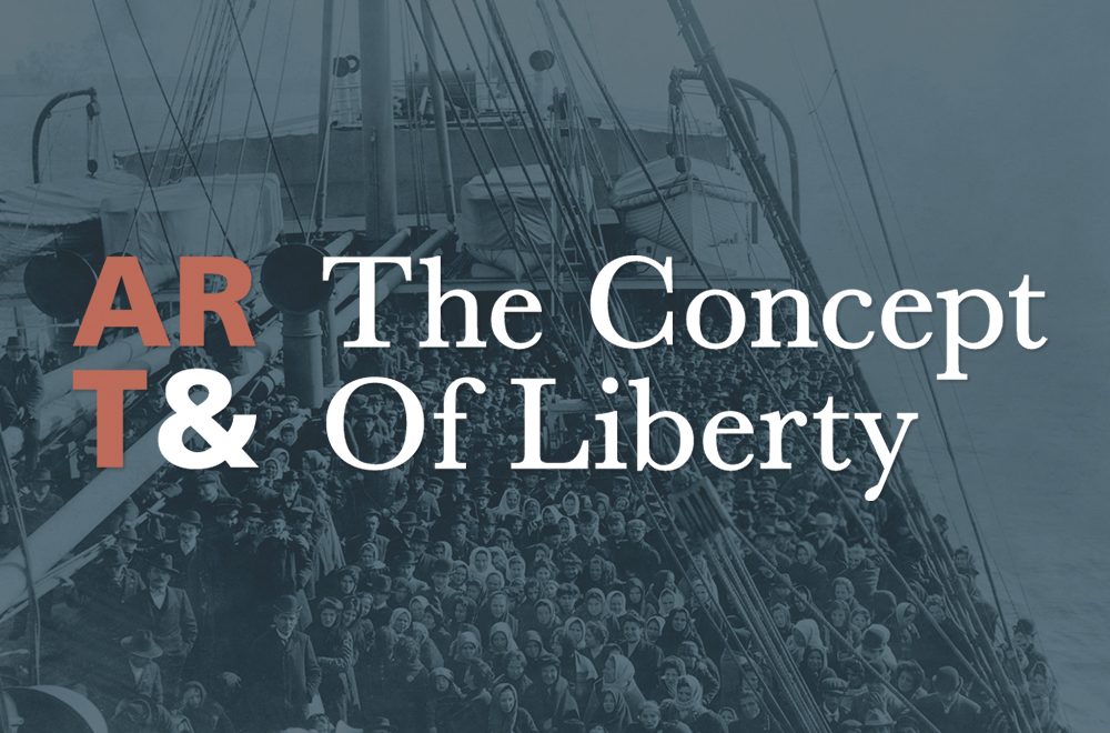
My group was tasked with designing an exhibit for the 17–18th centuries. We were given a few weeks to complete the project, meaning that we had to decide on our narrative, pick our pieces, write copy, and create a cohesive identity for the exhibit. The only thing we were given, was that both exhibits would be titled, “Art & The Concept of Liberty.” It was a tall order, but there were seven of us working on the project, so it felt feasible. We had five writers, an editor, and I acted as the designer. We weren’t given a budget for the project, so all existing pieces of art were considered fair game. The goal was to pitch an exhibit that could be edited to work for Drexel at a later date.

Drexel University's Paul Peck Gallery

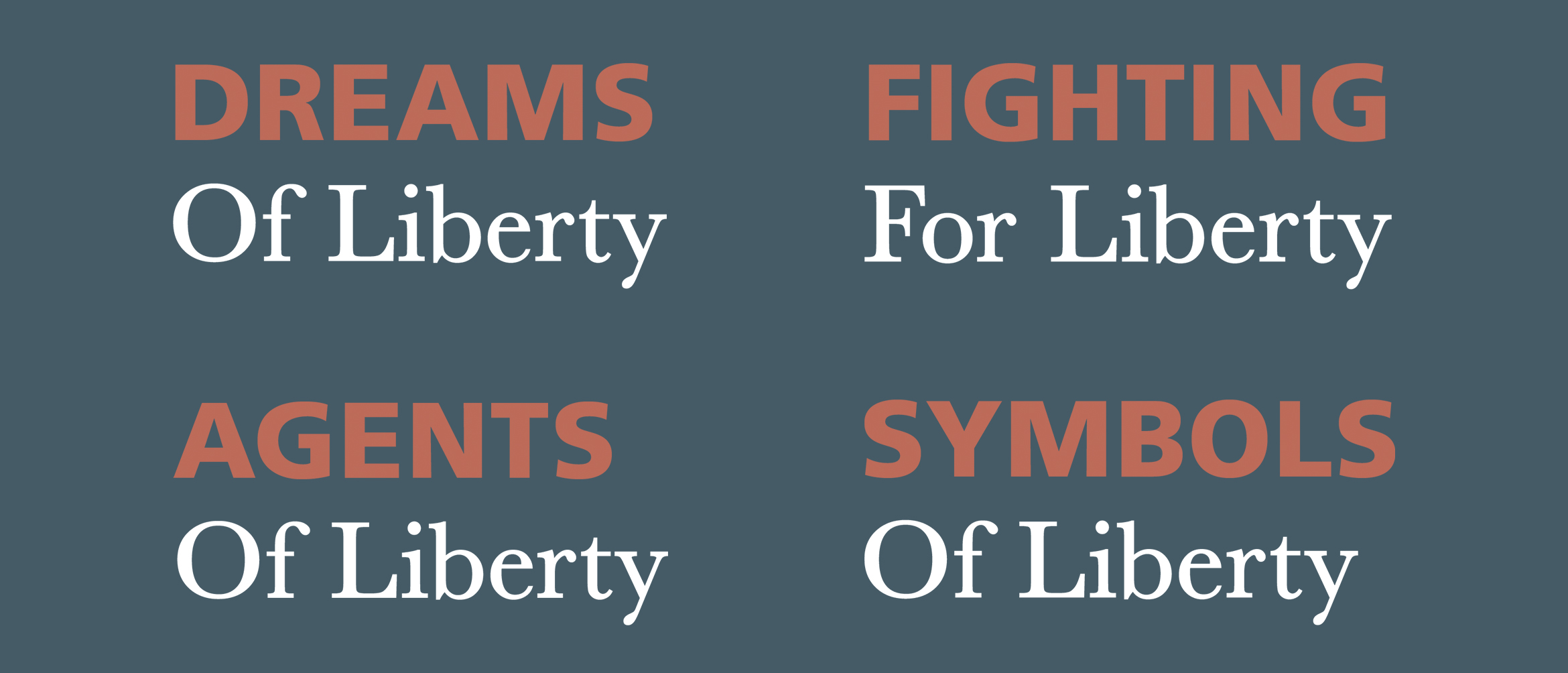
We started the lengthy process by taking a long list of possible art pieces and categorizing them. We wanted to be very abstract with how we classified them as an effort to make the exhibit less controversial. Because everyone has a different concept of liberty, we didn’t want to place the art in a restricted metaphorical box that would only fuel argument. We settled on: Dreams Of Liberty, Agents Of Liberty, Fighting For Liberty, and Symbols Of Liberty (specifically in that order). These categories worked as a loose narrative for us. People dream of freedom, key agents fight for it, and once it’s achieved, we respect the symbols that represent freedom, and those who gave their lives for us to have it. From here, we narrowed our selection down to a few key pieces for each category, and our writers started to generate copy for the narrative that would be displayed among the chosen work.

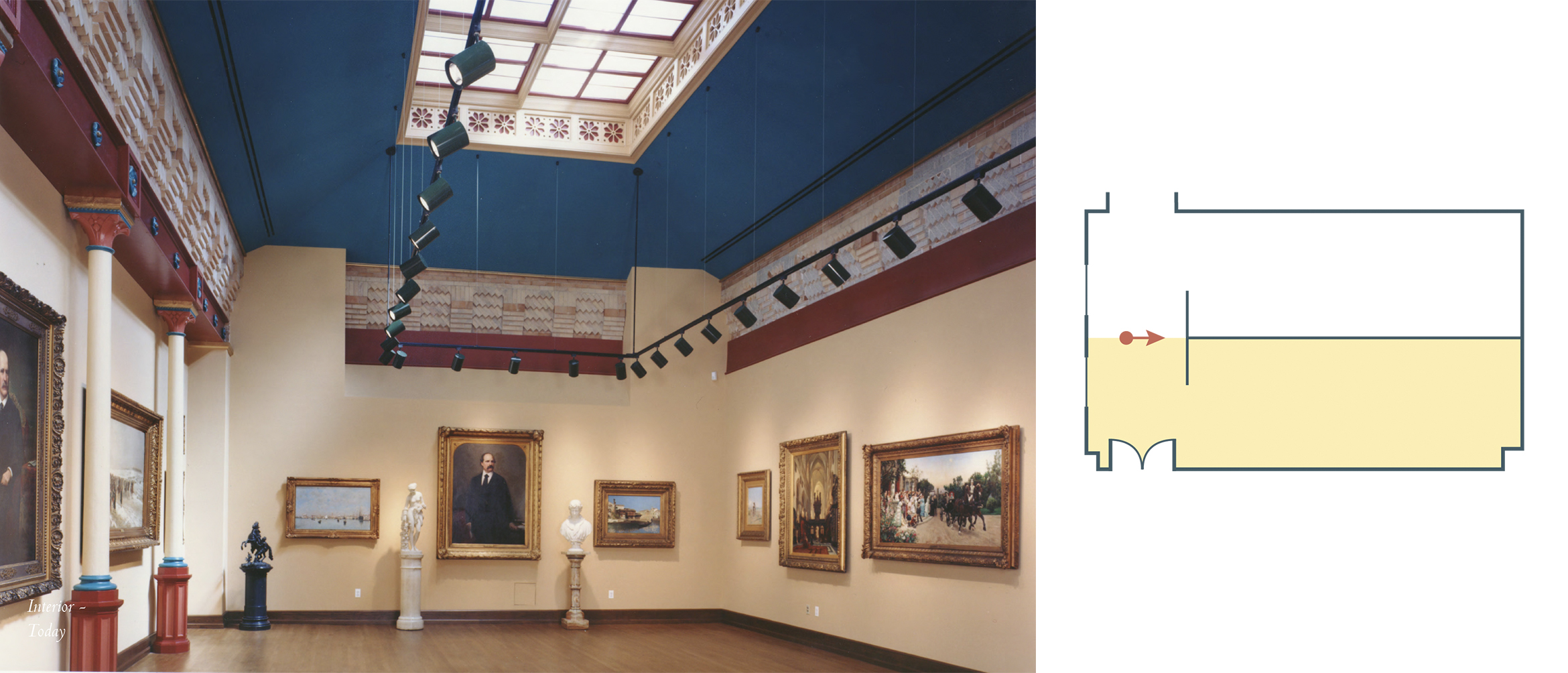
As the writers and editor got to work on the copy, I decided to visit Drexel’s Paul Peck Gallery and work with its blueprints to fully understand our design options. I was given very little information, but there were a few things I knew. The gallery was small, and we had exactly half of the space to work with. Both groups were told we had to share the room, so I needed to figure out how the space should flow, and were I wanted to place the front. I knew that the Paul Peck Gallery could not be painted, and that temporary walls were used to hang temporary pieces, as well. These restrictions informed a lot of my design decisions.

Interactive Exhibit Entrance Facade

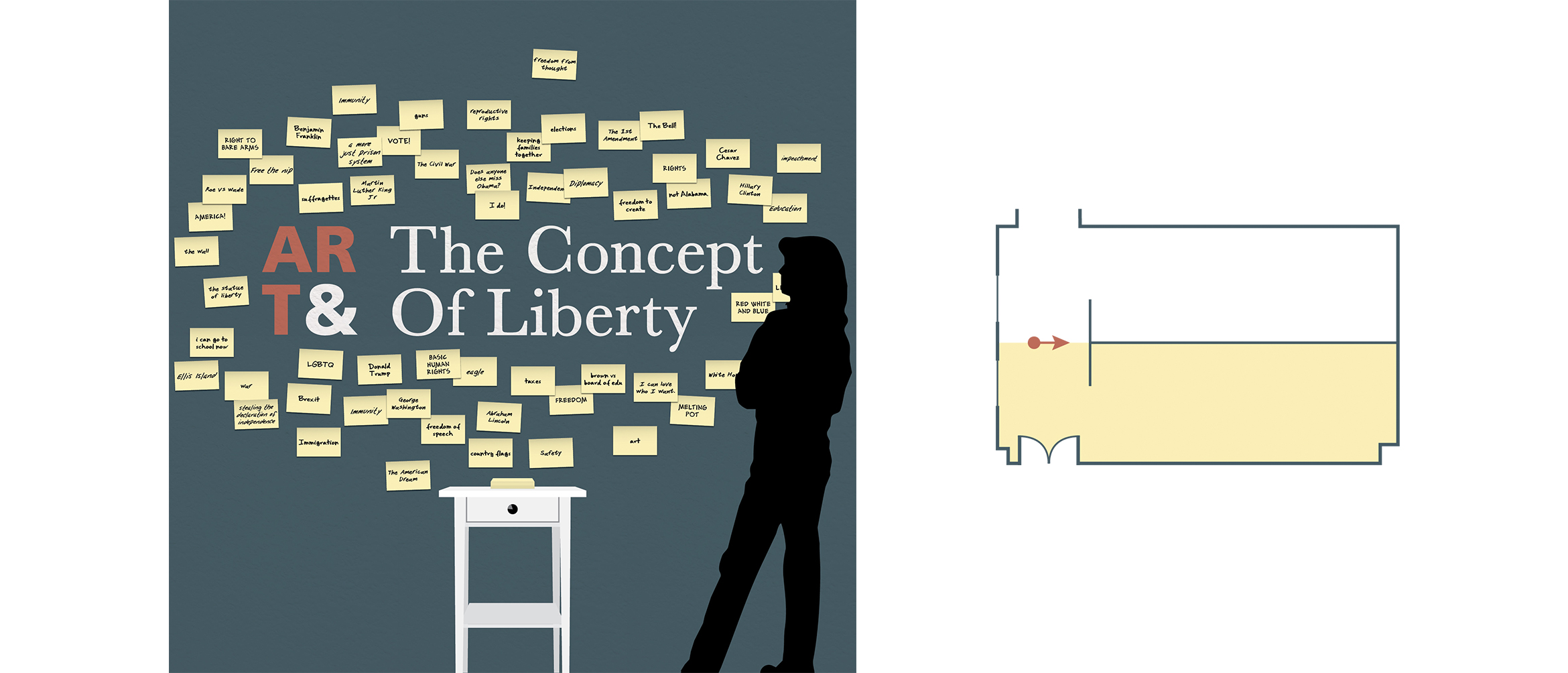
I was recently inspired by a speech I’d heard from Nina Simon, who expressed the importance of connecting and interacting with your audience when you build an exhibit. Still running off the high I got listening to her talk, I was inspired to add an interactive element to the space. This also influenced the way I divided the room. Because the Paul Peck Gallery uses temporary walls, I thought we could bisect the room laterally two walls creating a ‘T’ shape. This would give us a front end to the exhibit that would put the ‘Dreams Of Liberty’ section directly in our visitors’ sight lines. Once I settled on a typographic mark for our exhibit’s name, I brainstormed interactive solutions for the front end of the exhibit.

I kept thinking back to the fact that each student in my class had a different concept of liberty that was directly related to who they were and what their experiences were as an individual. My class isn’t an anomoly, however. Everyone has their own perception of what liberty and freedom is. What if we gave them a space to share their thoughts and start a larger conversation? After all, it’s what we’d been doing all term!

The front of the exhibit is a large temporary wall covered in a muted teal vinyl adhesive. This solution doesn’t damage the wall, but still gives our exhibit a pop of color. The wall would have a small desk placed in front of it that compliments the room’s original architecture. A 6×4″ pad of sticky notes and a marker will sit atop the desk, with extras inside its drawer. Each person will be prompted with the question, “What does liberty mean to you?” though not everyone will agree with all the answers placed on the wall, they will be aware of their communities thoughts and encouraged to have a larger conversation.

Exhibit South Wall
Exhibit East Wall (left), Exhibit North Wall (right)

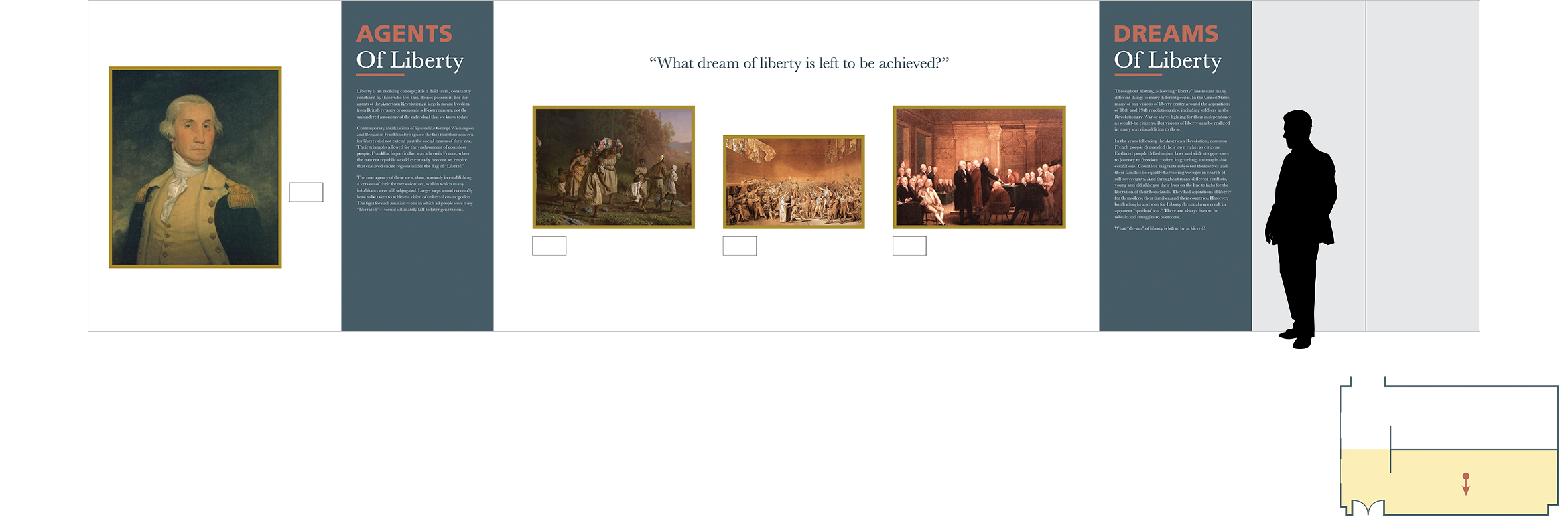
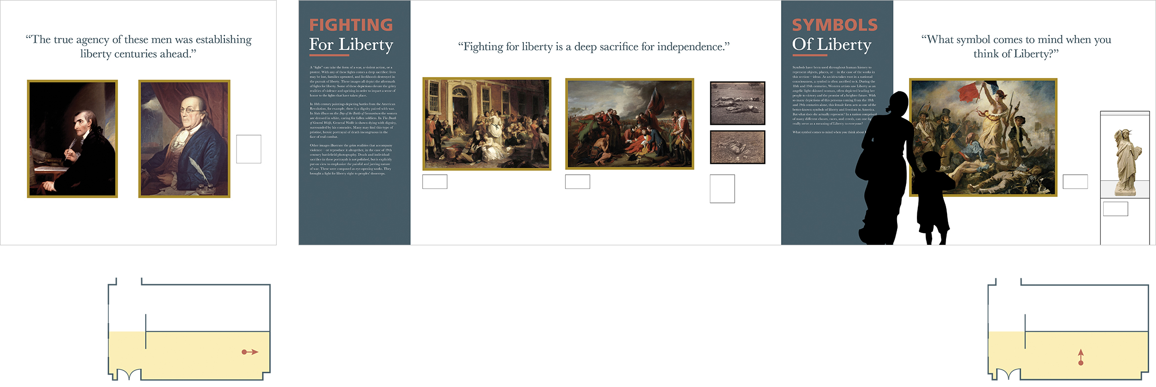
Each section of the exhibit was separated by vinyl wall decals that extend the full height of the temporary walls. Once our writers finished creating content that tells the narrative of the story, our editor worked to put everything in one cohesive voice. I typeset the copy on the information panels and designed how they’d integrate within the space. It was important to communicate the narrative before looking at the pieces included, so I decided to treat them as section dividers. To break up the space and add further visual interest, I included vinyl die-cut quotes that were placed above the pieces. Some were thought-provoking quotes, and others were questions that could influence the conversation at the front of the exhibit on the interactive wall.

The Visual Identity

As I mentioned before, working with several restrictions influenced my design solutions greatly. My color palette was immediately taken from the colors already existing in the space. I didn’t want to use colors that weren’t appropriate for the pieces we included, and luckily for us, they shared common hues with Drexel’s Paul Peck Gallery. Due to this restriction, I worked to find other ways to add visual variation to our exhibit. I felt that typography was a great way to accomplish this.

In the exhibit, we focus on key events and figures like America’s liberation from Brittan, and our founding fathers. Though the writing we included for the narrative had more of a contemporary feel, I was itching to use Baskerville. How could I not?! The typeface invented by John Baskerville and embraced by Benjamin Franklin had to be featured in an exhibit celebrating liberty in America.

I did want to offset it with a more modern sans-serif typeface, though. The classical nature of Baskerville is absolutely lovely, but I worried about making the exhibit look dated to a certain extent. To offset this, I combined it with Frutiger. Because Frutiger is commonly used in the signage and wayfinding in airports and train stations, I consider it to be the official typeface of transportation. I thought it worked as a visual metaphor—speaking to America’s journey to a liberated future. Its geometric nature also compliments the delicate, friendly letterforms in Baskerville; ultimately, modernizing the typography.

Section Title Typesetting
Example of Exhibit Label, 6.7 x 3.8"

Though we didn’t have a lot of time to put our pitch together, I was proud of what we were able to accomplish. My knowledge from my undergraduate course on Environmental Graphic Design influenced my approach to this project greatly. I feel that it gave me the tools I needed to create a holistic final design that incorporated individual aspects of both courses. Moreover, I loved that I didn’t work with designers on this project. In my undergraduate course, it was so fun to hear the perspectives of other designers and watch our project elevate visually. In my graduate class, the process was different. It was rather interesting because my team’s primary focus was on the content. They were more concerned with the curating and logistics of the project than they were about any color decisions I made—let alone the typeface I chose. It required me to adapt to a team dynamic I’m not used to, and it gave me a different perspective as I moved through the design process.

Takanawa in Moonlight

Hiroshige's "Takanawa in Moonlight"

Utagawa Hiroshige was a master of Japanese woodblock printing. He had an observational, unbiased eye and captured important landscapes in Japanese history. More notably, he captured the View of Takanawa in Moonlight during the newly lifted restrictions on Japanese trade with the western world. He paints a serene scene that shows a peace that was two hundred years in the making.

Hiroshige was a master of ukiyo-e (woodblock prints) art and tradition. Also known as Ando Hiroshige, he wasn’t always known as an artist. He was raised in Edo or modern-day Tokyo. He had a heavy samurai background, which wasn’t uncommon because the Tokugawa Shogunate took control of Japan. Hiroshige’s parents passed when he was very young – about twelve years old. He belonged to a fire warden family that monitored the Edo Castle. Once his father passed, young Hiroshige took over as the fire warden. He took the job very seriously, but it came with a lot of down-time. There weren’t many fires at the Edo Castle that needed to be extinguished. In his solitude, he began to dabble in painting.

Hiroshige fell in love with painting and sought out for a formal education in it. Though he was still working as a fire warden, he also took on an apprenticeship where he’d work on illustrations for books and single-sheet ukiyo-e prints. The subject matter for these books and prints tended to be of female beauties in the red-light district and kabuki actors, but he’d developed his own personal style during the execution.

Artists have a tendency to paint what they know, and Hiroshige was no different. Because he grew up in Edo, he developed an extensive body of work focused on his home. Towards the beginning of his career, he had painted flora and fauna near modern-day Tokyo. He eventually evolved into more of a landscape painter – most likely due to his influence from Hokusai, the artist behind the incredibly popular series, “Thirty-six Views of Mount Fuji.”

Two popular prints from Hiroshige's, "Thirty-six Views of Mount Fuji"

Hiroshige decided to fully pursue his career in the arts years later. He left his job as the fire warden to his brother, Tetsuzo, and decided to travel outside of Edo to paint new landscapes. His first wife was very supportive of his endeavors and sold her clothes and ornamental combs to help pay for his travels. During his that time, he painted the collections, “Illustrated Places of Naniwa,” “Famous Places of Kyoto,” and “Eight Views of Omi,” but he would always come back home to Edo.

“View of Takanawa in Moonlight,” is a piece from Hiroshige’s series, “Famous Places in the Eastern Capital.” Here, Hiroshige designs a print of a familiar sight. “View of Takanawa in Moonlight,” is a view of present-day Tokyo Bay. This particular print is important because it depicts an early morning scene of the trading port. We know it’s early morning, rather than late at night because the sky is a hazy blue rather than a deep midnight color. Previous ukiyo-e prints depict nighttime with rich dark colors. In the bottom right portion of the composition, we see a Japanese marketplace, most likely specializing in fish due to its close proximity to the ocean. You see a number of fisherman sailing on their small boats in the water looking to get their early morning catch. Some people are carrying bountiful earnings from the boats to the market for preparation and distribution.

Modern-day Tokyo Bay

Hiroshige’s print has a few Japanese characters on it. The left side contains three different types of information. First, we see the artist’s signature. These are the three characters located on the leftmost side stacked on top of one another. To the right of them, there are two Kanji characters enclosed in circles. During the time the Tokugawas were in power, there was a strict system in place that determined what art was and wasn’t appropriate for the public. Everything needed a seal of approval before it could be released. This practice ended a few years after this print was approved. Underneath Hiroshige’s signature and the seals of approval, we see a Kanji character inside of a box. Though this character isn’t very common anymore, it signifies inner consideration and mindfulness. The ukiyo-e’s name is written in the red box to the right end of the print.

Japanese Characters from "Takanawa in Moonlight"

The most notable feature of Hiroshige’s composition is the larger boats on the horizon line. They’re much larger than the Japanese vessels used for fishing. Because the print was created in 1854, we know the ships in the horizon were most likely foreigner vessels. During the Edo period foreigners weren’t allowed to travel or trade with the Japanese. This was the case until 1853. Japan’s recent, though reluctant, choice to open their borders in certain ports, explains the European vessels in Tokyo Bay. Hiroshige’s work is mostly poetic and ambient, so it would make sense that he would portray this scene as an impartial observer. The foreign visitors don’t look threatening in any way, they just look as though they’re part of the quiet, early morning scene.

Japanese Scroll Depicting Perry Expedition Ships. USS Susquehanna, Commodore Perry's flagship, full starboard view. Drawing is on the "Susquehanna & Mississippi Scroll", depicting Perry's expedition to Japan. Watercolor drawing by Taguchi Shumpei. Image date: July 9, 1853.

In 1600, Japan was unified under the Tokugawa Shogunate with emphasis on the reestablishment of order following one hundred years of civil war. It was the civil war that created the chaos that allowed the Tokugawas to take control in the first place, and their approach to governing Japan was militaristic, to say the least. Though they were incredibly strict, Japan did live in peace and stability during their rule. The military class was demilitarized – they kept all of their practices, except the warfare.

City people became more relevant, rather than the extreme polarization we had seen before where the leaders were rich, and the citizens lived in poverty. This new rule leads to the rise of the chonin, and a more comfortable middle class.

During the time, the Japanese became weary of Europeans spreading their ideas of Christianity to the Eastern nations. The Tokugawa Shogunate was suspicious of the Dominican and Franciscan missionaries that arrived in the Philippines looking to spread the word on Christianity only to dominate the country. Because of this, Tokugawa Ieyasu decided to end all Christian practice in Japan, as well as prohibit trade with western nations. This embargo was called the “Act of Seclusion” and was established in 1636. It remained active for the next 200 years until American Matthew Perry interrupted it.

In 1853, American Commodore Matthew Perry led his fleet of ships into Tokyo Bay, looking to re-establish regular trade between Japan and the western world since Japan ended relations with persistent Europeans looking to convert them to Catholicism. Since America started using California as a trade port, pursuing trade with China and Japan would be easier and beneficial for the western nation. Not only that, but Americans were finding themselves stranded in Japan due to ship malfunctions on their way to China. They were usually greeted with hostility, and America was hoping to work out a deal where Japan offers coaling stations to Americans on their way.

The deal seemed fair, but to ensure it went in favor of America, Commodore Perry brought an armed fleet to Japan when he tried to arrange a deal. To prove he knew little about the political situation in Japan, he asked to speak to the emperor rather than Tokugawa Ieyasu. Once he was directed properly, Japan reluctantly agreed to lift the “Act of Seclusion” on their own terms. They felt that if they were forced into the decision, it may end in war. Doing it on their own accord would be better in the long run. They wanted to ease into the trade, however. They agreed to open two American coaling stations where they allowed Americans to live and operate in peace, and they opened a few ports in Japan for global trade – just not all of them.

Japan opening their ports provided them with a lot of opportunities. Unfortunately, it also meant that the art of woodblock printing would also come to an end.

In 1858, Hiroshige passed away. This would go on to be known as the beginning of the end of ukiyo-e. Toward the end of his life, trade was re-established in Japan causing it to move into a progressive era. The country faced westernization due to the tools and knowledge they were adopted from the foreigners they once tried to seclude themselves from. Today, woodblock printing is appreciated as an ancient art form and is practiced as a nostalgic look at traditional Japanese culture, but it’s lost the weight it once held in their society. Looking back, Hiroshige was one of the great masters of ukiyo-e, and his contribution and unbiased observational eye will never be forgotten.

My Bachelors in Design

Five years ago, I was sitting in my graphic design class poking about Google. I had already finished my final for the semester and decided to look at design universities. I thought about going to Virginia Tech or Pratt for a while. I wanted a school where I could learn about design, but also focus on academics. Then, I stumbled upon Drexel University. I honestly couldn’t tell you what website I was on, but it ranked Drexel in the top five schools for graphic design in the country. Once I dug a little deeper and did some research, I decided to submit my portfolio. I’d been looking at a few schools, so it wouldn’t hurt to submit my portfolio and see what would happen.

It was in April of 2014 that I received my acceptance email. I decided to pick up my life and leave my friends, family, and cat in Las Vegas. I was moving across the country to go to Drexel University in fabulous Philadelphia, PA. It was one of the best decisions I’d ever made (aside from going back for my cat).

Last week, I earned my Bachelor’s of Science in Graphic Design. I graduated Magna Cum Laude with minors in Fine Arts, Art History, and Marketing. I felt accomplished, overwhelmed, and excited to share the moment with my friends and family. I’d spent the last three months before graduation planning and prepping my small apartment for the seven people it would be holding in June. In between writing long marketing term papers about sales forecasting and revisiting my design portfolio, I’d randomly pick times to wash my walls or scrub my air vents. I was buying air mattresses between classes and scheduling every hour my guests would be here with me. What can I say – I like a good plan.

My Graphic Design Senior Showcase display

The week leading up to my graduation was a little stressful because I had to take my final final exams and get ready for my Graphic Design Senior Showcase. Once I took my last Marketing final, I was able to sit down and truly appreciate the wave of love and support surrounding me. The night before my Senior Show, my mom put my dinner together for me for the first time in four years. I sat with my best friends, who had just got off their five-hour flights, and laughed about how I ordered Qdoba catering for them because I honestly can’t be bothered to cook. Alyssa, one of my mentors at Michael Graves Architecture & Design, even drove down to visit me at my Senior Show the following day. All week I reflected on how fortunate I am to have such positive and supportive people around me.

(Left) Receiving my diploma, (Right) Austin, Jon, and I take a picture in front of our Freshman dorm

Two days later, I sat in Drexel’s gym (which had received a full HGTV makeover), in an oversized gown, jittery and excited. After a few speeches, my row was ushered to the side of the stage to wait in line. Immediately my anxiety took over and waiting in line felt like it took ages.

I was worried I’d trip and fall, or forget to walk when my name was called. Before I knew it, I heard, “Theresa Tobin!” I rushed forward, shook President Fry’s hand, hugged my Graphic Design advisor, Bill, and then immediatly became a Drexel graduate. It was so sudden.

At that point, the rest of the names were called, and the ceremony wrapped up. Before I left for the summer, there was one final thing I had to do on Drexel’s campus, though. My boyfriend, Austin, and I met one of our best friends (and roommate) during our Freshman year. We all lived in a tiny dorm room in Calhoun Hall. After hearing rumors that Drexel was thinking of tearing it down, we wanted to take one final picture in front of the building on my big day. We ran over, took a few goofy photos, and went home to our reasonably sized apartment.

(Left) Magna Cum Laude Tee, (Right) Austin and I wearing the Magna Cum Laude tee at Shofuso Japanese House & Garden

Later that day, we changed out of our formal clothes, and into one of my graduation presents. Three months ago, my roommate, Jon, came up with the hilarious idea that we should all wear matching tee-shirts on the day of my graduation. The design was inspired by the work I did for Mutant Water Babies. In the past, I had pitched a logo tee-shirt as a revenue booster for the production. Though the idea was shot down, Jon really loved my design. We took the type-treatment I used for the Mutant Water Babies logo, and spelled out, “Magna Cum Laude.” Each of my loved ones (and a stranger online) bought shirts in blue and green – making us look like a family unit.

(Left) Standing on the bridge overlooking Manayunk with Kelsea, (Right) Manayunk newsletter

While everyone was here, it was so important to me that they experience my version of Philadelphia. Among other things on the list, I wanted to take them to Manayunk. It’s a small, creative neighborhood not too far away from where I live. I spent the entirety of Spring term in my Junior year, working on my Travel Newsletter for my Typography 3 class. We went to Lucky’s Last Chance, the burger joint I wrote about and featured in the newsletter, and walked down Main Street. We ended the day watching the sunset on the large pedestrian bridge overlooking the neighborhood. My best friend, Kelsea, took so many pictures of us in the ‘magic hour’ lighting, and it was a great way to end the day.

(Left) My dad and I before I got on the plane to leave for University, (Right) My mom and I after my Commencement

It was such a privilege to be able to spend a little less than two weeks with those I care so much for. Everyone that came to celebrate with me brought so much love with them. I could never thank them enough for all of their support.

For my immediate family, my graduation had a little more meaning behind it. I’m pretty sure there wasn’t a soul alive who was more excited to see me graduate than my dad. There were times it seemed like he was more excited than I was! He’d always talk about how proud he was of me and how he couldn’t wait to see me open my own design firm – as though it would happen two days after I graduated. Unfortunately, he couldn’t sit with my mom and friends to watch me accept my diploma. He passed away this past November. It was very sudden. Every day surrounding my graduation, he was on my mind. I could picture him tearing up with joy, and it made me tear up. It was in those moments that I could feel him with me, and felt whole and proud of my accomplishment.