
Bachelors of Science Graduation Invitations
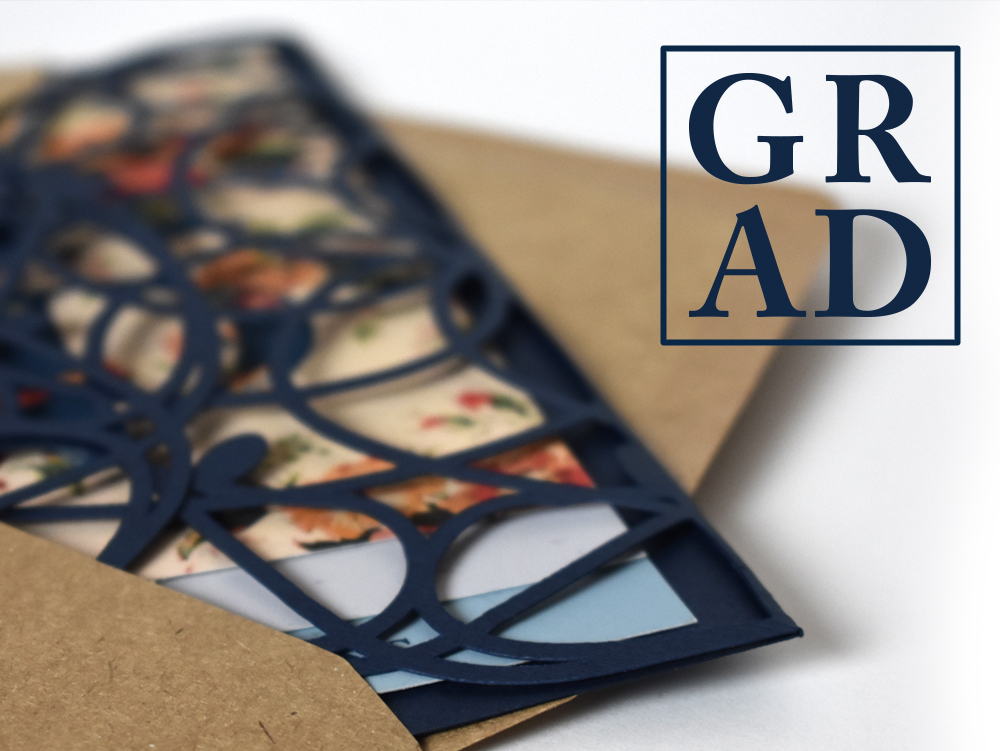
In December I sent out my graduation invitations. The process of designing them was so odd. I’ve found it’s always hard designing for yourself. It’s so easy to over-design, and there’s always something you want to change after production finishes. In my case, I didn’t have a huge budget. I’d be comping my design and sending them out by hand with my boyfriend, Austin. At every juncture of the design process, he kept production in mind. I, however, shot for the stars and designed whatever I wanted to. I didn’t think of how much effort printing and comping would take until I ended up with a three-tiered design with an intense die cut and a staple closure. I wanted to add twine as well, but you have to know when to stop.
I worked in between classes looking online for inspiration. I knew I wanted to use a gatefold that mimicked lace, but I wasn’t entirely sure what else I wanted to add to the look and feel. My school colors are navy and goldenrod. Navy is a beautiful, elegant color, but goldenrod is harsh. If I die cut my gatefold flaps to look like lace, using goldenrod in my design would look disconnected. I was interested in using a pastel yellow to reference the color, without beating you over the head with the actual color. I found a beautiful vintage wallpaper pattern online that used pastel yellow and navy together. It was floral, which I felt was appropriate for spring, and feminine – something that felt appropriate to me.
Once I had the floral motif combined with my lace, the rest of my design decisions fell into place.
The card I was sending out had to be more than just a card. I was sending it out so early because my friends and family live on the west coast, and they needed time to book their flights and hotels. Graduation season in Philadelphia is very hectic, and you have to book in advance. Otherwise, you won’t have any options. I wanted to include information about when the ceremony is, and where to RSVP, but I also wanted to include a list of hotels and where I live in reference to my graduation events. I could fit all of this on a huge sheet of paper, but I didn’t want to custom order envelopes. I needed to stick to a standard mail size, so I felt that a tiered system would be the best way to approach this. I created a tabbed system for the card so my friends and family could navigate my system easily, and kept the tertiary map information in the back.
Production was a small nightmare.
A month prior, I bought a Cricut die cutter, and it was one of the best decisions of my life. I bought textured navy paper at Michaels and ran all of my shells through my Cricut, so I wouldn’t have to sit with my X-Acto knife for days on end. The hard part came, weirdly enough, when I was printing. My file was huge and my printer kept seizing up. I couldn’t afford to buy speckle tone paper, so I simulated it in my design as an overlaid texture. Unfortunately, this made my file size huge. I tried compressing it as a PDF, turning it off and on again, and asking it nicely, but it wouldn’t budge. I needed to comp twenty cards, and one sheet of paper took thirty minutes to finish printing. There wasn’t much I could do. I decided to place two full cards on a larger sheet of paper to cut my print time down, and I sucked it up. While everything was printing, Austin and I sat at the dining room table cutting the cards out of each sheet of paper. We had the Cricut running in the background, while we stapled each card, one at a time, over the course of five hours of steady printing.
Months later, I revisited my design to shoot it for this post. I still love it (which is a good sign), but I’d be lying if I couldn’t find one more thing I want to change. I guess that’s just the struggle of a graphic designer. Luckily for me, I graduate in two weeks, all twenty invitations have already arrived at their location, and there’s nothing I can do about it. That’s the beauty of a deadline.