2020 has been full of surprises. I don’t think anyone could’ve predicted all of this when we were toasting during New Year’s, but it doesn’t change the position we’re in, regardless. If anything, this year may be referred to as ‘The Year of Cancelations’. I was going to see Harry Styles live in San Antonio! I was also going to attend a number of food and hot sauce festivals this summer for work. I was really excited, to be honest. I’d get to learn more about Yellowbird’s devoted customers, and it’d get to try some interesting foods. Broaden my horizons overall! With all that being said, the Austin Chronicle Hot Sauce Festival was postponed…and then something strange happened. Society pivoted and learned that we don’t have to be together to be together. Hot Ones with Sean Evans switched to video interviews, and the rest of the hot sauce community followed suit. The Austin Chronicle Hot Sauce Festival delivered sauce kits and managed to bring the festival to its fans — socially distanced, that is.
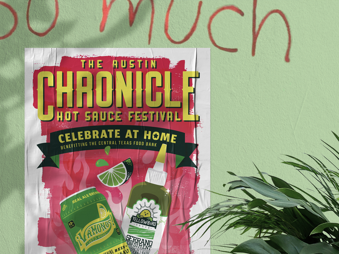
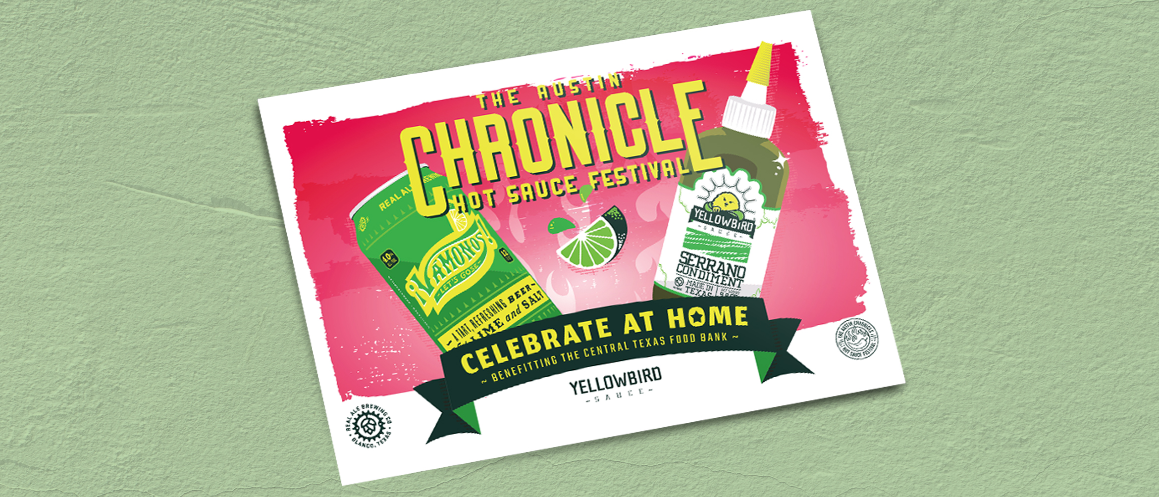
With the festival back on, albeit in a totally new way, they needed a poster and postcard design last-minute including two vital partners of the festival: Yellowbird and Real Ale. This was a really fun project because I wasn’t beholden to Yellowbird’s brand standards. It was a neutral ground, of sorts, because Yellowbird and Real Ale’s new Vamonos! had to be equally represented.

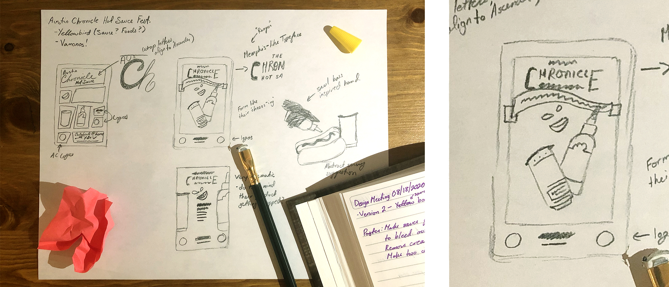
I started with a series of sketches to brainstorm different layouts and aesthetics — really running the gambit to try everything. My art director and I were attracted to a few points of inspiration. We loved the harsh form-focused nature of Saul Bass’s work. It’s timeless, minimalistic, and striking. One issue I found with going this route was that we’d have to create minimalistic iconography for our brand as well as Vamonos! and I wasn’t sure if we had adequate time to ensure we were representing their brand properly. The timeline for this project was only two days, after all. We were also inspired by old grocery store posters that incorporated heavy typography and the classic sunburst effect. The latter ended up being the winner, but it was important that we didn’t fall into any old design clichés, when we could do better.

Texture and color were the driving forces that brought this piece to life once the composition was finalized. Two things were decided for me before I could create anything, though: the products used in the piece were both predominantly green. To make the piece colorful and eye-catching, I wanted to use red as my secondary color since it’s green’s direct compliment. I also didn’t want to give the work a ‘Christmas in summer’ look. I settled on pink because it’s an offshoot of red that’ll do much of what I’m looking for, without beckoning for Santa Claus. Balancing textures was my second hurdle once color was basically decided on. Yellowbird’s product photography didn’t share consistent lighting with Real Ale’s mockup of the Vamonos! can, so I had to create a vector representation for both products. This turned out nicely, but texturally, it looked smooth and computer-generated. This wasn’t a huge issue, but it was important that I balanced it out with something rougher. I hand-painted the background to add a grittiness that wouldn’t be there otherwise, and I originally masked a sunburst inside it.
A sunburst in a poster design? How original! Don’t worry, this didn’t make the final design. Even though I hand painted the background, it was still reading flat. I needed a visual anchor that wouldn’t obstruct the objects in the foreground. That’s when I settled on fire! A perfect harmony of gradients and blend settings subdued the flame in the background — the final element that tied the piece together.

From there, it was all polishing and typography. I can honestly say, I scrolled through so many typefaces that letters shifted into abstract shapes in my brain. The frustrating thing was that the solution was staring at me the entire time. What do the Austin Chronicle Hot Sauce Festival, Yellowbird, and Vamonos! have in common? Texas. More specifically the Southwest. Once I decided on a southwest typeface similar to what Real Ale used in their packaging for the product, everything fell in to place and my head could stop spinning.
The deadline for this project was tight. I didn’t have a lot of time, but the deliverable we presented was something I was truly proud of. A tight deadline isn’t an excuse for poor quality. It’s an opportunity to exercise brilliant time management and make something beautiful and unexpected.

