Holiday Cards 2018
Every year since I first started University, I’ve made an effort to design and produce my own holiday cards. In the past, I loved sending them out to friends and family to spread holiday cheer and show how I’ve grown as a designer. To be honest, I love sending them out because it encourages my friends and family to also send a card my way. Receiving my family’s Christmas photos makes it feel like we’re celebrating together – despite the fact that they’re thousands of miles away.
This year, I also wanted to send holiday cards to designers that inspire me. It’s so easy to share your work with the world now, and I find myself following a number of artists on Twitter and Instagram. Some live in cities I’ve never visited, and others speak languages I don’t know. Regardless, I wanted to reach out and send some seasonal joy their way.
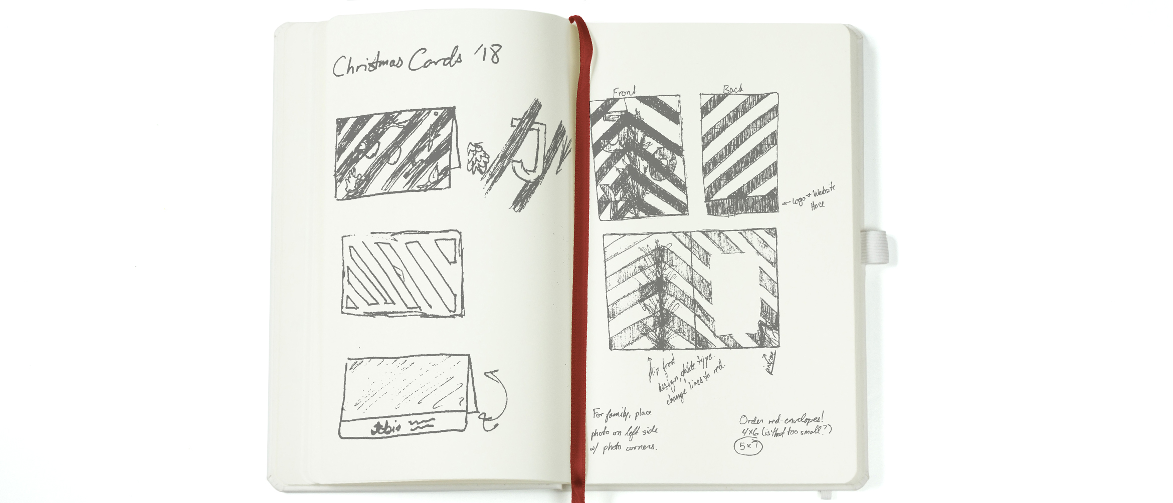
I’ve been contemplating on and off since September what I wanted the cards to look like. I was recently inspired by the line work used in optical illusions. I didn’t want my final design to make anyone’s brain throb, but I’ve been interested in the dynamic quality the lines would often have. I knew I wanted to somehow incorporate that, but I wasn’t sure how to go about it. As I was falling asleep in some time around my birthday, I finally had that eureka moment and knew what I wanted the cards to look like. At 11:30 at night, I turned on my bedside light (waking up my boyfriend in the process), and began to scribble in my notebook. I wanted to do high contrast dynamic black and white lines weaving around bold red type with some collage work.

I started the project off by visiting my local Michaels. I dug through their faux plant section hunting for cinnamon scented pine cones, pine tree branches, and currants. Because I figured out my concept in October, a lot of foliage was a beautiful orange color…or dead. Either way, it wasn’t very reminiscent of the ‘Winter Wonderland’ spirit.
That night I shot each of the pieces individually on my living room floor and mentally prepared to cut each pine needle out in Photoshop for the next few days.
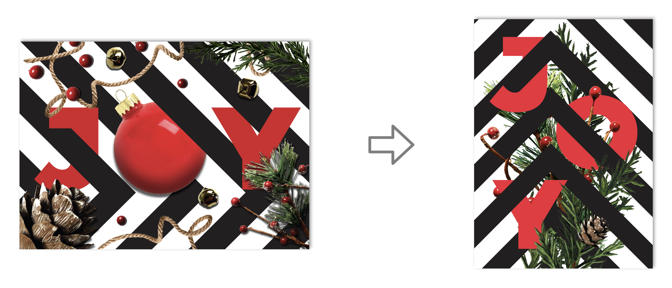
 In my initial sketch, I planned on using a landscape orientation for the card. I figured I could weave the lines in and out of the text and build a border using my collaged nature. Once I had it laid out, I couldn’t help but feel unsatisfied. At the end of a project, you should feel good. You should have that prideful “I made that” moment. I knew something was wrong, but I couldn’t quite pin it down. I loved my initial concept but felt the whole thing ended up looking safe and predictable. After three years of typography and a number of years studying composition, I decided to start over with a blank sheet. I had all the elements to make a great card – I just had to use my brain.
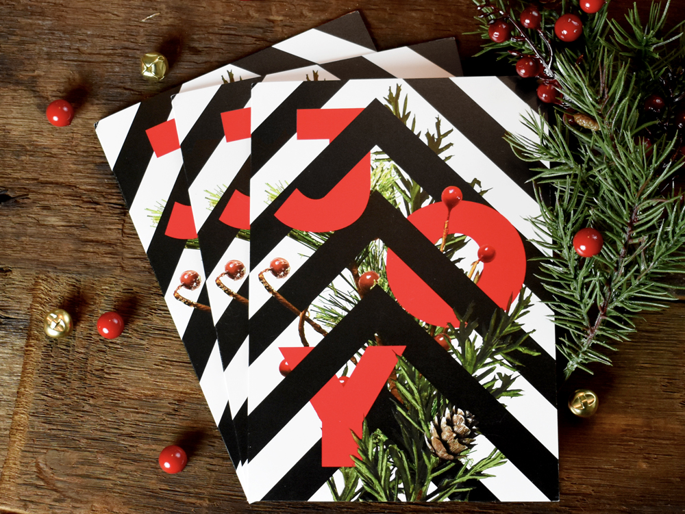
I revisited my sketchbook and tried to disrupt my design thinking by using a portrait layout instead. By just looking at it sideways, I noticed that I liked the lines pointing upward instead of to the right. I started thinking that I could use them as a visual cue for my composition. Moving them off center helped make my composition less static, but I wanted to stagger the type to activate more of the space rather than just stacking it vertically. I also felt that using a Christmas ornament in the ‘O’ has been done about a million times. I didn’t want to follow that cliché, so I scrapped it. Pushing the foliage together and having it directly interact with the type and line work added interest to the composition and made it look less random.
The new design had something the old one lacked: purpose. The elements weren’t thrown together haphazardly anymore, they were interlocked and working together.
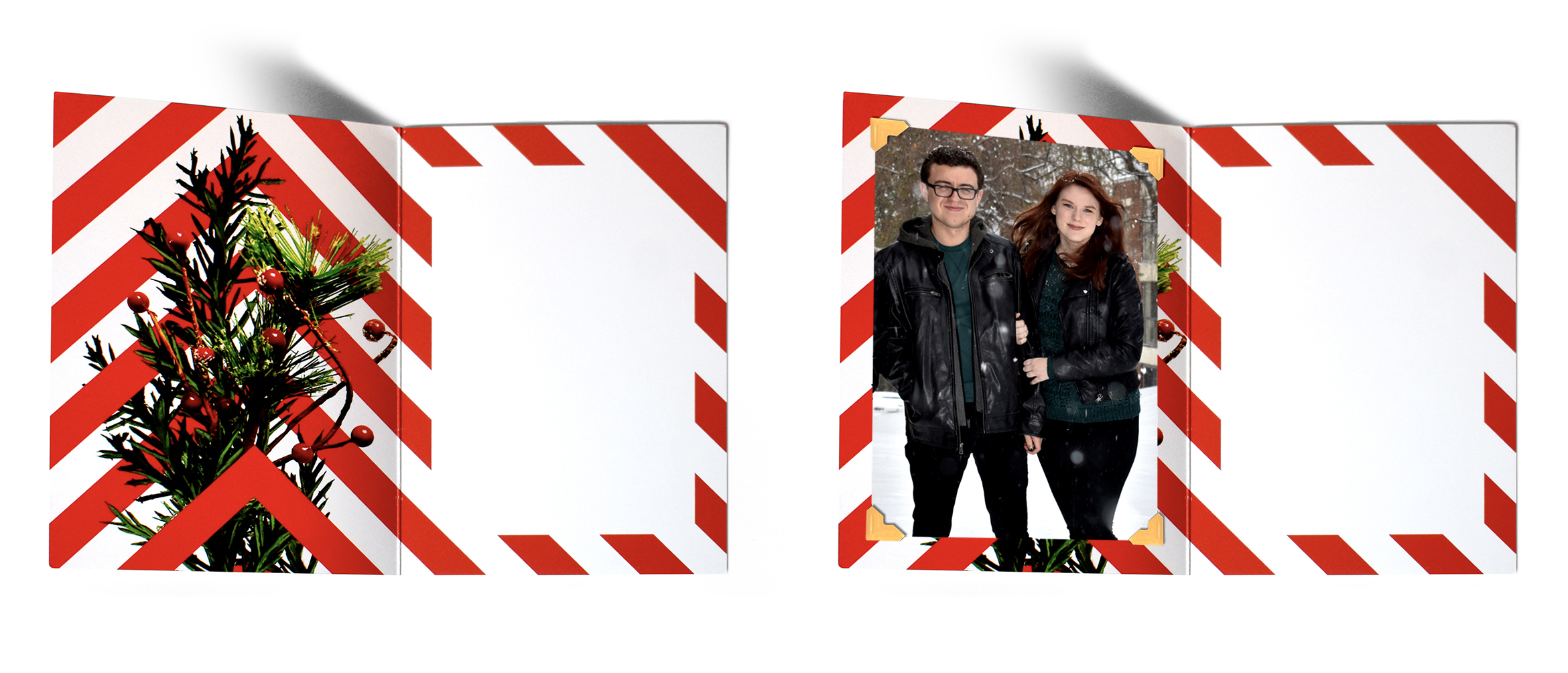
 I knew I wanted the inside of the cards to have an unexpected pop of red that still felt connected to the exterior of the card. The inside has a candy cane stripe that is the direct reverse of the pattern on the exterior of the card. Because of this, I also wanted to show the back side of the foliage. Lines that were previously covered by branches in the card’s exterior now sit in the foreground. I did this to give the design a three-dimensional perspective.
As a student, I don’t have an endless supply of money. I knew that these cards would be sent out to family and to designers I admire. Most likely, those designers don’t want the annual holiday photo my mom looks forward to every year. It was important that the inside of the cards had a solution for both audiences. I still loved the brass bells I shot in the first draft of the card. They didn’t make it to the final draft, but I wanted to still incorporate their color and texture somehow. In cards sent to family and friends, we printed our holiday photo and attached it with brass colored photo corners. This allowed them to remove the picture to place it in photo albums while not disrupting the final design. This also meant that the printer only had one design to print, instead of two; thus, reducing the cost of the job substantially.
I think my favorite part about this project was that I was able to send holiday joy to friends and family, as well as strangers I admire, by making my design flexible.


