Tag Archives: Design

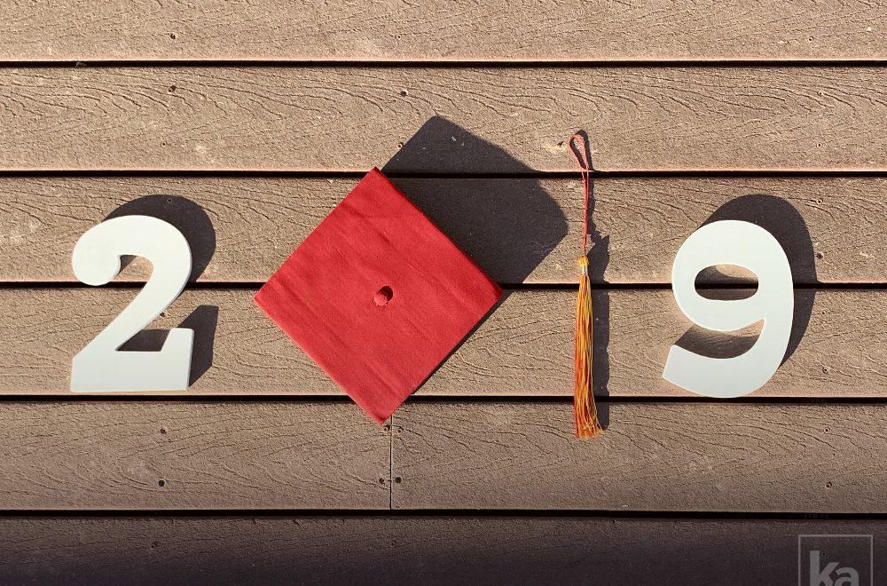
2019 Graduation Season

Much like last year, graduation season is a busy time! This year, two of my best friends walked with their diplomas in hand. Kelsea Arsenault, an amazing person who is basically my sister, finally graduated with her Bachelors in Film from UNLV. Jonathan Fabian, my roommate of five years and avid dog lover, graduated with his Bachelors in Biomedical Engineering from Drexel University. With Kelsea graduating in May, Jon graduating in June, and my graduate thesis starting up, I had my work cut out for me this year. While balancing my full-time job along with my school work, I had to make my special graduates cheesy tee-shirts to commemorate their achievements.

Kelsea’s Graduation

Austin and I were thrilled to fly home again. We’d been away from Las Vegas for so long. We missed our families and the unforgettable taste of a Double Double from In-N-Out Burger. For months Austin would turn to me and say, “I can’t wait to fly home.” It was a much-needed vacation for us. I was in the middle of a crazy spring term in school, and Austin was working extra hours to save for our move this summer. We couldn’t wait to spend a week in the Vegas heat celebrating Kelsea’s graduation and her 23rd birthday.

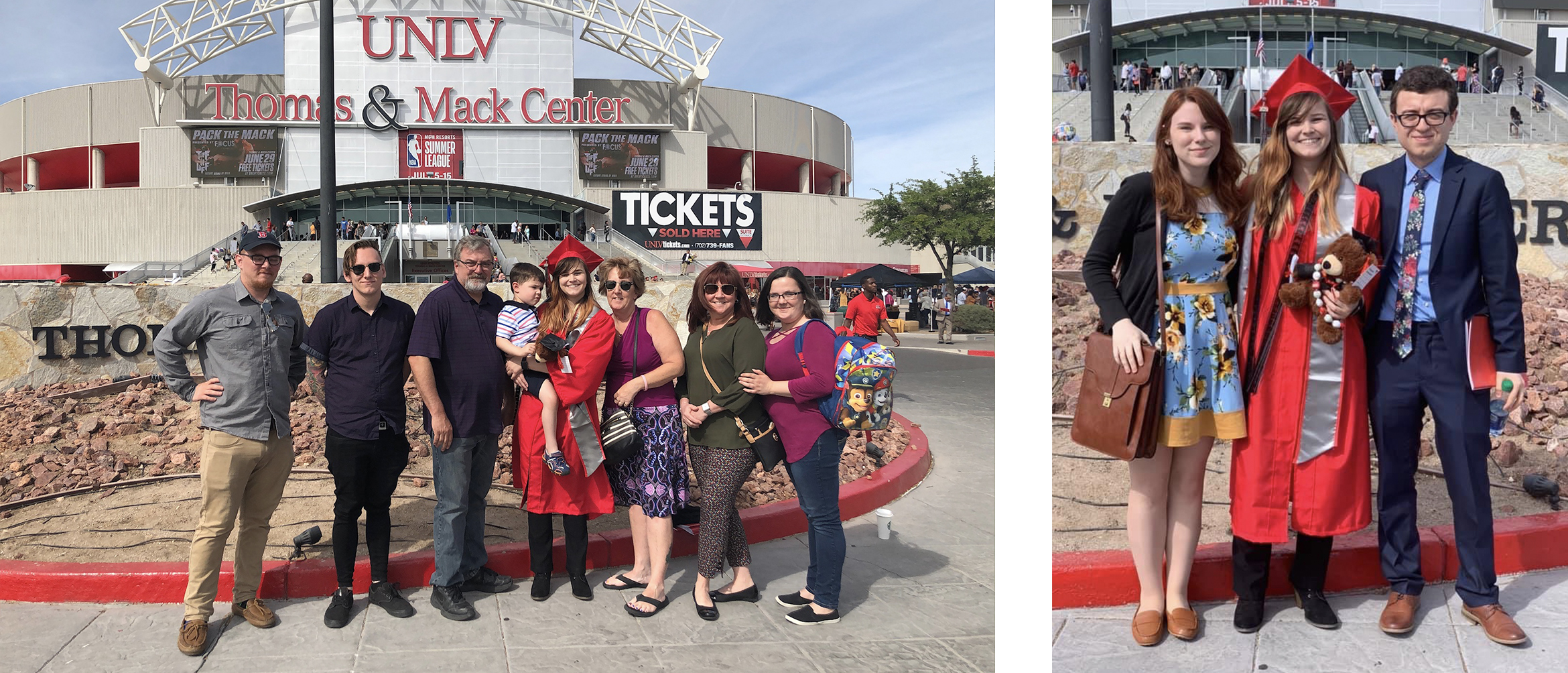
UNLV’s Commencement was held at the Thomas & Mack Center. That morning I tied Austin’s tie and watched Kelsea go through several outfit changes before we all climbed into our rental car. She tried on three olive green shirts that looked nearly identical before she settled on the winning blouse…that she then covered entirely with her red regalia. We were all so excited for her; I’m sure none of us were thinking very straight.

Kelsea separated from us and her family to prepare for the ceremony with her graduating class. We waddled through the crowd following her parents until we reached the arena. Arriving an hour early, we were able to find the perfect seats. Kelsea’s nephew crawled onto my lap, and we sat waiting to see our graduate walk!

Once her class started walking, we were all trying to get the perfect photo of her. We took some of her sitting down, the moment she walked across the stage and shook the president’s hand…and then we lost her. She completely disappeared—she wasn’t in her seat anymore! Our phones buzzed, and Kelsea’s brother leaned in to whisper, “She already left!” The group ran outside to see Kelsea standing there smiling. She didn’t want to stay for the whole ceremony, it was too long anyway. We all laughed.

Since my graduation last year, our friends have decided to make ‘graduation shirts’ a tradition. All this means is that Theresa spends a few weeks designing tee-shirts for everyone as a way of celebrating in the cheesiest way possible. It’s a labor of love though! After my rushed design last year, I’ve taken careful effort to make these shirts fun and specific to the person wearing them.

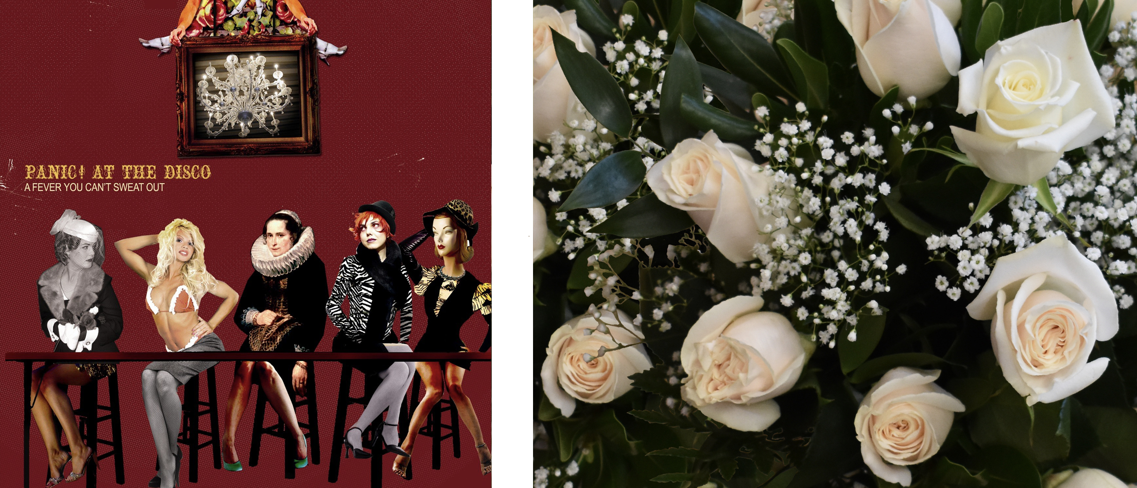
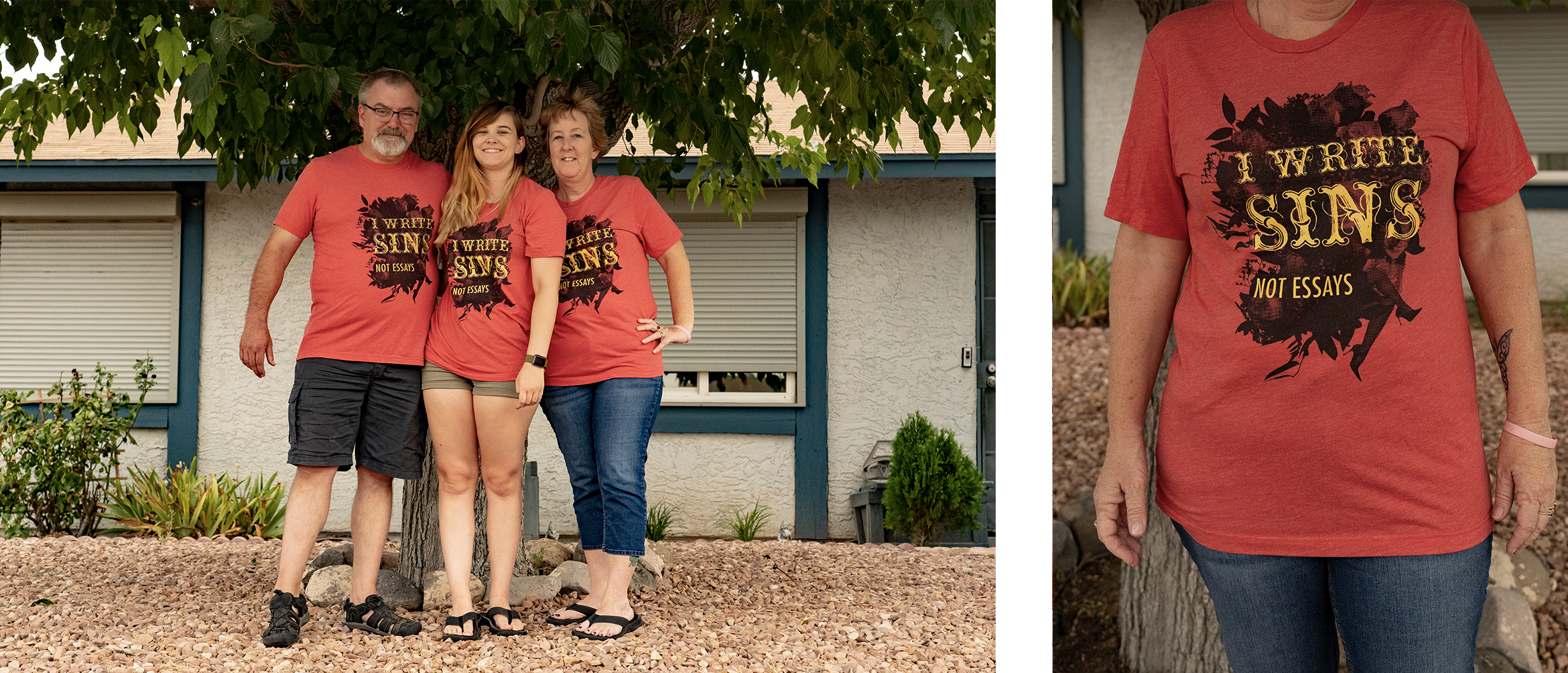
Kelsea’s shirt was inspired by Panic! At The Disco’s first album A Fever You Can’t Sweat Out. It was one of the first things we bonded over when we met in 6th grade, and she loves the album more today than she ever did in middle school. For a few days in April, we were batting around cringy sayings to go on the shirt. One night, Austin and I had come up with, “I Write Sins, Not Essays” after Panic! At The Disco’s 10th track, I Write Sins Not Tragedies. It was terrible and dorky and Kelsea immediately agreed.

Stylistically, there are a number of neat things going on within the album cover that I wanted to incorporate to the shirt design. I loved the vaudevillian aesthetic and it reminded me of the route I took for my undergraduate movie poster project. I used a half-tone effect on flower photos I’d taken in a flower shop while mixing legs in with the leaves. Kelsea felt legs were an iconic aspect in the album’s cover design. Personally, I thought it was cool they worked so well within the leaves. They didn’t stick out too much, but it was a cute nod to my inspiration. The shirt’s typography was directly influenced by the type from the album. I used an ornate typeface that resembled the type on the album cover and offset it with a lightweight sans-serif because I wanted to counteract its bold nature.

The shirt came out soft and lovely. Sure, it came in a few days late because the printer’s servers went down, but we still love the design all the same. It even worked out that the shirt was set in UNLV colors!

Jon’s Graduation

A few weeks after Kelsea walked with her diploma, it was Jon’s turn. It was so sweet: his parents and brother flew from California to support him. Austin and I were especially over the moon because we’d watched him perched at our dining room table for five years groaning at his computer as he pushed through lab write-ups and online quizzes.

The morning of his graduation, Austin and I picked up Dunkin Donuts. Jon was too excited to eat them. He wanted to make sure he had everything ready. I adjusted the hood on his regalia, and we left twenty minutes early to ease his nervous jitters. Much like at Kelsea’s graduation, Jon separated from us to join his graduating class and Austin and I found seats with Jon’s family.

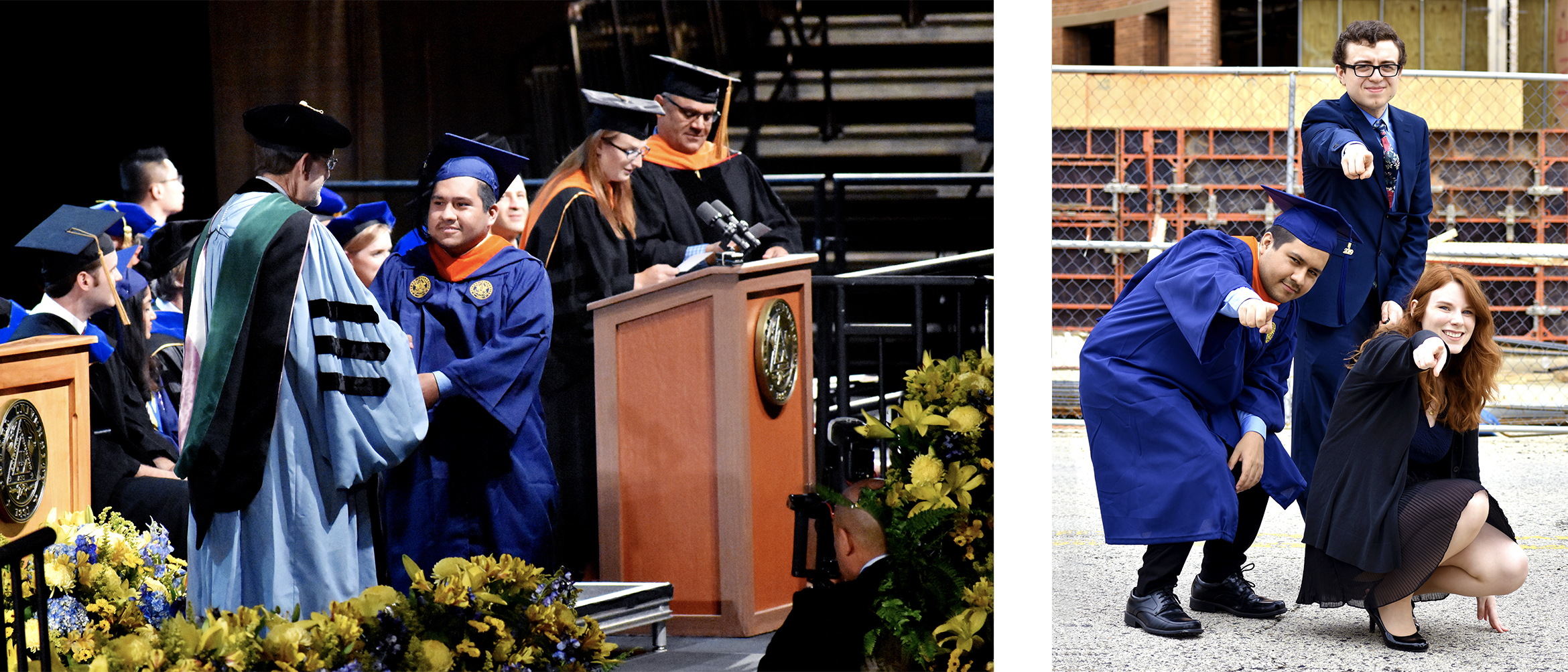
Jon graduated in Drexel’s gym, as I did a year ago. Austin and I sat in the same exact spot my friends and family sat for my graduation. I thought it was poetic, but Austin insisted it was the best spot to get a photo of Jon. Either way, it was so cool to watch the ceremony as a guest, rather then a member of the graduating class. The graduation for The School of Biomedical Engineering was much shorter than my Westphal College of Media Arts & Design last year. After we listened to the guest speaker talk about the advances she’s made in her field for breast cancer screening, Jon stood to cross the stage. He was beaming, and we were all so proud. We took a thousand photos and it was over before we knew it. He did it!

Jon’s shirt was the second I’d designed for graduation season since he’d graduate nearly a full month after Kelsea. His shirt was inspired by his personality, as well as funny things I’ve observed from him as his roommate of five years.

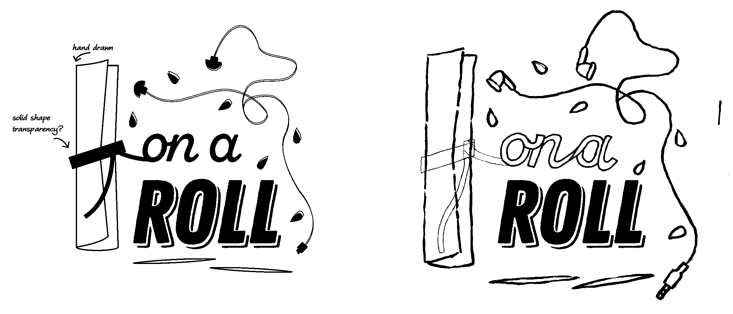
If there’s one thing you need to know about Jon, he’s always wearing headphones. He’s been that way since we first met freshman year — it also explains why he only hears every other thing I say. I knew I had to incorporate that, but it wasn’t enough to build a design fully. I wanted it to have a cute quote like Kelsea’s shirt.

Austin, Jon, and I all settled on, “On a Roll,” as his quote. It was a clever nod to his unique habit of rolling every paper that comes in contact with his hands, contrasted by the visual of a rolled diploma. Jon rolls his receipts, gum wrappers, napkins, drier sheets, etc. It was the distinguishing factor that made this design special to him.

After I’d settled on the direction, I started to add elements that further solidify what I lovingly call a ‘Jon Puddle.’ It’s usually what emerges next to his computer while he’s studying for a midterm. It consists of a rolled napkin, a few rogue pumpkin seeds, tangled headphones (though he’s recently switched to cordless), and a couple discarded toothpicks. He always cleans up once the dust settles, but a new pile emerges once finals approach.

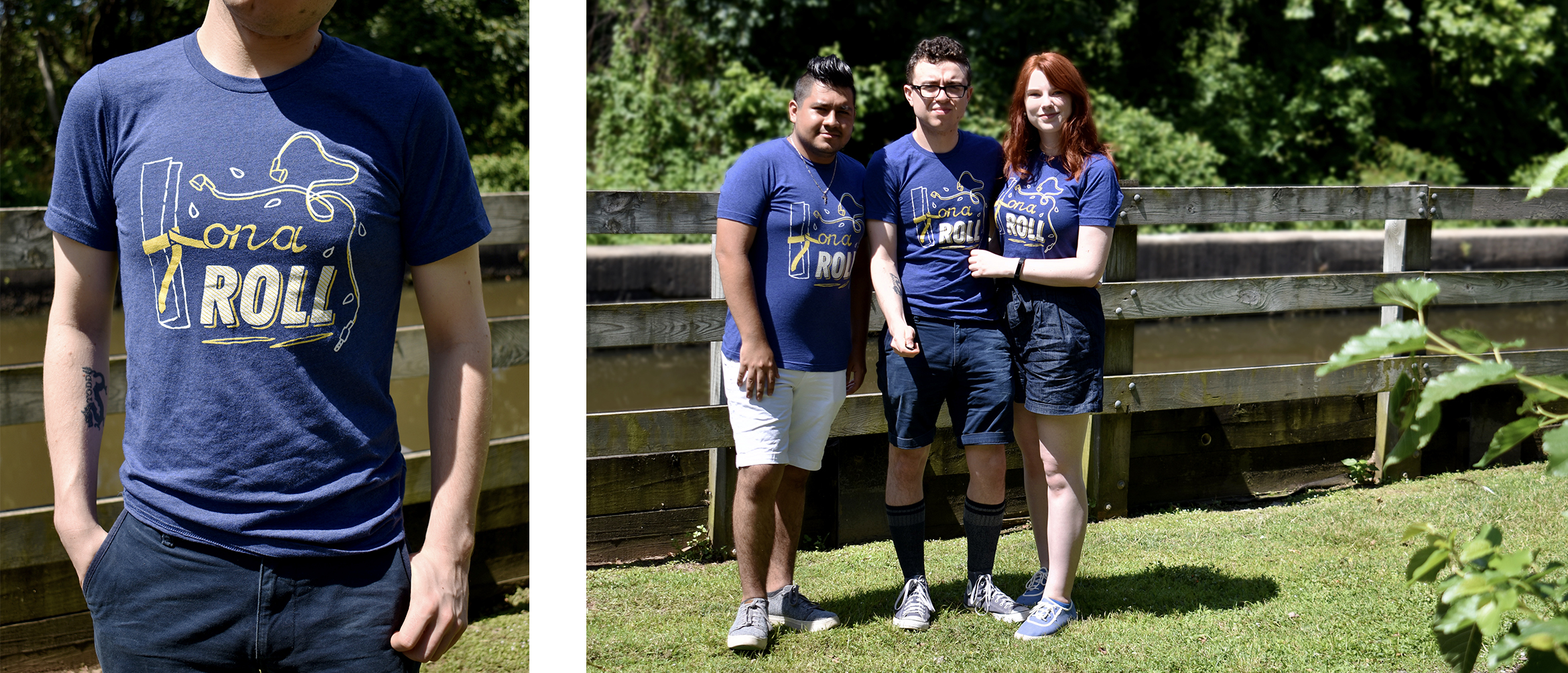
The color palette and execution of the design felt natural once I nailed my subject matter. Since Kelsea’s shirt had a palette that matched so seamlessly with her university’s branding, I wanted to do the same thing for Jon. I found a navy tri-blend shirt that was soft and blue enough to allude to Drexel University. From there, I sourced a white and goldenrod hue from the printer to ensure the colors appeared properly once the fabric was screen printed. I then started experimenting with line weight and illustrative styles to give the design a more ‘hand-made’ look. I wanted it to look sentimental and special rather than overly polished because the design is personal in nature. I referenced my stiff line drawing as a guide and transferred my drawing to Photoshop to merge my digital and illustrated typography.

In the end, I’m so happy with how my designs came out. I’m absolutely more proud of my friends’ monumental achievements, but these unique keepsakes are something we’ll hold close to our hearts for years to come. Not only that, but I’m thrilled that we’ll all have ample opportunities to wear matching outfits. We’ll be the coolest kids on the block with cheesy academic tee-shirts.

Help Me Excel Logo Design

Following my graduation last spring, my Uncle Jamie approached me with a project. For a long time, he’d worked as a financial consultant, and he’d finally made the decision to launch his own website: Help Me Excel. There was one caveat, though. He needed a logo.

When we had started the project, there were a number of things we discussed. We wanted Help Me Excel to have a fresh appearance and feel different from its competitors. Taking a new visual approach is always risky, so I developed a number of concepts that felt relevant, but not always inspired by the financial nature of his business. First, I had experimented with cues I’d taken from Microsoft Excel since that’s Uncle Jamie’s go-to tool. I was particularly inspired by the rigid grid within the program and looked for ways to integrate its essence into a modern typographic design. I also went with an approach that was less obvious. Since the slogan for the website is, “Saving lives with Excel,” I wanted to create designs that speak to the helpful messaging, without seeming too tied to the idea of finances.

My first round of concepts focused on the idea that Help Me Excel is your ‘helping hand.’ I found that your hands could create an ‘x’ and ‘l’ shape which might act as a fun visual reference to the actual name. At this point, we were also inspired by tropical color palettes because it was unlike anything we had seen in this industry, and he was drawn to the bright nature of the colors.

Introducing a fresh color palette can differentiate you from your competition, or alienate you from your subject matter. It’s a fine line to walk, and it was important to me that we did it right.

Ultimately, there were a few issues with these designs. The pink and purple option didn’t provide a clear read on the hand gesture and its color palette felt more appropriate for a health care service, in my opinion. The yellow and teal option was funky and read more legibly, but it was at this point that we realized utilizing finance-driven imagery might convey the purpose of the company more effectively.

The second round of concepts was inspired by the grid in a Microsoft Excel document. It has a very distinctive form—made up of long cells that are immediately recognizable. These two designs were ultimately more contemporary in nature and gave the logotype a geometric modernism that was missing in the first round of concepts. It felt more masculine but still friendly.

The first design cut into the letters in a way that resembled the cells of an Excel document, without sacrificing the legibility of the name. Though I felt it was a successful design, Uncle Jamie was particularly drawn to the second option that featured an ‘XL’ shape. I integrated the grid pattern into the letters without interrupting their overall silhouette. It was a quick read, and we both felt strongly that this design had the most impact…but the color was all wrong.

During the revision phase, I worked to refine the type in the mark, tightening its overall presence. It was important to me that I made the logo versatile so that it could work within the website for any screen size. It had to be responsive — moving from a single mark, to a vertical, and then horizontal orientation.

I also fought with color palettes. I knew that the tropical color route wasn’t right for this project — it was random, and lacked any connection to the financial sector. I needed a strong green that wasn’t a carbon copy of what Google Sheets or Microsoft Excel had chosen. In the second round of concepting, I loved the jewel-toned purple I had chosen for the first logo. Obviously, I couldn’t make the Help Me Excel logo purple, but it drove me to pursue jewel-tones. In my research, it seemed that no one else had gone this route, so it felt unique to Help Me Excel. This path also helped me to develop a cohesive palette for the brand.

Once I had finalized the mark for Help Me Excel, I got into one of my favorite things: brand building. I love creating a story for the visual identity and supporting the logo with carefully chosen type living within a cohesive color system.

I’ve been saying for years that gradients are coming back to the design world—and for years my peers and coworkers called me crazy. The second Instragram rebranded and releaseed their new logo, gradients came flooding back into the mainstream. I was all too excited about this, and jumped on the opportunity to use them again.

For Help Me Excel’s brand identity, I used a deep navy and the green I worked so hard to decide on. The gradation between the two hues was beautiful, but I still wanted to integrate the grid into the color space. When I designed Uncle Jamie’s business cards, I used both the grid and gradient together. It created a high-contrast space that pushed his mark to the foreground.

I also typeset his brand in Gill Sans. The letters themselves have such a sturdy presence, and it’s honestly a classic. Not only that, but when I thought back to how this project started, Uncle Jamie made it a priority to communicate the helpful and friendly nature he wanted Help Me Excel to have. The humanist styling of Gill Sans makes his brand feel welcoming and helpful with its rounded geometry.

Developing the logo for Help Me Excel was one of the best early learning experiences I’ve had. I’m so lucky that one of my first freelancing projects was with someone I love and trust so much. It helped me understand the creative process between the designer and client much more intimately than I had experienced while working within a company. Now that I’m freelancing more, I feel comforted that I could figure the process out with my family before developing my business relationships.

Writing & Designing a Book

I’ve thought about what to do for my thesis since I was in my freshman year of university. I had a lot of ideas, but ultimately I knew I wanted to do something that made me excited every day I worked on it. I knew it had to be personal, and I wanted to give it my full effort. I struggled for a while because I wanted to originally illustrate a cookbook full of my family’s recipes. That would’ve been fun, but I wanted more of a challenge. Besides, I already designed a food magazine years ago.

After careful consideration, I recognized that graphic design has been a consistent and dominating part of my identity. I’d started learning about it in 2009 and immediately fell in love. It became my major in high school, consumed my extra-curricular activities, and lead me to study at Drexel University. As I’m finishing up my senior year of university, I constantly wish I could go back in time and tell my younger self tips and tricks to help her flourish and succeed. I always wanted to grow and did everything in my power to get to where I am today. I read countless art and design books and stayed up at night working in InDesign.

Looking back, I remember a lot of my peers in high school didn’t have a large variety of design books to learn from. It wasn’t their fault, or my advisor’s for that matter. There wasn’t a huge budget for books, and we only met for a few hours a day to cover print and animation design. I always wished there was a book written for high schoolers – a book that knew our exact situation and could cut through all of the nonsense and tell us what to focus on. Then, I had no clue how important typography was, and now I know it could be a deciding factor as to what gets you a job.

I wanted to write the book I wish I had in high school.

It’s a careful line to tow when you’re writing a book for high schoolers. It seems silly, but there’s a lot to consider. Trends constantly change, and as we grow, we lose touch with who we were then. Toward the beginning of this process, I took the time to notice consistencies across generations regarding adolescence. Humor is a large driving factor when you’re writing for a younger audience. A lot of design books target college students, recent graduates, or those established in the industry because they’re more mature and have a direction for their research. I felt that, when I was a high schooler, I wished someone would sit down and be honest with me. Do I really need to understand the Pantone color system? Is identifying a counter of a letter truly important? I felt that a candid approach to learning was probably the best way to go. I wanted to read something light-hearted with all of the basic information I needed in one place.

As I mentioned before, trends are constantly changing. This is something I paid close attention to in high school. It informs where you shop, how you dress, and what you’re drawn to. There’s this exciting reemergence of some classic design approaches in the spotlight. What I’m specifically referring to, I think, has officially been called Post-Memphis design. 80’s inspired patterns and colors are becoming popular again, and I felt this would be a great way to attract my younger audience while still tapping into a classic art style.

My inspiration was based on a few pieces I found. Paramore, a band I’ve loved since middle school, just released a new album called After Laughter. The overall sound of the album taps into an early 90’s nostalgia that’s further expressed in the album artwork. The bright colors, at first glance, may appear childish. I found that stores like Urban Outfitters, Primark, and Forever21 (to name a few) were also jumping on this Post-Memphis bandwagon. It seemed that this younger generation wasn’t afraid to embrace bright colors and this nostalgic design style was making a comeback.

Once my style was established I focused on how to create an interactive experience. It’s one thing to read colorful words on a page, but you’ll learn so much more if you can make the reading a physical experience with folds and pull-outs. Throughout my research, I’d find that I’d have a random idea, and I’d write it down in my journal. This would happen often because I mostly researched other designers to influence my writing for my own book. For example, early on I knew I wanted to incorporate mylar guides into my design for the grid portion of the book. I knew it would help the reader better understand how breaking the grid still works in the modular system, and that using a grid didn’t mean you had to have boring blocks of text everywhere. It just adds structure.

I also decided in the early stages that I wanted my textbook to be more of a box set, rather than a huge book. This was because I hated my backpack in high school with a burning passion. I was enrolled in AP History and Trigonometry – and you had to carry a book around for both. I didn’t want to be the monster who wrote a 100-page book some poor seventeen-year-old would have to add to their turtle shell of a backpack. If I wrote a box set, they could pick and choose what small book they needed for the day and could leave the other pages at home.

One of the first things I settled on was my basic systems. Typography was one of the key systems I addressed because I craved consistency throughout each book and I felt type was a great way to achieve that. I knew I wanted to shift the color for each book to give each one its own look and feel, while still belonging to the same parent system. I used Helvetica and Baskerville throughout the box set. Before you think of how basic that is, I actually have very good reasons for using these typefaces and why they’re together. I chose Helvetica because it’s a universally celebrated typeface in the design community with a lot of history. I understand it can be overused (but honestly, so is Futura, and that typeface is golden), but it’s a cornerstone typeface for the history of graphic design and should be included in a book about the subject. My body copy is in Baskerville because of a really silly reason, honestly. In my senior year of high school, I read an old type book that called Baskerville one of the most friendly typefaces in the world. I wanted to share this with my reader and used it as my body copy typeface. I have a personal connection to it, and it’s just fate that it also compliments Helvetica like a match made in heaven.

My first book is called, “Design Something With… Design Basics.” It covers basic concepts like purpose and problem solving, a brief graphic design timeline, the elements of design, and Gestalt’s principles of design. It ends, much like the other books, with a ‘Words of Wisdom’ section. There I ask actual designers in the industry what their real-world advice is on tricky subjects students would prefer candid answers to. The book follows a red color palette, and starts off like any basic graphic design course: with the question, “What is graphic design?”. I knew my book had to start with this question because it’s something we always hear when we first start learning about design. I felt like Jessica Helfand had the perfect answer to this question, so I quoted her in the book here. I realize that I’m not a professional just yet, but I’ve read a lot of their advice and wanted to share the best pieces I’ve read with those who read my book.

Early on, I made the decision to include humor as a vehicle to deliver the important information I’m trying to get across. I didn’t want to try to write a comedy book, but I wanted my words to connect with my imagery so that the reader would be entertained. One of my favorite examples of this is in the ‘Space’ section of ‘Design Something With… Design Basics.’ It was the fourth element of design, and the previous spread had a bit of a sensory overload in terms of content. ‘Space’ worked to air out the book in pacing, but it also did a great job of acting as an example for the concept. One of my favorite parts of this spread is the kerning between the ‘C’ and ‘E’ in the word ‘SPACE’ mostly because there’s a note in red telling the viewer they can learn more about this moment in the second book. I worked really hard to get the books to play off of each other to make moments like this memorable and get the viewer to be curious about kerning and type spacing. Both are kinds of spacing but used in different ways.

To be honest, this is also one of my favorite jokes in the book.

“‘Stop showing up at my house! We broke up two months ago!’ Everyone always talks about wanting their space, and design’s no different. Here, we’re talking about white space, rather than Brad threatening a restraining order against you. Young designers always want to fill every last bit of space in their compositions.”

My second book is called “Design Something With… Type & The Grid.” The main color palette for this book shifts half way because of the shift in subject matter. Typography is communicated with an orange palette while The Grid shifts to a yellow. Originally I was going to cover the grid in its own separate book, but as I went on with my research, that didn’t make much sense. In my reading, I found that when you’re covering type, you first focus on the concept of the letter. This is where type anatomy comes into play, and we focus on the different classifications. Then, we move into lines of text. We focus on how much space is between letters, words, and lines of text. We learn about ragging, and how to align our quotes. After all of this, we learn how to organize a hierarchy of information, and this works as an introduction to the grid. It wouldn’t make much sense to make The Grid its own book when the connection between the two subjects is so natural. When I looked at the pacing, separating the two would feel more disruptive than anything.

‘The Body’ section of the Type side of the book took a lot of time to construct. I knew I wanted this page to act as a mental break because I made the ‘Space’ spread that follows look like a solar system. It gets a little chaotic, and I thought this could be a beautiful rest with white space before you get into the chaos that follows. Interestingly enough, this spread went through a lot of changes. Originally, I fit my body copy (get it?) into the shape of a random leg with a foot. I thought it was an interesting approach because I worried an hourglass figure would be too predictable for this part. It was just creepy. I took it through a few rounds of review and changing the severed foot into a body ultimately solved a lot of my problems. It helped with my justified rag and made my readers feel more comfortable. I guess you could say, this book cost me an arm and a leg! (Sorry)

The third book is called “Design Something With… Production.” The main color palette is comprised of different shades of blue complimented with complimentary accent colors. This book has a heavy focus on print and production, but also briefly addresses proper color and saving methods for digital design as well. I felt that when I was in high school, I fell short when it came to print and production, even though it came up often. I remember working in my high school design classes diligently making sure my JPG files were ready to print by setting their color mode in CMYK. It was a dark time – especially because I thought I was doing my due diligence! I knew I was printing, so I put the file in CMYK; however, I didn’t know JPGs were a lossy file format and should be used strictly for digital design. I also knew to add crop-marks to my printed pieces but didn’t think to include a bleed. All of my practices were half right, and a book with all the basics tied up in a neat little bow would’ve fixed a lot of my problems.

Clients are part of the production process when you start designing in the real world and I wanted to somehow add this into “Design Something With… Production.” I never had a lot of practice working with clients in high school, but I went to a Career and Technical Education (CTE) school, and they’re typically designed so you can enter your field of choice once you graduate. If I had chosen to not pursue a college degree, I’d be working as a freelance graphic designer right out of high school. Including a section on clients and the questions, designers should ask them feels appropriate to include for students choosing to start their careers right out of high school.

This is the case for each of the books, but in this one especially, I wanted to teach by example. There are so many neat tricks you can do to make your printwork a tactile experience. When I was in high school, I didn’t know the first thing about putting these finishes into place, and I couldn’t comprehend that I would ever be able to use them. This spread, in particular, is special to me because I was able to create physical examples of embossing, varnishing, debossing, die cutting, and foil. I had to laser cut each of the letters I wanted to emboss so I could press them into the paper, hand cut packing tape to mimic a spot varnish, and I actually used a die cutter to cut my holes into the right sheet. A lot of love and care went into the craft for each of my books, but this spread took a lot of time and consideration. The design is relatively simple because the page is full of custom bells and whistles.

Writing a textbook in ten weeks was a lot harder than I initially thought it’d be. I know that sounds silly, but it’s true. In ten weeks I accomplished so much, but there’s still so much more for me to do. In the time it’s taken me to write this book, I’ve reflected on my education, my adolescence, and thought about what’s next. It’s neat that I’ve written and designed every single page of this book, but I think I’m not done just yet. It’s amazing to me how short ten weeks are, and I’m somewhat saddened that I couldn’t write just one more book. I placed such an emphasis on the print side of the industry, and I didn’t begin to actually touch the ever-expanding web portion.

In my initial outline, I wanted to cover Design Basics, Type & The Grid, New Media, and Production. By the time my seventh week rolled around, it became abundantly clear I had to choose between New Media and Production for my deadline. I chose Production because I had already sketched out some concepts and written out some jokes for it. I knew the format New Media would take, but that’s all I had truly thought about it. It may have been neglectful on my part, but because of how I managed my time, New Media wasn’t going to be finished by the thesis deadline. Once thesis wrapped up, I intend on diving back in and writing one last book on new media. The project is finished and unfinished as of today, and it’s up to me to bring it up to my standards.

I want to share this book with Mr. K, my first design teacher, and send a copy to my high school. If any of his students have a love for design like me, I’m sure they’ll love it.

Portfolio
Want to know more about this project?
To learn more about the process of the project, you can access my portfolio entry, “Design Something With…”

Paper Sculpture

Minimalism was something that always fascinated me. It wasn’t something I’d known about when I first started learning about design, but it intrigued me once I got to college. Continue reading

My Co-Op Experience

During the Fall of my Junior year, I began my Co-Op at Michael Graves Architecture & Design (MGA&D). I’d worked all summer to get my license and lease a car in time for my first day of work. Continue reading

Spread the Joy Animation

Spread the Joy was a campaign Michael Graves Architecture & Design created for their cards for the 2016 holiday season. I was fortunate enough to design the two card series and send them off to press. Continue reading