Holiday Cards 2017

Tis the season to morph my dining room into a design studio! Making my annual holiday cards is one of my favorite labors of love. Usually they’re a fun little piece of design I can send my family to spread a little joy every December; however, 2017 had a bit of a rough landing for me. The end of my Fall Term was enough work as it usually is, but was topped off by Drexel announcing the senior graduation dates. This meant I had graduation announcement cards to produce on top of my holiday cards that weren’t even designed yet. It was an extra item on my to-do list and I worried I wasn’t going to be able to finish everything. Austin and I decided to print and assemble the cards together at home for both graduation and the holiday season to save a little money and not have to deal with a professional printer. It was a financially savvy decision that resulted in us staying up most nights fussing with our die cutter and running back and forth between the printer and a cutting mat to score and cut every page. Somehow we managed to get everything out in the post a week before Christmas. That being said, the holiday cards went out a little later this year, so check your mailboxes a couple days after Christmas. I’m only human!
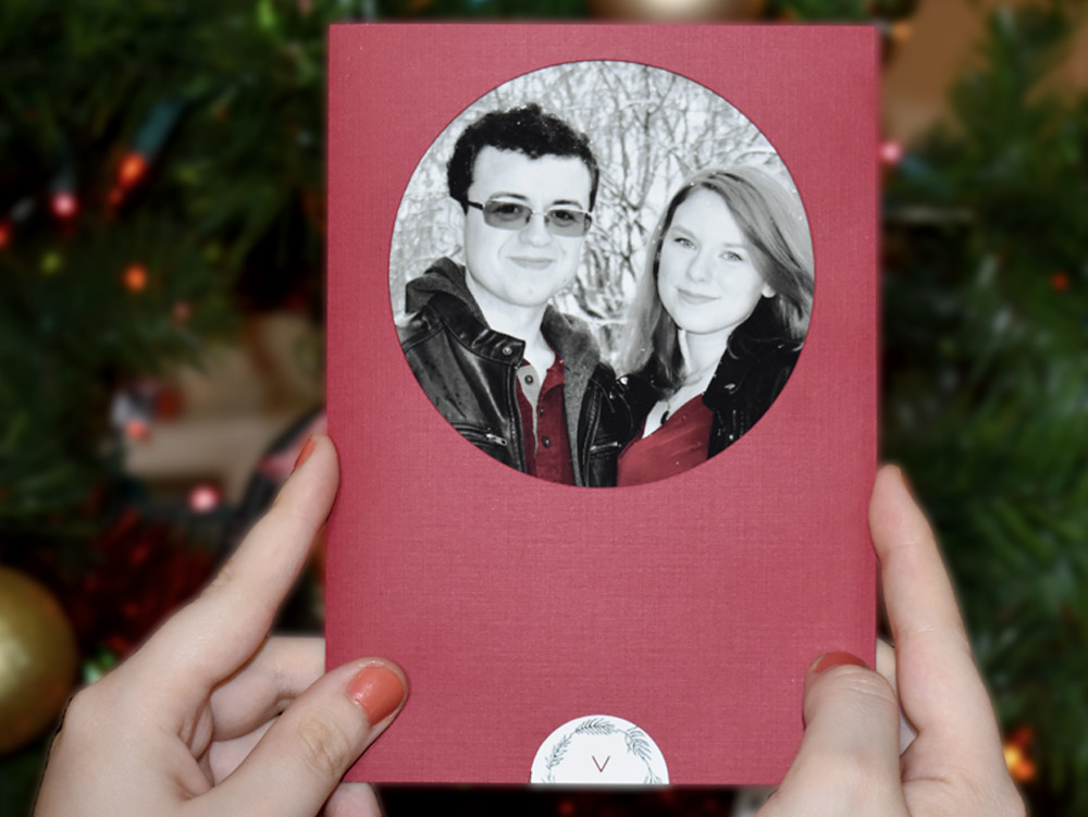
When it comes to the design of this year’s card, I wanted it to be elegant and personal all at once. After having lunch with my bosses at Michael Graves, I saw they were sending their holiday cards out in shimmery silver envelopes. Originally, my holiday cards were going to go out in some craft paper envelopes I had left over from my graduation invitations, but I’d immediately fallen in love with the silver envelopes at Michael Graves. Because my design was primarily black and white with pops of red, I felt like using these envelopes worked to elevate my design and make the entire package a little more cohesive than using a random brown color. Not only that, but I conveniently found them on sale at Staples when I was shopping for ink – obviously it was fate.
I always try to add an interactive graphic element to my cards. Every year we try to include a photograph of ourselves to send to our relatives, but I never want it to look like a Shutterfly template. I’ve spent too much money at Drexel learning about design to allow that to happen! The interactive element this year was a simple sleeve with a circle cut out to reveal our faces. It feels like an obvious choice, but I love how it simplifies the design and gives it a streamlined appearance. I chose a red stock for the sleeve that’s lightly textured to contrast the smooth paper used in the actual bi-folded card and the shimmery envelope. Once you pull on the downward facing arrow, you release the bi-folded card from its sleeve and it reveals the full black and white picture of Austin and I standing together in the snow. We wore the same color shirt that day, so I color matched our shirts to the sleeve’s stock to create a connection between those two elements. I also felt like the pop of color could be the unifying factor throughout the entire design.
Because the front of the card is so black and white, with very sparse areas of red, I wanted the inside to be an unexpected surprise. Once you open the card, you see a flood of red that matches our shirts in the picture and the sleeve. The flood of color is broken up with a tree branch texture I created that’s been placed at a low transparency in the back to activate the space and reference the trees in the photograph of Austin and I. I used the typeface Cursive Script for “Merry & Bright” because I felt like it was a genuinely lovely script. To contrast the ornate script, I used Helvetica for my body copy just to bring back some geometry to the piece. As a personal element, Austin, Wiggles, and I signed each card with white ink.