Writing & Designing a Book
I’ve thought about what to do for my thesis since I was in my freshman year of university. I had a lot of ideas, but ultimately I knew I wanted to do something that made me excited every day I worked on it. I knew it had to be personal, and I wanted to give it my full effort. I struggled for a while because I wanted to originally illustrate a cookbook full of my family’s recipes. That would’ve been fun, but I wanted more of a challenge. Besides, I already designed a food magazine years ago.
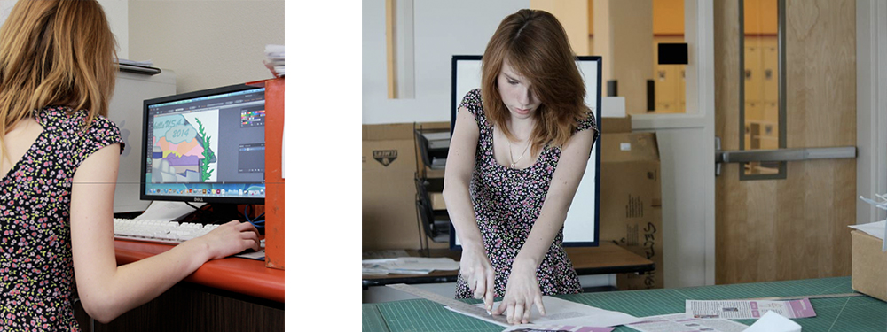
After careful consideration, I recognized that graphic design has been a consistent and dominating part of my identity. I’d started learning about it in 2009 and immediately fell in love. It became my major in high school, consumed my extra-curricular activities, and lead me to study at Drexel University. As I’m finishing up my senior year of university, I constantly wish I could go back in time and tell my younger self tips and tricks to help her flourish and succeed. I always wanted to grow and did everything in my power to get to where I am today. I read countless art and design books and stayed up at night working in InDesign.
Looking back, I remember a lot of my peers in high school didn’t have a large variety of design books to learn from. It wasn’t their fault, or my advisor’s for that matter. There wasn’t a huge budget for books, and we only met for a few hours a day to cover print and animation design. I always wished there was a book written for high schoolers – a book that knew our exact situation and could cut through all of the nonsense and tell us what to focus on. Then, I had no clue how important typography was, and now I know it could be a deciding factor as to what gets you a job.
I wanted to write the book I wish I had in high school.
It’s a careful line to tow when you’re writing a book for high schoolers. It seems silly, but there’s a lot to consider. Trends constantly change, and as we grow, we lose touch with who we were then. Toward the beginning of this process, I took the time to notice consistencies across generations regarding adolescence. Humor is a large driving factor when you’re writing for a younger audience. A lot of design books target college students, recent graduates, or those established in the industry because they’re more mature and have a direction for their research. I felt that, when I was a high schooler, I wished someone would sit down and be honest with me. Do I really need to understand the Pantone color system? Is identifying a counter of a letter truly important? I felt that a candid approach to learning was probably the best way to go. I wanted to read something light-hearted with all of the basic information I needed in one place.
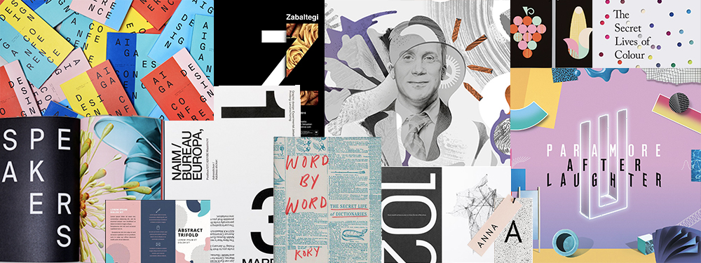
As I mentioned before, trends are constantly changing. This is something I paid close attention to in high school. It informs where you shop, how you dress, and what you’re drawn to. There’s this exciting reemergence of some classic design approaches in the spotlight. What I’m specifically referring to, I think, has officially been called Post-Memphis design. 80’s inspired patterns and colors are becoming popular again, and I felt this would be a great way to attract my younger audience while still tapping into a classic art style.
My inspiration was based on a few pieces I found. Paramore, a band I’ve loved since middle school, just released a new album called After Laughter. The overall sound of the album taps into an early 90’s nostalgia that’s further expressed in the album artwork. The bright colors, at first glance, may appear childish. I found that stores like Urban Outfitters, Primark, and Forever21 (to name a few) were also jumping on this Post-Memphis bandwagon. It seemed that this younger generation wasn’t afraid to embrace bright colors and this nostalgic design style was making a comeback.
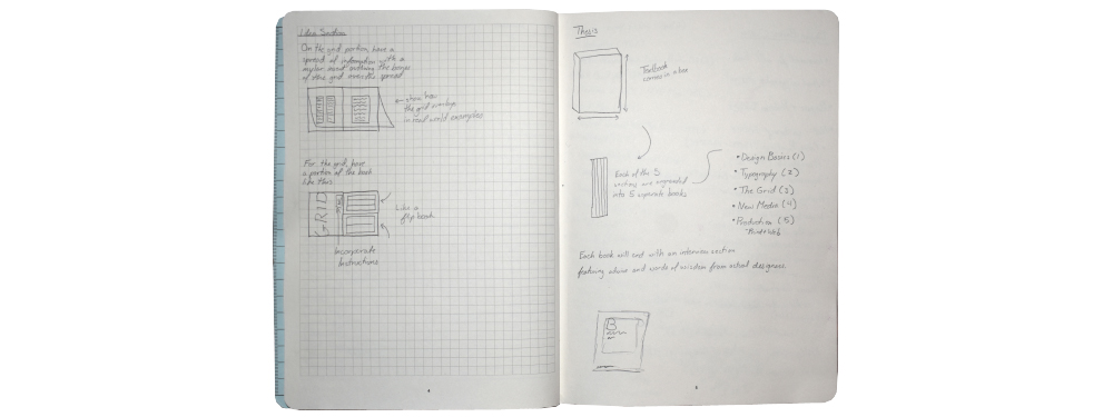
Once my style was established I focused on how to create an interactive experience. It’s one thing to read colorful words on a page, but you’ll learn so much more if you can make the reading a physical experience with folds and pull-outs. Throughout my research, I’d find that I’d have a random idea, and I’d write it down in my journal. This would happen often because I mostly researched other designers to influence my writing for my own book. For example, early on I knew I wanted to incorporate mylar guides into my design for the grid portion of the book. I knew it would help the reader better understand how breaking the grid still works in the modular system, and that using a grid didn’t mean you had to have boring blocks of text everywhere. It just adds structure.
I also decided in the early stages that I wanted my textbook to be more of a box set, rather than a huge book. This was because I hated my backpack in high school with a burning passion. I was enrolled in AP History and Trigonometry – and you had to carry a book around for both. I didn’t want to be the monster who wrote a 100-page book some poor seventeen-year-old would have to add to their turtle shell of a backpack. If I wrote a box set, they could pick and choose what small book they needed for the day and could leave the other pages at home.
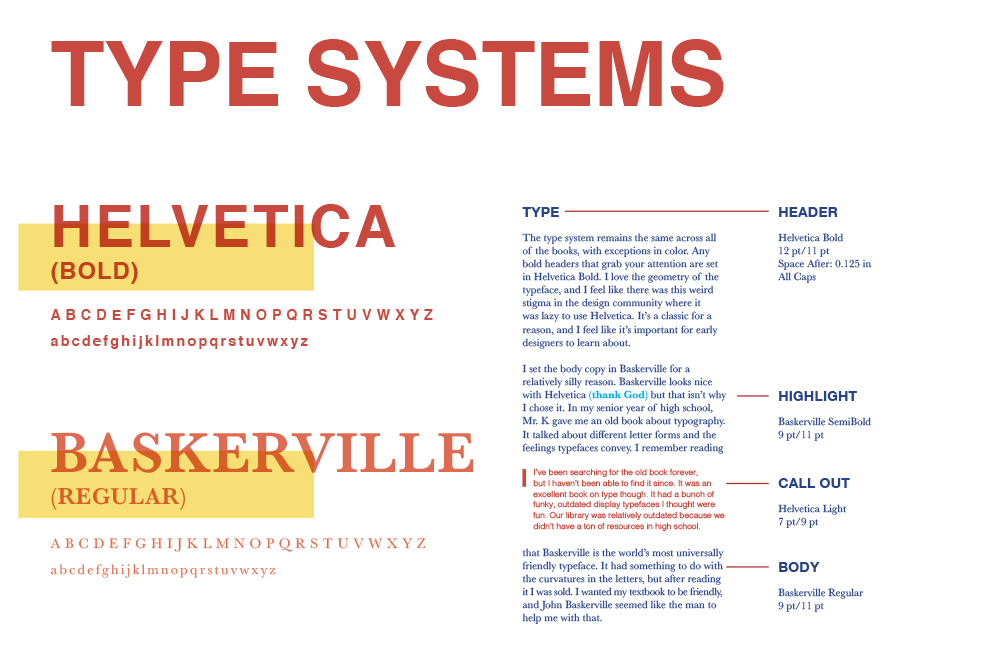
One of the first things I settled on was my basic systems. Typography was one of the key systems I addressed because I craved consistency throughout each book and I felt type was a great way to achieve that. I knew I wanted to shift the color for each book to give each one its own look and feel, while still belonging to the same parent system. I used Helvetica and Baskerville throughout the box set. Before you think of how basic that is, I actually have very good reasons for using these typefaces and why they’re together. I chose Helvetica because it’s a universally celebrated typeface in the design community with a lot of history. I understand it can be overused (but honestly, so is Futura, and that typeface is golden), but it’s a cornerstone typeface for the history of graphic design and should be included in a book about the subject. My body copy is in Baskerville because of a really silly reason, honestly. In my senior year of high school, I read an old type book that called Baskerville one of the most friendly typefaces in the world. I wanted to share this with my reader and used it as my body copy typeface. I have a personal connection to it, and it’s just fate that it also compliments Helvetica like a match made in heaven.
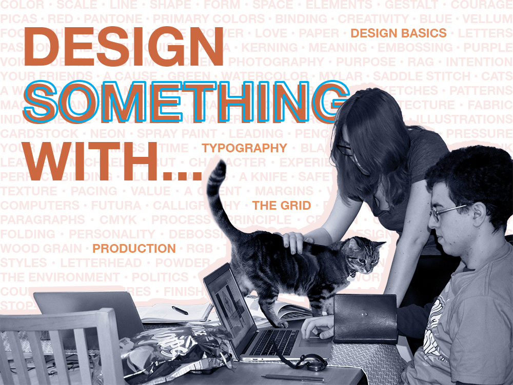
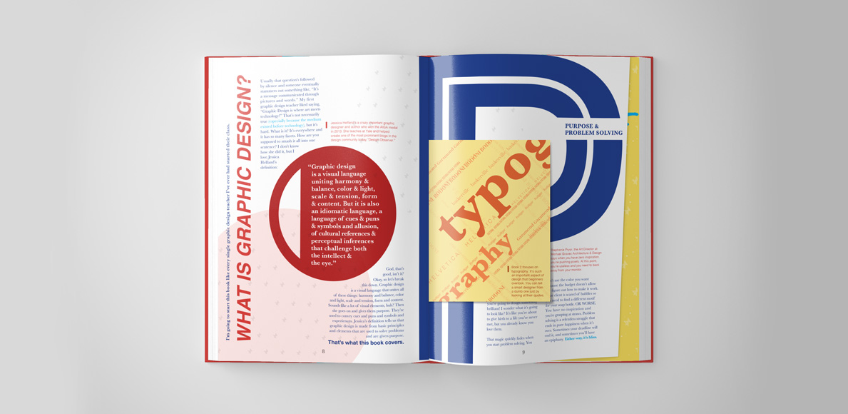
My first book is called, “Design Something With… Design Basics.” It covers basic concepts like purpose and problem solving, a brief graphic design timeline, the elements of design, and Gestalt’s principles of design. It ends, much like the other books, with a ‘Words of Wisdom’ section. There I ask actual designers in the industry what their real-world advice is on tricky subjects students would prefer candid answers to. The book follows a red color palette, and starts off like any basic graphic design course: with the question, “What is graphic design?”. I knew my book had to start with this question because it’s something we always hear when we first start learning about design. I felt like Jessica Helfand had the perfect answer to this question, so I quoted her in the book here. I realize that I’m not a professional just yet, but I’ve read a lot of their advice and wanted to share the best pieces I’ve read with those who read my book.
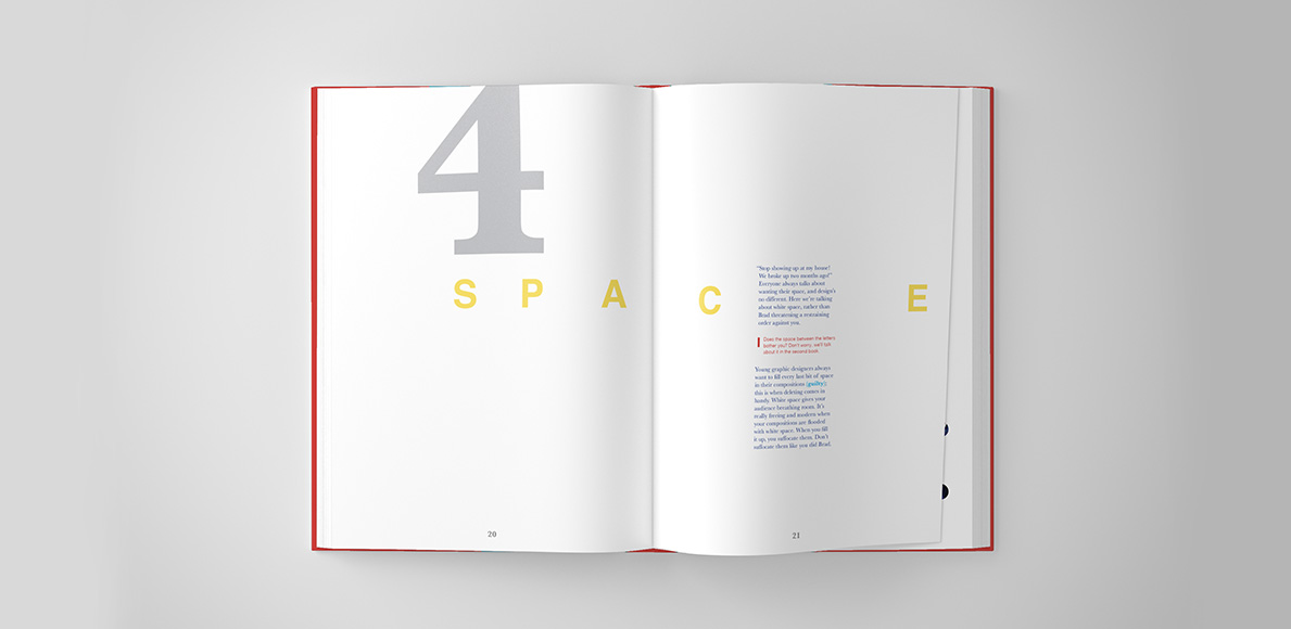
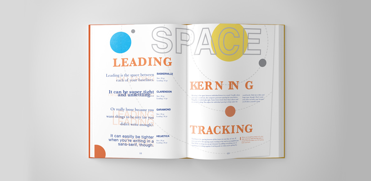
Early on, I made the decision to include humor as a vehicle to deliver the important information I’m trying to get across. I didn’t want to try to write a comedy book, but I wanted my words to connect with my imagery so that the reader would be entertained. One of my favorite examples of this is in the ‘Space’ section of ‘Design Something With… Design Basics.’ It was the fourth element of design, and the previous spread had a bit of a sensory overload in terms of content. ‘Space’ worked to air out the book in pacing, but it also did a great job of acting as an example for the concept. One of my favorite parts of this spread is the kerning between the ‘C’ and ‘E’ in the word ‘SPACE’ mostly because there’s a note in red telling the viewer they can learn more about this moment in the second book. I worked really hard to get the books to play off of each other to make moments like this memorable and get the viewer to be curious about kerning and type spacing. Both are kinds of spacing but used in different ways.
To be honest, this is also one of my favorite jokes in the book.
“‘Stop showing up at my house! We broke up two months ago!’ Everyone always talks about wanting their space, and design’s no different. Here, we’re talking about white space, rather than Brad threatening a restraining order against you. Young designers always want to fill every last bit of space in their compositions.”
My second book is called “Design Something With… Type & The Grid.” The main color palette for this book shifts half way because of the shift in subject matter. Typography is communicated with an orange palette while The Grid shifts to a yellow. Originally I was going to cover the grid in its own separate book, but as I went on with my research, that didn’t make much sense. In my reading, I found that when you’re covering type, you first focus on the concept of the letter. This is where type anatomy comes into play, and we focus on the different classifications. Then, we move into lines of text. We focus on how much space is between letters, words, and lines of text. We learn about ragging, and how to align our quotes. After all of this, we learn how to organize a hierarchy of information, and this works as an introduction to the grid. It wouldn’t make much sense to make The Grid its own book when the connection between the two subjects is so natural. When I looked at the pacing, separating the two would feel more disruptive than anything.
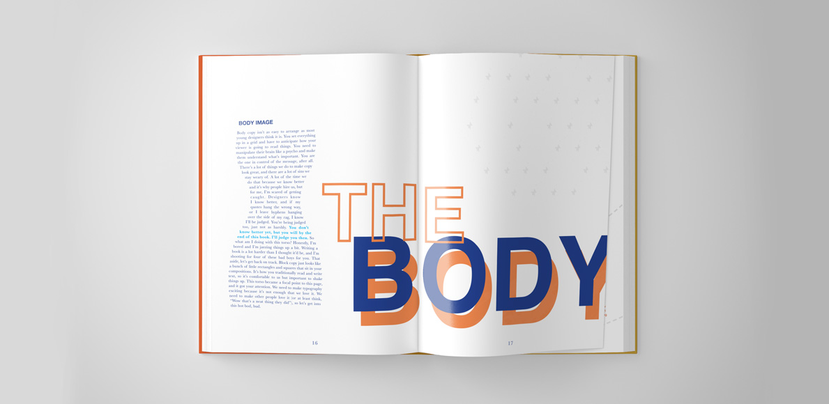
‘The Body’ section of the Type side of the book took a lot of time to construct. I knew I wanted this page to act as a mental break because I made the ‘Space’ spread that follows look like a solar system. It gets a little chaotic, and I thought this could be a beautiful rest with white space before you get into the chaos that follows. Interestingly enough, this spread went through a lot of changes. Originally, I fit my body copy (get it?) into the shape of a random leg with a foot. I thought it was an interesting approach because I worried an hourglass figure would be too predictable for this part. It was just creepy. I took it through a few rounds of review and changing the severed foot into a body ultimately solved a lot of my problems. It helped with my justified rag and made my readers feel more comfortable. I guess you could say, this book cost me an arm and a leg! (Sorry)
The third book is called “Design Something With… Production.” The main color palette is comprised of different shades of blue complimented with complimentary accent colors. This book has a heavy focus on print and production, but also briefly addresses proper color and saving methods for digital design as well. I felt that when I was in high school, I fell short when it came to print and production, even though it came up often. I remember working in my high school design classes diligently making sure my JPG files were ready to print by setting their color mode in CMYK. It was a dark time – especially because I thought I was doing my due diligence! I knew I was printing, so I put the file in CMYK; however, I didn’t know JPGs were a lossy file format and should be used strictly for digital design. I also knew to add crop-marks to my printed pieces but didn’t think to include a bleed. All of my practices were half right, and a book with all the basics tied up in a neat little bow would’ve fixed a lot of my problems.
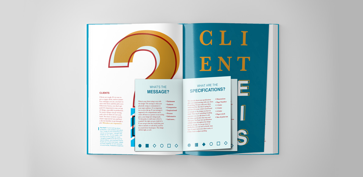
Clients are part of the production process when you start designing in the real world and I wanted to somehow add this into “Design Something With… Production.” I never had a lot of practice working with clients in high school, but I went to a Career and Technical Education (CTE) school, and they’re typically designed so you can enter your field of choice once you graduate. If I had chosen to not pursue a college degree, I’d be working as a freelance graphic designer right out of high school. Including a section on clients and the questions, designers should ask them feels appropriate to include for students choosing to start their careers right out of high school.
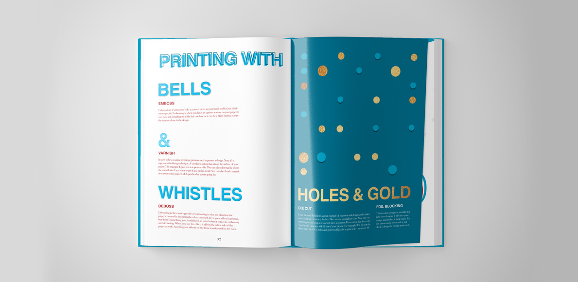
This is the case for each of the books, but in this one especially, I wanted to teach by example. There are so many neat tricks you can do to make your printwork a tactile experience. When I was in high school, I didn’t know the first thing about putting these finishes into place, and I couldn’t comprehend that I would ever be able to use them. This spread, in particular, is special to me because I was able to create physical examples of embossing, varnishing, debossing, die cutting, and foil. I had to laser cut each of the letters I wanted to emboss so I could press them into the paper, hand cut packing tape to mimic a spot varnish, and I actually used a die cutter to cut my holes into the right sheet. A lot of love and care went into the craft for each of my books, but this spread took a lot of time and consideration. The design is relatively simple because the page is full of custom bells and whistles.
Writing a textbook in ten weeks was a lot harder than I initially thought it’d be. I know that sounds silly, but it’s true. In ten weeks I accomplished so much, but there’s still so much more for me to do. In the time it’s taken me to write this book, I’ve reflected on my education, my adolescence, and thought about what’s next. It’s neat that I’ve written and designed every single page of this book, but I think I’m not done just yet. It’s amazing to me how short ten weeks are, and I’m somewhat saddened that I couldn’t write just one more book. I placed such an emphasis on the print side of the industry, and I didn’t begin to actually touch the ever-expanding web portion.
In my initial outline, I wanted to cover Design Basics, Type & The Grid, New Media, and Production. By the time my seventh week rolled around, it became abundantly clear I had to choose between New Media and Production for my deadline. I chose Production because I had already sketched out some concepts and written out some jokes for it. I knew the format New Media would take, but that’s all I had truly thought about it. It may have been neglectful on my part, but because of how I managed my time, New Media wasn’t going to be finished by the thesis deadline. Once thesis wrapped up, I intend on diving back in and writing one last book on new media. The project is finished and unfinished as of today, and it’s up to me to bring it up to my standards.
I want to share this book with Mr. K, my first design teacher, and send a copy to my high school. If any of his students have a love for design like me, I’m sure they’ll love it.