My First Trip to The MoMA
Continue reading
The transition of power at Willie Fetchko Graphic Design was a very interesting case. It’s a story following the company’s lifecycle and how its business model shifted in both management and mission. The business Mark Willie and Bernard Fetchko founded in 1985 isn’t the same studio Jenny Yip and Marcy Coffey run today; though, they’ve worked to preserve the company’s history. Willie Fetchko Graphic Design has evolved with time and new leadership, and while those in charge may have had different ways to tackle running a business, they showed how a studio can still thrive, regardless.
Mark Willie was one of my graphic design professors at Drexel University. During my undergraduate publication and book design courses, he’d talk about his experiences as a designer and how he worked his way into the industry.
Mark would laugh and say, “I ended up delivering something from a production company I worked for to this agency and they hired me on the spot. I kind of talked my way into there. I really wanted it and it was really exciting that they hired me. I thought of it as my best break ever. It was a special moment that I was able to make a career out of that.” (Interview with Mark Willie, October 24, 2018)
He started out working strictly on production but was offered more design opportunities during his time at the company and eventually held an active role as the art director. “A certain percentage of the business is proposal writing – which is something I actually really liked, I enjoyed writing the proposals as well as the design and working with clients. It was just part of the business.” (Interview with Mark Willie, October 24, 2018)
During Mark’s time at the marketing company, he also worked with his friend, Bernard Fetchko, another designer. They had knocked around the idea of starting up their own studio one day, but both felt content at their current company. That is, until one day the owner had passed. Once the dust settled, their late owner’s wife decided to take over his role and run the business. She didn’t know much about the marketing industry, and Mark felt his workload increase over time. “We were essentially running the office and the deceased owner’s widow became our de facto boss. And it ended up not being a good situation. So in about a year, I wanted to leave that office.” (Interview with Mark Willie, October 24, 2018) With this sudden change in authority, it felt like the perfect time to depart from their marketing firm and pursue their own business venture.
Typically, when you decide you want to start your own company, there are quite a few formalities you need to address before you proceed to hire staff and work with clients. Aside from deciding on a business structure, and carefully considering a business model, you need to decide what happens to your company if something unfortunate were to happen to you. There should be a designated successor to resume your position in the event of a tragedy. This individual should be thoroughly vetted and possess the skills necessary to continue toward your company’s mission. In this particular case, it would appear that Mark’s superior didn’t consider this when he formed the company, and the property was transferred to his wife legally by default. Even though this wasn’t a particularly large company, many employees and their families’ sense of financial security was threatened by his lack of foresight and should serve as a cautionary tale for other business owners.
In this particular case, the timing for Mark and Bernard to leave their current marketing company to branch out and build their own design studio could not have been more perfect. Mark had already gained experience acting in an administrative role in the design world in his previous art director position. He worked to find clients, write design proposals, advise and design numerous projects, and collaborate with printers and other contractors.
“In the end, it ended up being a really good partnership because I ended up sort of being the designer and my partner Berny was the business part of it. So, we kind of split it into ‘Marketing – Design.’ My partner’s job was to get the business and really market us as a firm.” (Interview with Mark Willie, October 24, 2018)
Most graphic design studios work as limited liability companies (LLC). In this business structure, you can combine the pass-through taxation of a partnership or sole proprietorship with the limited liability of a corporation. Today, the term partnership and LLC are used interchangeably; however, there are slight discrepancies that make a difference in the long run. Partnerships are preferable for time-specific businesses with a set termination or completion date. In this, partners manage the company and assume responsibility for any debt and obligations. Because of this, it’s important that all parties have read and agreed to a very detailed partnership agreement. LLCs are similar to partnerships but protect the personal assets of all participants. It gives flexibility in adding owners or changes in management and has higher credibility in the marketplace overall.
In their partnership, they developed a common dynamic we see today in the design industry: one founder acts as the designer and the other as a business strategist. This dynamic is called dual leadership because each partner takes responsibility for the separate functions of the same company. Mark and Bernard’s relationship challenged most negative assumptions about dual leadership including, “…Conflict is inevitable; Structured communication is required; and that managerial and artistic leaders have divergent yet complementary skill sets.” (Reynolds, Tonks, and MacNeill 2017, 89). This just wasn’t the case. The two had very similar interests because they’re both designers at heart – one just happened to be more business savvy. Their strengths complimented each other in a way that allowed their company to grow.
“…Our findings emerged, we identified a special case of dual leadership within some leadership couples: one which demonstrates a sense of equality and shared responsibility for leadership of the organization at the highest level, irrespective of the formal hierarchical relationship between the two. We identify this as an instance of collaborative leadership, a special case of dual leadership, characterized by an acknowledged interdependency between the dual leaders.” (Reynolds, Tonks, and MacNeill 2017, 90)
After making the decision to work together, Mark sat with Bernard in his home working on projects here and there. As partners, they’d split all their income 50/50 after they paid whatever company maintenance costs accrued over the course of their business. “It was certainly a shock going from a weekly or monthly salary to nothing. The funny part was when Bernie and I started actually making a salary. We used to joke and say, ‘We made money this year!’ Whatever we could afford to pay each other we would do. We’d always make it equal – always equal. So, what we would do is divide it. One month we would make $350, but then the next month we’d make $500.” (Interview with Mark Willie, October 24, 2018) It was at this point that Willie Fetchko Graphic Design was born.
Finding clients is really the main source of income for a graphic design studio. After all, it’s difficult to charge someone for design work when no one knows you exist. When Mark was departing from his old marketing company, he reached out to his past clients and informed them he was moving on to work for himself. Stealing clients is a large ethical issue in the design industry because clients are the crux of our business models. Mark made the ethically sound decision to alert his clients of a change, rather than reaching out to them in his new company so they could decide for themselves what design route they wanted to choose. Not only that but alerting them is a way of saying the partnership they once had would be coming to an end after any current projects they may have been working on. He acted in professional courtesy and found that some of his clients wanted to support his new business endeavor.
For new graphic design startups, it’s vital that you don’t earn a reputation as a client-thief. So much of the design industry is rooted in collaboration. It’s important that you don’t burn bridges, and you help others when you can.
“…As long as we bring integrity and professionalism to the relationship and stick to the simple rules of human relationships: the same ones that also apply in normal social life – empathy, understanding, and tolerance… One of the most valuable assets that a freelance designer or studio can acquire is a database of contacts.” (Shaughnessy 2010, 74–75)
There are situations when a client has a less-than-pleasant experience at one design firm and in turn, chooses another one for their next project. In these cases, the past design firm probably felt stress on that relationship on their end as well. It isn’t outlandish to think they may not be a repeat client. These situations are understandable, and typically don’t fall into unethical waters.
Willie Fetchko Graphic Design has always had a business model – even if it hadn’t been officially planned out and written down during its conception. As long as a company’s mission is clear, the model can easily follow. “A business model describes the rationale of how an organization creates, delivers, and captures value…We believe a business model can best be described through nine basic building blocks…The nine blocks cover the four main areas of business: customers, offer, infrastructure, and financial viability.” (Osterwalder and Pigneur 2010, 14-15) The model usually revolves around a company’s value proposition, or more simply put, the value they deliver to the customer. Surrounding the core value proposition are the clients and the business procedures that keep your company running smoothly. When it comes to your clients, it’s important to know who they are (customer segments), what relationship you have with them (customer relationship), and what channels you interact with them through (channels). Planning all of this out helps you cultivate closer and more successful relationships with your clients that lead to future projects with them. On the business side of the model, it focuses on the key entities that keep your organization running. It’s comprised of activities, resources, and partners. This allows you to take stock of the most important elements of your business, so you understand what you need to pay for. The foundation of any business model is rooted in money. We take care of our customers because we want them to continue to purchase our services. Their money allows us to maintain our equipment, pay our partners, and continue our mission. This portion of the model is broken into the cost structure and the revenue streams. Your cost structure is comprised of the company’s expenses while the revenue streams explain how you’re going to pay for them.
In the case of Willie Fetchko Graphic Design, their value focused on providing a quality graphic design service to local businesses in the Philadelphia area with a specialization in layout design. Their customer segment is considered to be diversified in that they were able to work for a myriad of clients from different backgrounds to create design work ranging anywhere from branding to the layout design of annual reports. “We had a large range of work, but we ended up finding our niche. Our niche ended up being, for a while, a lot of nonprofit clients. We were doing a lot of institutional nonprofit work that morphed into smaller nonprofits and arts organizations.” (Interview with Mark Willie, October 24, 2018) During the process of a project, they developed their own channels to work with their clients and ensure each party got the most from their business relationships. Their behind-the-scenes maintenance was particularly interesting. Their key activities primarily consisted of project design work, corresponding and communicating with clients, writing proposals, monitoring their books, and working with accountants to understand future growth to conduct business more efficiently. These are relatively typical for a design studio. It was an eye-opening experience to hear about their key resources.
“In the beginning, we had a very low overhead when we started because we didn’t have lots of equipment. We had pretty much physical things like drawing tables, art materials and then access to things like printers and copy machines and things like that. As we grew our materials got much more specific for what we needed to maintain the firm.” (Interview with Mark Willie, October 24, 2018)
Today creating a graphic design start-up is wildly different. Printers, among other supplies, are vital to day-to-day work. Testing color aside, designers need to mock-up projects for clients to approve the work before the finished project is sent to an actual printer.
As Mark and Bernard became more successful, and their business grew, they were able to lease proper studio space, purchase all the supplies they needed to print comfortably under their own roof, and hire staff as well. This is a direct result of their revenue stream surpassing their cost structure allowing them to grow and further develop their resources. At this stage of Willie Fetchko Graphic Design’s life cycle, the two partners felt comfortable. The company was experiencing steady growth, and they were able to bring on a couple more designers to help with the workload. “We ended up landing at the sweet spot of four of us in the office it was myself, my partner, and two designers and then, with sometimes a fifth person as a [Drexel] Co-Op. It was the most we’d ever want and the most manageable at the time.” (Interview with Mark Willie, October 24, 2018)
A successful studio is a busy studio. Mark and Bernard ran Willie Fetchko Graphic Design on their own. Hiring a couple of designers helped to make the client workload more manageable, but Mark noticed he was in a similar situation he had once experienced years ago at his old marketing agency. Mark was writing proposals often, and he often found himself working on the business end of the company with Bernard due to their popularity. In, what I’m sure was a difficult decision, Mark decided to ultimately exit his partnership and teach graphic design full-time at Drexel University.
“If I were to do it over again, I’m sure I would’ve done a lot of things differently, but I think that model of small design firms was a good one. I loved collaborating with other designers. I did well working in an atmosphere with design happening around me, and the fact that it was part of my business was really important.” (Interview with Mark Willie, October 24, 2018)
One doesn’t typically compare a business to human life. Some would argue it’s a callous interpretation that diminishes the value of life; however, they would be thinking too literally. When you create a company, you watch it grow and develop from a scrappy start-up into a mature entity that eventually, one day, declines to a terminal end – much like our own lives. Formally, there are seven stages to an organization’s life-cycle: idea, startup, growth, maturity, decline, a turnaround opportunity, and termination. During the company’s peak maturity, Mark felt that he wasn’t doing what he loved as much as he would’ve liked, and he wanted to get back to designing. As a founder, he understood that his views no longer aligned with the mission of the company, and felt it was best to step away. Because he and Bernard hadn’t previously discussed how Mark would transition out of the company, they needed to bring in an expert to facilitate the process.
During this time, Jenny Yip and Marcy Coffey worked as graphic designers at Willie Fetchko Graphic Design. They had originally met at the office, despite the fact that they were both Drexel Alumni. Jenny completed her Drexel Co-Op at the studio and was brought on to work full time. Interestingly enough, she hadn’t had Mark as a professor during her undergraduate courses. Marcy had Mark as a professor previously but saw the studio had a position open and expressed interest after she graduated. “Jenny: When Mark decided to leave, we didn’t see it coming.” (Interview with Jenny Yip and Marcy Coffey, November 24, 2018)
Mark’s transition process out of the company ended up being more time consuming than anyone had initially expected. Once Mark announced that he wanted to leave Willie Fetchko Graphic Design, Bernard decided that he would depart after a couple more years. The process ended up taking over a year to complete. In the transition, Mark sold his half of the company back to Bernard – which is standard in procedure once a partnership dissolves. Because the company had debts, clients, and other assets, the process proved to be much longer than anyone had entailed.
“Jenny: During the buyout, the initial offer was that Berny would have 50% and we would each be 25%. Things ended up shifting over time, but that was the original offer…Berny had a proposed price, and he said that it was fine as long as it was incrementally increased. We worked with the lawyer for like a year…Berny was like, ‘Oh my God, if the paperwork takes this long, and I only want to stay on for another year…. With the paperwork taking this long, why don’t you girls just buy the whole company from me? I don’t want to do this again.’ So we did.” (Interview with Jenny Yip and Marcy Coffey, November 24, 2018)
That decision led to Jenny and Marcy owning their own studio, WFGD.
Jenny and Marcy had briefly talked about owning their own studio one day together, but I’m sure they didn’t think it would happen so quickly and under these circumstances. In buying Willie Fetchko Graphic Design, they bought its studio space, supplies, (some) clients, partners, debts, as well as Mark and Bernard’s shares. Over the course of a few years, they paid Mark and Bernard a stipend after the major down payment they paid initially for the company.
The transition was a very complicated process for a number of reasons. First of which, was the fact that Jenny and Marcy weren’t experts in business. They had learned a lot from working at a smaller studio, but nothing could have prepared them for the logistics that followed. They were essentially back to the start-up phase of the company’s lifecycle. Luckily, they had more of a foundation than when Mark and Bernard had first conceived the company.
“Jenny: We had to set up a new entity for ourselves…We had to change the name of the business. In the eyes of the federal government, we are a new business. We have a different EIN number than Willie Fetchko Graphic Design. Marcy: We didn’t want to be liable for anything from the old company; in case something came up like old tax issues.” (Interview with Jenny Yip and Marcy Coffey, November 24, 2018) Registering as a new company gave Jenny and Marcy a clean slate of sorts. Going through the set-up phase allowed them to fully understand their business structure, while also giving them an official starting point. This made them familiar with any paperwork they needed to keep track of in case of an audit or any other foundational issue. Because they had never owned a company, they wanted to make sure they did their due diligence in setting up WFGD properly while learning along the way.
After watching the difficulties unfold in the recent shift of power, they worked hard to create an air-tight partnership agreement, among other things, as precautionary measures. In moments like this, they needed to hire sound legal counsel. It is so imperative to have a good relationship with your company’s lawyer and accountant. Though it can be expensive at times, their advice (hopefully given in advance) keeps your business out of hot water. It’s always best to ask for help sooner rather than later. Jenny and Marcy felt it was a priority that the people they hired worked well with them and had the best intentions for WFGD. They were very selective about who they worked with because your key partners directly influence the success of your business. With this in mind, they made the decision to hire a new accountant that would work closely with them to put together a budget and financial plan for the future of their company. “For the fledgling design company, having a good accountant is like having a good psychoanalyst…The main benefit, though, is having someone to talk to and someone who will listen to you about business concerns.” (Shaughnessy 2010, 59)
Jenny and Marcy’s partnership dynamic is much different than that of Mark and Bernard. While Mark and Bernard split up their specialties between design and business, these ladies work as direct equals. Jenny and Marcy both work as full-time designers while carving out time to address certain necessities like pay or design proposals. Their secret to juggling the inner workings of WFGD all comes back to time management. “Marcy: We used to try and do it where Fridays were billing days, and it just doesn’t work that way. Things are just so fast-paced, and it’s like every day is different. We just kind of roll with the punches. And as we’ve been doing this a long time, we became less stressed with it, and we know we’ll find a solution.” (Interview with Jenny Yip and Marcy Coffey, November 24, 2018) Marcy laughed and mentioned that just recently she gave two weeks’ notice for her upcoming vacation because they noticed a slight lull in the work and it seemed to work out just fine. In a more intimate studio like WFGD, this type of flexible schedule works really well because there are fewer lives to manage and it doesn’t interfere with any client timetables. It allows them to get the time they need to recuperate while also tending to their client base.
One of the major challenges that came with purchasing WFGD was making the company feel like their own. In the beginning, they were still operating out of Mark and Bernard’s original space, using their equipment, and working with some of their own clients.
“Jenny: This space was very different than it is now. We had to work out where the walls would go and carpeting and windows for light…We’ve been here for three years. It felt like a brand-new space, so we made it feel like it was our own. Before we did inherit a lot of stuff like tables, so when we moved here, we could have a fresh new start. In the old place, we tried buying furniture, but it always felt like we were in someone else’s house.” (Interview with Jenny Yip and Marcy Coffey, November 24, 2018)
Moving to another floor, even though they were still in the same building, really helped them feel like they were building something new together. It was truly a turning point for the company.
When I visited WFGD, I was immediately greeted by their office dog, Scrapple, who sat in the corner demolishing a bone while I spoke to Jenny and Marcy. Their space looked so fresh and fun – you could absolutely see their personalities oozing out of every corner of the studio, especially in the conference room. We sat at an aluminum table with popcorn and candy displayed proudly in the center, and as I spoke to them, their recent work was tacked up behind them. Today, Jenny and Marcy shared that the mission for WFGD has shifted as they took over. They still deliver quality graphic design work but have more of a focus on branding and identity.
Their overall business model shares a lot of similarities with Willie Fetchko Graphic Design in that a lot of their success is dictated by the amount of client work they receive; however, there are a lot of differences it’s important to highlight as well. WFGD has shifted their value proposition to building brand identities as their specialty, while still offering other standard graphic design services as well. Their customer segment hasn’t necessarily changed, but they have noticed a decline in their non-profit sector of their clients. While I spoke with them, they shared that they don’t use traditional marketing as a channel to reach out to their clients. WFGD has experienced great success using their newly updated web presence in collaboration with their social media usage and word-of-mouth to find work. It seems this method works well for them when they went on to share more about their customer relationships. “We try to go after as many proposals as we can. We’re small. A lot of times when people meet us, if it’s clients we haven’t met in person, they definitely think there’s a whole staff underneath and that we’re just the contact. We go in for meetings and they go, ‘Oh, so who else is in your team?” and I’m like ‘You’re looking at the team!” ‘I literally thought there were sixteen people there.’” (Interview with Jenny Yip and Marcy Coffey, November 24, 2018)
The concept of using social media as a way to attract potential customers is relatively popular now, but also specific to this decade. “New technologies have opened up access to a wide range of interactivity devices: from article-assessment mechanisms (“Like”) – which content publishers can use to better target their production – to the constitution of their own social networks, exclusive to some readers. In the same vein, the creation of a page on existing social networks (e.g., Facebook) is a new option in the interaction between publishers and consumers. These interactivity devices are often supplemented with discussion forums.” (Benghozi and Lyubareva 2014, 4) Previously, social media hadn’t gained enough traction on a national or global scale; therefore, it wasn’t an effective way of reaching out to clients or companies. This isn’t the case today, with at least 81% of America’s population owning a social media account.
I noticed substantial changes in their key resources and partners that stood out to me since their activities mostly were made up of the general maintenance and design work we’d seen in Mark and Bernard’s business. Jenny and Marcy explained the importance of updating their technology and resources to keep their business running smoothly. One of the major changes they’ve implemented was the installation of a company server. Marcy’s husband proved to be incredibly helpful when it came to this because of his background in technology. The two of them shared that it made work a lot easier because they could access their server remotely from home if they needed to work outside the office, while it also allowed them all to work on a client project at once and share the files in real-time. It’s made their work a lot easier, and it backs up their work as a safety precaution as well. This has become a common staple in the graphic design industry today and in the digital age in general.
Despite WFGD’s small size, Jenny and Marcy bridge a lot of gaps through collaboration. The studio often partners with other creative specialists in the area to expand their overall scope of work.“Marcy: We always want to be small. We’re never going to be that big agency that offers all this stuff. Another great thing about being small is that we get to partner with other people like other web design firms, writers, communication firms, photographers. We’re a small firm but when we have bigger proposals, we try to bring everyone onto our team.” (Interview with Jenny Yip and Marcy Coffey, November 24, 2018) By reaching out, they’re able to maintain their smaller size without sacrificing the services they’re able to provide. When they feel that WFGD isn’t able to take on a project, they also work with the client and make recommendations to other creatives who might be able to help them. They always put the needs of their clients first, even if they may not be the best option for them. This mindset strengthens their relationship with their own clients and with other creatives in the industry.
“Jenny: I feel like part of what makes us who we are is the care that we take in design and the way that we work and listen. I don’t think that it’s necessarily replicable… You can’t just tell someone to do what we do. We’re small and custom.” (Interview with Jenny Yip and Marcy Coffey, November 24, 2018)
WFGD’s size isn’t indicative of its future. Jenny and Marcy don’t want their studio to get too big, and at the moment, they’re quite happy with their three-woman team. The three of them are able to accomplish a surprising amount of work together, and the fact that they all work so well together speaks to their enormous success. Large companies can be difficult to manage, and at the end of the day, these ladies are designers at heart. They don’t want a future where they’re burdened by keeping the company running and no longer have a creative role. Moreover, their size offers flexibility that just wouldn’t be possible with rapid expansion. Now, they can go out for lunch with other specialists and learn from them – maybe even partner with them! The design boutique experience they offer allows them to cultivate close relationships with their clients that wouldn’t be possible if they had a middleman answering all of their incoming phone calls and booking their meetings. WFGD takes design personally, and it’s visible from their business plan to every client interaction.
“Marcy: We both have lives outside of work that we need to also handle like family and kids and lives, so right now I feel like it’s a sweet balance. We have one other person working in the office and that helps with workflow and ideas and keeping things fresh. So right now, we’re in a sweet spot, but that might change so we’re very fluid. Jenny: There may come a day when your main job is finding clients and it’s no longer working on design. We want to avoid that from happening.” (Interview with Jenny Yip and Marcy Coffey, November 24, 2018)
At the end of the day, Jenny and Marcy have created a company built on a sense of balance. They’ve figured out how to manage their design passion with business upkeep and their personal lives and achieved a true sense of happiness in what they do. Their work is a direct reflection of themselves, and I’m excited to see how they transition into the next step of their business’s lifecycle.
Every year since I first started University, I’ve made an effort to design and produce my own holiday cards. In the past, I loved sending them out to friends and family to spread holiday cheer and show how I’ve grown as a designer. To be honest, I love sending them out because it encourages my friends and family to also send a card my way. Receiving my family’s Christmas photos makes it feel like we’re celebrating together – despite the fact that they’re thousands of miles away.
This year, I also wanted to send holiday cards to designers that inspire me. It’s so easy to share your work with the world now, and I find myself following a number of artists on Twitter and Instagram. Some live in cities I’ve never visited, and others speak languages I don’t know. Regardless, I wanted to reach out and send some seasonal joy their way.
I’ve been contemplating on and off since September what I wanted the cards to look like. I was recently inspired by the line work used in optical illusions. I didn’t want my final design to make anyone’s brain throb, but I’ve been interested in the dynamic quality the lines would often have. I knew I wanted to somehow incorporate that, but I wasn’t sure how to go about it. As I was falling asleep in some time around my birthday, I finally had that eureka moment and knew what I wanted the cards to look like. At 11:30 at night, I turned on my bedside light (waking up my boyfriend in the process), and began to scribble in my notebook. I wanted to do high contrast dynamic black and white lines weaving around bold red type with some collage work.
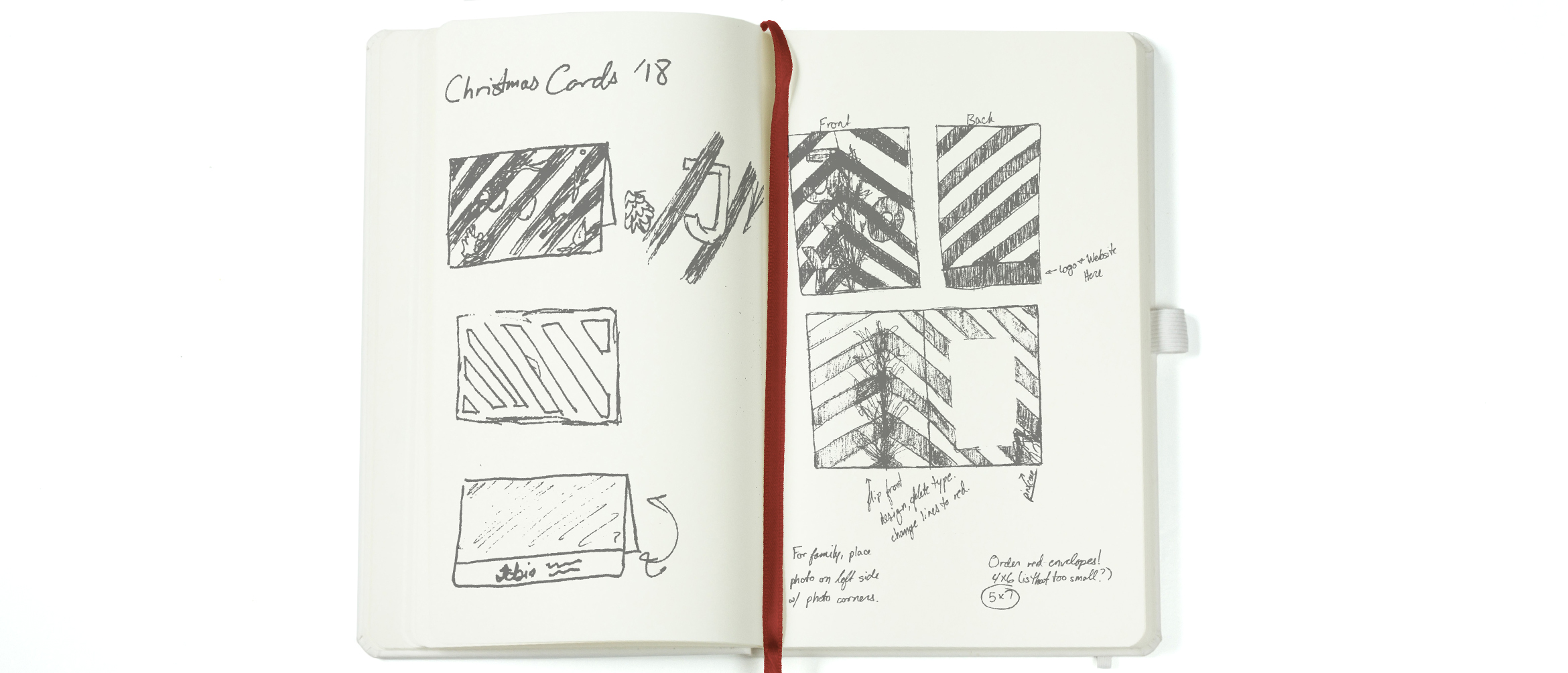
I started the project off by visiting my local Michaels. I dug through their faux plant section hunting for cinnamon scented pine cones, pine tree branches, and currants. Because I figured out my concept in October, a lot of foliage was a beautiful orange color…or dead. Either way, it wasn’t very reminiscent of the ‘Winter Wonderland’ spirit.
That night I shot each of the pieces individually on my living room floor and mentally prepared to cut each pine needle out in Photoshop for the next few days.
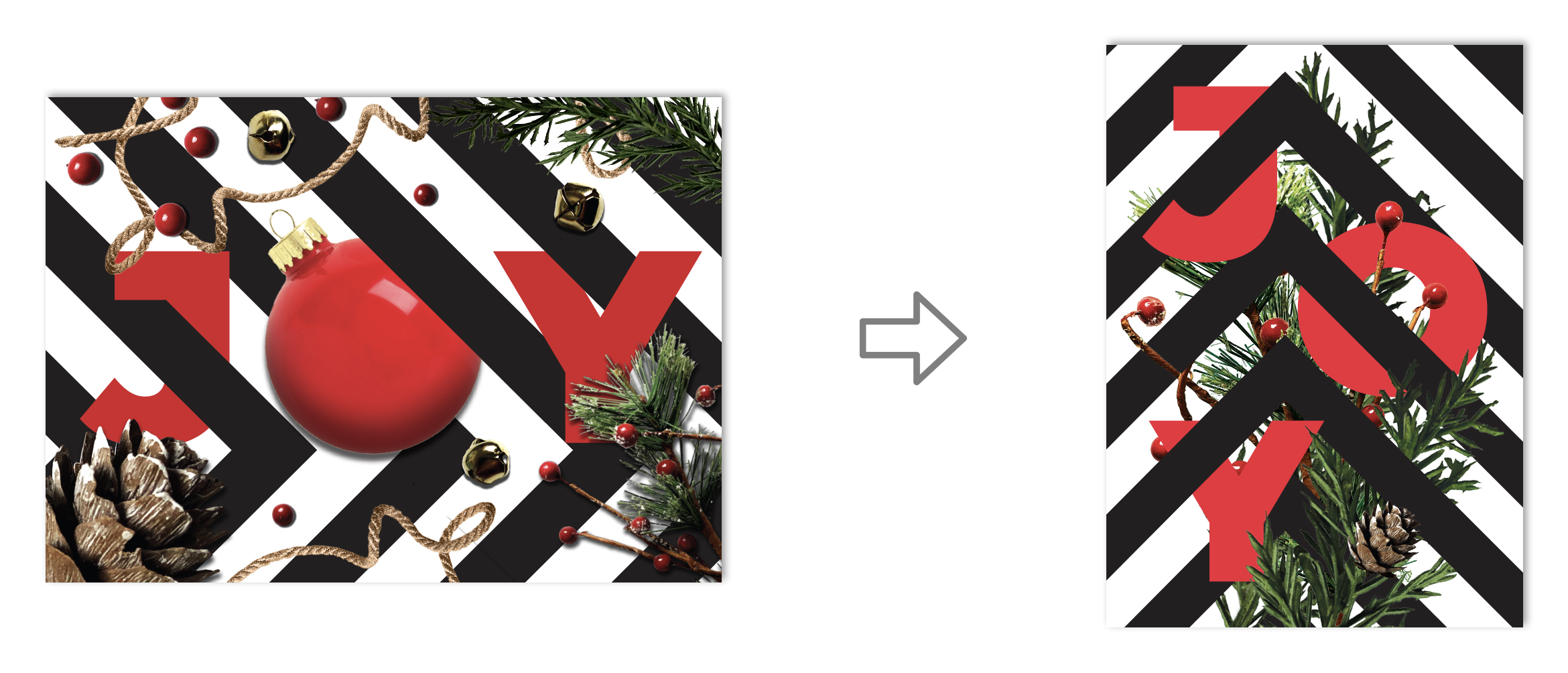 In my initial sketch, I planned on using a landscape orientation for the card. I figured I could weave the lines in and out of the text and build a border using my collaged nature. Once I had it laid out, I couldn’t help but feel unsatisfied. At the end of a project, you should feel good. You should have that prideful “I made that” moment. I knew something was wrong, but I couldn’t quite pin it down. I loved my initial concept but felt the whole thing ended up looking safe and predictable. After three years of typography and a number of years studying composition, I decided to start over with a blank sheet. I had all the elements to make a great card – I just had to use my brain.
I revisited my sketchbook and tried to disrupt my design thinking by using a portrait layout instead. By just looking at it sideways, I noticed that I liked the lines pointing upward instead of to the right. I started thinking that I could use them as a visual cue for my composition. Moving them off center helped make my composition less static, but I wanted to stagger the type to activate more of the space rather than just stacking it vertically. I also felt that using a Christmas ornament in the ‘O’ has been done about a million times. I didn’t want to follow that cliché, so I scrapped it. Pushing the foliage together and having it directly interact with the type and line work added interest to the composition and made it look less random.
The new design had something the old one lacked: purpose. The elements weren’t thrown together haphazardly anymore, they were interlocked and working together.
 I knew I wanted the inside of the cards to have an unexpected pop of red that still felt connected to the exterior of the card. The inside has a candy cane stripe that is the direct reverse of the pattern on the exterior of the card. Because of this, I also wanted to show the back side of the foliage. Lines that were previously covered by branches in the card’s exterior now sit in the foreground. I did this to give the design a three-dimensional perspective.
As a student, I don’t have an endless supply of money. I knew that these cards would be sent out to family and to designers I admire. Most likely, those designers don’t want the annual holiday photo my mom looks forward to every year. It was important that the inside of the cards had a solution for both audiences. I still loved the brass bells I shot in the first draft of the card. They didn’t make it to the final draft, but I wanted to still incorporate their color and texture somehow. In cards sent to family and friends, we printed our holiday photo and attached it with brass colored photo corners. This allowed them to remove the picture to place it in photo albums while not disrupting the final design. This also meant that the printer only had one design to print, instead of two; thus, reducing the cost of the job substantially.
I think my favorite part about this project was that I was able to send holiday joy to friends and family, as well as strangers I admire, by making my design flexible.
The perfect gift guide for that graphic designer in your life, or yourself! (You’ve been good this year.) 24 gifts to choose from – one for each of the 24 days before Christmas. Prices range from $5.99 to $196.00. Continue reading
Whenever someone talks about graduating, it’s always followed by a flood of emotions, uncertainty, and excitement – as well as a sense of achievement. For the most part, I was no different. I looked forward to it from the start of my senior year. Saying I was excited was the understatement of the century. In June, I’d finally finish a degree that took me four straight years of hard work, late nights, and SO MUCH PAPER. Not to mention, I’d also be sharing the moment with the friends and family I had to leave for University. That being said, I lacked that nervous uncertainty that comes with this monumental achievement.
In April, I was accepted into Drexel’s Arts Administration Master’s Program. After a short summer off, I already knew what I’d be doing for the next fifteen months – I’d be earning my Master’s. Out of everyone in my graduating class, very few had made the decision to pursue their Master’s so early. For me, I knew it was something I’d always wanted to do. Yes, it’s a little early, but because of my financial situation, it made sense. Not only that, but most of my mentors expressed some sort of interest in having a Master’s degree. They just struggled with the hurdles that arise when you go back to school. They have families and careers. It’s hard to add night classes to their regimen and expect them to balance it all effortlessly.
Toward the end of my senior year, I often worried and second-guessed my decision to continue with school. I kept thinking, “There has to be a reason no one else is doing this. What am I NOT seeing?”
It took me a long time to come to terms with the fact that we’re all different. This morning, I just found out one of my classmates decided to randomly move to California! I didn’t know she was thinking about making that change. It certainly isn’t the right one for me, but it may be for her. It’s always been my dream to one day own my own design studio. I know I need more education in business and financing, so why not get started learning about it now? If anything, it’ll add a new tool to my utility belt during my future job hunt.
For now, my main concern is that I continue to design during my studies. Working part-time at Michael Graves Architecture & Design helps a lot with that, but I think I may start freelancing soon as well. I loved building my best friend’s brand, and I’m excited about the new work I’m doing for Help Me Excel. Continuing design will keep my portfolio updated, my brain sharp, and my heart happy. I’d never leave design for business, and I’m sure I’ll miss it during every term paper I write and every financing equation I solve. I do know one thing, though. When I’m sitting in my office in my own design firm, my future-self will thank my past-self for all of her hard work.
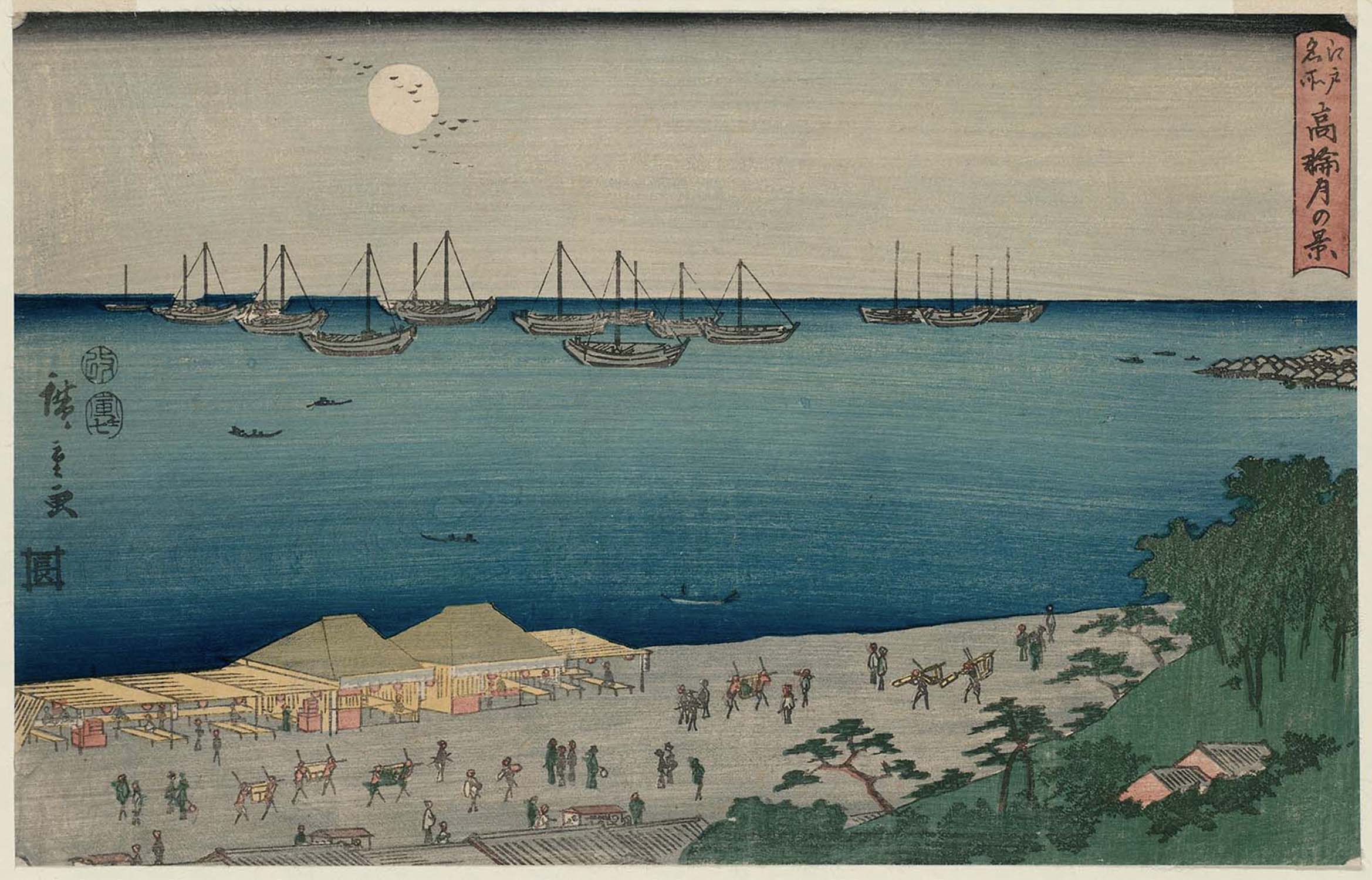
Utagawa Hiroshige was a master of Japanese woodblock printing. He had an observational, unbiased eye and captured important landscapes in Japanese history. More notably, he captured the View of Takanawa in Moonlight during the newly lifted restrictions on Japanese trade with the western world. He paints a serene scene that shows a peace that was two hundred years in the making.
Hiroshige was a master of ukiyo-e (woodblock prints) art and tradition. Also known as Ando Hiroshige, he wasn’t always known as an artist. He was raised in Edo or modern-day Tokyo. He had a heavy samurai background, which wasn’t uncommon because the Tokugawa Shogunate took control of Japan. Hiroshige’s parents passed when he was very young – about twelve years old. He belonged to a fire warden family that monitored the Edo Castle. Once his father passed, young Hiroshige took over as the fire warden. He took the job very seriously, but it came with a lot of down-time. There weren’t many fires at the Edo Castle that needed to be extinguished. In his solitude, he began to dabble in painting.
Hiroshige fell in love with painting and sought out for a formal education in it. Though he was still working as a fire warden, he also took on an apprenticeship where he’d work on illustrations for books and single-sheet ukiyo-e prints. The subject matter for these books and prints tended to be of female beauties in the red-light district and kabuki actors, but he’d developed his own personal style during the execution.
Artists have a tendency to paint what they know, and Hiroshige was no different. Because he grew up in Edo, he developed an extensive body of work focused on his home. Towards the beginning of his career, he had painted flora and fauna near modern-day Tokyo. He eventually evolved into more of a landscape painter – most likely due to his influence from Hokusai, the artist behind the incredibly popular series, “Thirty-six Views of Mount Fuji.”
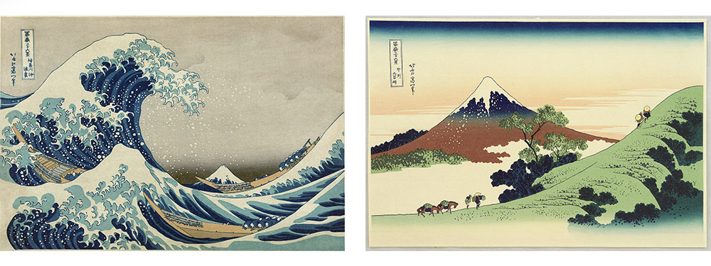
Hiroshige decided to fully pursue his career in the arts years later. He left his job as the fire warden to his brother, Tetsuzo, and decided to travel outside of Edo to paint new landscapes. His first wife was very supportive of his endeavors and sold her clothes and ornamental combs to help pay for his travels. During his that time, he painted the collections, “Illustrated Places of Naniwa,” “Famous Places of Kyoto,” and “Eight Views of Omi,” but he would always come back home to Edo.
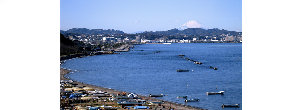
“View of Takanawa in Moonlight,” is a piece from Hiroshige’s series, “Famous Places in the Eastern Capital.” Here, Hiroshige designs a print of a familiar sight. “View of Takanawa in Moonlight,” is a view of present-day Tokyo Bay. This particular print is important because it depicts an early morning scene of the trading port. We know it’s early morning, rather than late at night because the sky is a hazy blue rather than a deep midnight color. Previous ukiyo-e prints depict nighttime with rich dark colors. In the bottom right portion of the composition, we see a Japanese marketplace, most likely specializing in fish due to its close proximity to the ocean. You see a number of fisherman sailing on their small boats in the water looking to get their early morning catch. Some people are carrying bountiful earnings from the boats to the market for preparation and distribution.
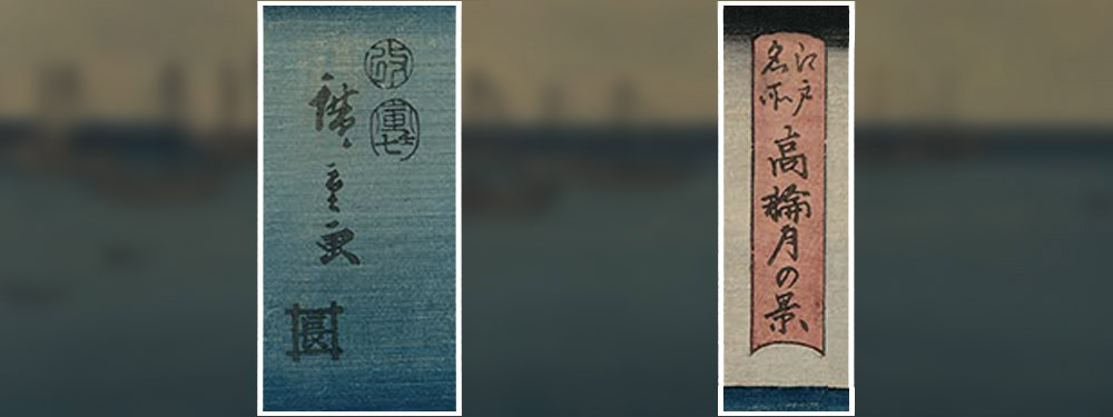
Hiroshige’s print has a few Japanese characters on it. The left side contains three different types of information. First, we see the artist’s signature. These are the three characters located on the leftmost side stacked on top of one another. To the right of them, there are two Kanji characters enclosed in circles. During the time the Tokugawas were in power, there was a strict system in place that determined what art was and wasn’t appropriate for the public. Everything needed a seal of approval before it could be released. This practice ended a few years after this print was approved. Underneath Hiroshige’s signature and the seals of approval, we see a Kanji character inside of a box. Though this character isn’t very common anymore, it signifies inner consideration and mindfulness. The ukiyo-e’s name is written in the red box to the right end of the print.
The most notable feature of Hiroshige’s composition is the larger boats on the horizon line. They’re much larger than the Japanese vessels used for fishing. Because the print was created in 1854, we know the ships in the horizon were most likely foreigner vessels. During the Edo period foreigners weren’t allowed to travel or trade with the Japanese. This was the case until 1853. Japan’s recent, though reluctant, choice to open their borders in certain ports, explains the European vessels in Tokyo Bay. Hiroshige’s work is mostly poetic and ambient, so it would make sense that he would portray this scene as an impartial observer. The foreign visitors don’t look threatening in any way, they just look as though they’re part of the quiet, early morning scene.
In 1600, Japan was unified under the Tokugawa Shogunate with emphasis on the reestablishment of order following one hundred years of civil war. It was the civil war that created the chaos that allowed the Tokugawas to take control in the first place, and their approach to governing Japan was militaristic, to say the least. Though they were incredibly strict, Japan did live in peace and stability during their rule. The military class was demilitarized – they kept all of their practices, except the warfare.
City people became more relevant, rather than the extreme polarization we had seen before where the leaders were rich, and the citizens lived in poverty. This new rule leads to the rise of the chonin, and a more comfortable middle class.
During the time, the Japanese became weary of Europeans spreading their ideas of Christianity to the Eastern nations. The Tokugawa Shogunate was suspicious of the Dominican and Franciscan missionaries that arrived in the Philippines looking to spread the word on Christianity only to dominate the country. Because of this, Tokugawa Ieyasu decided to end all Christian practice in Japan, as well as prohibit trade with western nations. This embargo was called the “Act of Seclusion” and was established in 1636. It remained active for the next 200 years until American Matthew Perry interrupted it.
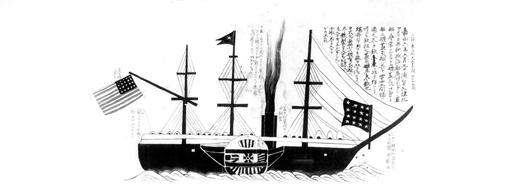
In 1853, American Commodore Matthew Perry led his fleet of ships into Tokyo Bay, looking to re-establish regular trade between Japan and the western world since Japan ended relations with persistent Europeans looking to convert them to Catholicism. Since America started using California as a trade port, pursuing trade with China and Japan would be easier and beneficial for the western nation. Not only that, but Americans were finding themselves stranded in Japan due to ship malfunctions on their way to China. They were usually greeted with hostility, and America was hoping to work out a deal where Japan offers coaling stations to Americans on their way.
The deal seemed fair, but to ensure it went in favor of America, Commodore Perry brought an armed fleet to Japan when he tried to arrange a deal. To prove he knew little about the political situation in Japan, he asked to speak to the emperor rather than Tokugawa Ieyasu. Once he was directed properly, Japan reluctantly agreed to lift the “Act of Seclusion” on their own terms. They felt that if they were forced into the decision, it may end in war. Doing it on their own accord would be better in the long run. They wanted to ease into the trade, however. They agreed to open two American coaling stations where they allowed Americans to live and operate in peace, and they opened a few ports in Japan for global trade – just not all of them.
Japan opening their ports provided them with a lot of opportunities. Unfortunately, it also meant that the art of woodblock printing would also come to an end.
In 1858, Hiroshige passed away. This would go on to be known as the beginning of the end of ukiyo-e. Toward the end of his life, trade was re-established in Japan causing it to move into a progressive era. The country faced westernization due to the tools and knowledge they were adopted from the foreigners they once tried to seclude themselves from. Today, woodblock printing is appreciated as an ancient art form and is practiced as a nostalgic look at traditional Japanese culture, but it’s lost the weight it once held in their society. Looking back, Hiroshige was one of the great masters of ukiyo-e, and his contribution and unbiased observational eye will never be forgotten.
Five years ago, I was sitting in my graphic design class poking about Google. I had already finished my final for the semester and decided to look at design universities. I thought about going to Virginia Tech or Pratt for a while. I wanted a school where I could learn about design, but also focus on academics. Then, I stumbled upon Drexel University. I honestly couldn’t tell you what website I was on, but it ranked Drexel in the top five schools for graphic design in the country. Once I dug a little deeper and did some research, I decided to submit my portfolio. I’d been looking at a few schools, so it wouldn’t hurt to submit my portfolio and see what would happen.
It was in April of 2014 that I received my acceptance email. I decided to pick up my life and leave my friends, family, and cat in Las Vegas. I was moving across the country to go to Drexel University in fabulous Philadelphia, PA. It was one of the best decisions I’d ever made (aside from going back for my cat).
Last week, I earned my Bachelor’s of Science in Graphic Design. I graduated Magna Cum Laude with minors in Fine Arts, Art History, and Marketing. I felt accomplished, overwhelmed, and excited to share the moment with my friends and family. I’d spent the last three months before graduation planning and prepping my small apartment for the seven people it would be holding in June. In between writing long marketing term papers about sales forecasting and revisiting my design portfolio, I’d randomly pick times to wash my walls or scrub my air vents. I was buying air mattresses between classes and scheduling every hour my guests would be here with me. What can I say – I like a good plan.
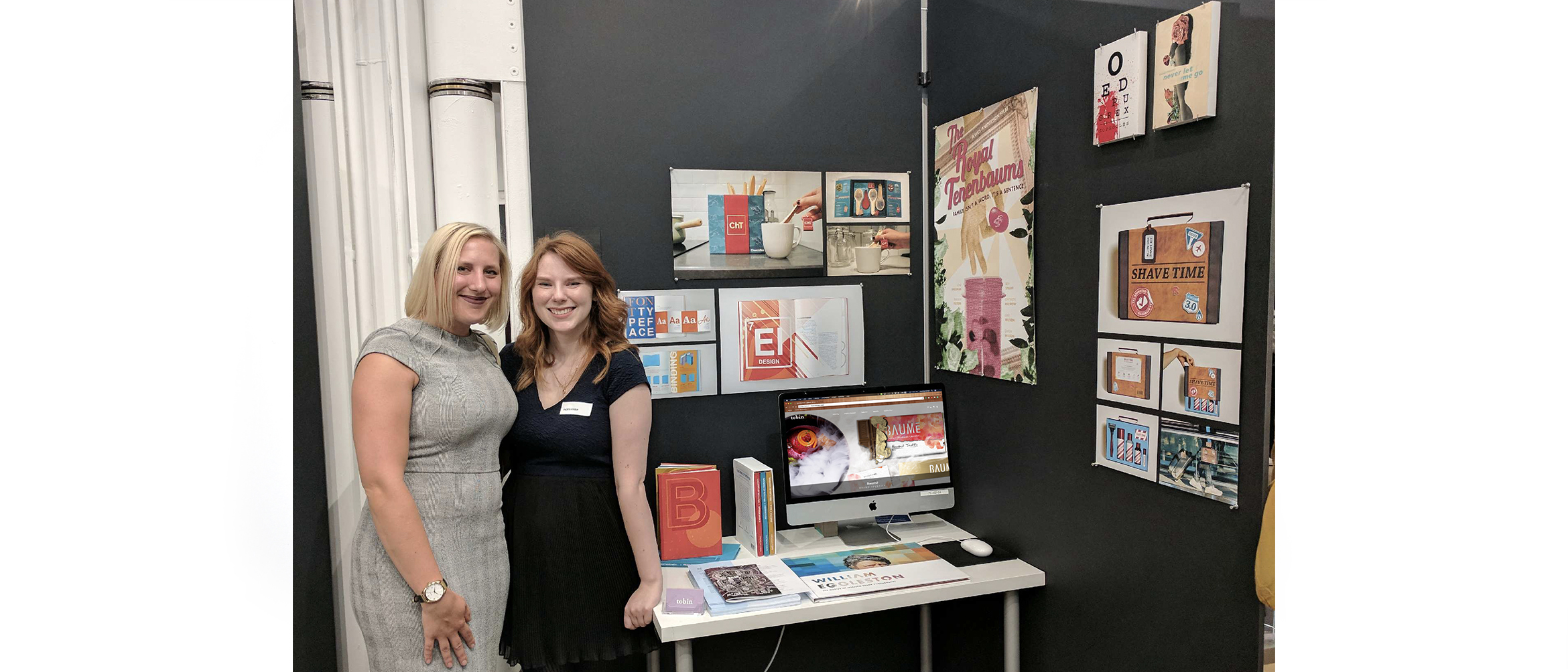
The week leading up to my graduation was a little stressful because I had to take my final final exams and get ready for my Graphic Design Senior Showcase. Once I took my last Marketing final, I was able to sit down and truly appreciate the wave of love and support surrounding me. The night before my Senior Show, my mom put my dinner together for me for the first time in four years. I sat with my best friends, who had just got off their five-hour flights, and laughed about how I ordered Qdoba catering for them because I honestly can’t be bothered to cook. Alyssa, one of my mentors at Michael Graves Architecture & Design, even drove down to visit me at my Senior Show the following day. All week I reflected on how fortunate I am to have such positive and supportive people around me.
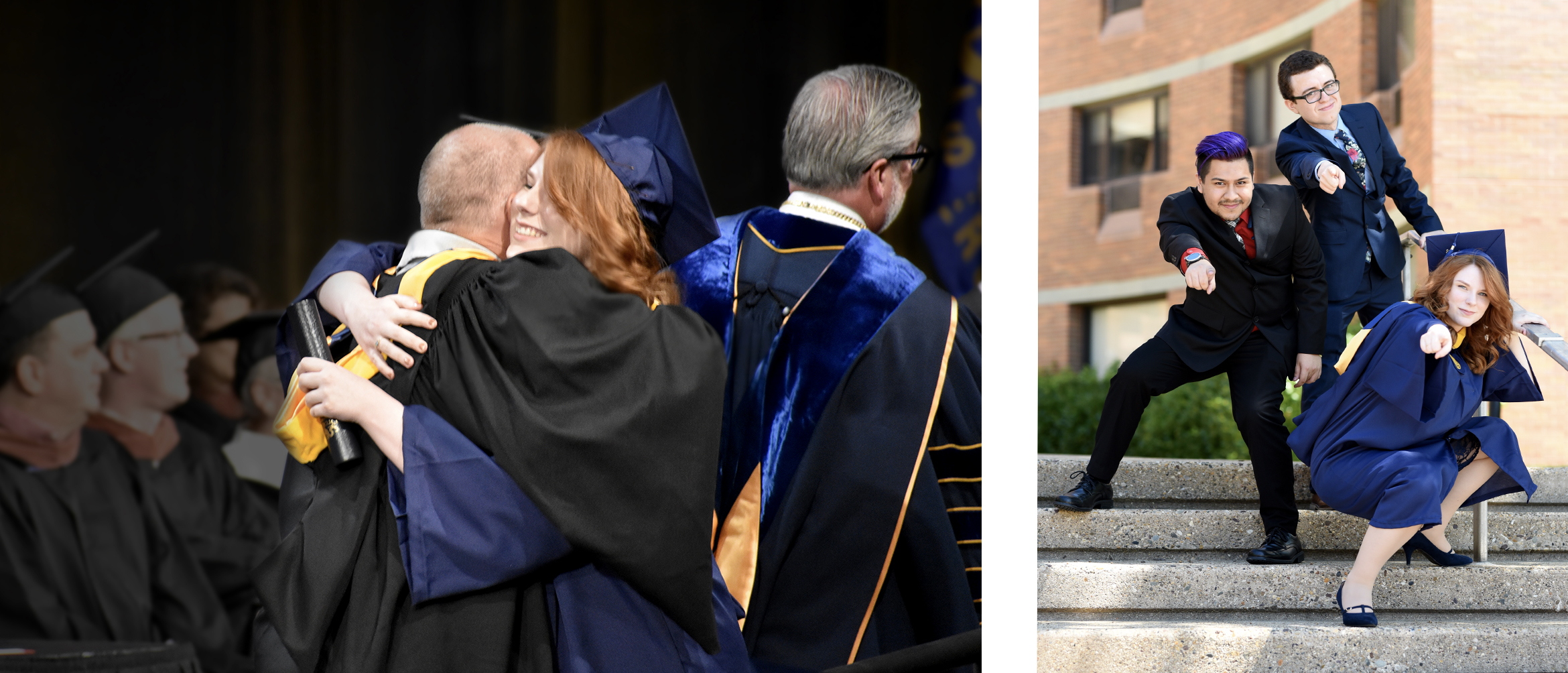
Two days later, I sat in Drexel’s gym (which had received a full HGTV makeover), in an oversized gown, jittery and excited. After a few speeches, my row was ushered to the side of the stage to wait in line. Immediately my anxiety took over and waiting in line felt like it took ages.
I was worried I’d trip and fall, or forget to walk when my name was called. Before I knew it, I heard, “Theresa Tobin!” I rushed forward, shook President Fry’s hand, hugged my Graphic Design advisor, Bill, and then immediatly became a Drexel graduate. It was so sudden.
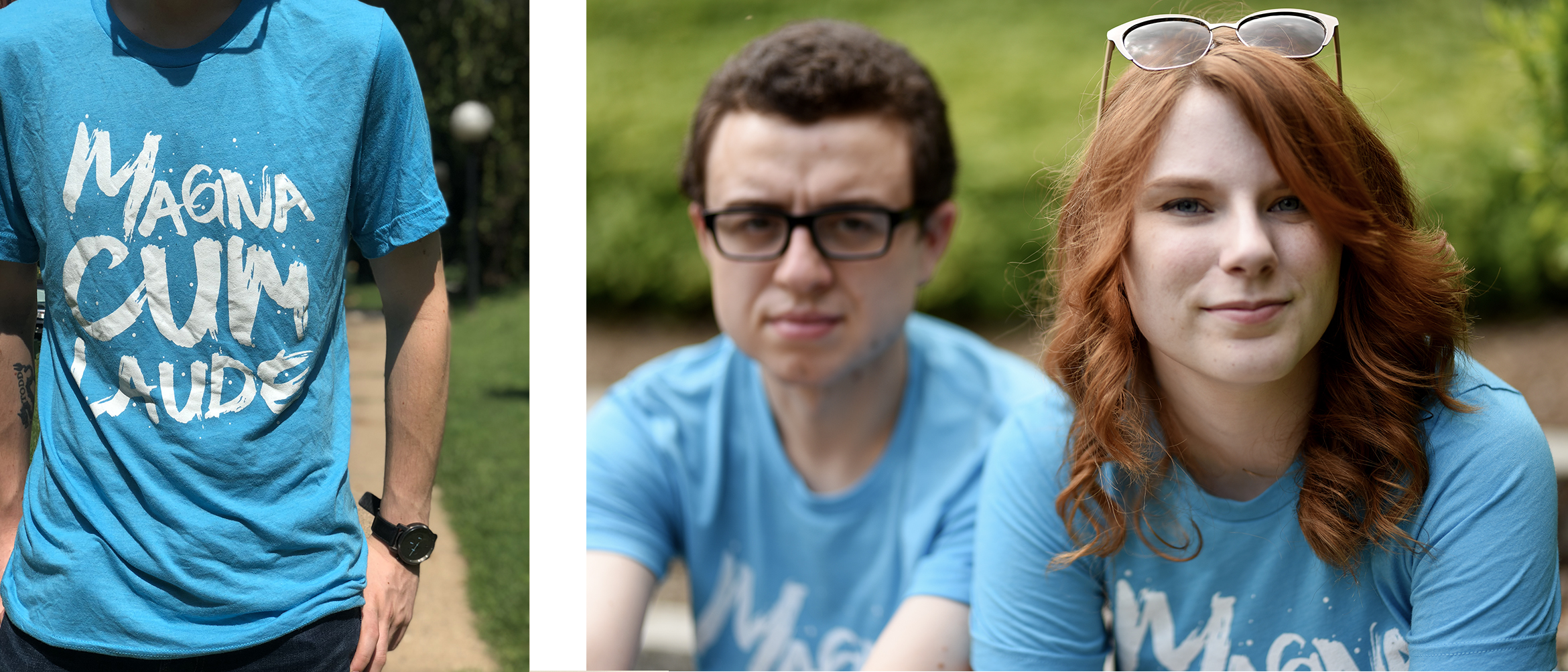
At that point, the rest of the names were called, and the ceremony wrapped up. Before I left for the summer, there was one final thing I had to do on Drexel’s campus, though. My boyfriend, Austin, and I met one of our best friends (and roommate) during our Freshman year. We all lived in a tiny dorm room in Calhoun Hall. After hearing rumors that Drexel was thinking of tearing it down, we wanted to take one final picture in front of the building on my big day. We ran over, took a few goofy photos, and went home to our reasonably sized apartment.
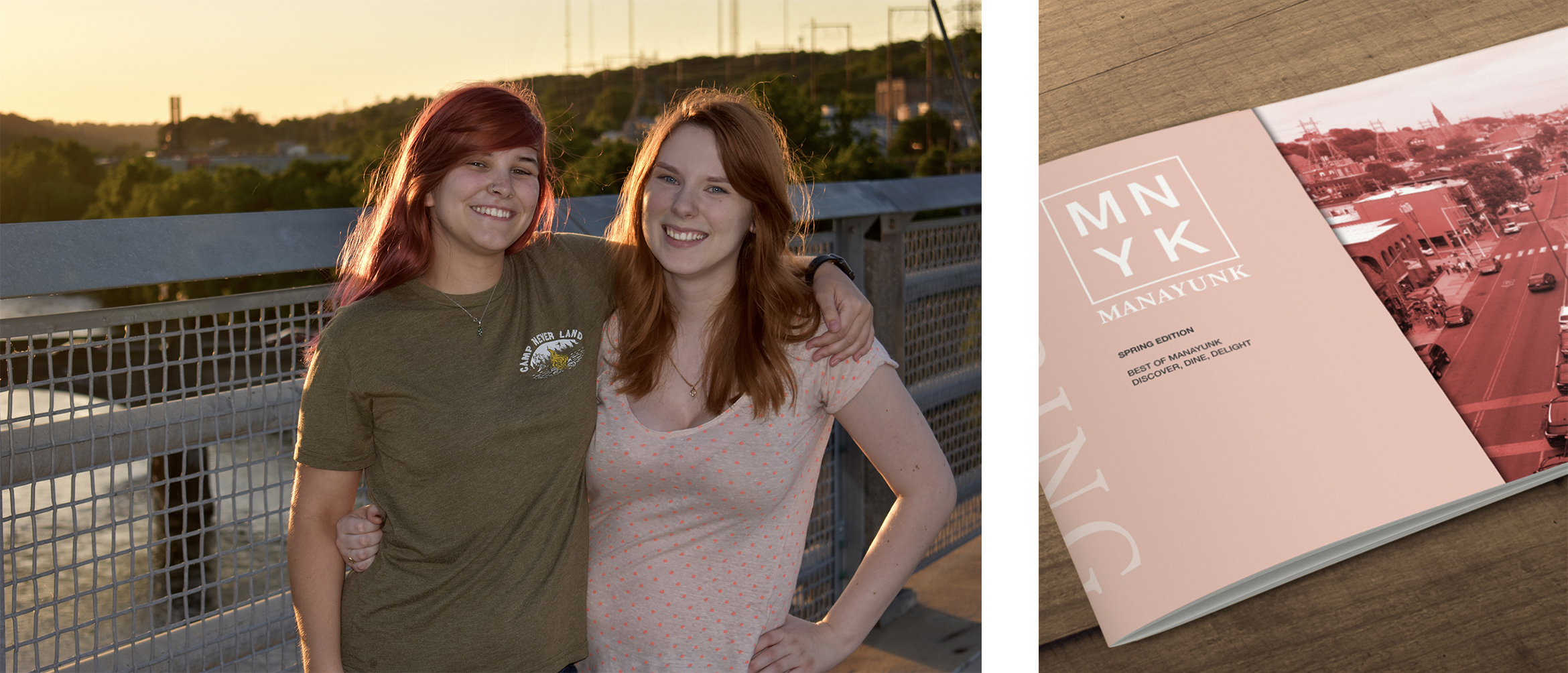
Later that day, we changed out of our formal clothes, and into one of my graduation presents. Three months ago, my roommate, Jon, came up with the hilarious idea that we should all wear matching tee-shirts on the day of my graduation. The design was inspired by the work I did for Mutant Water Babies. In the past, I had pitched a logo tee-shirt as a revenue booster for the production. Though the idea was shot down, Jon really loved my design. We took the type-treatment I used for the Mutant Water Babies logo, and spelled out, “Magna Cum Laude.” Each of my loved ones (and a stranger online) bought shirts in blue and green – making us look like a family unit.
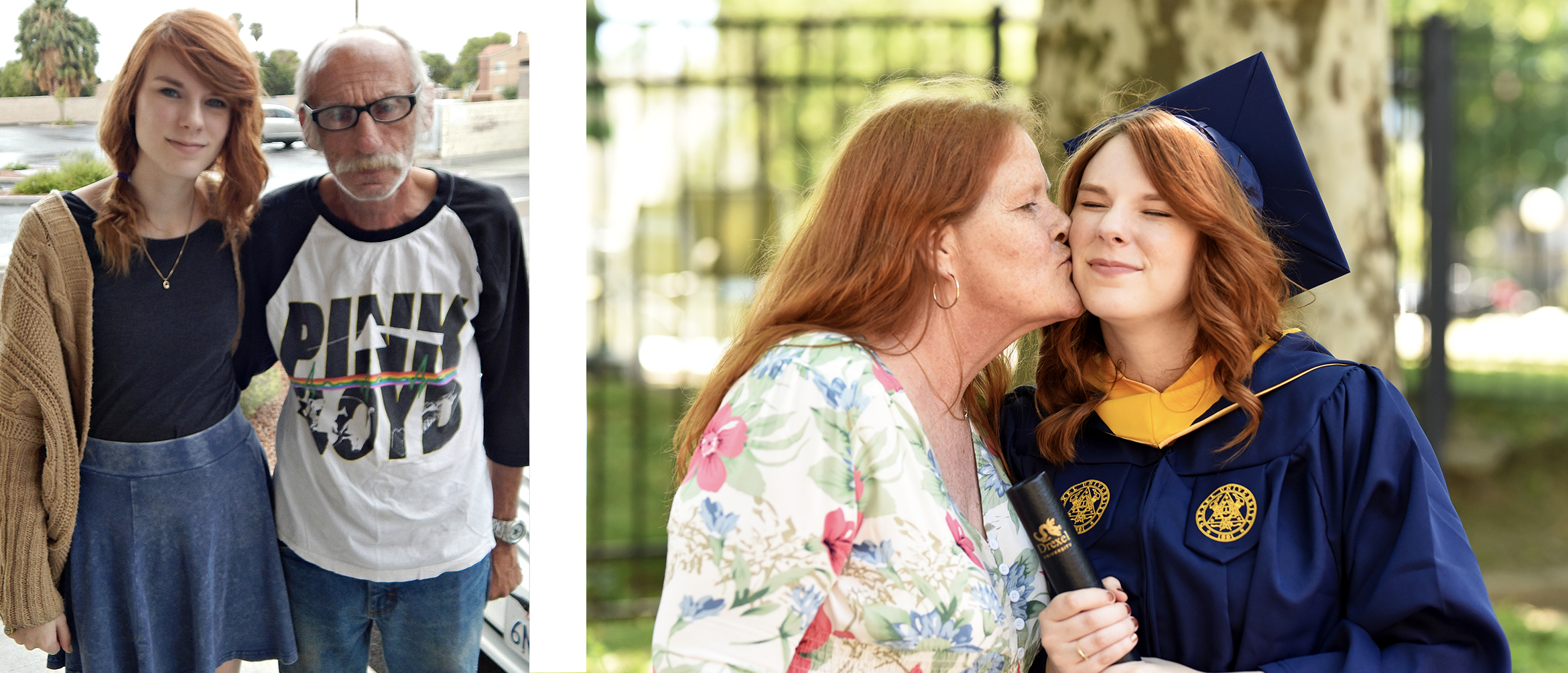
While everyone was here, it was so important to me that they experience my version of Philadelphia. Among other things on the list, I wanted to take them to Manayunk. It’s a small, creative neighborhood not too far away from where I live. I spent the entirety of Spring term in my Junior year, working on my Travel Newsletter for my Typography 3 class. We went to Lucky’s Last Chance, the burger joint I wrote about and featured in the newsletter, and walked down Main Street. We ended the day watching the sunset on the large pedestrian bridge overlooking the neighborhood. My best friend, Kelsea, took so many pictures of us in the ‘magic hour’ lighting, and it was a great way to end the day.
It was such a privilege to be able to spend a little less than two weeks with those I care so much for. Everyone that came to celebrate with me brought so much love with them. I could never thank them enough for all of their support.
For my immediate family, my graduation had a little more meaning behind it. I’m pretty sure there wasn’t a soul alive who was more excited to see me graduate than my dad. There were times it seemed like he was more excited than I was! He’d always talk about how proud he was of me and how he couldn’t wait to see me open my own design firm – as though it would happen two days after I graduated. Unfortunately, he couldn’t sit with my mom and friends to watch me accept my diploma. He passed away this past November. It was very sudden. Every day surrounding my graduation, he was on my mind. I could picture him tearing up with joy, and it made me tear up. It was in those moments that I could feel him with me, and felt whole and proud of my accomplishment.
In December I sent out my graduation invitations. The process of designing them was so odd. I’ve found it’s always hard designing for yourself. It’s so easy to over-design, and there’s always something you want to change after production finishes. In my case, I didn’t have a huge budget. I’d be comping my design and sending them out by hand with my boyfriend, Austin. At every juncture of the design process, he kept production in mind. I, however, shot for the stars and designed whatever I wanted to. I didn’t think of how much effort printing and comping would take until I ended up with a three-tiered design with an intense die cut and a staple closure. I wanted to add twine as well, but you have to know when to stop.
I worked in between classes looking online for inspiration. I knew I wanted to use a gatefold that mimicked lace, but I wasn’t entirely sure what else I wanted to add to the look and feel. My school colors are navy and goldenrod. Navy is a beautiful, elegant color, but goldenrod is harsh. If I die cut my gatefold flaps to look like lace, using goldenrod in my design would look disconnected. I was interested in using a pastel yellow to reference the color, without beating you over the head with the actual color. I found a beautiful vintage wallpaper pattern online that used pastel yellow and navy together. It was floral, which I felt was appropriate for spring, and feminine – something that felt appropriate to me.
Once I had the floral motif combined with my lace, the rest of my design decisions fell into place.
The card I was sending out had to be more than just a card. I was sending it out so early because my friends and family live on the west coast, and they needed time to book their flights and hotels. Graduation season in Philadelphia is very hectic, and you have to book in advance. Otherwise, you won’t have any options. I wanted to include information about when the ceremony is, and where to RSVP, but I also wanted to include a list of hotels and where I live in reference to my graduation events. I could fit all of this on a huge sheet of paper, but I didn’t want to custom order envelopes. I needed to stick to a standard mail size, so I felt that a tiered system would be the best way to approach this. I created a tabbed system for the card so my friends and family could navigate my system easily, and kept the tertiary map information in the back.
Production was a small nightmare.
A month prior, I bought a Cricut die cutter, and it was one of the best decisions of my life. I bought textured navy paper at Michaels and ran all of my shells through my Cricut, so I wouldn’t have to sit with my X-Acto knife for days on end. The hard part came, weirdly enough, when I was printing. My file was huge and my printer kept seizing up. I couldn’t afford to buy speckle tone paper, so I simulated it in my design as an overlaid texture. Unfortunately, this made my file size huge. I tried compressing it as a PDF, turning it off and on again, and asking it nicely, but it wouldn’t budge. I needed to comp twenty cards, and one sheet of paper took thirty minutes to finish printing. There wasn’t much I could do. I decided to place two full cards on a larger sheet of paper to cut my print time down, and I sucked it up. While everything was printing, Austin and I sat at the dining room table cutting the cards out of each sheet of paper. We had the Cricut running in the background, while we stapled each card, one at a time, over the course of five hours of steady printing.
Months later, I revisited my design to shoot it for this post. I still love it (which is a good sign), but I’d be lying if I couldn’t find one more thing I want to change. I guess that’s just the struggle of a graphic designer. Luckily for me, I graduate in two weeks, all twenty invitations have already arrived at their location, and there’s nothing I can do about it. That’s the beauty of a deadline.
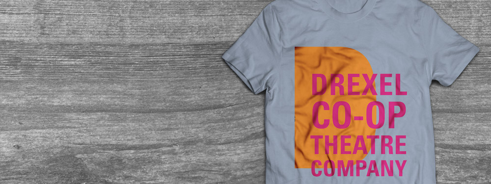
This is a compilation of the advertising designs I created for each of the performances within the Drexel Co-Op Theater Ensemble’s 2018 Season. They range from large banners and posters to small postcards. I also rebranded the Co-Op Theater Ensemble and incorporated this in their end-of-season tee-shirts. Continue reading