Archives

Symposium Emporium

PRIVATE CLIENT

SYMPOSIUM EMPORIUM

ART DIRECTION / BRANDING / EVENT DESIGN / PACKAGING

Symposium is a semiannual, multi-day event that celebrates the work accolades of a company that specializes in tech/communication. Half-way through the event, there is an evening Social component structured as a themed cocktail party. For Spring 2024, the theme was ‘Vintage Grocery’ inspired by Meow Wolf’s Omega Mart.

Affirma developed the core branding and art direction, while collaborating with several other event planning organizers to provide full event support. The event required everything from large format signage to the development of faux products adorning grocery endcaps.

For this brand system, my team invited attendees to step back in time for a retro inspired company social. Drawing from old-school printing methods, we infused every detail of the event collateral with nostalgia. From the iconic halftone dot patterns to the whimsical hand-drawn starbursts, this system captured the essence of a vintage shopping experience.

Our designers wear many hats, including overall conceptual design and copywriting. If you have a great idea, we’ll figure the rest out in order to actualize it.

PROJECTION DESIGN

To play off the theme, our team provided vintage poster designs for each aisle name with a hand-painted aesthetic to be projected onto the walls. An added weathered paper texture makes them look pasted on to the wall.

CEILING BANNERS

These hanging banners add another example branding to the space to further elevate and add color to the social event space. The banners utilize accent colors from the branding behind the logo to increase accessibility.

CIRCLE BANNER

This acts as the central anchor for the space with the open bar located immediately below. The exterior pushes a high-contrast treatment of the event logo, while the interior provides a surprise pop of color that ties into the space.

CEREAL & MILK

A clever pairing that ties into the theme of the first and last days of the event: Symposium and Demo Days. The two items have a corresponding color story, while the cereal box explores an illustrative option.

PAPER TOWELS & BLEACH

Our cleaning supplies are inspired by the 2nd Wave of Technology: AR/VR! The graphic elements of the paper towel band nod to VR rhythm games while the layout and color palette maintain harmony with the bleach label.

WINE

The vintage label design for Reality Red evokes visual callbacks to other types of wines such as rosé (with an illustration of a rose), and sparkling (with sparkle accents). It offers a sense of celebration and embodies the spirit of camaraderie.

BBQ SAUCE

Celebrating the organization’s love for sweet and tangy BBQ sauce, we’ve introduced a label design treatment that mimics that of ‘Sweet Baby Ray’s.’ The design is embellished with digital media symbols as a nod to the communication aspect of the private client’s work.

This project was an excellent demonstration of the skills my team is capable of. We created a design system that was so delightful and flexible, it covered over 50 individual assets while maintaining a sense of purpose and intrigue. Affirma’s designers wear many hats, including overall conceptual design and copywriting. If you have a great idea, we’ll figure out how to actualize it.

One of the major challenges of this engagement was the condensed timeline. With over 50 individual assets, our 20-day approach had to be aggressive and organized. Through our strategic approach to design process and flexible team of designers, we were able to meet our deadlines all while going above and beyond the client’s initial expectations.

LET'S CONNECT

If you have a vision, let’s pair it with my flair for design! Feel free to send me an email to learn more about my experience, freelance rates, and availability.

Yellowbird Hot Dip

YELLOWBIRD FOODS

HOT DIP

BRANDING / PACKAGING / ILLUSTRATION / WEB & ANIMATION

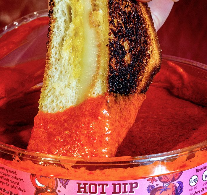
In the summer of 2020, Yellowbird Foods made its dip debut at Whole Foods Market nationwide. Made with 100% organic ingredients, Hot Dip’s visual identity took a lot of cues from the Yellowbird’s Whole30-approved organic sauce line that launched early 2019. With illustrations of fresh garden veggies and vibrant colors that pop right off the shelf, Hot Dip is the perfect addition to the nest.

To learn more about the process of this project, access my blog entry here: Branding a Product Line.

My team focused heavily on the journey our condiments take: from the pepper farm, to our kitchen in beautiful San Marcos, straight to your Friday night feast. Hot Dip’s illustrative direction is primarily inspired by floral prints found on oilcloth. We champion anything that encourages us to play with our food — no matter how messy we get.

Our illustrations are brought to life by a key component of our brand identity: color. Much like our other sauces, color acts to differentiate different flavors of dip. Hot Dip utilizes a mostly-monochromatic, surrealist approach to color. The ingredient illustrations harmonize with the background’s overarching color; however, the radiant leaves interrupt the monotonous monochrome with sparks of unexpected contrasting hues inspired by Sandy Skoglund’s A Breeze at Work (1987). This adds a visual interest that would be lacking otherwise.

We complimented our lush illustrations and unexpected color palette typographically with heavier letter forms as a reference to the thick, rich consistency of the dip.

Compositionally, we were driven by the cyclical form of our dip container and used it as a method of story-telling. The lid has a border of fiery ingredients arranged in a circle to reflect on our commitment to holistic and clean nutrition. The Bird peaks out from his garden of fiery produce to challenge our Flock to think beyond the chip. Hot Dip is a journey. Once you buy it, you embark on an experience that’s hotter than a pedicab seat on a summer day. When you open your first tub of Hot Dip, the inside lid surprises you with a literal wave of flavor. It encourages you to dip, dunk, and drench any food to make it infinitely yummier. Make sure to put down an oilcloth — things are going to get messy.

LET'S CONNECT

If you have a vision, let’s pair it with my flair for design! Feel free to send me an email to learn more about my experience, freelance rates, and availability.

Yellowbird Original

YELLOWBIRD FOODS

ORIGINAL GIFT PACK

BRANDING / PACKAGE DESIGN / ILLUSTRATION

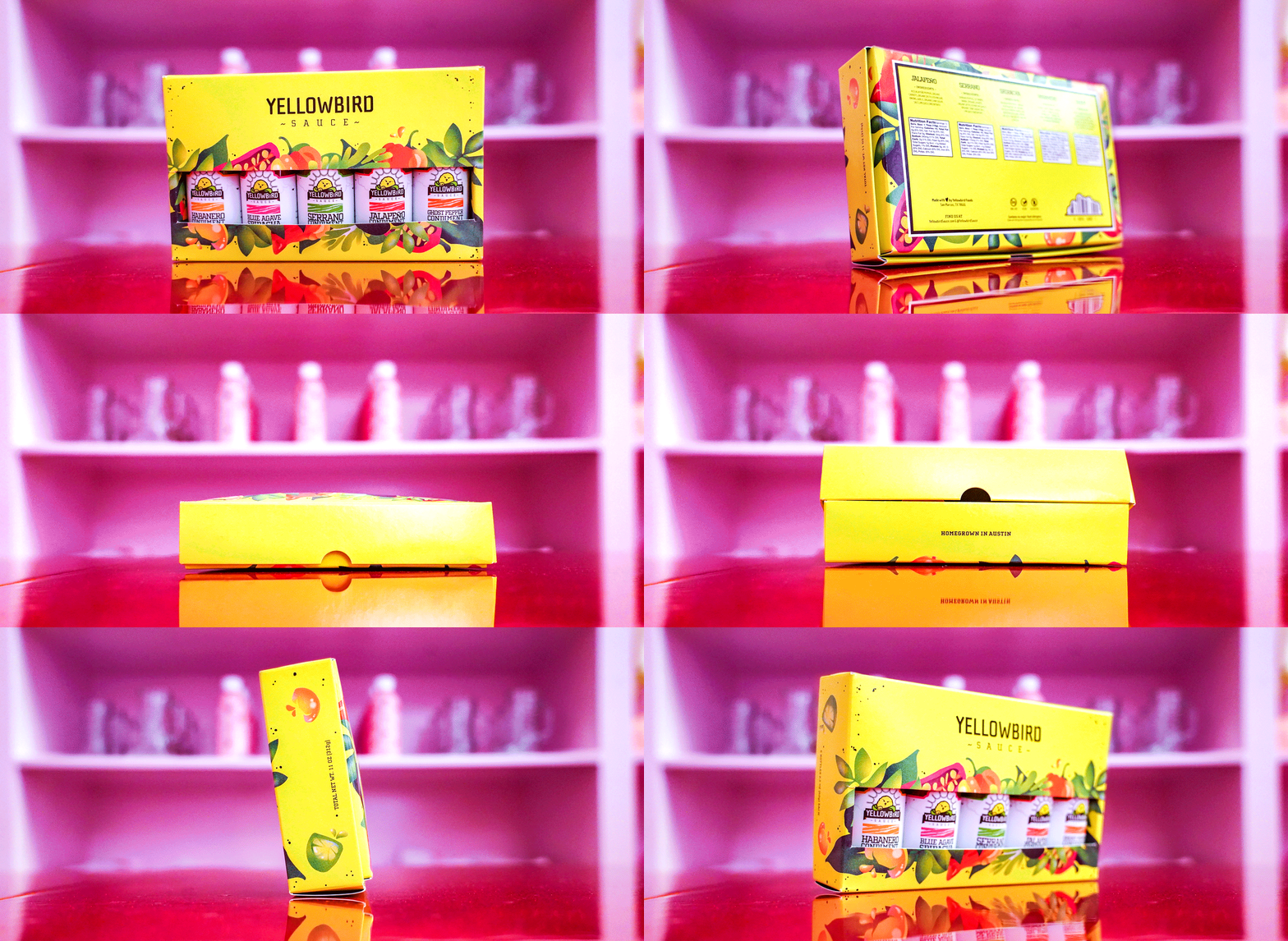
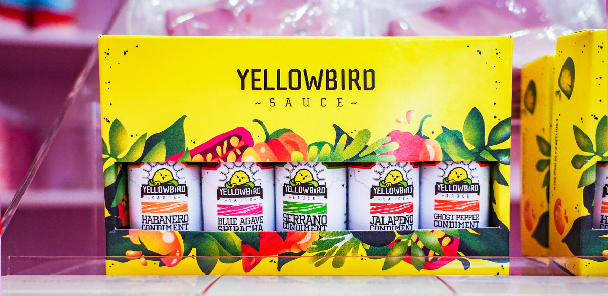
Yellowbird’s first expedition into the petite picante was their 2.2oz Original Variety Pack. It was immediately loved by members of the Flock and those looking to venture into the spicy unknown. Unfortunately, the packaging was only designed to retail online; it lacked the necessary information to sell in a brick-and-mortar retail environment. This made it difficult to attract newcomers who weren’t familiar with the brand. The goal for this project was to design retail-ready packaging that highlights the unique look and feel of the Original sauce line while also making an appropriate pairing for the existing 2.2oz Organic Variety Pack.

The gift pack’s aesthetic was inspired by the bright vibrancy of Yellowbird’s core palette. Typically, the branding dictates that yellow is used as a supporting accent color; however, moving forward with vibrant yellow packaging would be the best way to compliment the bright white look and feel of the bottle design. It was important that this design felt related to its pair, The Organic Gift Pack, so we maintained a consistent base layout with a few stylistic differences. Each of the foliage illustrations was rendered in Adobe Illustrator with dimensional gradients and added grain.

A departure from the painterly illustrations on the Organic pack still felt similar with the added textural quality and vibrant color palette. The barcode was also swapped from a pepper (on Organic) to a cloud as a callback to the cloud motif on the Original bottle design. The interior of the packaging supports Yellowbird’s natural narrative by featuring a rich green interior with a subtle cow-print texture. Compositionally, the color payoff of the dark velvety-colored interior adds a break from the packaging’s shocking vibrancy.

The vibrant quality of the packaging design, and incorporated illustrations, speak to the unique flavors tucked within.

To experience the heat yourself, visit Yellowbird.com or visit a local hot sauce shop near you. The Original 2.2oz Variety Pack is now available in the gift shop at the Museum of Ice Cream @Austin, Texas today! I can’t think of a better pair for fresh-picked heat than chilly, pink sweets.

LET'S CONNECT

If you have a vision, let’s pair it with my flair for design! Feel free to send me an email to learn more about my experience, freelance rates, and availability.