Symposium Fall 2022


PRIVATE CLIENT
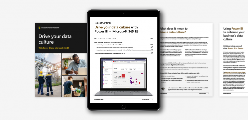
SYMPOSIUM FALL 2022
ART DIRECITON / BRANDING / EVENT DESIGN
Symposium is a semiannual, multi-day event that celebrates the work accolades of a private company specializing in tech/communication. For Fall 2022, Affirma Consulting developed the core branding and art direction, while collaborating with several event planning organizations to provide full event design support. The event required everything from digital collateral to share on social media, to in-person event support—and everything in between!
My team met the initial standards and elevated the quality of work to create an atmosphere that was unmatched by previous iterations of the event.


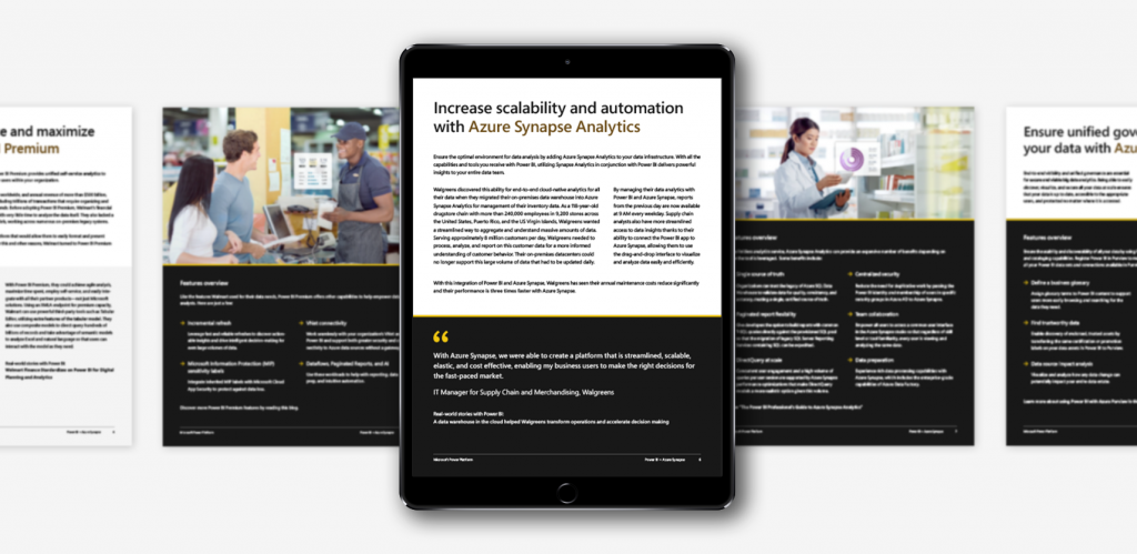
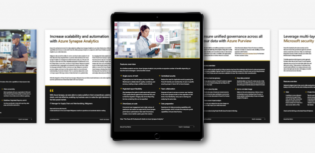
This brand system, titled ‘Fall Deco’ is elegant, dazzling, and sophisticated. Art Deco-inspired gold patterns frame the classic Symposium logo and contrast against the dark velveteen background to create this elevated look/feel. The brand system is complimented by a delicate smoke motif, adding an organic touch to the sleek geometry. With this being the organization’s first in-person Fall Symposium after COVID-19, this brand system welcomes attendees back with celebration.

DIGITAL EVENT ASSETS
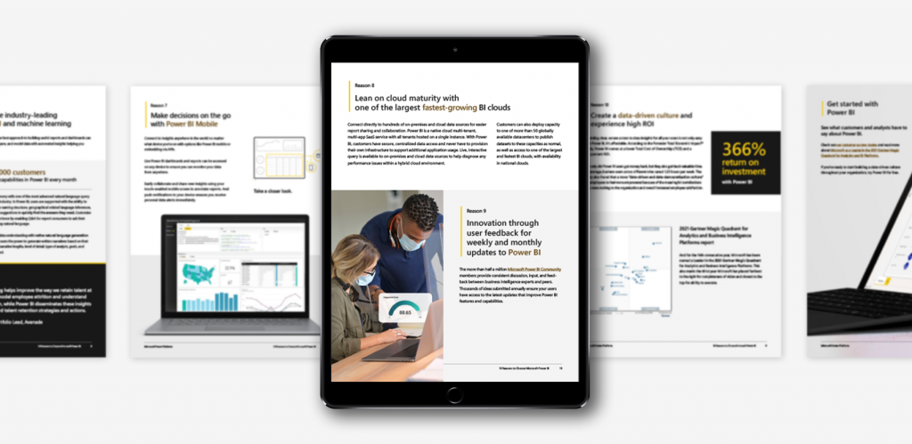
The client requested my team support on a digital asset package for use on social media, including a profile image, banner, and several event images. We also created PowerPoint templates for presenters.

LARGE-FORMAT SIGNAGE
The event required meterboard, easel, and banner signage. These pieces are crucial to placemaking and wayfinding, as large signage adds atmosphere and corrals large groups of people.
EVENT BADGES
This season, we opted for a dynamic badge styling. The metallic Fall 2022 logo is placed atop a velvety pine background, with smoke wafting in the foreground creating a marbled effect.

EVENT AGENDA
Our team was provided a long list of activities that take place over the course of the multi-day event. That information was synthesized into a clear/concise document with high-level overviews and scheduling.

STICKERS
Stickers are a common swag item for each Symposium. Our team typically provides a few simple options with the seasonal logo, and then branches out to more complex illustrative designs that lean more into the theme—in this case, it was Art Deco!
SOCKS
Symposium socks are a staple of each event and are highly coveted amongst attendees. With only a limited number ordered, and such a large fan-base, the design team has big shoes to fill each season! In Fall 2022, we dazzled with a delicate golden, scallop pattern.
Our team offers A/V for the support as well. While collaborating with an external A/V vendor for show running, our team develops looping stage animations, lower thirds, and live-stream assets to ensure each moment of event touchpoint collateral feels branded and considered. Our aim is always full design cohesion in the space, it’s online presence, and the lead-up marketing.
Our team created a design system that was so versatile, it covered over 80 individual assets, while still maintaining a sense of purpose and intrigue.

This project displayed the amazing skills our team is capable of. We created a design system that was so versatile, it covered over 80 individual assets, while still maintaining a sense of purpose and intrigue. We worked closely with event planners and A/V specialists to deliver full design coverage, and day-of support—ensuring our client’s event ran smoothly and looked beautiful simultaneously. From start to finish, project management maintained a steady timeline, with room to spare.
One of the major challenges of this regular engagement is that our team isn’t able to go on-site to ensure quality. Due to Affirma’s global nature, our design team has to create and deliver all assets while working remotely—both from the client and each other. Our consistent caliber of work has built strong relationships with stakeholders, vendors, and print/production contacts, allowing for better collaboration to ensure all items meet our high-quality standards, despite the distance we have to overcome.
LET'S CONNECT
If you have a vision, let’s pair it with my flair for design! Feel free to send me an email to learn more about my experience, freelance rates, and availability.