


MICROSOFT POWER BI
E-BOOK SERIES
PUBLICATION / WEB & ANIMATION
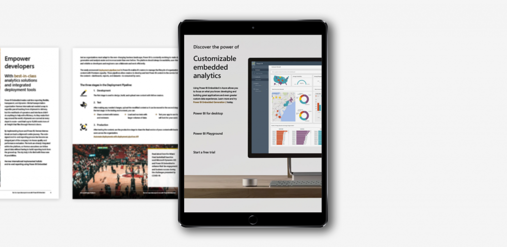
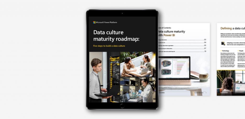
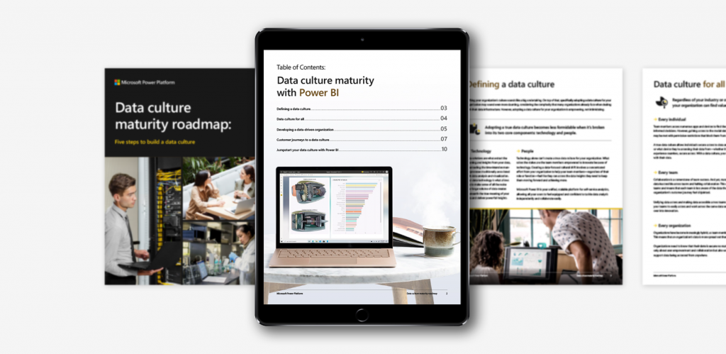
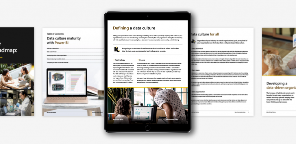
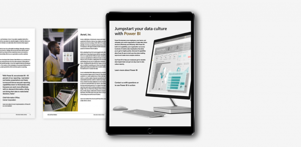
Microsoft approached Affirma Consulting looking for a series of five eBooks advertising different unique selling points of Power BI—each speaking to independent user experiences. One of the main goals was to develop final InDesign and PDF files that offered an interactive experience that was certified as entirely accessible.
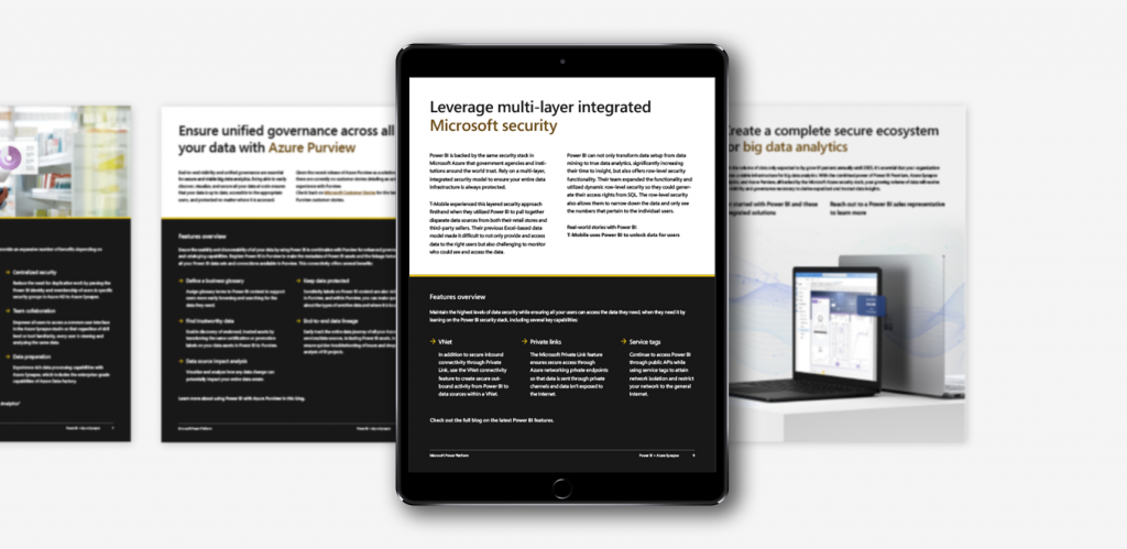
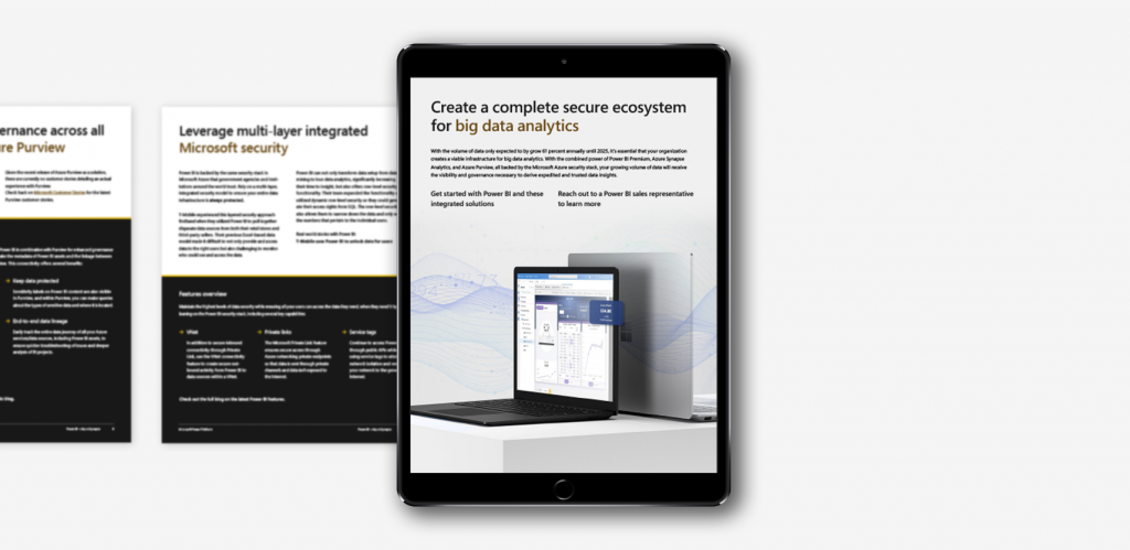
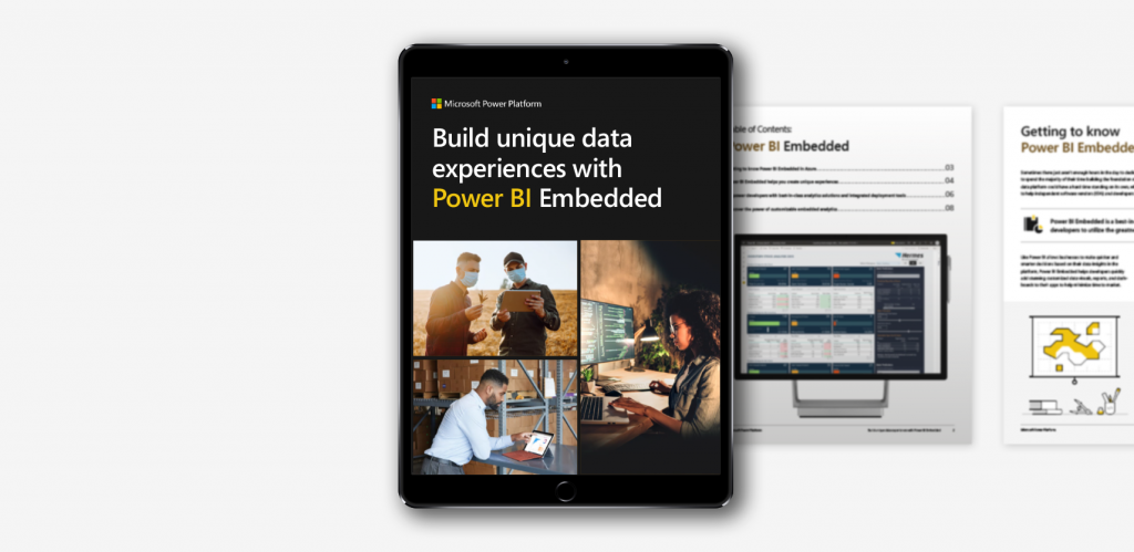
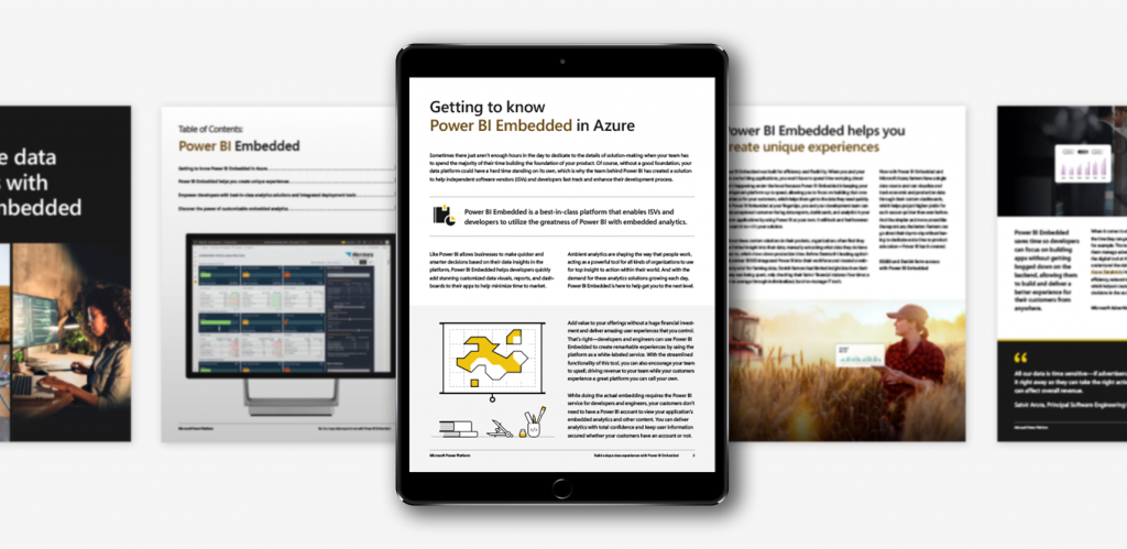
It’s a privilege to go through Microsoft’s Power Platform standards and create this series building an innovative design system for these eBooks off of Microsoft’s established regulations. Because my team isn’t internal to Microsoft, gathering resources was an interesting process. A large part of design was sourcing existing imagery from Microsoft’s website. I found myself pulling iconography and illustrations from the Power BI website and generating my own—mimicking the different styles.
What couldn’t be pulled from Microsoft, we sourced from licensed stock photography that was Photoshopped to match the predetermined look and feel. By the end of the project, the team had our own asset library of different photography, iconography, and illustrations. It was important to have variety and not lean on one form of visual because the stakeholders were looking for something new, exciting, and inclusive—all while following brand standards.
Microsoft’s heavy emphasis on accessible content ensures everyone can interact with their brand. This practice opened my eyes to new ways of communicating with a broader audience, and I found new marketing opportunities I hadn’t previously considered as a designer.


Designing in an interactive space that must be 100% accessible presents several challenges when it comes to layout and type design. Across all eBooks, type contrast, legibility, and flow were a key priority to cater towards individuals that live with some sort of visual impairment. I spent additional time and care to provide alt. text describing images and infographics, as well.
This practice opened my eyes to new ways of communicating with a broader audience. Additionally, I wanted a beautiful layout that could easily translate to a plain-reader view for those with cognitive impairments that have difficulty determining reading order. Microsoft’s heavy emphasis on accessible content ensures everyone can interact with their brand, not just a select few.


LET'S CONNECT
If you have a vision, let’s pair it with my flair for design! Feel free to send me an email to learn more about my experience, freelance rates, and availability.