Symposium Emporium


PRIVATE CLIENT
SYMPOSIUM EMPORIUM
ART DIRECTION / BRANDING / EVENT DESIGN / PACKAGING
Symposium is a semiannual, multi-day event that celebrates the work accolades of a company that specializes in tech/communication. Half-way through the event, there is an evening Social component structured as a themed cocktail party. For Spring 2024, the theme was ‘Vintage Grocery’ inspired by Meow Wolf’s Omega Mart.
Affirma developed the core branding and art direction, while collaborating with several other event planning organizers to provide full event support. The event required everything from large format signage to the development of faux products adorning grocery endcaps.


For this brand system, my team invited attendees to step back in time for a retro inspired company social. Drawing from old-school printing methods, we infused every detail of the event collateral with nostalgia. From the iconic halftone dot patterns to the whimsical hand-drawn starbursts, this system captured the essence of a vintage shopping experience.
Our designers wear many hats, including overall conceptual design and copywriting. If you have a great idea, we’ll figure the rest out in order to actualize it.

PROJECTION DESIGN
To play off the theme, our team provided vintage poster designs for each aisle name with a hand-painted aesthetic to be projected onto the walls. An added weathered paper texture makes them look pasted on to the wall.
CEILING BANNERS
These hanging banners add another example branding to the space to further elevate and add color to the social event space. The banners utilize accent colors from the branding behind the logo to increase accessibility.
CIRCLE BANNER
This acts as the central anchor for the space with the open bar located immediately below. The exterior pushes a high-contrast treatment of the event logo, while the interior provides a surprise pop of color that ties into the space.

CEREAL & MILK
A clever pairing that ties into the theme of the first and last days of the event: Symposium and Demo Days. The two items have a corresponding color story, while the cereal box explores an illustrative option.

PAPER TOWELS & BLEACH
Our cleaning supplies are inspired by the 2nd Wave of Technology: AR/VR! The graphic elements of the paper towel band nod to VR rhythm games while the layout and color palette maintain harmony with the bleach label.

WINE
The vintage label design for Reality Red evokes visual callbacks to other types of wines such as rosé (with an illustration of a rose), and sparkling (with sparkle accents). It offers a sense of celebration and embodies the spirit of camaraderie.

BBQ SAUCE
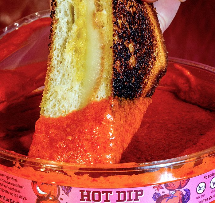
Celebrating the organization’s love for sweet and tangy BBQ sauce, we’ve introduced a label design treatment that mimics that of ‘Sweet Baby Ray’s.’ The design is embellished with digital media symbols as a nod to the communication aspect of the private client’s work.

This project was an excellent demonstration of the skills my team is capable of. We created a design system that was so delightful and flexible, it covered over 50 individual assets while maintaining a sense of purpose and intrigue. Affirma’s designers wear many hats, including overall conceptual design and copywriting. If you have a great idea, we’ll figure out how to actualize it.
One of the major challenges of this engagement was the condensed timeline. With over 50 individual assets, our 20-day approach had to be aggressive and organized. Through our strategic approach to design process and flexible team of designers, we were able to meet our deadlines all while going above and beyond the client’s initial expectations.
LET'S CONNECT
If you have a vision, let’s pair it with my flair for design! Feel free to send me an email to learn more about my experience, freelance rates, and availability.