
Design Something With…
A GUIDE FOR EARLY GRAPHIC DESIGNERS
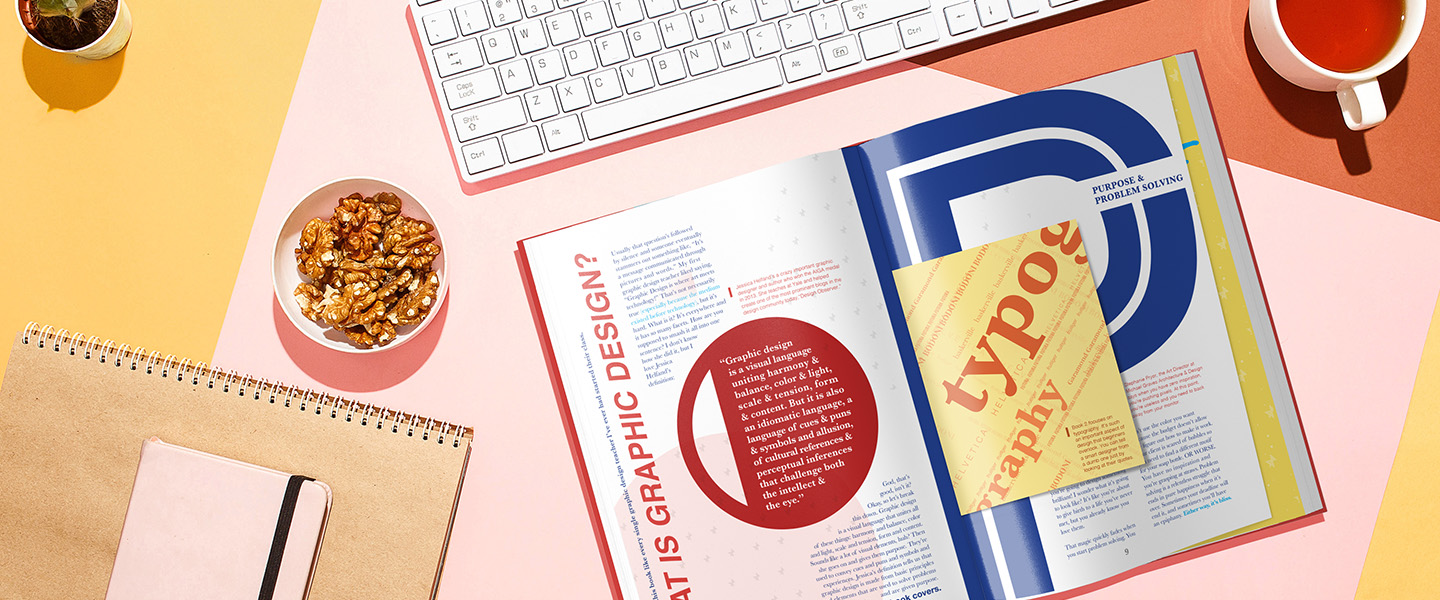
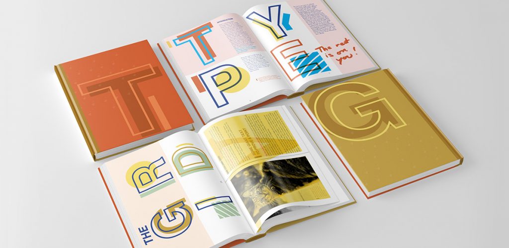
Design Something With… is an introductory graphic design reference book for high school students in career and charter schools. It’s divided into three smaller books tackling subjects like Design Basics, Typography and The Grid, and Production because books are heavy and you should be allowed to pick and choose what you want to carry. Each book is given a designated primary color and fit in a box set rendered after a Pantone color chip. The type system uses Helvetica for most primary headings and embraces Baskerville for all body copy.
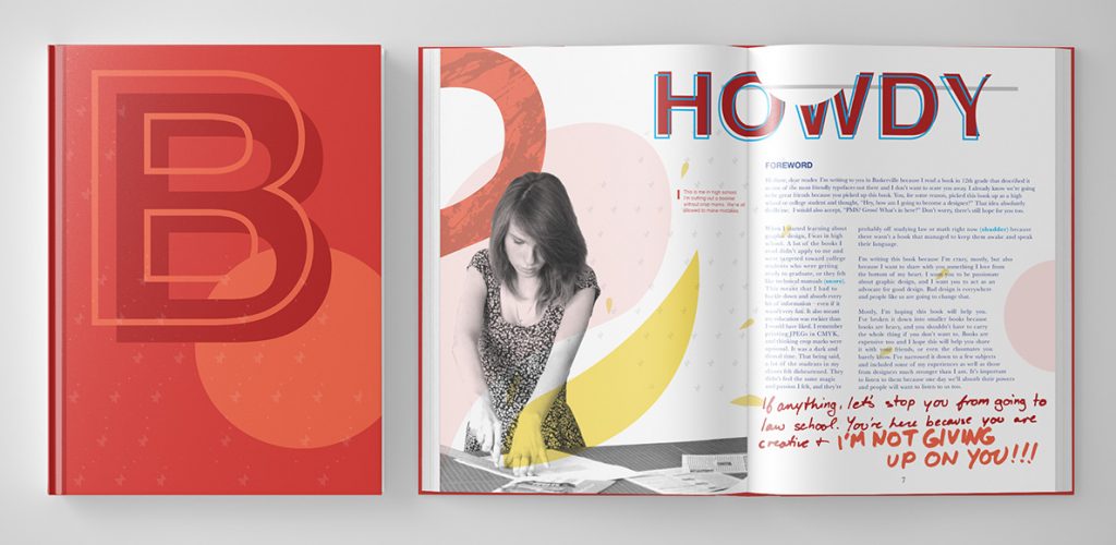
Design Something With… is a candid take on introductory level graphic design information. It uses sidebars, added opinions, and advice throughout to give perspective on what separates academic information from that of the real world. Inspired loosely on the revival of Memphis design in today’s modern aesthetic, it’s a bright, interactive vehicle meant to engage and entertain the audience.
“Each book utilizes production techniques like fold-outs, pouches, accordion pull-outs, and smaller books to give a visual and tactile learning experience.”

Type & The Grid
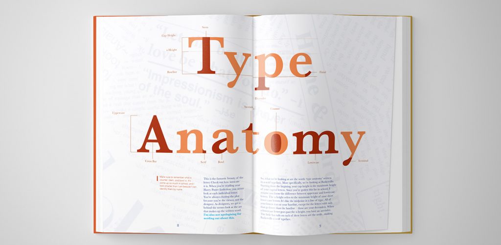
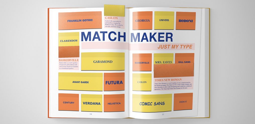
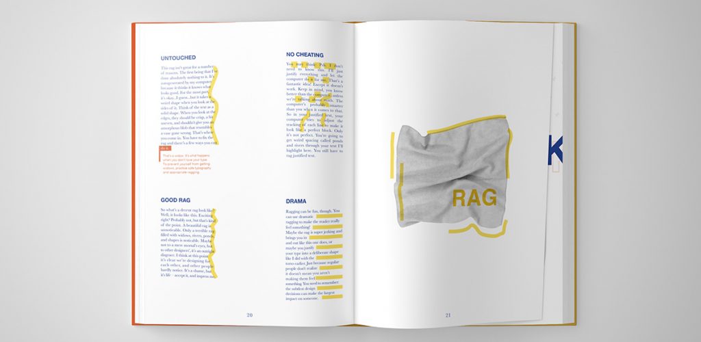
The second book in the set is called Type & The Grid. It gives the reader perspective on type through a hierarchy of learning. First, it explains the elegance and anatomy of the letter. Then, it moves into full words and how typefaces and kerning make an impact on their appearance. From words, we move into lines and paragraphs – discussing leading, raging, and eventually moving into type on a grid. Because type and the grid are technically separate topics, they’re given different colors to represent their sections. They are so closely related, however, it was appropriate to put them in the same book.

“I used visual cues [like highlighting the rag] so the reader leaves with lasting impressions that build stronger design practices.”
Production
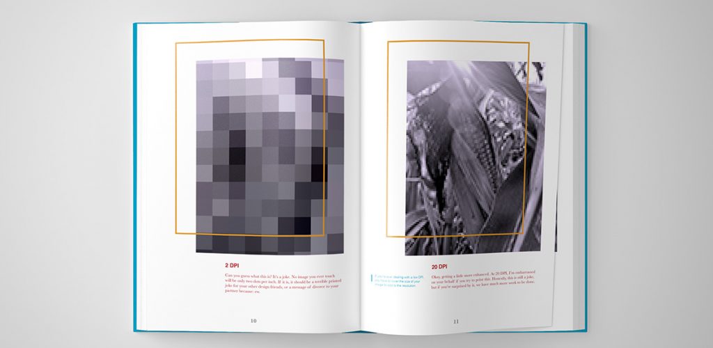
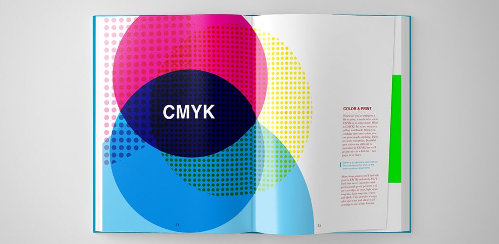
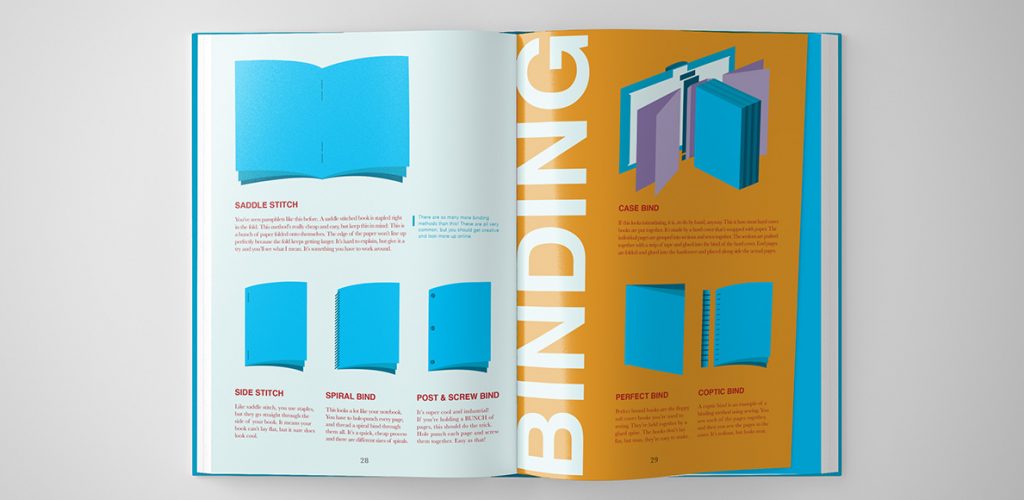
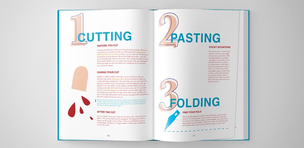
The third book in the set focuses on Production. It covers resolution, color in print and web, binding and production techniques, client relationships, budgeting, and tips for excellent craft. Though the book has a heavy focus on print design, it instills vital knowledge on the reader about producing a well-manicured comprehensive design for a client. With the design industry heavily embracing technology, I find design students struggle with their craft. Design Something With… Production provides tips and tricks to combat this issue.


“Illustrations simplify complicated production techniques and provide comic relief to combat the dry nature most textbooks have.”

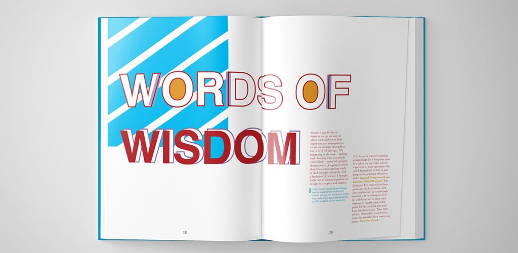
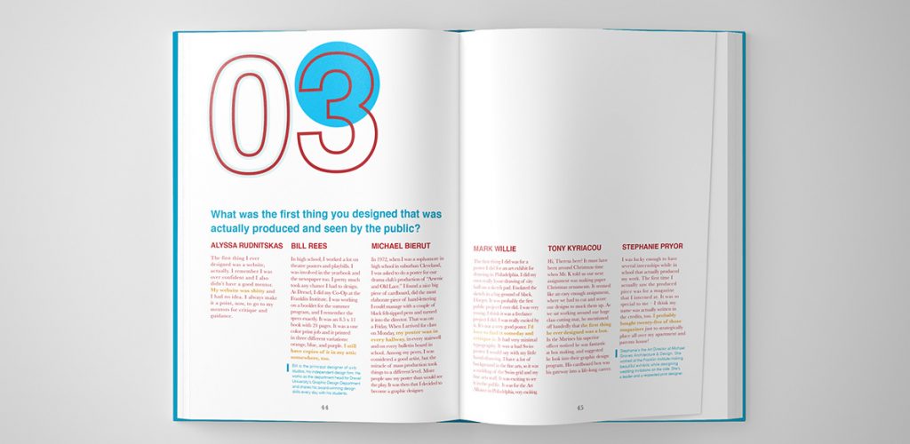
Each of the books ends with a ‘Words of Wisdom’ section. Here, professionals in the industry share their real-world responses to questions students are afraid to ask in the classroom. Questions like, “What typeface are you sick of?” and “Should a design student know art history?” are answered here.