Archives

Yellowbird Hot Dip

Yellowbird Hot Dip

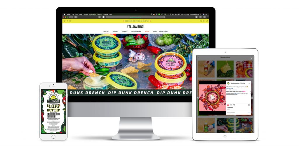
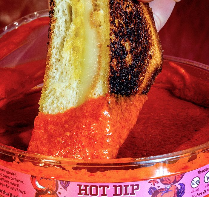
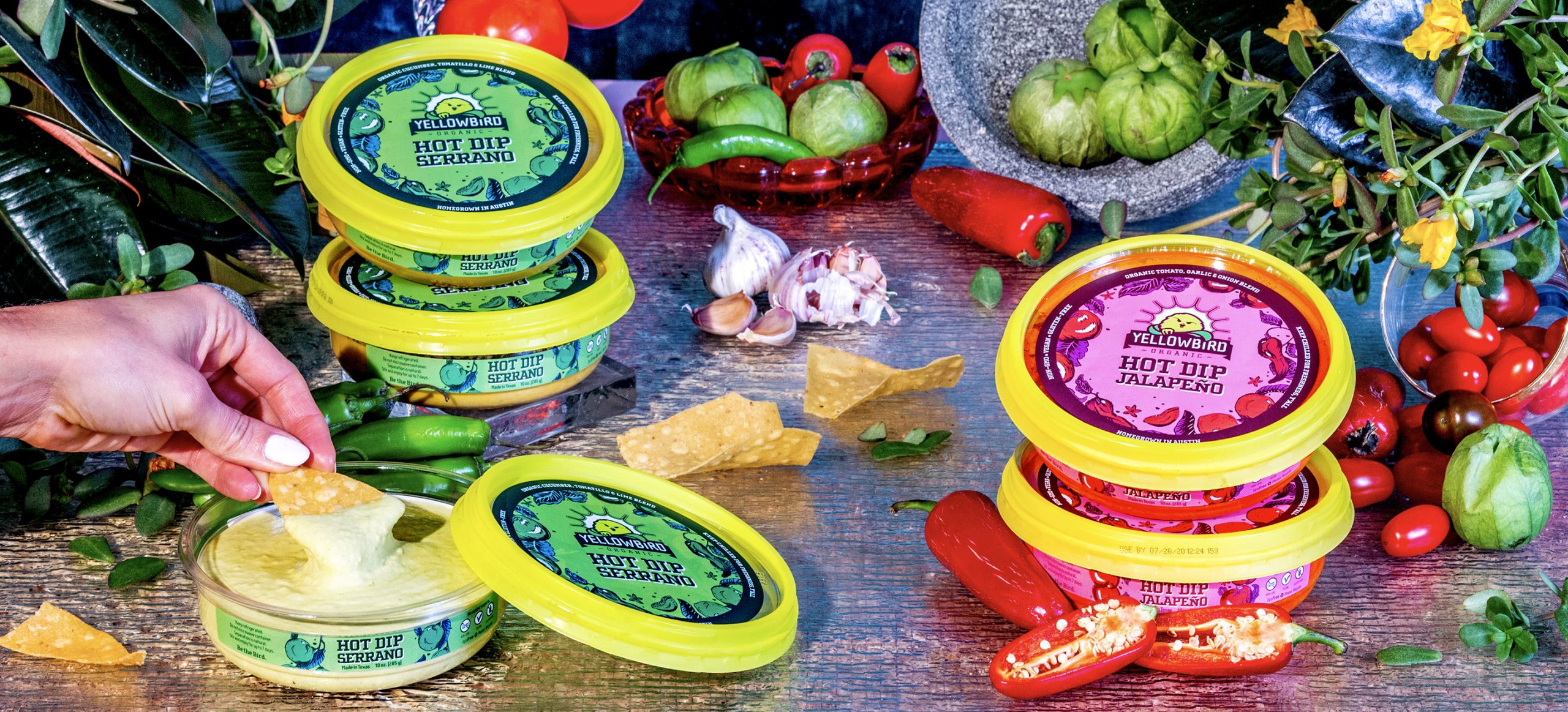
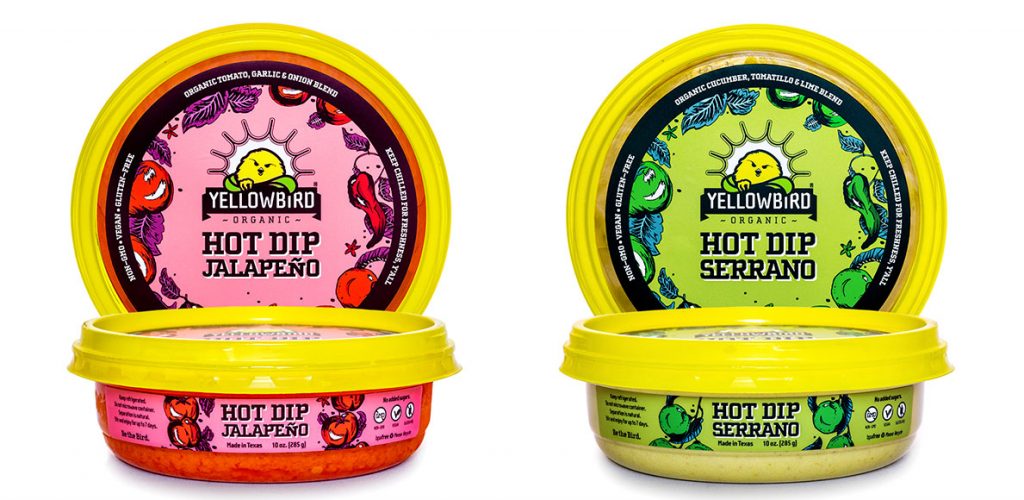
In the summer of 2020, Yellowbird Foods made its dip debut at Whole Foods Market nationwide. Made with 100% organic ingredients, Hot Dip’s visual identity took a lot of cues from the Yellowbird’s Whole30-approved organic sauce line that launched early 2019. With illustrations of fresh garden veggies and vibrant colors that pop right off the shelf, Hot Dip is the perfect addition to the nest.

To learn more about the process of this project, you can access my blog entry here: Branding a Product Line  

My team focused heavily on the journey our condiments take: from the pepper farm, to our kitchen in beautiful San Marcos, straight to your Friday night feast. Hot Dip’s illustrative direction is primarily inspired by floral prints found on oilcloth. We champion anything that encourages us to play with our food — no matter how messy we get.

Our illustrations are brought to life by a key component of our brand identity: color. Much like our other sauces, color acts to differentiate different flavors of dip. Hot Dip utilizes a mostly-monochromatic, surrealist approach to color. The ingredient illustrations harmonize with the background’s overarching color; however, the radiant leaves interrupt the monotonous monochrome with sparks of unexpected contrasting hues inspired by Sandy Skoglund’s A Breeze at Work (1987). This adds a visual interest that would be lacking otherwise.

We complimented our lush illustrations and unexpected color palette typographically with heavier letter forms as a reference to the thick, rich consistency of the dip.

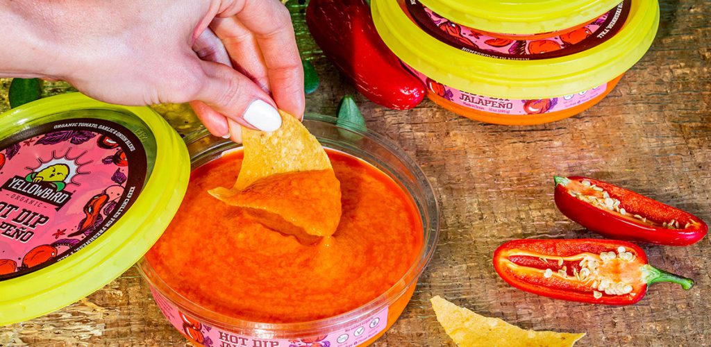
Compositionally, we were driven by the cyclical form of our dip container and used it as a method of story-telling. The lid has a border of fiery ingredients arranged in a circle to reflect on our commitment to holistic and clean nutrition. The Bird peaks out from his garden of fiery produce to challenge our Flock to think beyond the chip. Hot Dip is a journey. Once you buy it, you embark on an experience that’s hotter than a pedicab seat on a summer day. When you open your first tub of Hot Dip, the inside lid surprises you with a literal wave of flavor. It encourages you to dip, dunk, and drench any food to make it infinitely yummier. Make sure to put down an oilcloth — things are going to get messy.

BLOG POST
Want to know more about this project?
For additional animations, web content, and more insight detailing my design thinking, visit my blog post, “Branding a Product Line.”

Anniversary Series

Happy Anniversary Series

The Happy Anniversary Series is a collection of looping animations designed for a private client. The initial scope of work was to create a looping GIF celebrating work anniversaries for each month the company’s employees were assigned to work from home during the COVID-19 pandemic. Over the course of nine months, our team developed 24 concepts and 10 final looping animations spanning March through December of 2021.

Each month, I made it a point to learn a new skill in Adobe After Effects. My favorite part of the final reel is seeing how far the production quality has come from its humble beginnings in March.

There were a few items we had to keep in mind starting out. The client’s brand standards dictated the shape of the cake and the colors we were allowed to use in the illustrations. Fortunately, their color palette was expansive and their design direction was minimal for the series. However, it was incredibly important to the client that each month portrayed the seasons as accurately as humanly possible. In the initial stages, we spent days researching seasonal fruits, vegetables, and flora in the Farmer’s Almonach until we had a total of 24 concept sketches to pitch. Each concept featured a real cake made from fruits and vegetables that were in season for their corresponding month. The background also featured flora in bloom at that specific point in the year. Once we had our concepts fully fleshed out, the client narrowed the scope until each month had a single course of action.

This series was particularly special to me because it helped me steadily grow as a motion graphics designer. Each month, I made it a point to learn a new skill in Adobe After Effects. From learning a basic rain effect in April to manipulating different warp and light settings to create a dramatic heatwave in June, I was able to expand my toolkit along the way. My favorite part of the final reel is seeing how far the production quality has come from its humble beginnings in March.

Power BI eBooks

Power BI eBooks

Microsoft approached Affirma Consulting looking for a series of five eBooks advertising different unique selling points of PowerBI—each speaking to independent user experiences. One of the main goals of the project was to develop final InDesign and PDF files that offered an interactive experience that was certified as entirely accessible.


10 Reasons Customers Choose Power BI

VIEW ACCESSIBILITY REPORT

I considered it a great privilege to go through Microsoft’s Power Platform design standards and create this series with my Affirma team. It was a joy building an innovative design system for these eBooks off of Microsoft’s established regulations. Because my team wasn’t a group of Microsoft employees, I found that gathering resources to build the books was an interesting process. We weren’t given an excessive database of assets at our disposal. A large part of the design process was sourcing existing imagery from different nooks and crannies of Microsoft’s website. I found myself pulling iconography and illustrations from the PowerBI website and generating my own—mimicking the different styles. What I couldn’t pull from Microsoft, I sourced from licensed stock photography I Photoshopped to match the predetermined look and feel. By the end of the project, I had my own asset library of different photography, iconography, and illustrations. I felt it was important to have variety and not lean on one form of visual because the stakeholders were looking for something new, exciting, and inclusive—all while following brand standards.

Microsoft’s heavy emphasis on accessible content ensures everyone can interact with their brand. This practice opened my eyes to new ways of communicating with a broader audience. I found new marketing opportunities I hadn’t previously considered as a designer.

Designing in an interactive space that must be 100% accessible presents several challenges when it comes to layout and type design. Across all eBooks, I made type contrast, legibility, and flow a key priority. This was mostly to cater toward individuals that live with some sort of visual impairment. I spent additional time and care to provide alt. text describing images and infographics, as well. This practice opened my eyes to new ways of communicating with a broader audience. For example, in “10 Reasons Customers Choose Power BI,” I wrote alt. text for ‘2021 Gartner Magic Quadrant’ that interpreted the chart’s data and leveraged Microsoft’s positioning over their competitors. This offered a marketing opportunity the majority of the audience wouldn’t typically see. Additionally, I wanted a beautiful layout that could easily translate to a plain-reader view for those with cognitive impairments that have difficulty determining reading order. Microsoft’s heavy emphasis on accessible content ensures everyone can interact with their brand, not just a select few.

This project was an enriching learning experience for me as a designer. Initially, it was difficult maneuvering Adobe Acrobat’s recently established accessibility tools. As I familiarized myself with the program’s different capabilities, I found that I had the knowledge to troubleshoot any PDF and prepare it as 100% accessible–not just this series of eBooks.


Drive Your Data Culture

VIEW ACCESSIBILITY REPORT


Power BI + Azure Synapse

VIEW ACCESSIBILITY REPORT


Build Unique Experiences with Power BI Embedded

VIEW ACCESSIBILITY REPORT


Data culture maturity roadmap: Five steps to build a data culture

VIEW ACCESSIBILITY REPORT