Paul Peck Gallery Exhibit
The Project Scope
My favorite course so far during my master’s degree has been my Exhibit Design class. When I was studying design during my undergraduate degree, I had taken an Environmental Graphic Design course that focused on exhibit design and placemaking. It was a lot of work, but I truly enjoyed it. Because the undergraduate course had such a heavy focus on design, we didn’t have the time to cover any of the logistics that go into getting the design approved and implemented, though. This master’s class gave me the opportunity to learn more about curating and storytelling—two things that were heavily lacking in my prior knowledge.
Over the course of the term, my class was tasked with an overarching project to design an exhibit about liberty. On week one, the scope seemed relatively simple. We’d define liberty, suggest a few works we felt connected to the theme, and we’d hang them in Drexel’s Paul Peck Gallery. By week seven, my class realized that the project was much more difficult than we had anticipated.
We all had different definitions of liberty, and each of us wanted to focus on a specific historic example. My professor was inspired by the American Revolution, while others of us were inspired by the Suffragettes and liberation on a global scale. The scope of the project was too wide, and we only had three weeks to finalize our pitch for the exhibit.
To fix this issue, our class was divided into two groups: 17–18th century, and 19th–21st century. Each group would have to create their own pitch for the space as the final project.
My group was tasked with designing an exhibit for the 17–18th centuries. We were given a few weeks to complete the project, meaning that we had to decide on our narrative, pick our pieces, write copy, and create a cohesive identity for the exhibit. The only thing we were given, was that both exhibits would be titled, “Art & The Concept of Liberty.” It was a tall order, but there were seven of us working on the project, so it felt feasible. We had five writers, an editor, and I acted as the designer. We weren’t given a budget for the project, so all existing pieces of art were considered fair game. The goal was to pitch an exhibit that could be edited to work for Drexel at a later date.
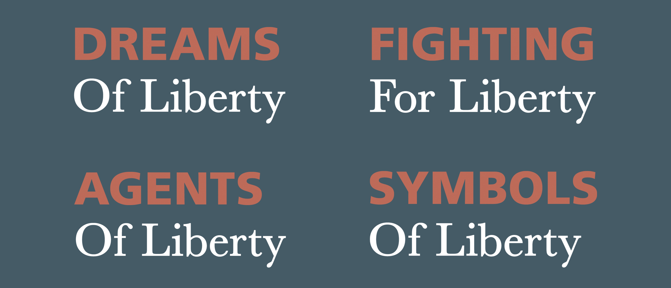
We started the lengthy process by taking a long list of possible art pieces and categorizing them. We wanted to be very abstract with how we classified them as an effort to make the exhibit less controversial. Because everyone has a different concept of liberty, we didn’t want to place the art in a restricted metaphorical box that would only fuel argument. We settled on: Dreams Of Liberty, Agents Of Liberty, Fighting For Liberty, and Symbols Of Liberty (specifically in that order). These categories worked as a loose narrative for us. People dream of freedom, key agents fight for it, and once it’s achieved, we respect the symbols that represent freedom, and those who gave their lives for us to have it. From here, we narrowed our selection down to a few key pieces for each category, and our writers started to generate copy for the narrative that would be displayed among the chosen work.
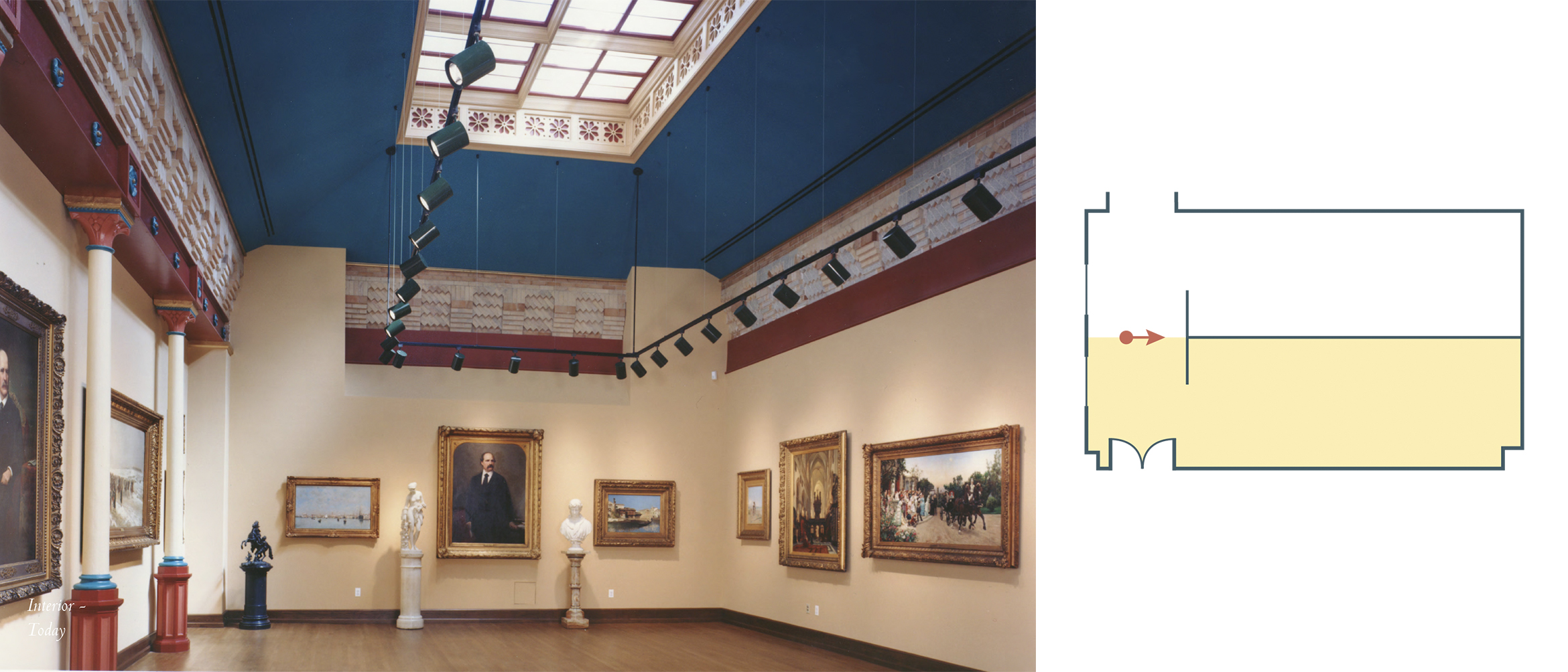
As the writers and editor got to work on the copy, I decided to visit Drexel’s Paul Peck Gallery and work with its blueprints to fully understand our design options. I was given very little information, but there were a few things I knew. The gallery was small, and we had exactly half of the space to work with. Both groups were told we had to share the room, so I needed to figure out how the space should flow, and were I wanted to place the front. I knew that the Paul Peck Gallery could not be painted, and that temporary walls were used to hang temporary pieces, as well. These restrictions informed a lot of my design decisions.
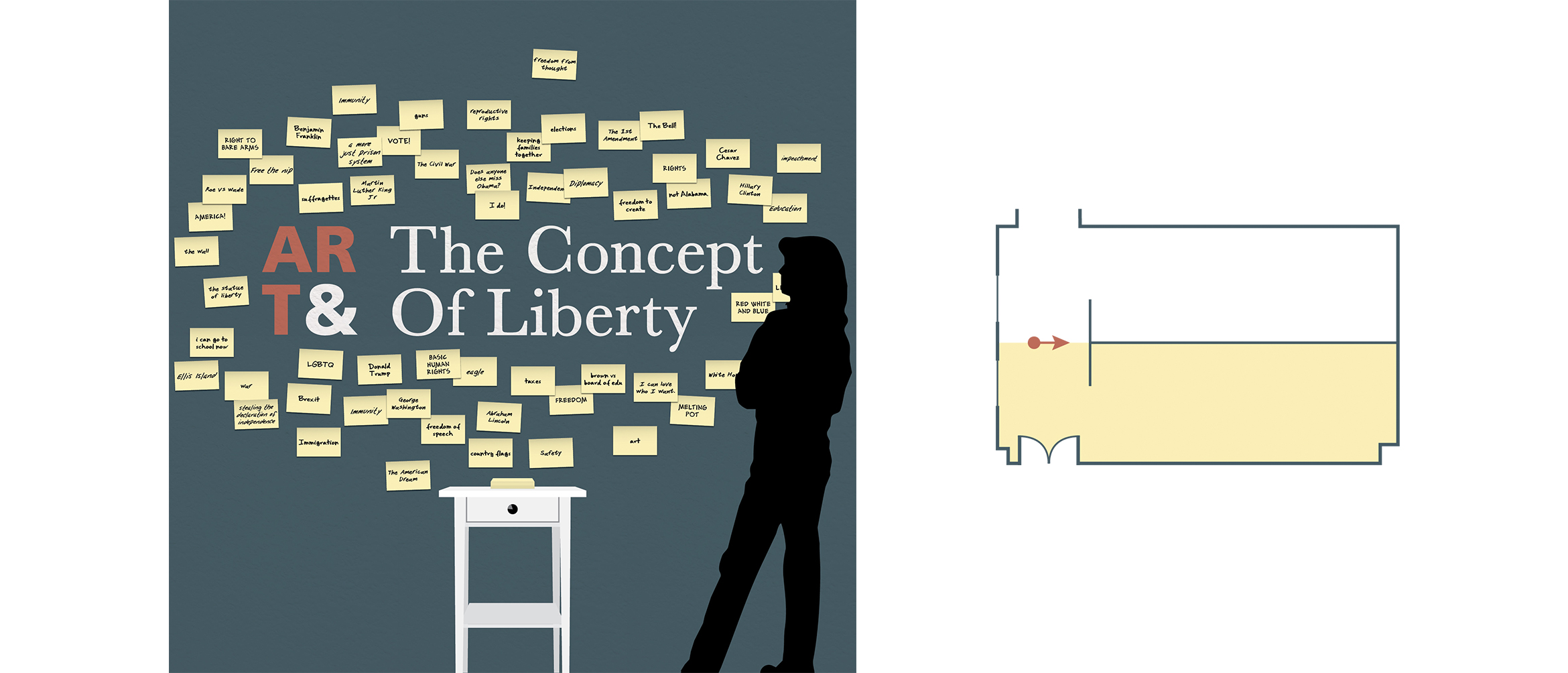
I was recently inspired by a speech I’d heard from Nina Simon, who expressed the importance of connecting and interacting with your audience when you build an exhibit. Still running off the high I got listening to her talk, I was inspired to add an interactive element to the space. This also influenced the way I divided the room. Because the Paul Peck Gallery uses temporary walls, I thought we could bisect the room laterally two walls creating a ‘T’ shape. This would give us a front end to the exhibit that would put the ‘Dreams Of Liberty’ section directly in our visitors’ sight lines. Once I settled on a typographic mark for our exhibit’s name, I brainstormed interactive solutions for the front end of the exhibit.
I kept thinking back to the fact that each student in my class had a different concept of liberty that was directly related to who they were and what their experiences were as an individual. My class isn’t an anomoly, however. Everyone has their own perception of what liberty and freedom is. What if we gave them a space to share their thoughts and start a larger conversation? After all, it’s what we’d been doing all term!
The front of the exhibit is a large temporary wall covered in a muted teal vinyl adhesive. This solution doesn’t damage the wall, but still gives our exhibit a pop of color. The wall would have a small desk placed in front of it that compliments the room’s original architecture. A 6×4″ pad of sticky notes and a marker will sit atop the desk, with extras inside its drawer. Each person will be prompted with the question, “What does liberty mean to you?” though not everyone will agree with all the answers placed on the wall, they will be aware of their communities thoughts and encouraged to have a larger conversation.
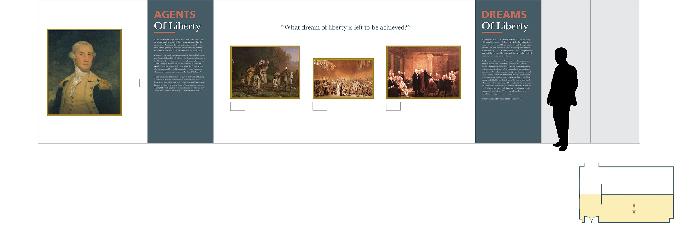
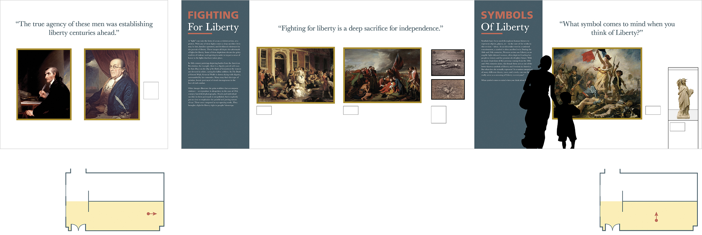
Each section of the exhibit was separated by vinyl wall decals that extend the full height of the temporary walls. Once our writers finished creating content that tells the narrative of the story, our editor worked to put everything in one cohesive voice. I typeset the copy on the information panels and designed how they’d integrate within the space. It was important to communicate the narrative before looking at the pieces included, so I decided to treat them as section dividers. To break up the space and add further visual interest, I included vinyl die-cut quotes that were placed above the pieces. Some were thought-provoking quotes, and others were questions that could influence the conversation at the front of the exhibit on the interactive wall.
The Visual Identity
As I mentioned before, working with several restrictions influenced my design solutions greatly. My color palette was immediately taken from the colors already existing in the space. I didn’t want to use colors that weren’t appropriate for the pieces we included, and luckily for us, they shared common hues with Drexel’s Paul Peck Gallery. Due to this restriction, I worked to find other ways to add visual variation to our exhibit. I felt that typography was a great way to accomplish this.
In the exhibit, we focus on key events and figures like America’s liberation from Brittan, and our founding fathers. Though the writing we included for the narrative had more of a contemporary feel, I was itching to use Baskerville. How could I not?! The typeface invented by John Baskerville and embraced by Benjamin Franklin had to be featured in an exhibit celebrating liberty in America.
I did want to offset it with a more modern sans-serif typeface, though. The classical nature of Baskerville is absolutely lovely, but I worried about making the exhibit look dated to a certain extent. To offset this, I combined it with Frutiger. Because Frutiger is commonly used in the signage and wayfinding in airports and train stations, I consider it to be the official typeface of transportation. I thought it worked as a visual metaphor—speaking to America’s journey to a liberated future. Its geometric nature also compliments the delicate, friendly letterforms in Baskerville; ultimately, modernizing the typography.
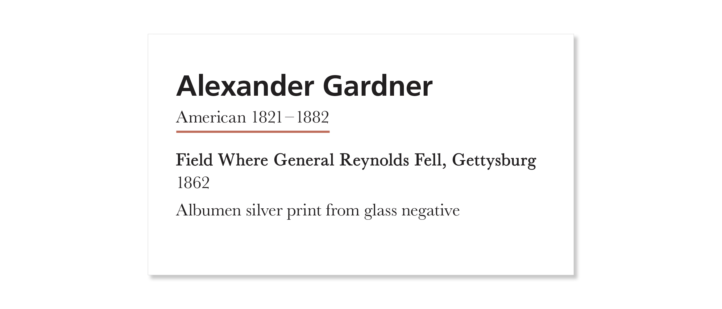
Though we didn’t have a lot of time to put our pitch together, I was proud of what we were able to accomplish. My knowledge from my undergraduate course on Environmental Graphic Design influenced my approach to this project greatly. I feel that it gave me the tools I needed to create a holistic final design that incorporated individual aspects of both courses. Moreover, I loved that I didn’t work with designers on this project. In my undergraduate course, it was so fun to hear the perspectives of other designers and watch our project elevate visually. In my graduate class, the process was different. It was rather interesting because my team’s primary focus was on the content. They were more concerned with the curating and logistics of the project than they were about any color decisions I made—let alone the typeface I chose. It required me to adapt to a team dynamic I’m not used to, and it gave me a different perspective as I moved through the design process.


