Help Me Excel Logo Design
Following my graduation last spring, my Uncle Jamie approached me with a project. For a long time, he’d worked as a financial consultant, and he’d finally made the decision to launch his own website: Help Me Excel. There was one caveat, though. He needed a logo.
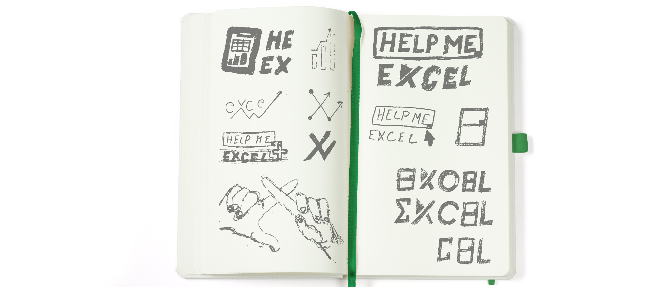
When we had started the project, there were a number of things we discussed. We wanted Help Me Excel to have a fresh appearance and feel different from its competitors. Taking a new visual approach is always risky, so I developed a number of concepts that felt relevant, but not always inspired by the financial nature of his business. First, I had experimented with cues I’d taken from Microsoft Excel since that’s Uncle Jamie’s go-to tool. I was particularly inspired by the rigid grid within the program and looked for ways to integrate its essence into a modern typographic design. I also went with an approach that was less obvious. Since the slogan for the website is, “Saving lives with Excel,” I wanted to create designs that speak to the helpful messaging, without seeming too tied to the idea of finances.
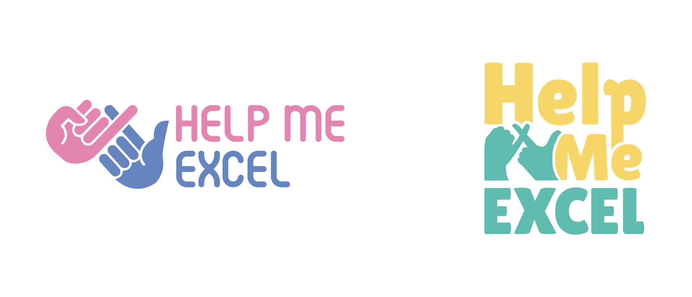
My first round of concepts focused on the idea that Help Me Excel is your ‘helping hand.’ I found that your hands could create an ‘x’ and ‘l’ shape which might act as a fun visual reference to the actual name. At this point, we were also inspired by tropical color palettes because it was unlike anything we had seen in this industry, and he was drawn to the bright nature of the colors.
Introducing a fresh color palette can differentiate you from your competition, or alienate you from your subject matter. It’s a fine line to walk, and it was important to me that we did it right.
Ultimately, there were a few issues with these designs. The pink and purple option didn’t provide a clear read on the hand gesture and its color palette felt more appropriate for a health care service, in my opinion. The yellow and teal option was funky and read more legibly, but it was at this point that we realized utilizing finance-driven imagery might convey the purpose of the company more effectively.
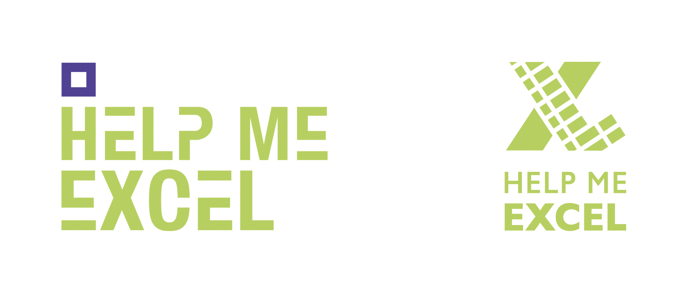
The second round of concepts was inspired by the grid in a Microsoft Excel document. It has a very distinctive form—made up of long cells that are immediately recognizable. These two designs were ultimately more contemporary in nature and gave the logotype a geometric modernism that was missing in the first round of concepts. It felt more masculine but still friendly.
The first design cut into the letters in a way that resembled the cells of an Excel document, without sacrificing the legibility of the name. Though I felt it was a successful design, Uncle Jamie was particularly drawn to the second option that featured an ‘XL’ shape. I integrated the grid pattern into the letters without interrupting their overall silhouette. It was a quick read, and we both felt strongly that this design had the most impact…but the color was all wrong.
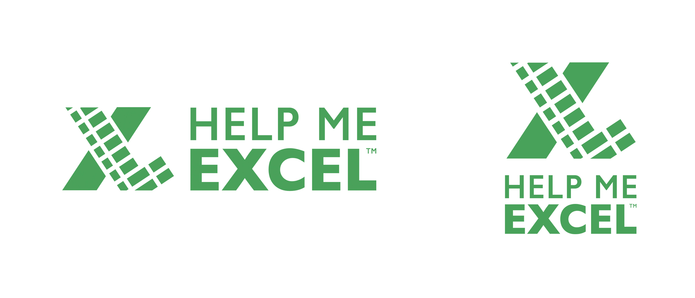
During the revision phase, I worked to refine the type in the mark, tightening its overall presence. It was important to me that I made the logo versatile so that it could work within the website for any screen size. It had to be responsive — moving from a single mark, to a vertical, and then horizontal orientation.
I also fought with color palettes. I knew that the tropical color route wasn’t right for this project — it was random, and lacked any connection to the financial sector. I needed a strong green that wasn’t a carbon copy of what Google Sheets or Microsoft Excel had chosen. In the second round of concepting, I loved the jewel-toned purple I had chosen for the first logo. Obviously, I couldn’t make the Help Me Excel logo purple, but it drove me to pursue jewel-tones. In my research, it seemed that no one else had gone this route, so it felt unique to Help Me Excel. This path also helped me to develop a cohesive palette for the brand.
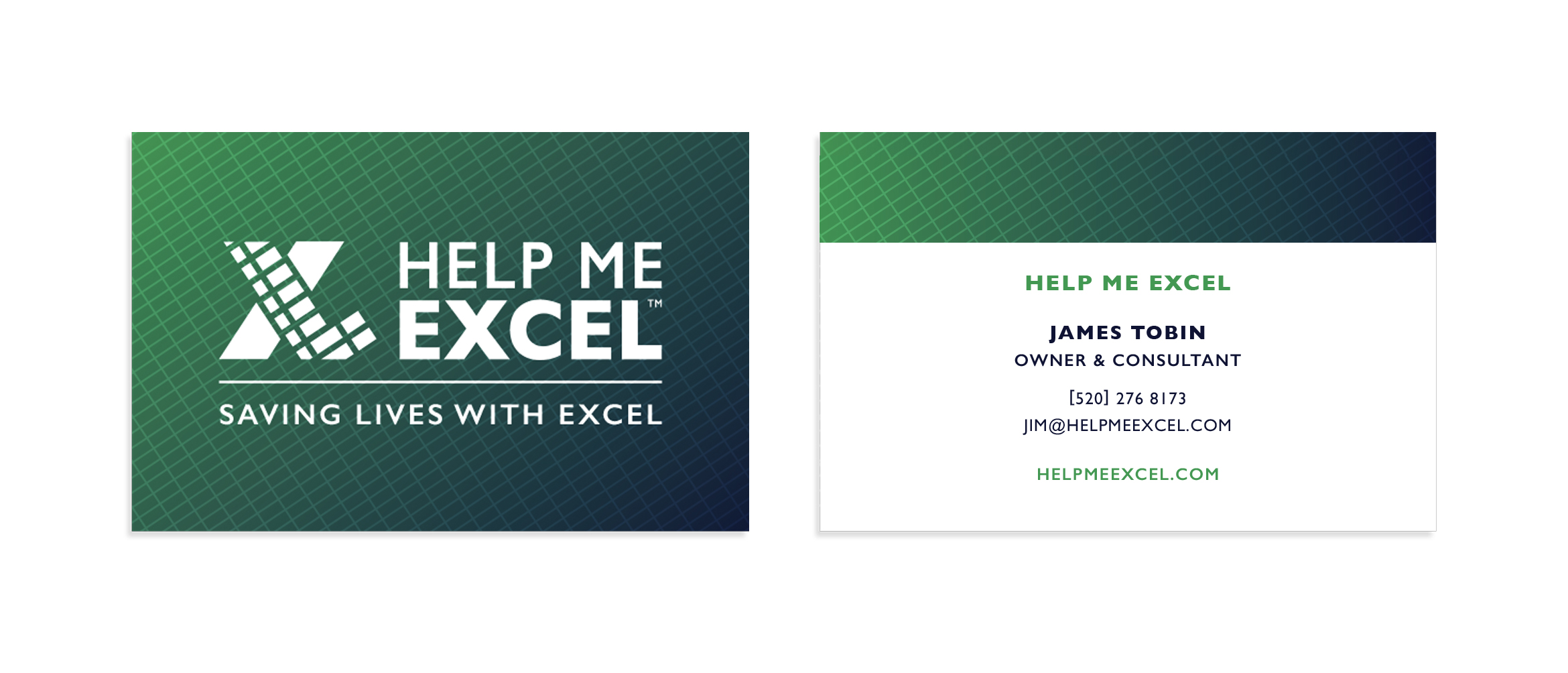
Once I had finalized the mark for Help Me Excel, I got into one of my favorite things: brand building. I love creating a story for the visual identity and supporting the logo with carefully chosen type living within a cohesive color system.
I’ve been saying for years that gradients are coming back to the design world—and for years my peers and coworkers called me crazy. The second Instragram rebranded and releaseed their new logo, gradients came flooding back into the mainstream. I was all too excited about this, and jumped on the opportunity to use them again.
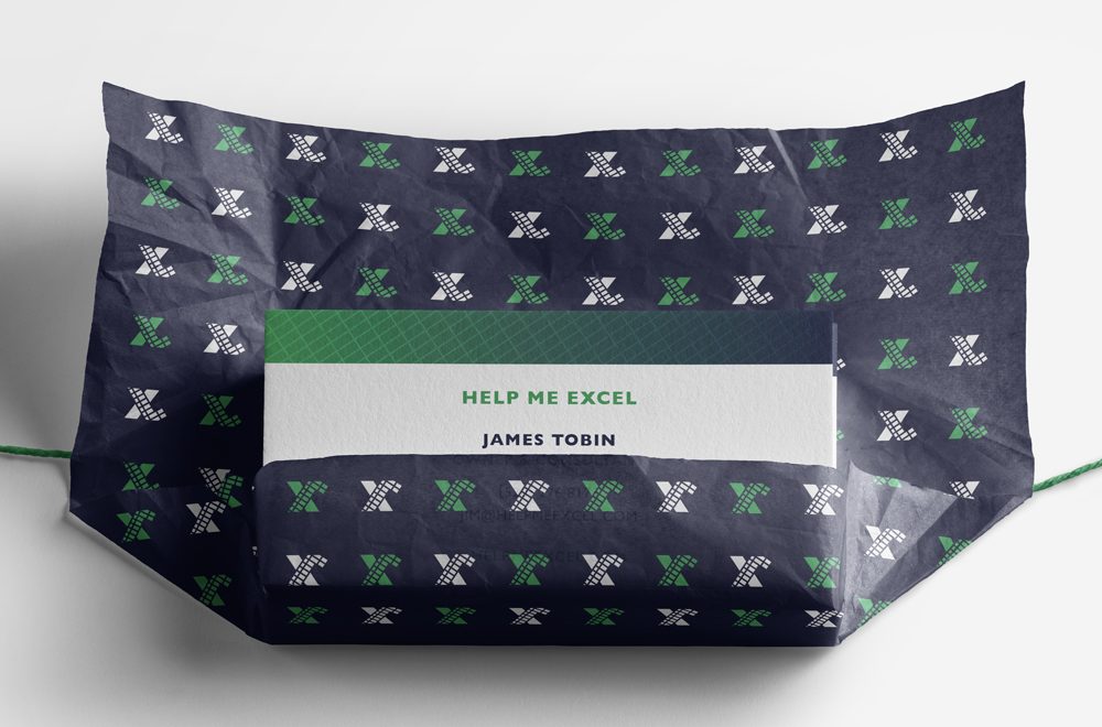
For Help Me Excel’s brand identity, I used a deep navy and the green I worked so hard to decide on. The gradation between the two hues was beautiful, but I still wanted to integrate the grid into the color space. When I designed Uncle Jamie’s business cards, I used both the grid and gradient together. It created a high-contrast space that pushed his mark to the foreground.
I also typeset his brand in Gill Sans. The letters themselves have such a sturdy presence, and it’s honestly a classic. Not only that, but when I thought back to how this project started, Uncle Jamie made it a priority to communicate the helpful and friendly nature he wanted Help Me Excel to have. The humanist styling of Gill Sans makes his brand feel welcoming and helpful with its rounded geometry.
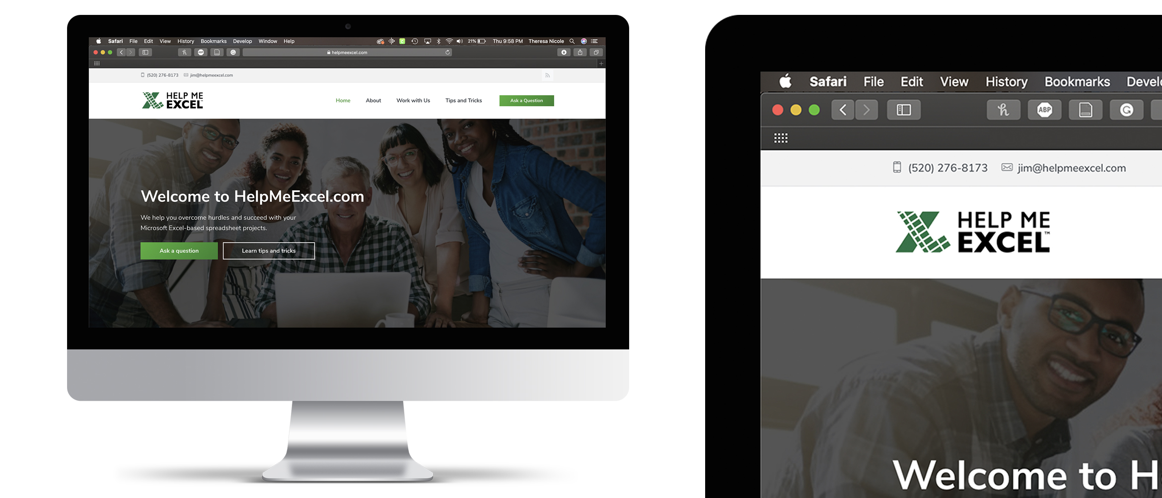
Developing the logo for Help Me Excel was one of the best early learning experiences I’ve had. I’m so lucky that one of my first freelancing projects was with someone I love and trust so much. It helped me understand the creative process between the designer and client much more intimately than I had experienced while working within a company. Now that I’m freelancing more, I feel comforted that I could figure the process out with my family before developing my business relationships.


