When I was designing my first pictorial logo for 4Sight Frames, a fictional company I was assigned in my Visual Communications 2 class, it ended up being a long, drawn-out process. Typically, creating a logo for the company was a two-week process for me, but my pictorial logo was entirely different. I’m sure this had a lot to do with how I chose to market the brand; however.

4 Sight Frames is a company that needs to target both parents and children when it comes to marketing. The children have to want the frames, as well as the parents. I’ve noticed that young children sometimes have trouble keeping their glasses frames from getting misplaced, or broken, or both. My solution to this problem is to create frames that kids actually want to wear. 4Sight produces frames featuring your children’s favorite Saturday morning cartoon characters. Sure, to adults the child will look a little silly, but the child won’t want to take them off! In the end, that’s what really matters to the parents as well.
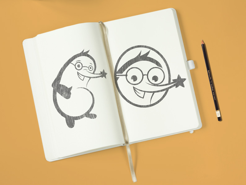
I felt that if I were to create a logo that featured zero type or abstractions, I might as well make a friend. I created a star-nosed mole named Simon. He wears glasses, and he’s radical! He’s a friend and a role model marketing toward children. To give him the perfect look where he appeals to kids while still looking professional was a thin line to walk. It took six weeks of revisions to come up with the final product, but Simon has never looked so good.