


REDWOOD CAMPUS
CAMPUS BRANDING & COLLATERAL
ART DIRECTION / BRANDING / WAYFINDING / ILLUSTRATION
A technology-focused research institution approached Affirma asking for a cohesive brand identity for their Redwood-based campus. Their parent branding was starting to feel a bit stale, and they wanted something fresh, vibrant, and fun to accentuate their research facility. To achieve this, my team created an expansive brand system that continues to reach different areas of their touch-point collateral.


As COVID-19 restrictions lifted, Redwood leadership was looking for a brand refresh to greet employees as a ‘Return to Office’ gift. We provided a detailed brand guide along with a print collateral package (postcards, stickers, fliers).
Pleased with the branding, the client employed Affirma as their official design team. We support their brand development, event design, digital assets for promotion on social media, presentation templates, swag, poster & signage design, animation, and more.


During initial branding discussions, our stakeholder wanted to pull away from using the natural PNW landscape as a point of inspiration. They were disinterested in earth tones and tree motifs. Understanding that the client is an industry disrupter looking for an innovative and eye-catching solution, we referenced loud art movements with electrifying color palettes. Our design team was particularly drawn to ’60s psychedelic rock posters because they featured vibrating colors and expressive typography.

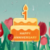
Redwood Campus is bustling with daily events, perks, and promotions for their employees. To ensure they get the word out, my team has created a versatile template for quick advertisement designs to be broadcast across campus. In line with Redwood branding, this template library includes layouts in a number of colors and compositions to fit your every need with designs that feel fresh every time. To implement this new system, we hosted multiple trainings and provided process documentation for the Redwood team to adopt the design template.
Ensuring our color story provided enough color contrast to pass accessibility standards was an early challenge for our team. The saturated colors in this design system had to be revised multiple times due to their vibrating color assimilation.
SUB-BRANDS

Munch Bunch
The Munch Bunch is a monthly group lunch for new-hires on campus to connect. Nostalgic and whimsical visuals support this brand system.

Holiday Bazaar
With the days getting shorter in the winter, the Holiday Bazaar is your chance to explore a vendor lineup at the end of your workday.

Resource Fair
This event is for employees looking to join a community within the Redwood Campus. The theme is, ‘Community soaring’.

This continued engagement is an excellent demonstration of the wide breadth of skills the team is capable of. We created a design system that was so versatile, it has covered over 200 individual assets and counting. The branding remains fresh, engaging, and strong. We’ve worked on a number of projects ranging from branding, print/production, web, illustration, animation, video production, and more. From start to finish, we always maintains a steady timeline with room to spare.
My team prioritizes accessible and effective visual design. Ensuring our color story provided enough color contrast to pass accessibility standards was an early challenge for our team. The saturated colors in this design system had to be revised multiple times due to their vibrating color assimilation. Our advanced knowledge of color theory allowed us to navigate this challenge and achieve the best of both worlds: a design system that’s exhilarating and touches everyone at the research campus.
LET'S CONNECT
If you have a vision, let’s pair it with my flair for design! Feel free to send me an email to learn more about my experience, freelance rates, and availability.