The following is a program I designed as a Creative Enterprise assignment for my Master’s Program. It is, in no way, an extension of AIGA’s mission and should be viewed as an academic hypothetical.
ABOUT THE PROJECT
In my Creative Enterprise course, we were tasked with creating a new program or company that solves a problem. For me in particular, it was important that I find a way to continue my research and practice in the graphic design industry, while also learning about the business behind the scenes. I dug through various journals looking for issues in the industry, but one study I found truly struck a chord with me.
70% of graphic design students are female; however, 89% of creative directors are male.
This isn’t an anomaly! In my graphic design program’s graduating class, we had maybe ten men out of fifty students. Why was there this wild misrepresentation? And how could I fix it? It was through this thought process that xHeight was born.
Generally, in the workforce, women are under-represented. Typically in the visual arts, men aged 40+ are considered leaders in the industry; there’s just one issue with that statistic. The graphic design industry holds a majority of women aged 40 and under. In this case, the minority have the loudest voice. xHeight is a program run by AIGA that tackles this problem at a local level. The initiative would start locally in the tri-state area, and expend outward after some measurable success and stability. It gives women a platform to network, celebrates their work, and shares their thoughts on design thinking. It’s an empowering initiative for women in design.
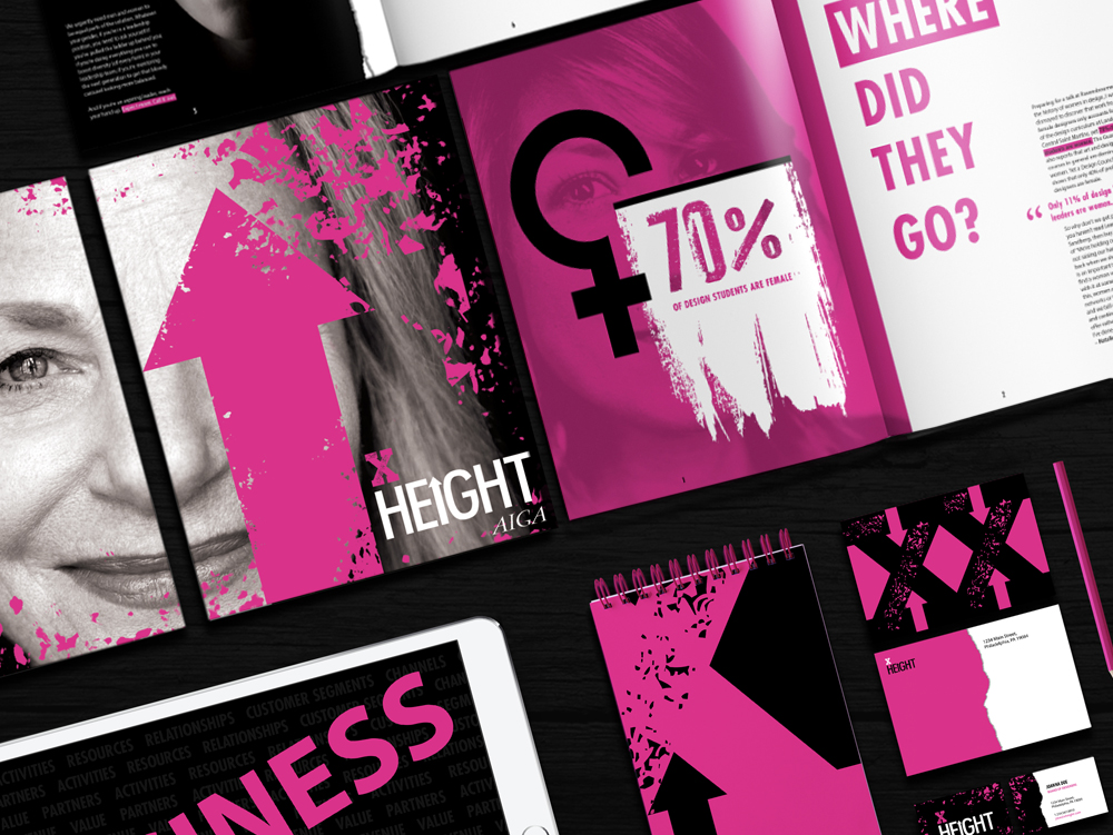
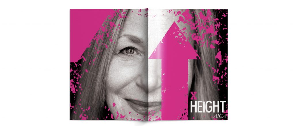
The name xHeight is meant to be a typographic pun. Aside from being the distance between the baseline and the midline in a line of type, it references the fact that women have an x chromosome. The word ‘height’ is used to imply that the sky is the limit in terms of our careers. Because the name is based on a typographic phrase, I wanted the logo to reflect that.
I had experimented with press-style slab serifs but didn’t like the masculine nature it came with. It felt too much like something from the wild west, and less like a contemporary movement. I settled on this treatment because it gave the ‘x’ a sticky ink appearance that would come from an old printer. ‘Height’ is spelled out in a condensed version of Futura as a nod to contemporary type treatments AIGA tends to use in their branding. I also chose to keep the x lowercase to stay true to the name.
After designing the logo, I wanted to make it come alive with an animation. After all, motion triggers emotion!
I was inspired by a lot of the contracts I was learning about between working freelance and studying in my Law and Ethics course. They all have you sign at the ‘x’. In this treatment, I chose to keep the ‘x’ stationary, but have the word ‘Height’ typed out like you would when filling out a contract. I moved the cursor to select the type and delete it in order to keep the animation looping.
MISSION, VISION, & VALUES
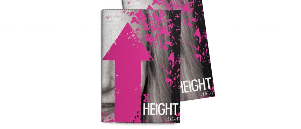
Mission
xHeight strives to create a professional alliance of designers in the tri-state area that amplifies the voice of women by showcasing their work, providing membership programs, and hosting exclusive networking events.
Vision
We aim to create equal representation and opportunity for all within the design industry. We see a future for the industry that fosters a more supportive community and values talent and diversity in the field.
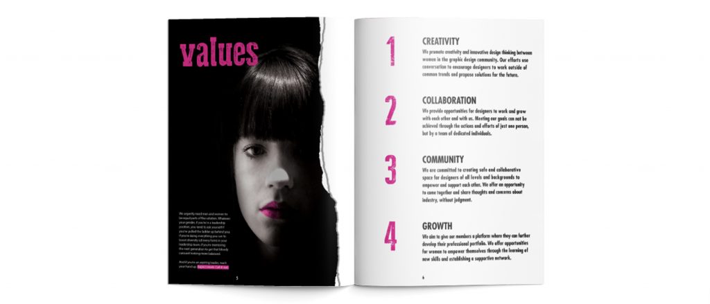
Values
Creativity: We promote creativity and innovative design thinking between women in the graphic design community. Our efforts use conversation to encourage designers to work outside of common trends and propose solutions for the future.
Collaboration: We provide opportunities for designers to work and grow with each other and with us. Meeting our goals can not be achieved through the actions and efforts of just one person but by a team of dedicated individuals.
Community: We are committed to creating a safe and collaborative space for designers of all levels and backgrounds to empower and support each other. We offer an opportunity to come together and share thoughts and concerns about the industry, without judgment.
Growth: We aim to give our members a platform where they can further develop their professional portfolio. We offer opportunities for women to empower themselves through the learning of new skills and establishing a supportive network.

DESIGNING FOR DESIGNERS
I always feel an added weight when you design something for designers specifically. When you’re creating something for the general public, things like legibility reign as a number one priority. They also don’t notice a lot of the clever choices you make. Designers do notice, however. They actively critique whatever you put in front of them – which is a good thing! I personally love that about myself because I think it makes me better at what I do. With that being said, I knew I needed to carefully craft a brand system for xHeight to entice local designers and bring them into its community.
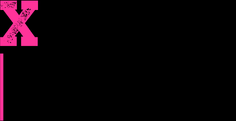
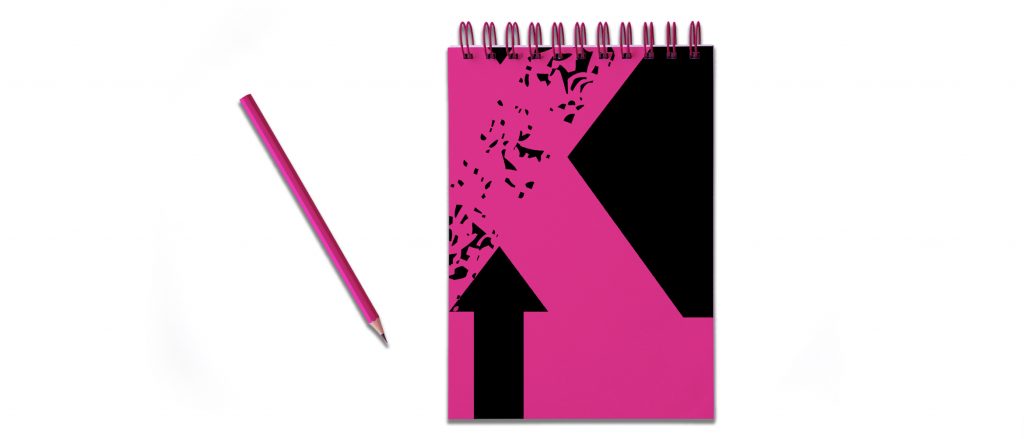
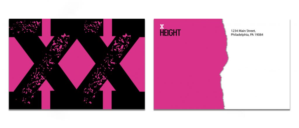
During my pitch presentation for the project, I felt like it was important that xHeight’s brand identity became a key component of the process. I designed a short magazine detailing our problem, the solution, and any supporting information that may be beneficial for a board to look over during the presentation. I also found it necessary to provide examples of marketing pieces (like postcards), and identity collateral the board would be using in the future (like notepads and business cards).
In the design work, I embraced certain forms found of particular interest. For example, the negative space around the ‘x’ in the logo has two arrows – one pointing up and one pointing down. I liked this as a directional motif and carried it into the cover of the brochure, the notepads, and the postcards because it spoke to the height aspect of the program’s name. I was primarily inspired by a mixture of ripped, messy collage work in black and white, with pops of bright pigmented pinks for emphasis. I also used 100% magenta as the brand’s main color due to its feminine nature, and the fact that it’s a core printing color the community would be familiar with.

HOW DOES IT WORK?
The whole purpose of the program is to bring more voices to the table when we’re looking at design thinking as a whole. Listening to design celebrities like Milton Glaser can be incredibly insightful, but he’s not the only game in town. Great ideas can come from the studio down the street from your own – you’ll just never hear them if you don’t strengthen these networks.
We intend to strengthen the local design community through communication.
xHeight will run on a website for local AIGA members to connect through. It’s similar to LinkedIn where you can see what studios are in your area but also acts like a blog. It encourages design companies to share their work locally, and explain their design thinking so others can learn from it. For studios upgrading to Premium Membership, they can view contact information and other exclusives (similar to a Chamber of Commerce portal). Meetings will also be held on a quarterly basis to allow these studios to meet in person, further develop their business relationships, and listen to speakers over food and drinks. As a way to celebrate their work, top pieces will be published in xHeight’s annual design publication (something that will start locally, and expand over time).
For more information regarding key resources or finances, please reference the chart below.
