Branding a Product Line
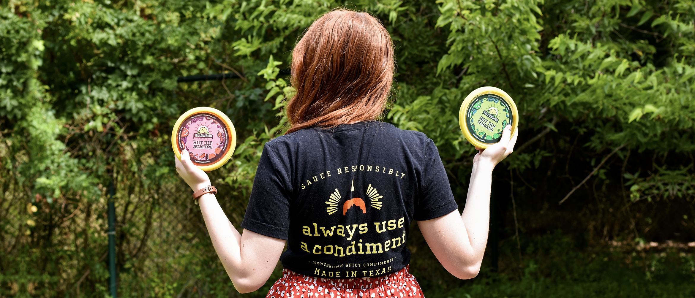
Ever since I was little, I wanted to make art with food. There was something so fascinating about taking something that wasn’t paint or pastel and making art with it. I’d always wanted to design in the food industry, so I considered it was a dream come true to work at Yellowbird Foods as their Graphic Designer. Making art with fresh fruits and veggies, whether it be through photography or package design, scratched that designer-itch I’ve always had. When I first joined the team, all of my coworkers were excited about the upcoming launch of this product, Hot Dip. Apparently, it was this delicious velvety dip based on our sauce flavors. It wasn’t until the Christmas party that I got to try it. It lived up to the hype. We didn’t have packaging for it at that point, and it hadn’t really been branded. It was ambiguous and a totally clean slate. In January, I was amped to see it appear on my to-do list. I’d get to help brand a product line for the first time in my life…and actual human strangers will get to hold it in their hands.
Look and Feel
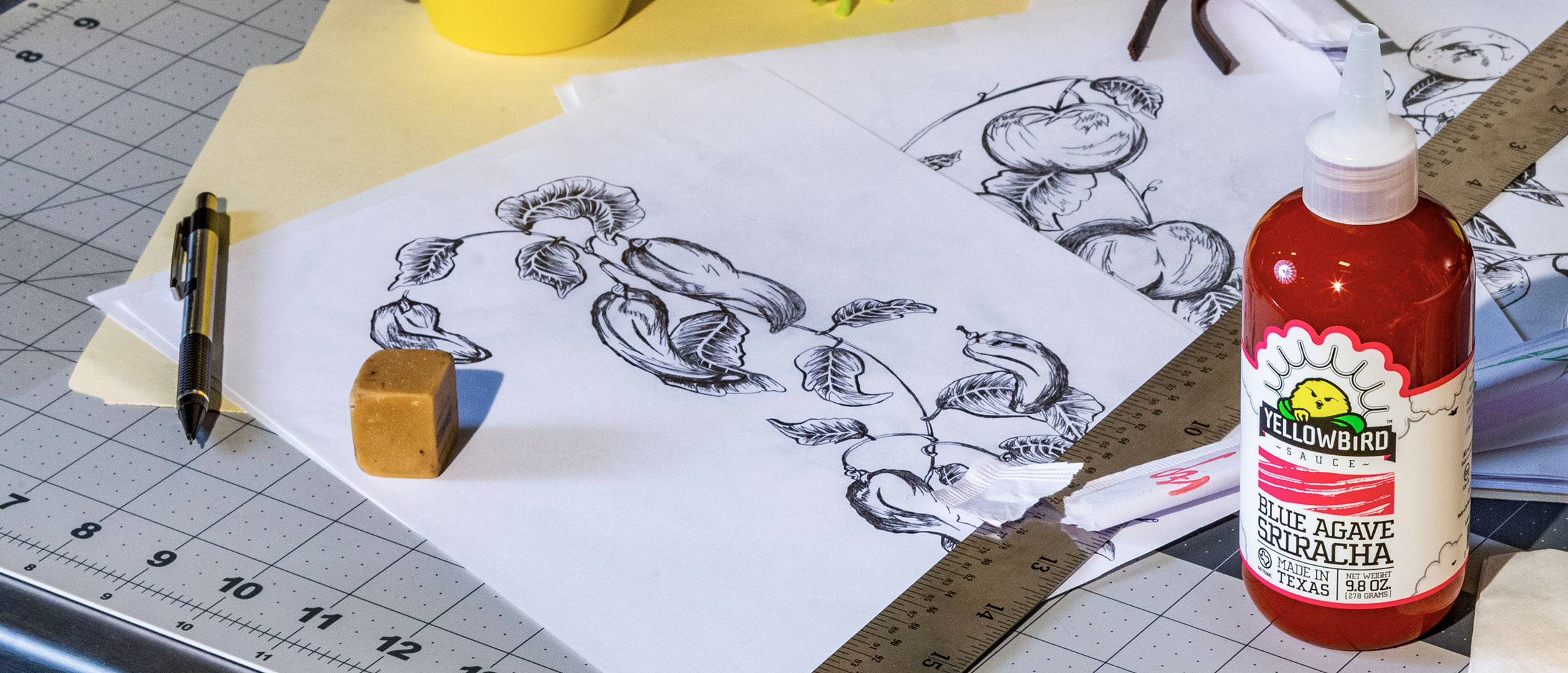
In the early stages, I created a few research collages to pinpoint what kind of look I was most attracted to. I looked at other competitors in the industry, and brands that didn’t really have anything to do with the food and beverage world. I even took a field trip to Whole Foods Market to see what was going on in the wondrous land of hummus and vegan cheese dips. Inspiration is everywhere, I just had to find an idea that was innately Yellowbird. I had a few ideas floating around, that led to me designing three loose concepts: a hand-drawn garden, a lava lamp, and a version utilizing our existing vector graphics. They were each very distinct, but I had a clear bias. The hand-drawn garden concepting was my favorite…and the thought of some stranger at a Whole Foods Market in Nebraska holding my drawings was mind-blowing. The team unanimously agreed on the first concept, and I moved forward building it out.
For a few weeks, I’d worked on and off sketching. I drew habaneros, jalapeños, tangerines, limes, flowers, etc. Any prominent flavors in the dips required a visual representation. I created as many assets as I could, so I wouldn’t feel like I was scraping the bottom of the barrel when it came to finalizing the label composition. I spent a while working in just black and white, moving sketches in a circular arrangement. Once I was happy with my sketch positioning, I addressed typography.
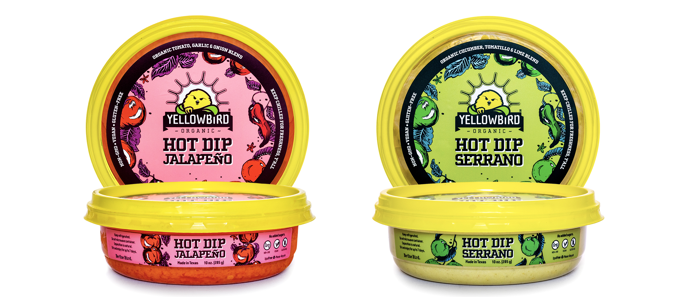
Yellowbird is beholden to the Cholla type family. Everything is typeset in Cholla Slab and Cholla Sans. Our bottle flavor names are typically set in Cholla Slab, Bold and tracked in tightly so the serifs connect. The tracking is iconic for the brand and something that was important to maintain in Hot Dip as well. However, just recently we’d learned that Cholla Slab updated to include a Heavy weight. We set the flavor and line name in Cholla Slab, Heavy to reference the rich nature of the dip. It felt appropriate because it’s thicker than both existing sauce lines.
Once the composition was set, and typography was carefully chosen, I couldn’t avoid it anymore. I had to address color. Honestly, I was dragging my feet when it came to developing color. Yellowbird Original is super minimal. The bottles are white, with black text, and an accent color relating to flavor. Conversely, Yellowbird Organic is ALL ABOUT COLOR. The labels feature colorful paintings on a colored background. They’re vibrant and completely different from the original line. I knew Hot Dip would fall under the Yellowbird Organic umbrella, so I knew it would be more color-forward than the original line. I struggled to find a way to make it feel unique though. If I colored the illustrations accurately, it would look too similar to the sauces. My first reference point was oilcloth designs. I loved the approach to shading, and it felt very reminiscent of our branding.
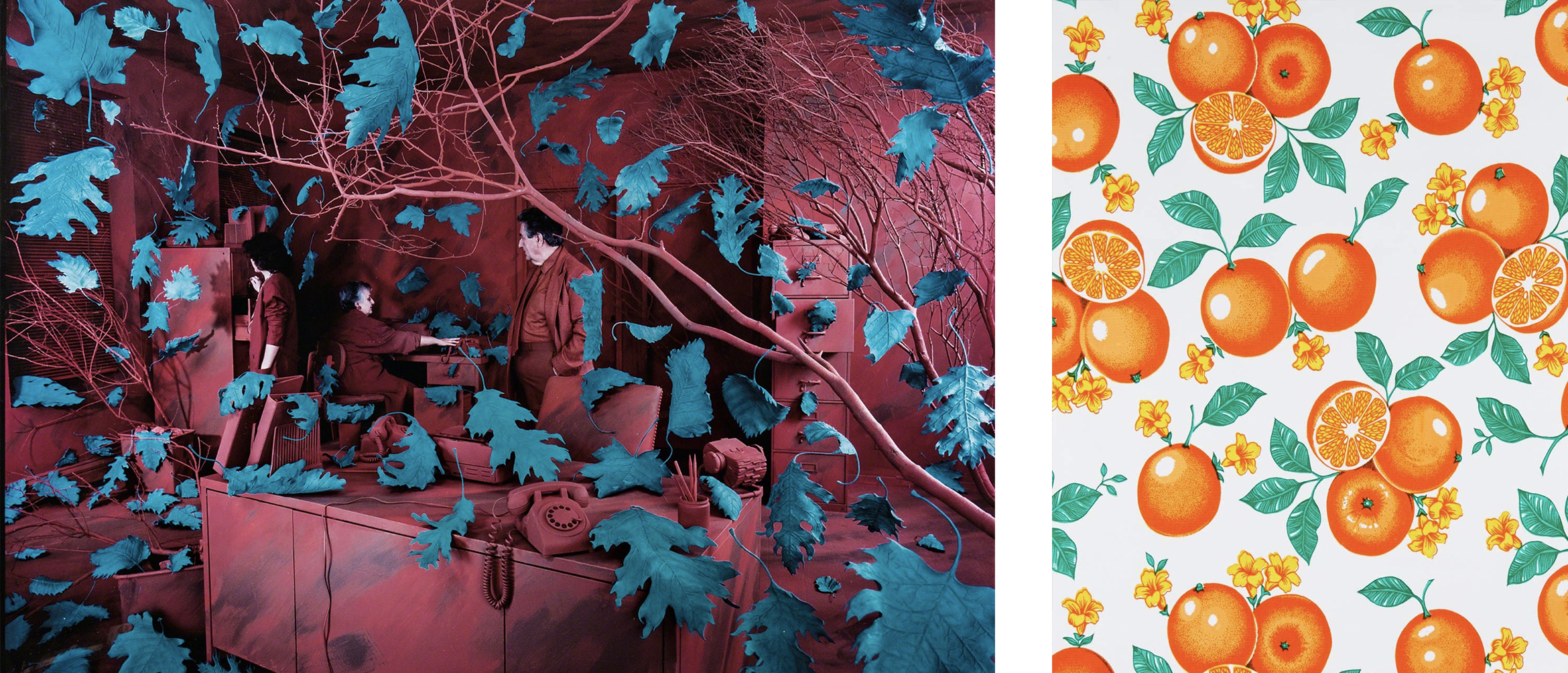
I changed the colors on Hot Dip Jalapeño one hundred times before stoping and reflecting on what I knew about color theory. I remembered a piece of surrealist installation art by Sandy Skoglund that immediatly brought everything into perspective. Her A Breeze At Work (1987) puts a forrest in the middle of a mundane office scene. That in itself is super creative, but her approach to color is what really stuck with me. The leaves on the trees were blue. There was this monochromatic scene that was visually disrupted by these large blue leaves. This was the exact approach I wanted to take to seperate Hot Dip from not only Yellowbird’s existing lines, but from other refrigerated dip competitors, as well.
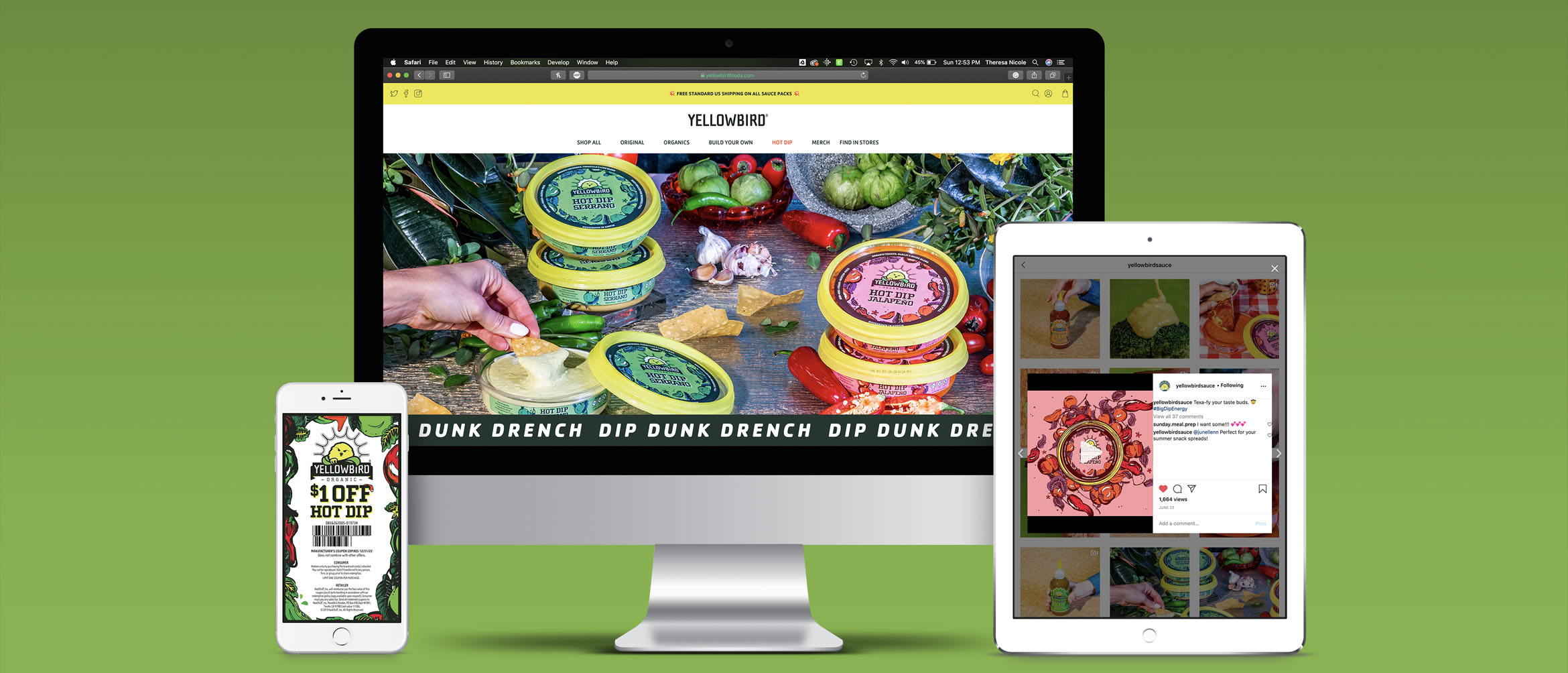
Once the labels were designed, there was a slew of other collateral that needed to be ready for launch. We needed a new landing page for the website, product photography to advertise on social media, and animations. The labels were truly the tip of the iceberg, because below the surface of the water, our work was cut out for us. I worked with my art director to create a wireframe of the landing page we’d use as the base for Hot Dip. It’s a refrigerated dip, so we didn’t have to worry about e-commerce, luckily. We mostly had to address the who, what, where, and why of the new product. Once the wireframe was set, it was my job to get to coding.
Website Landing Page
The landing page was designed to be a one-page scroller filled with delicious product photography and helpful information about the new product. To spice it up (pun absolutely intended), we incorporated some marketing phrasing that speaks more to our branding. This is the first product Yellowbird has released that looks entirely different. It’s not packaged in the familiar plastic squeeze-bottle, and it’s the first product released that requires mandatory refrigeration. Communication on this product has to be direct and clear, but that does not mean it can’t be fun. The page sets the scene with a striking hero image of the full product line. As the visitor scrolls, they learn that the product is available nationwide at Whole Foods Market. Beneath that section, there’s a three-column call-out sharing the different ways you can use the product: dip it, dunk it, or drench it. A common issue with Yellowbird Sauce is that customers don’t realize that it tastes great on everything. Encouraging them and providing serving suggestions helps to quickly deepen their relationship with the product. The page ends with the Destiny Store Locator pointing customers in the direction of the dip, and a digital coupon to incentivize.
To see the full landing page design, visit Yellowbird Foods.
Animations
Something that’s always stuck with me is that ‘motion conveys emotion’. This design thinking prompted the animation campaign following the launch of Hot Dip. The animations were built in Adobe After Effects and later edited in Premiere Pro. This gave them a more fluid quality so their movements appeared less sharp and mechanical. Another key difference is that the animations use the updated version of the product labels. Due to printing errors and COVID, the first run of labels had some print quality issues. The animations were used in the second round of advertisements for Hot Dip, so they used the updated design.
The ads can be separated into two categories: flavor, and usage. The first run of animations focuses on the key ingredients in each flavor by incorporating the lush garden into a psychedelic kaleidoscope that ungulates and eventually dissolves into the marketing type mark, ‘Dip, Dunk, Drench’. The second animation takes the customer slowly through the graphics hidden on the inside of the lid, inspiring them with the different uses of the dip. The animation cycles through different color palettes according to flavor. All of the advertisements utilize composition and color to create a psychedelic look that’s unique to this product line. This was primarily inspired by the consistency of the dip. Hot Dip Jalapeño looks a lot like an old lava lamp I had in my childhood bedroom, and it was a driving factor in the aesthetics of this animation series.
The process as a whole was very intense, and there were a number of setbacks we needed to manage in order to meet our deadlines. The dielines on our labels changed three times, as did the nutrition facts information. We experienced printing difficulties, and hiccups in our timeline due to this year’s pandemic. I’m in love with how everything turned out looking back, though. We overcame so much in the design process, and watching strangers interact with my illustrations in places I’ve never visited is positively mindblowing. I’m so excited to watch the lifecycle of this product and continue to learn from this experience. The next time I brand a product line, it’ll be even better.