Michael Graves Design
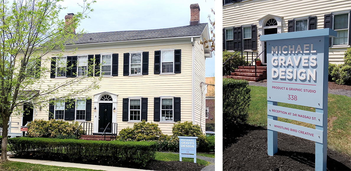
Michael Graves Design is the official retail line of Michael Graves Architecture & Design products. During my time at MGA&D, I worked to rebrand the product line by creating a new logo, modernizing the touchpoint collateral, and designing the outdoor signage.
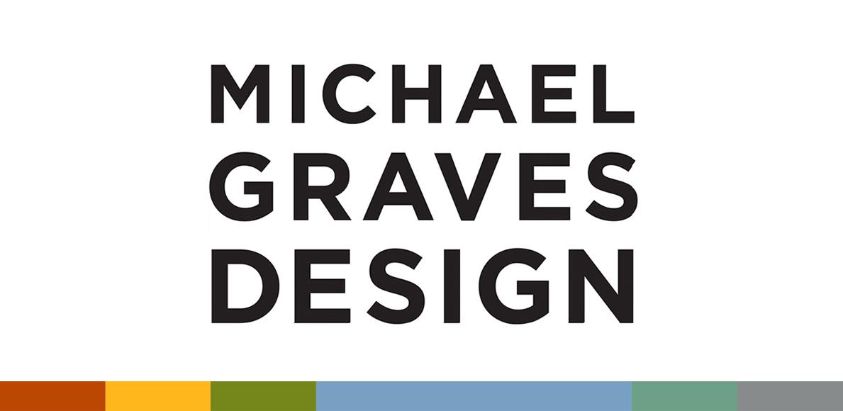
The new identity is influenced by the stacked letterforms in the logo. In the past, the logotype was laid out placing the most importance on the name “Michael Graves” with “Design” secondary. This new logo brings all elements up in scale to communicate that the name is just as important as the work it does.
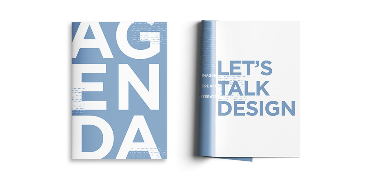
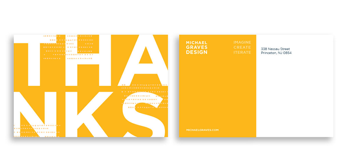
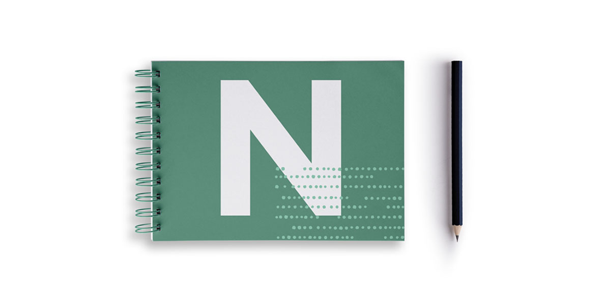
This modern typographic approach in Gotham Bold extends into the touchpoint collateral to further solidify the identity. Bold knock-out type sits on a vibrant new color palette that echoes the hues and tones Michael Graves was famous for using in his Post-Modern architecture.
A brand identity that communicates a famous name is just as important as the design it delivers.
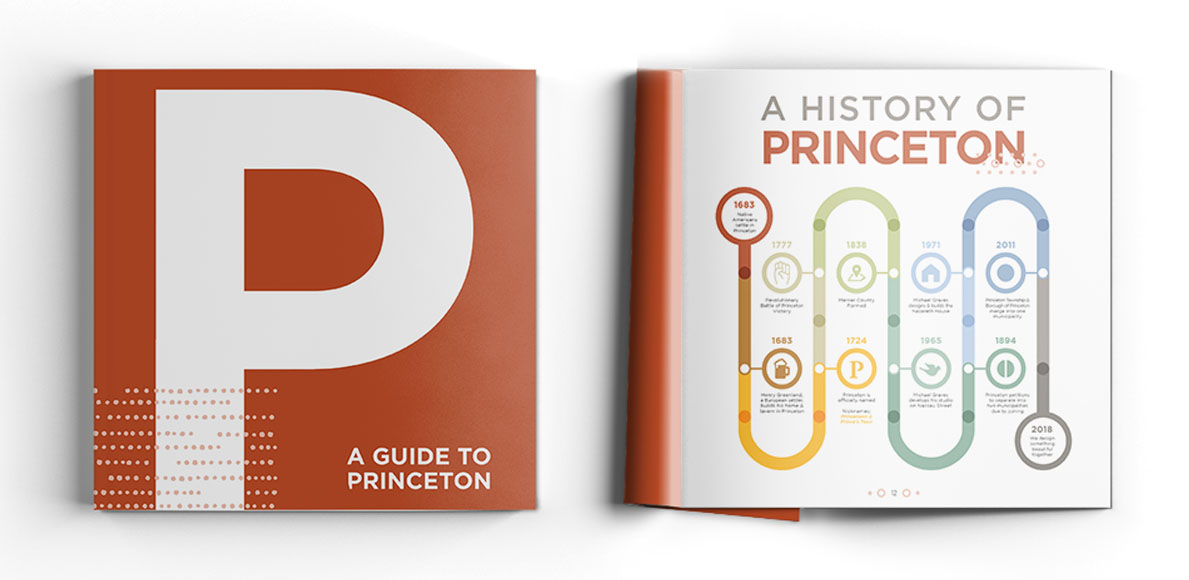
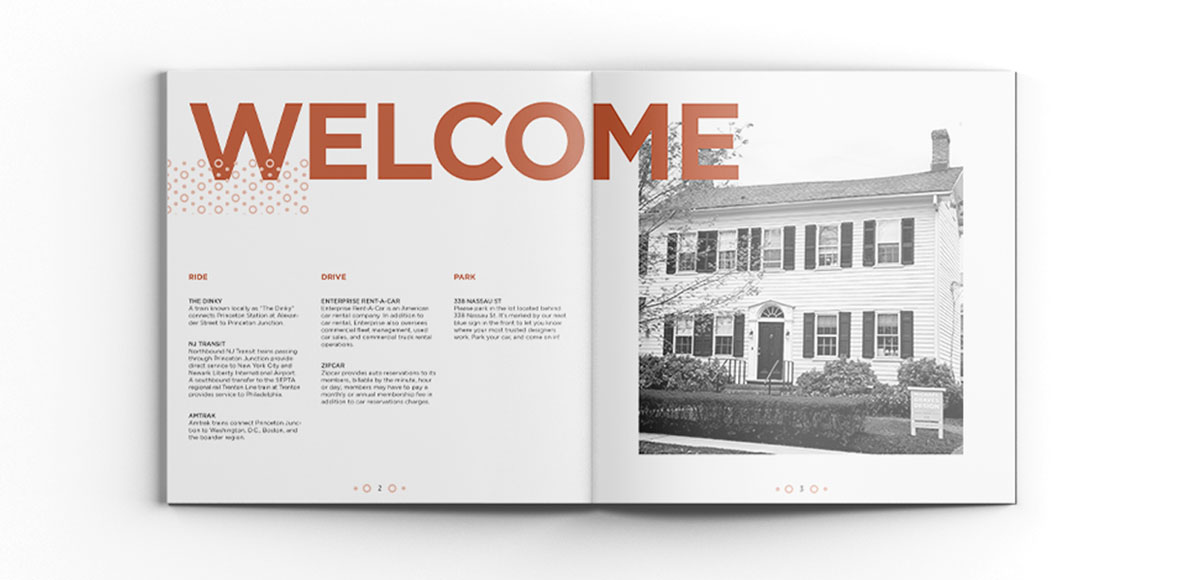
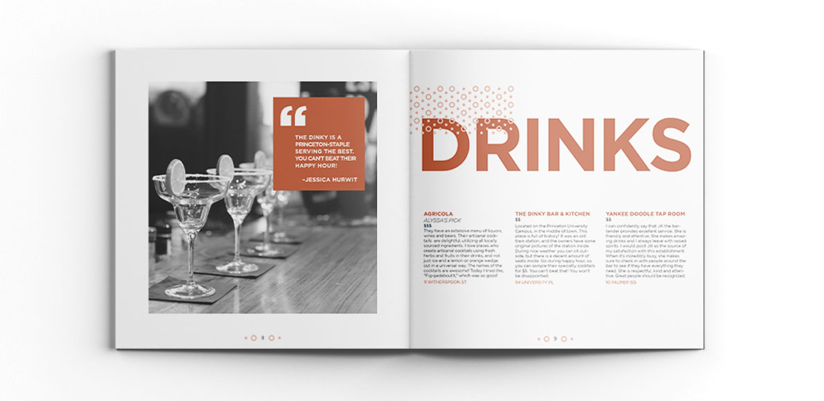
The system is made up of Agenda booklets for client meetings, notebooks for brainstorming sessions, a guide to Princeton, NJ for those staying overnight, and a thank you postcard.


