Archives

Oedipus Rex Cover

Oedipus Rex Cover

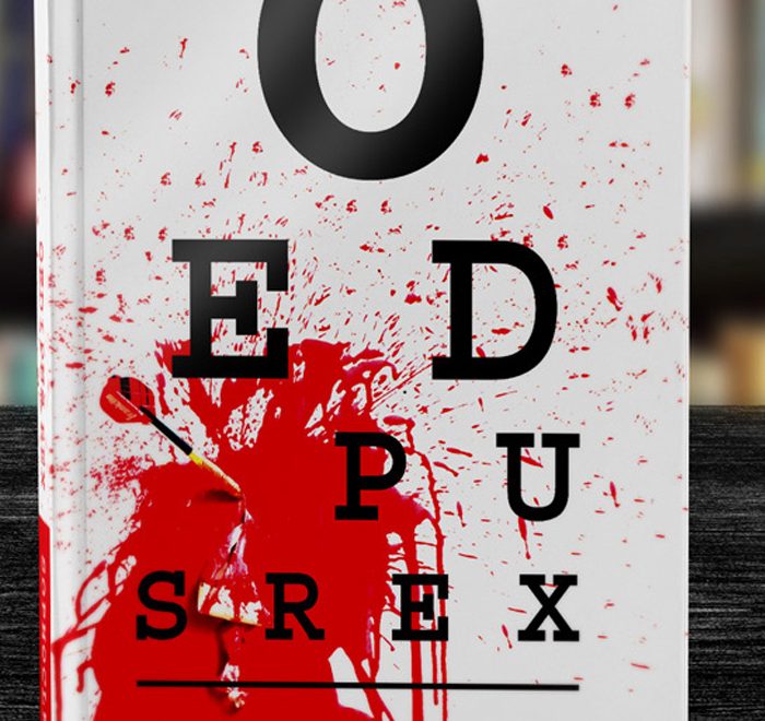
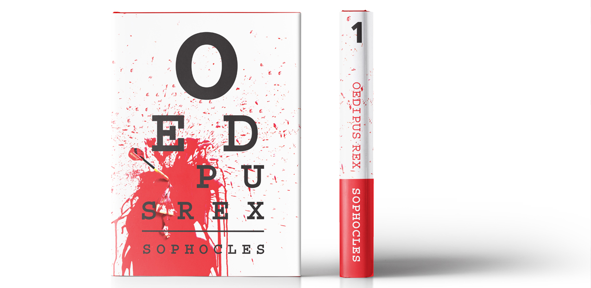
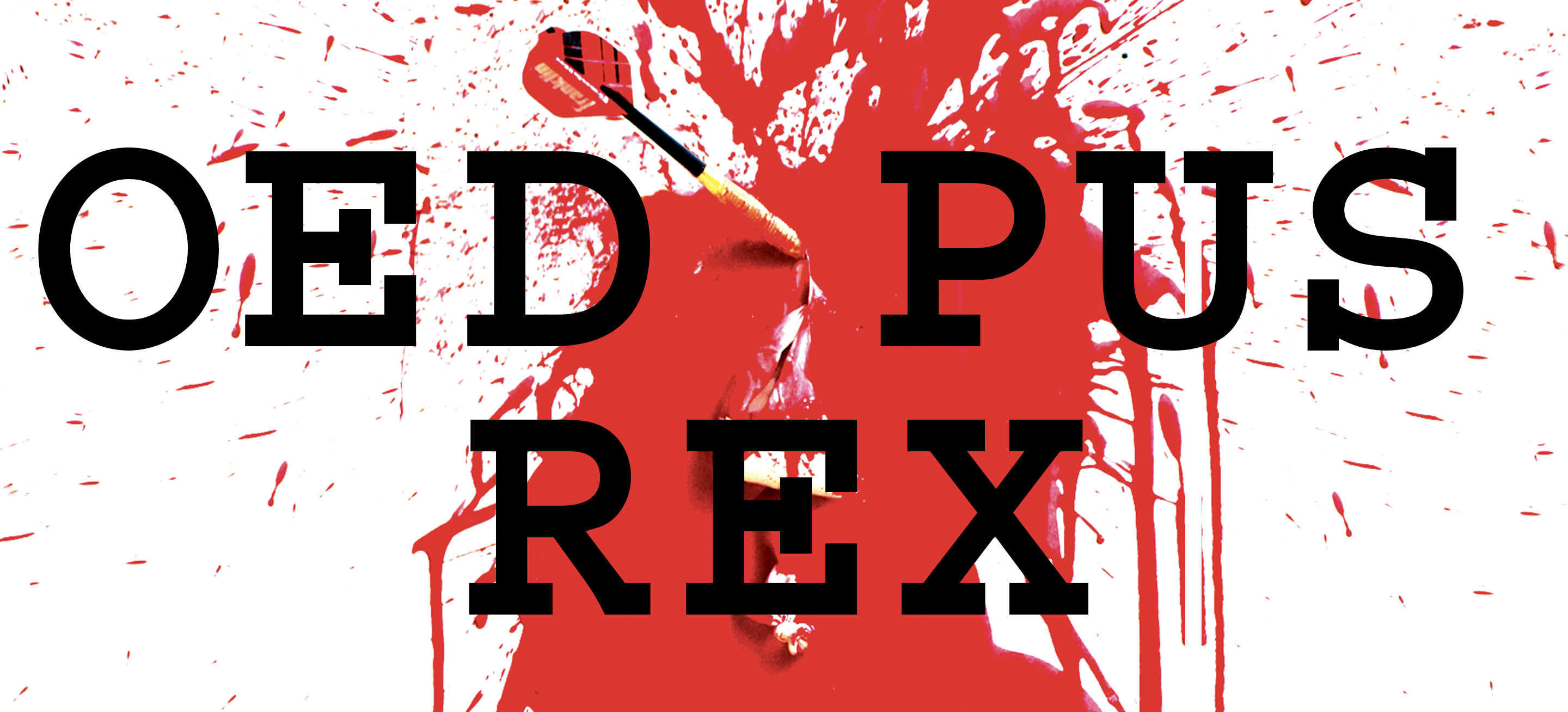
This cover design for Oedipus Rex is inspired by the climax of the story. Oedipus Rex is a story about a man who cannot escape his fate. He was destined to marry his mother and murder his father. He had lived his entire life blissfully ignorant of this prophecy until the climax of the story. After his wife and mother figured it out, she hung herself by her garment disgusted at what she had done. Shortly after, Oedipus discovers the horrible truth and in a fit of rage he takes his mother’s garment pins and stabs his eyes and leaves his kingdom. This moment in the story has the most recognizable imagery, so I decided to add a modern take to the classic Greek tragedy.

Print

Regional Design Award

2018

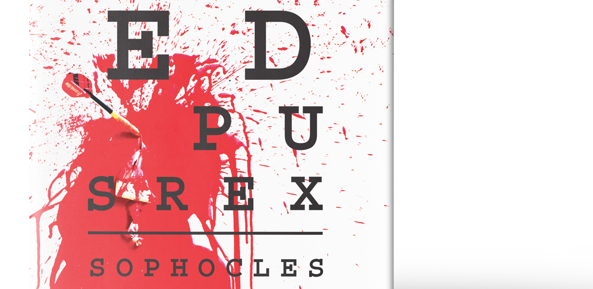
I approached the title with a typographic approach and arranged the letters to look like an eye chart with the “I” missing in the word Oedipus. I felt like it was a clever way to communicate with the audience once they reach the climax.

I then used a painting technique from the 1960’s where I filled balloons full of watered-down, acrylic red paint with air. I threw darts at them to get a gory splatter effect. I originally got the idea from my favorite movie, The Princess Diaries.

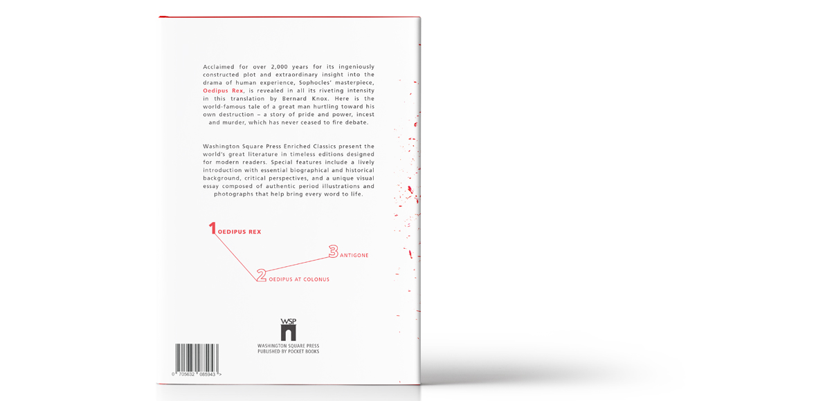
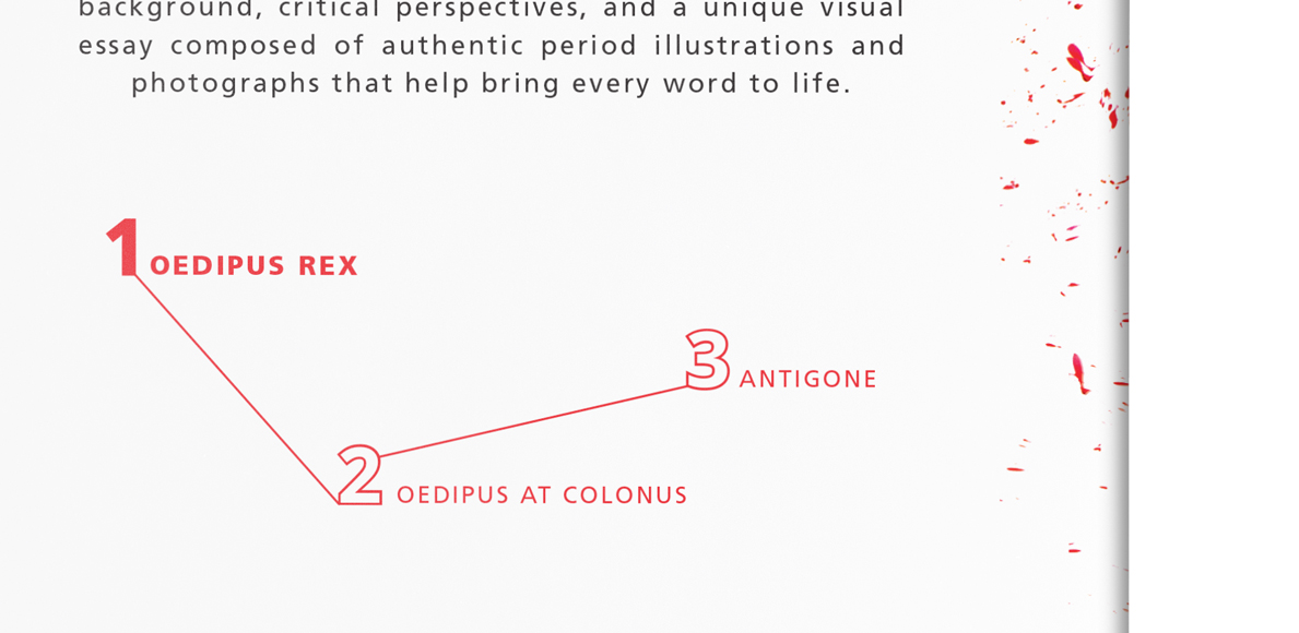
On the back, I arranged the Oedipus Trilogy to look like a blood spatter graph to inform the audience there’s more to read, and they’ve only just begun.

Design Something With…

Design Something With…

A GUIDE FOR EARLY GRAPHIC DESIGNERS


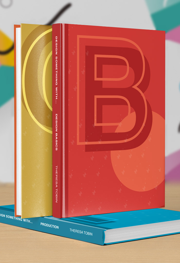
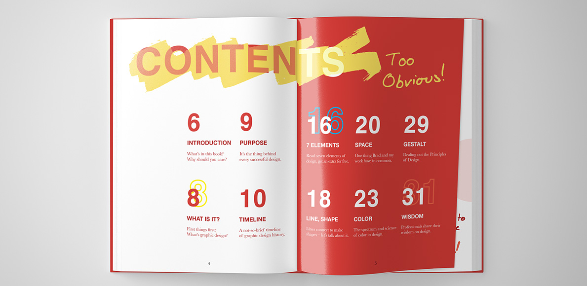
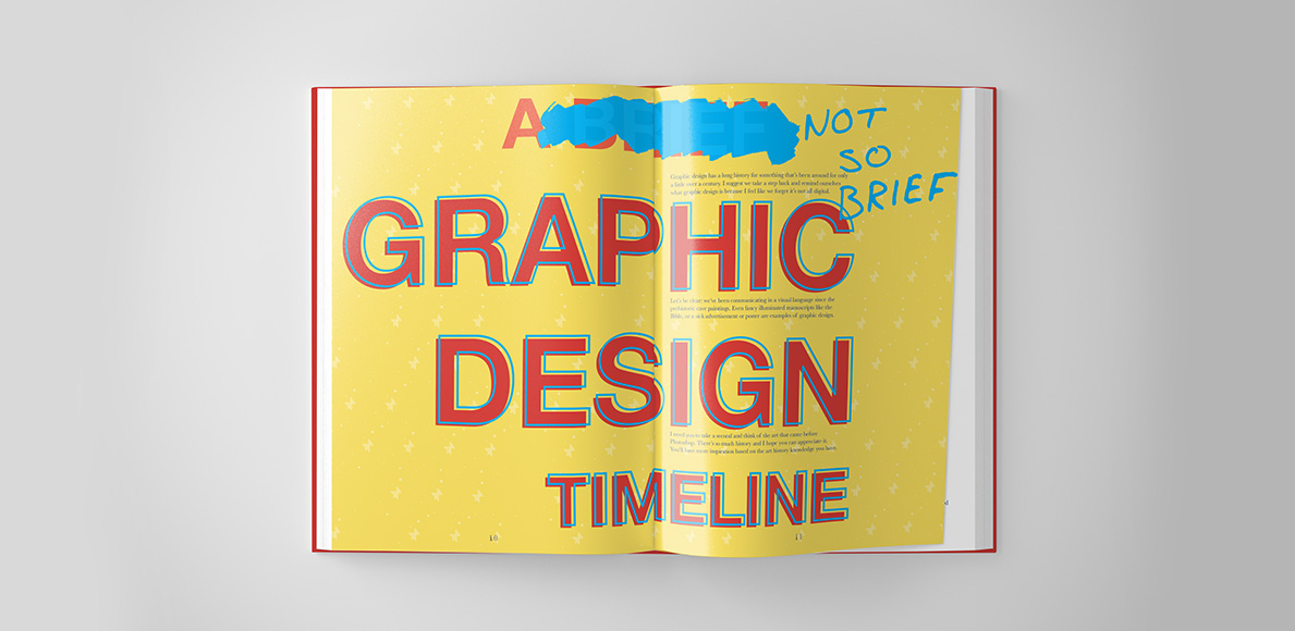
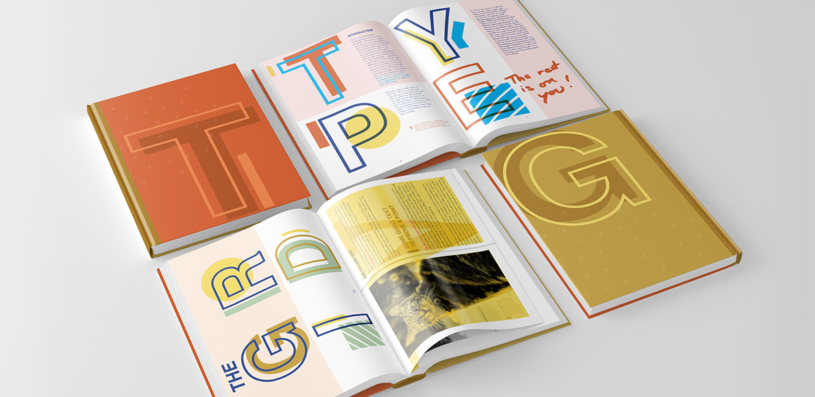
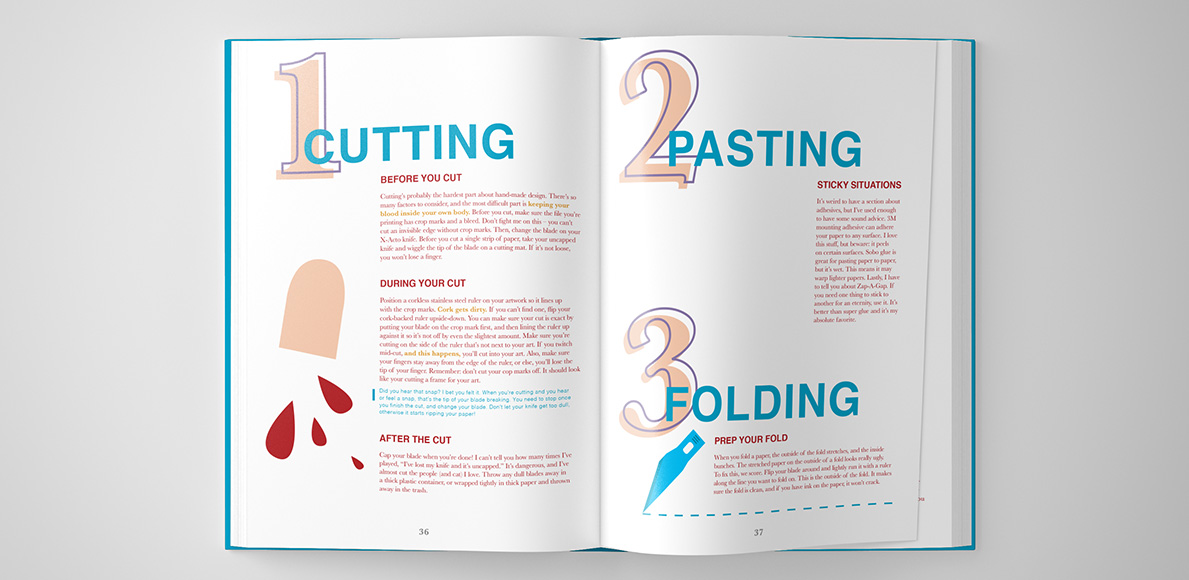
Design Something With… is an introductory graphic design reference book for high school students in career and charter schools. It’s divided into three smaller books tackling subjects like Design Basics, Typography and The Grid, and Production because books are heavy and you should be allowed to pick and choose what you want to carry. Each book is given a designated primary color and fit in a box set rendered after a Pantone color chip. The type system uses Helvetica for most primary headings and embraces Baskerville for all body copy. 

Design Something With... Design Basics

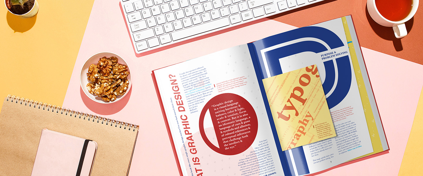
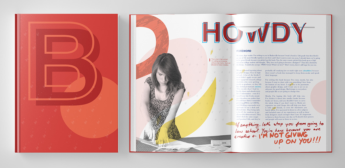
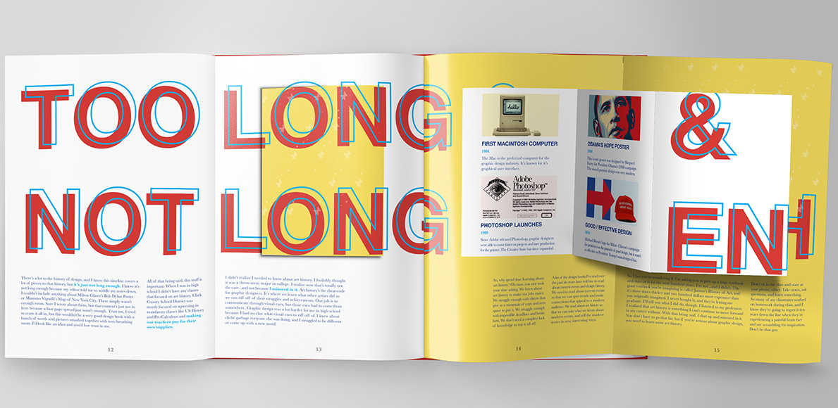
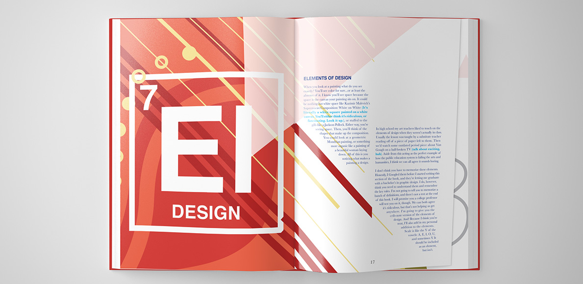
Design Something With… is a candid take on introductory level graphic design information. It uses sidebars, added opinions, and advice throughout to give perspective on what separates academic information from that of the real world. Inspired loosely on the revival of Memphis design in today’s modern aesthetic, it’s a bright, interactive vehicle meant to engage and entertain the audience.

Design Basics: Table of Contents

“Each book utilizes production techniques like fold-outs, pouches, accordion pull-outs, and smaller books to give a visual and tactile learning experience.”

Design Basics: Elements of Design
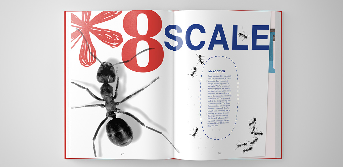
Design Basics: Adding scale to the Elements of Design

Type & The Grid


The second book in the set is called Type & The Grid. It gives the reader perspective on type through a hierarchy of learning. First, it explains the elegance and anatomy of the letter. Then, it moves into full words and how typefaces and kerning make an impact on their appearance. From words, we move into lines and paragraphs – discussing leading, raging, and eventually moving into type on a grid. Because type and the grid are technically separate topics, they’re given different colors to represent their sections. They are so closely related, however, it was appropriate to put them in the same book.

Design Something With... Type & The Grid
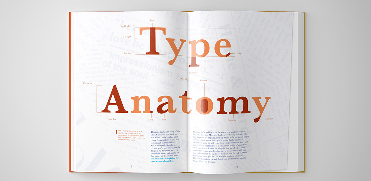
Type & The Grid: Type Anatomy spread
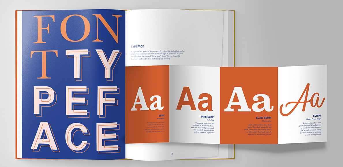
Type & The Grid: Explaining the difference between a font and a typeface. Showing examples of type classifications with accordion fold.
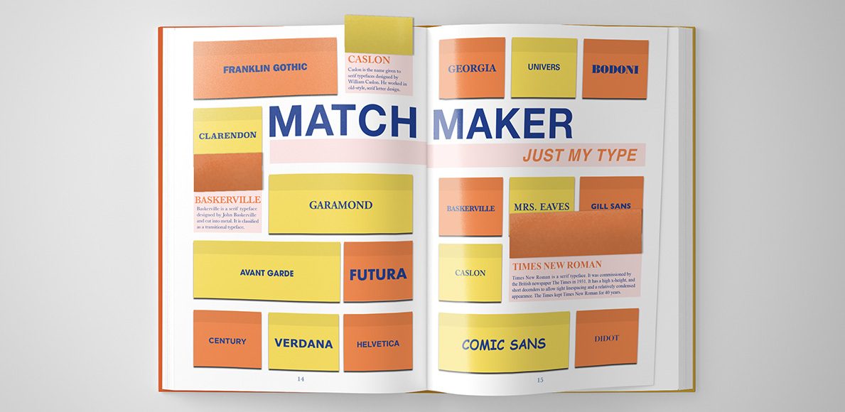
Type & The Grid: Listing the most common typefaces and providing their perfect match under every flap.

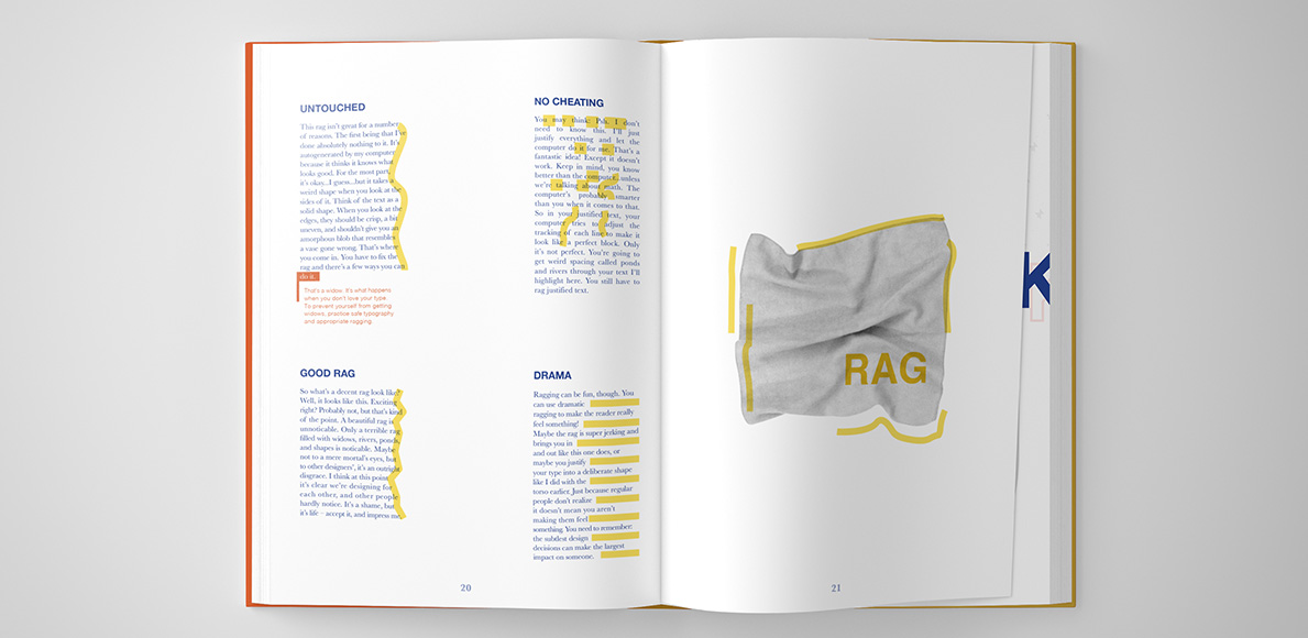
“I used visual cues [like highlighting the rag] so the reader leaves with lasting impressions that build stronger design practices.”

Type & The Grid: Paragraph rag

Production

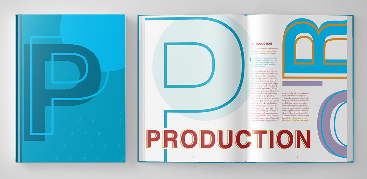
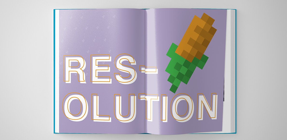
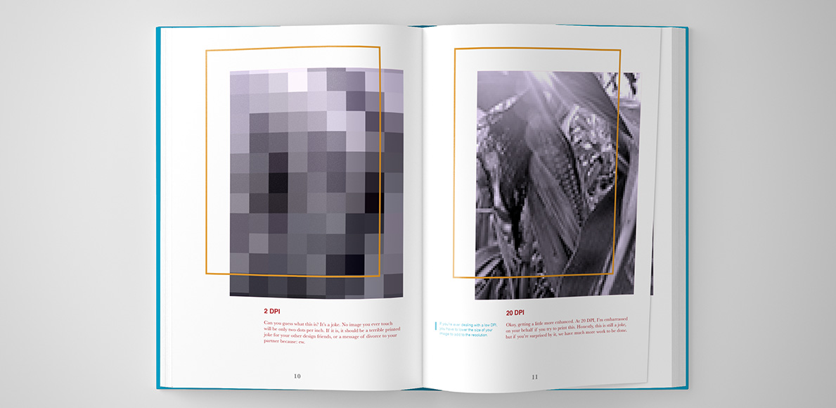
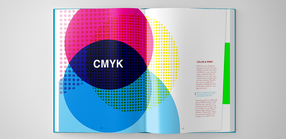
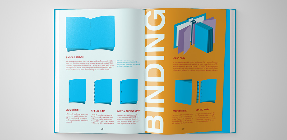
The third book in the set focuses on Production. It covers resolution, color in print and web, binding and production techniques, client relationships, budgeting, and tips for excellent craft. Though the book has a heavy focus on print design, it instills vital knowledge on the reader about producing a well-manicured comprehensive design for a client. With the design industry heavily embracing technology, I find design students struggle with their craft. Design Something With… Production provides tips and tricks to combat this issue.

Design Something With... Production
Production: Spread on CMYK color printing
Production: Spread on popular book binding techniques

“Illustrations simplify complicated production techniques and provide comic relief to combat the dry nature most textbooks have.”

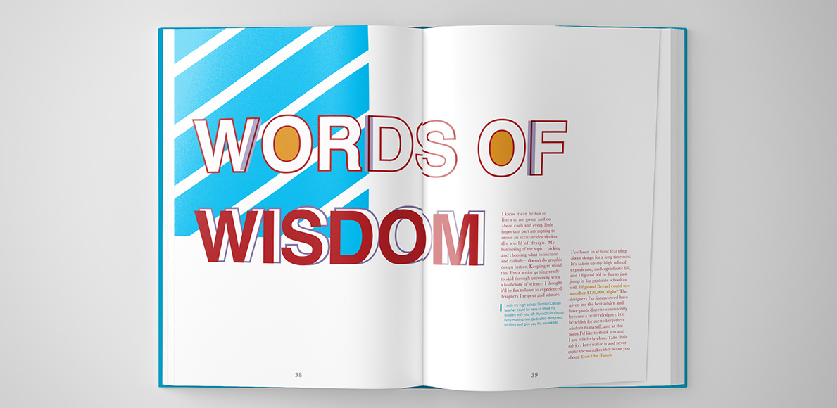
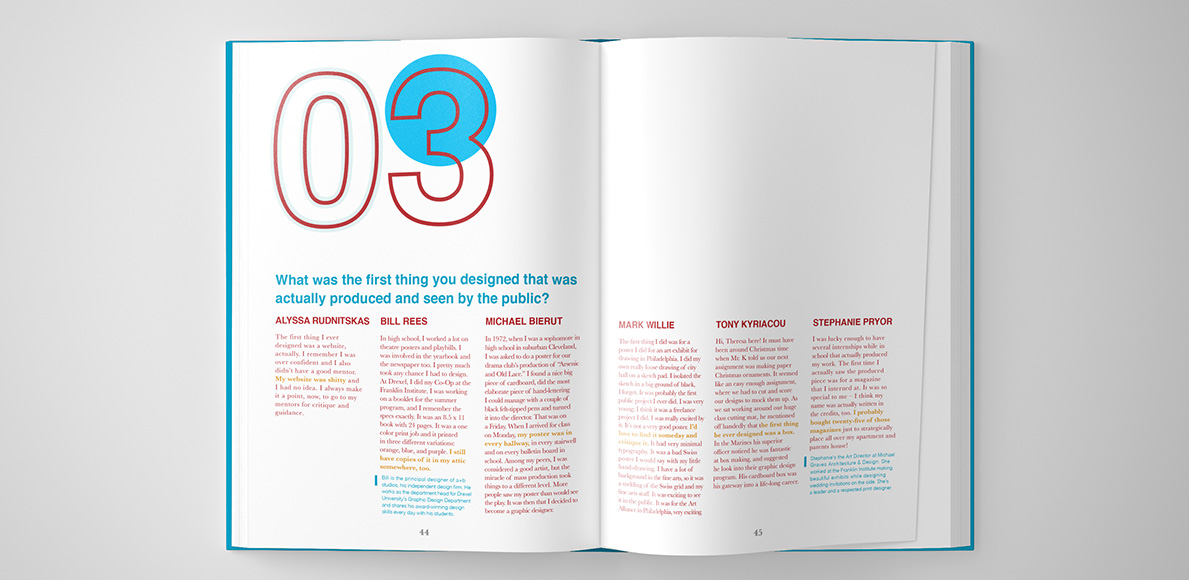
Each of the books ends with a ‘Words of Wisdom’ section. Here, professionals in the industry share their real-world responses to questions students are afraid to ask in the classroom. Questions like, “What typeface are you sick of?” and “Should a design student know art history?” are answered here.

BLOG POST
Want to know more about this project?
For extra spreads and more insight detailing my process and design thinking, visit my blog post, “Writing & Designing a Book.”

Power BI eBooks

Power BI eBooks

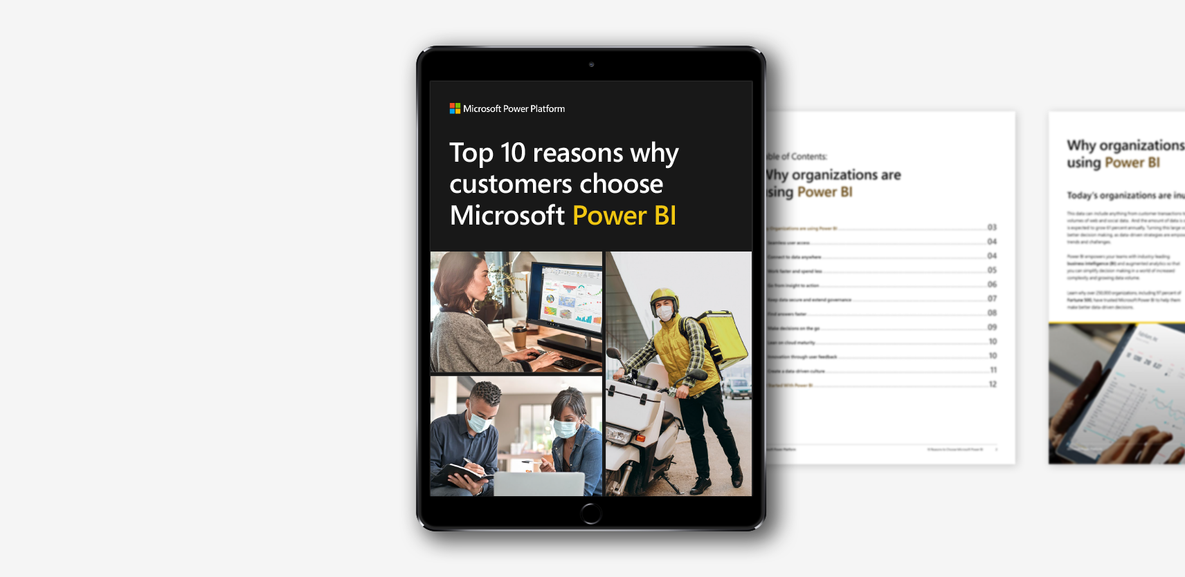
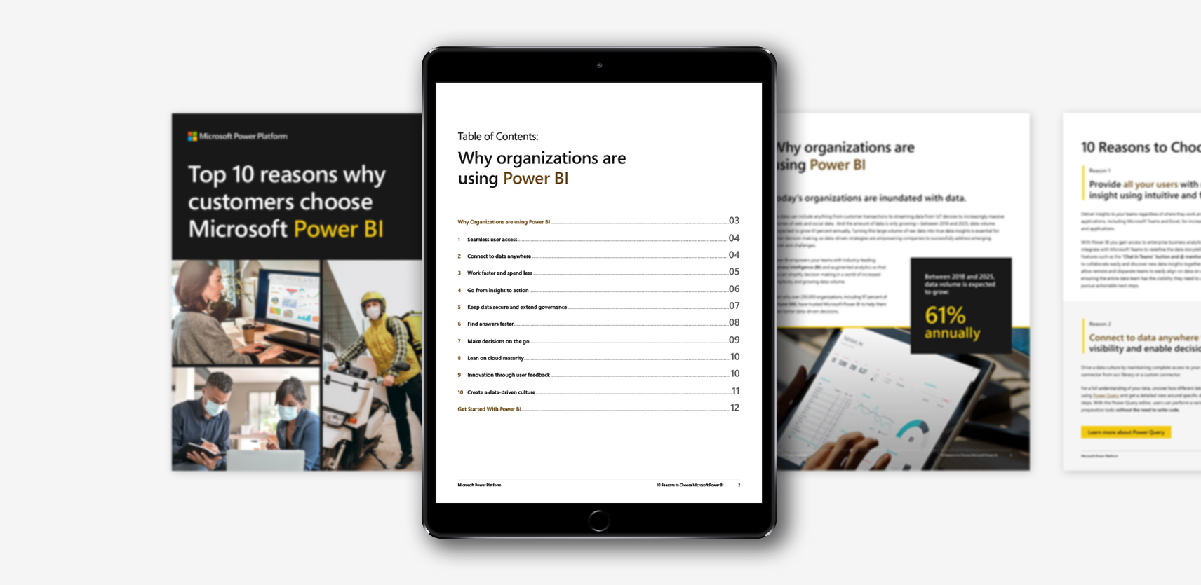
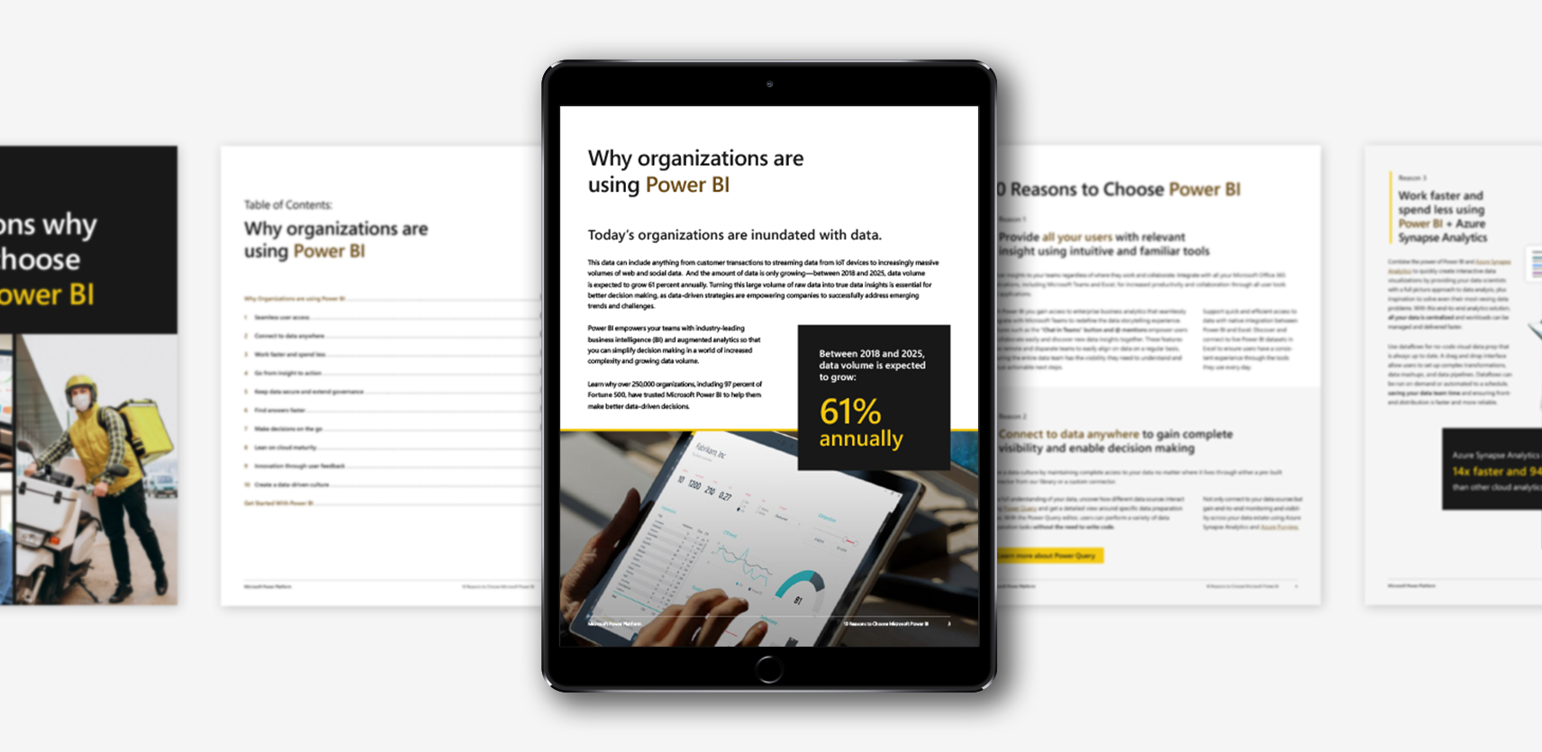
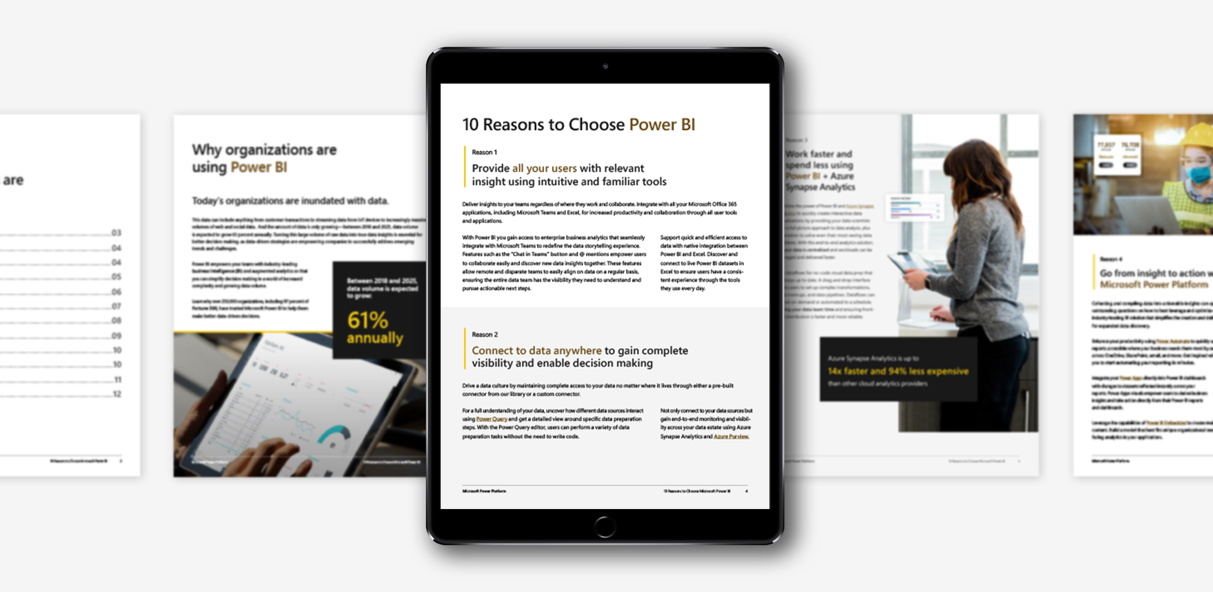
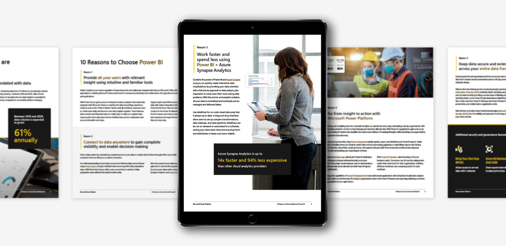
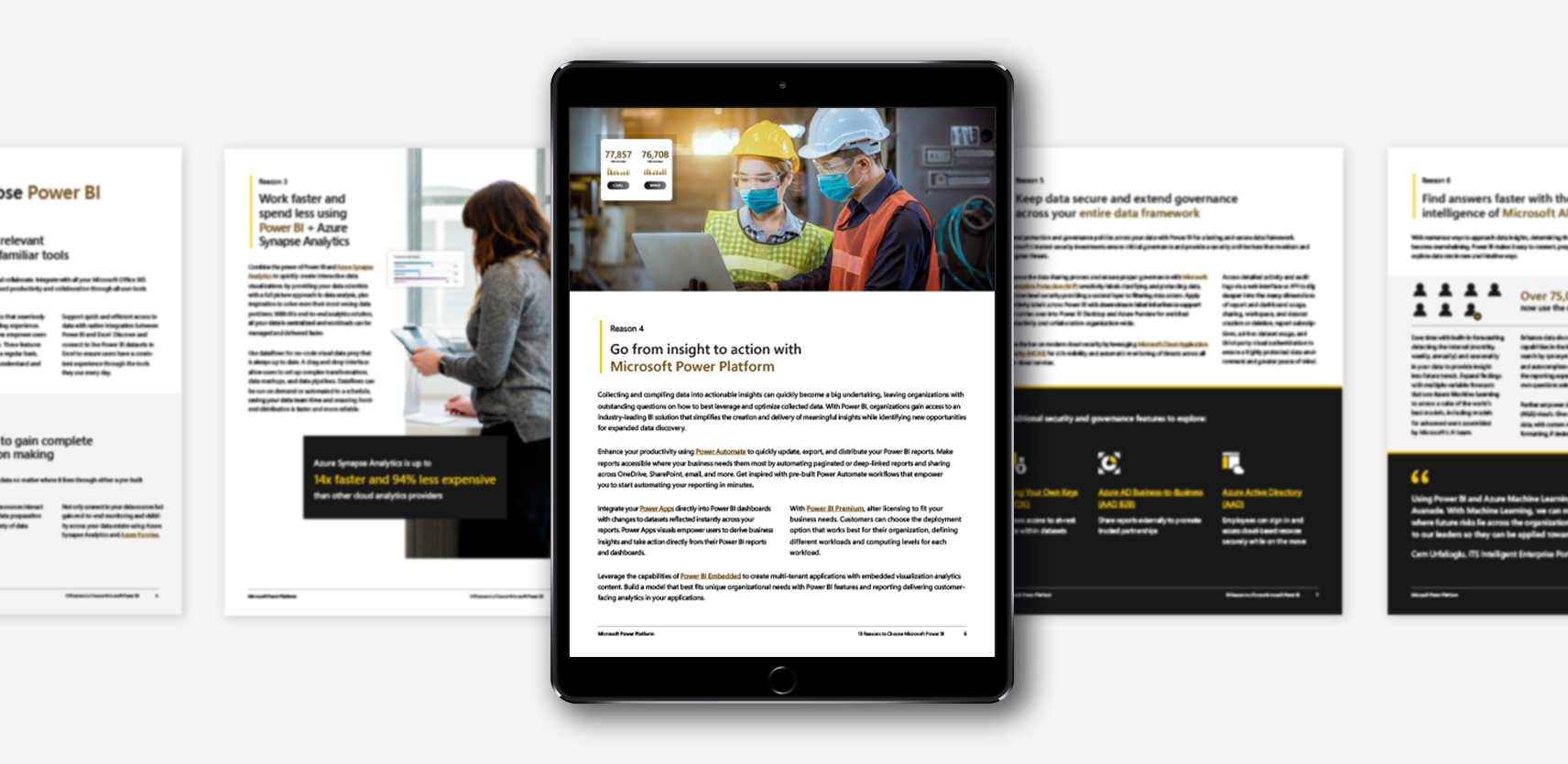
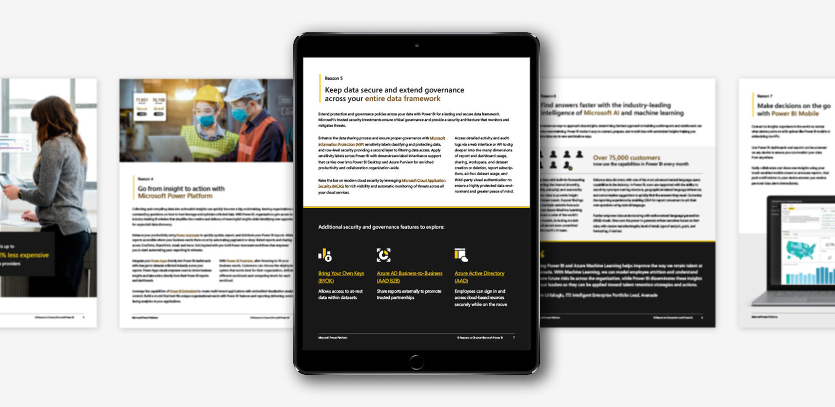
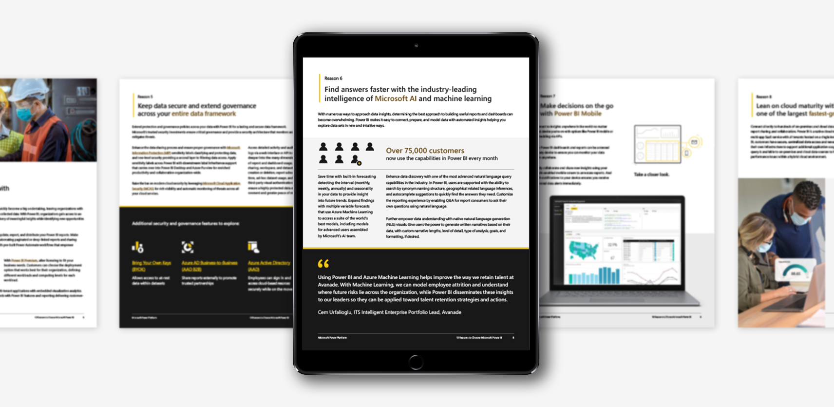
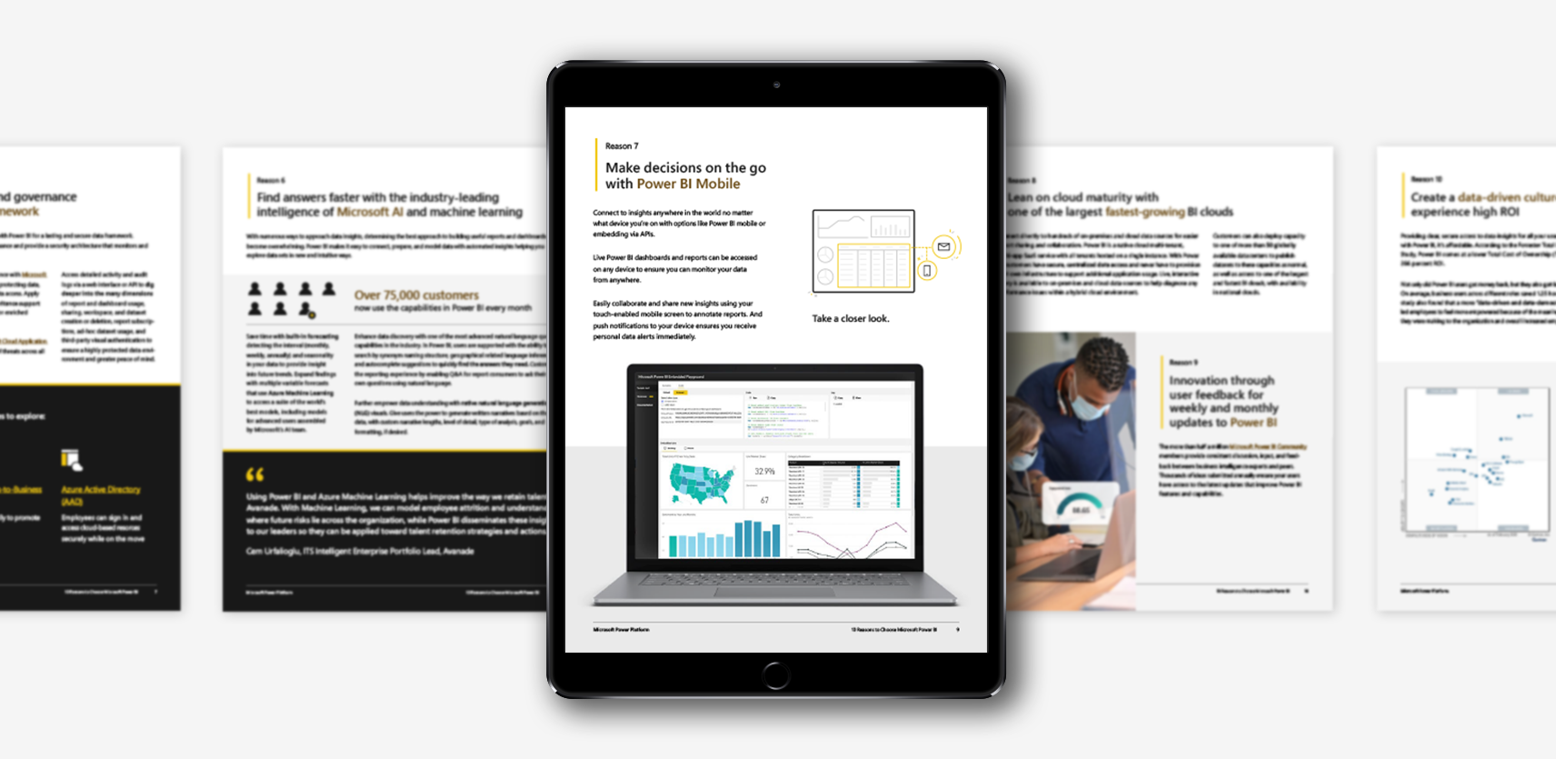
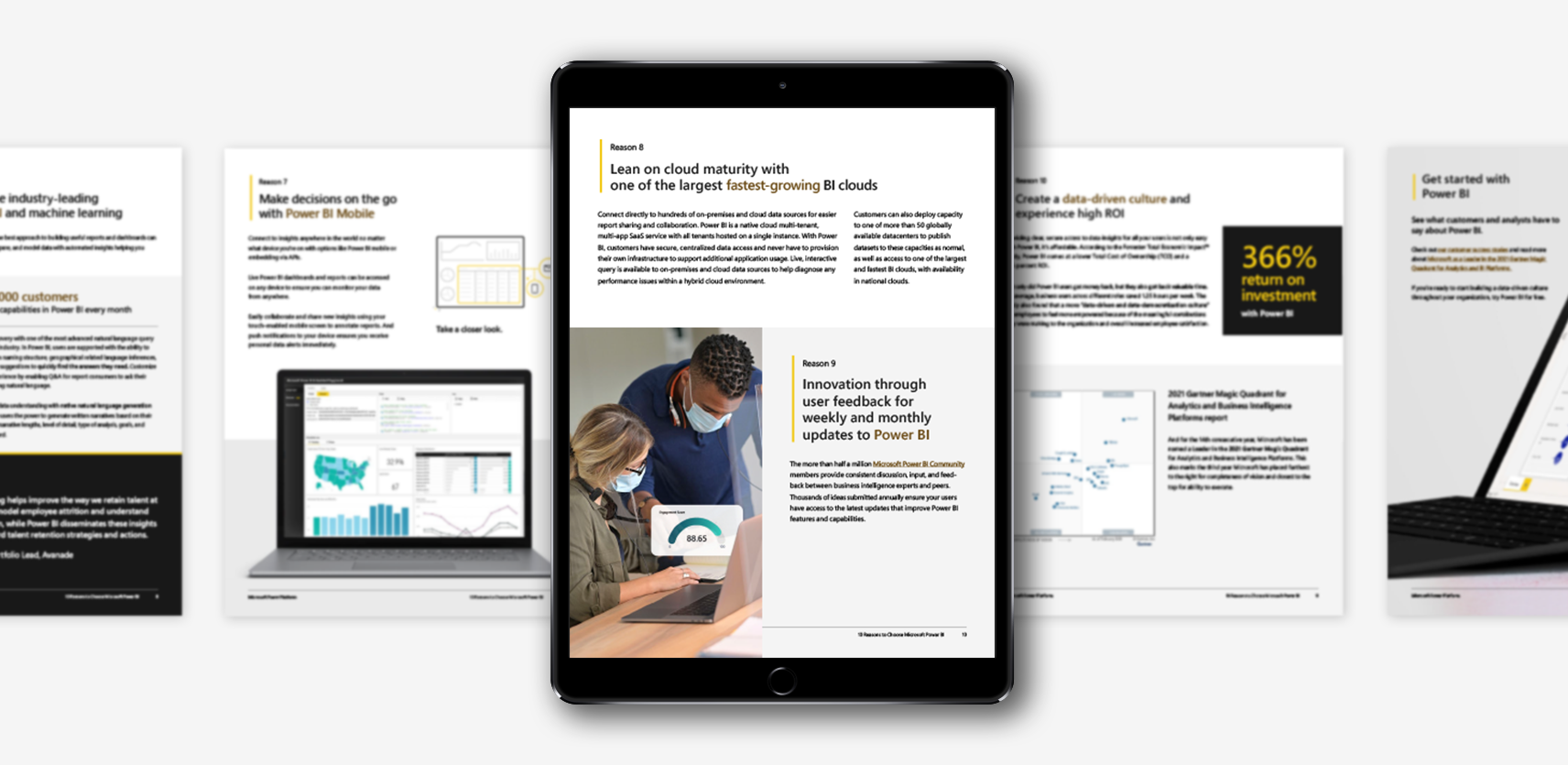
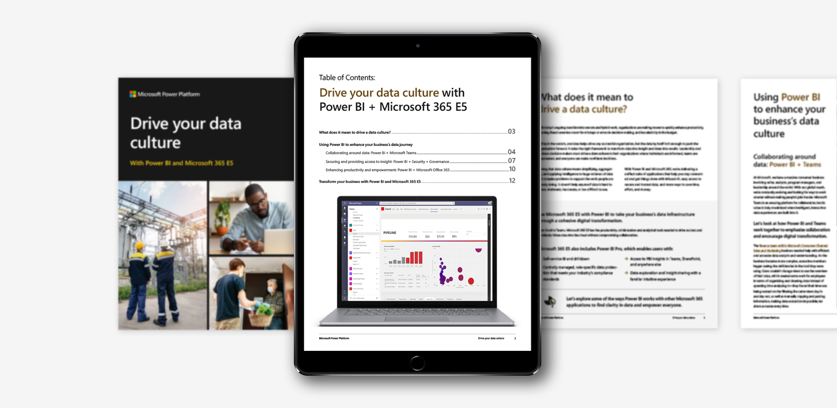
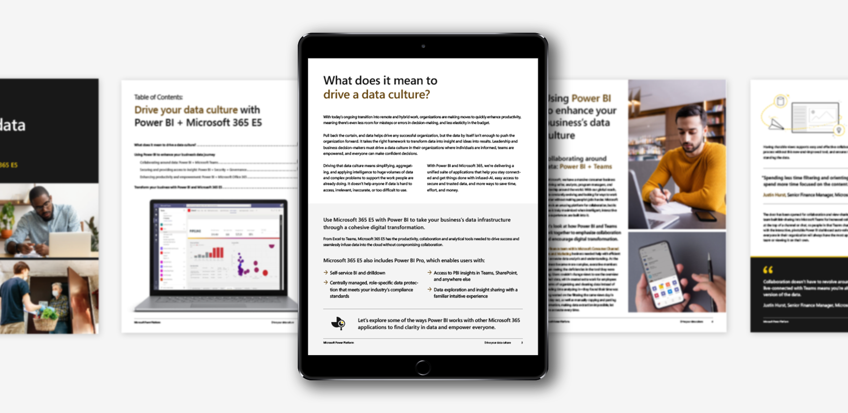
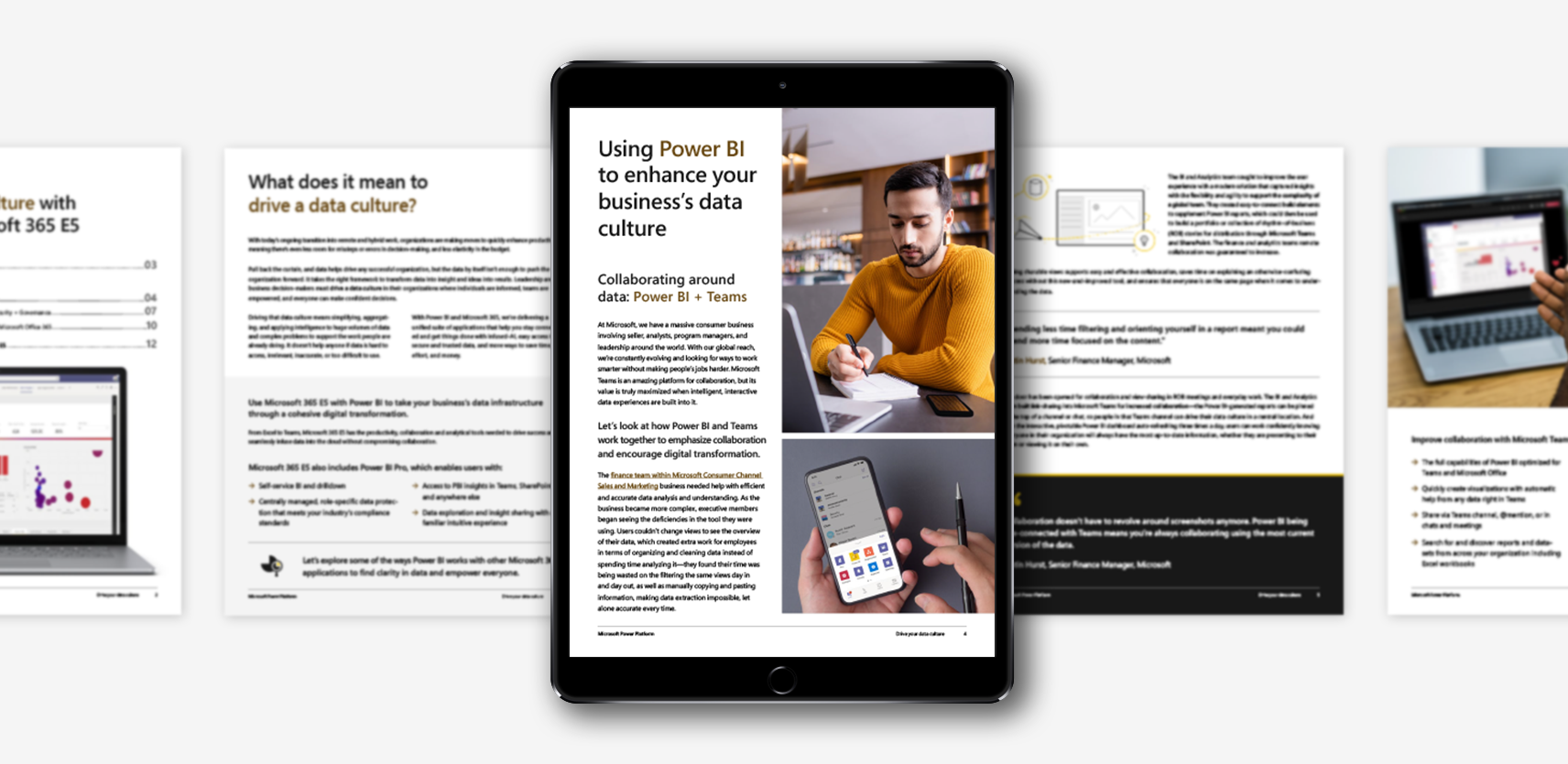
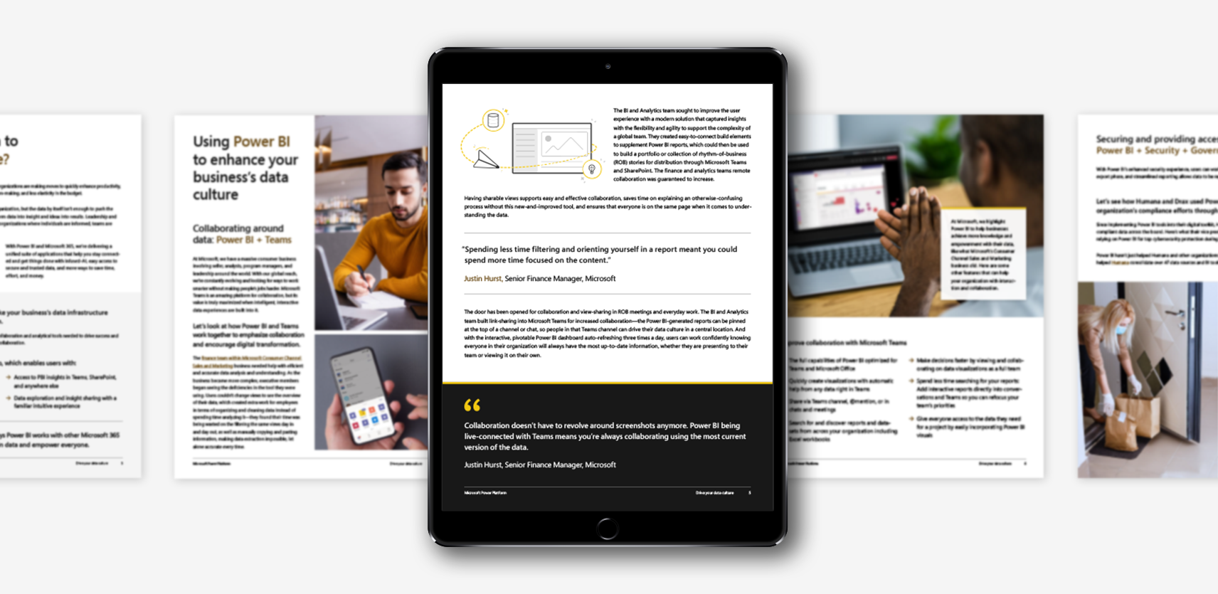
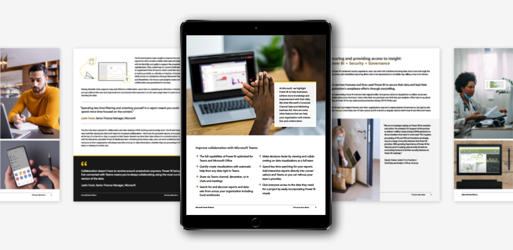
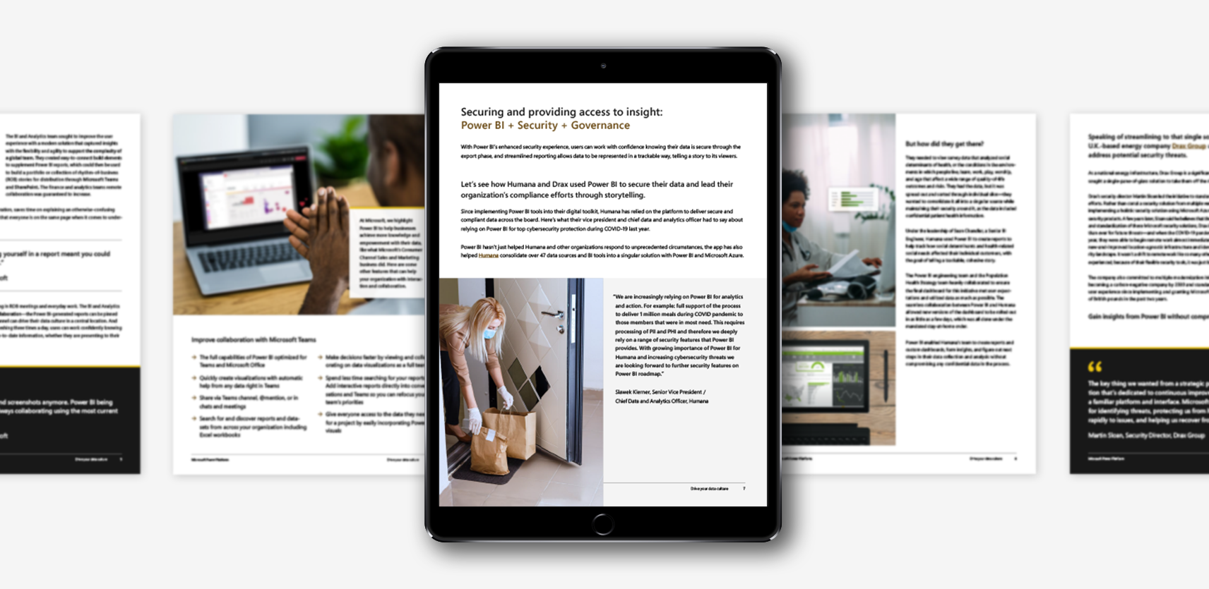
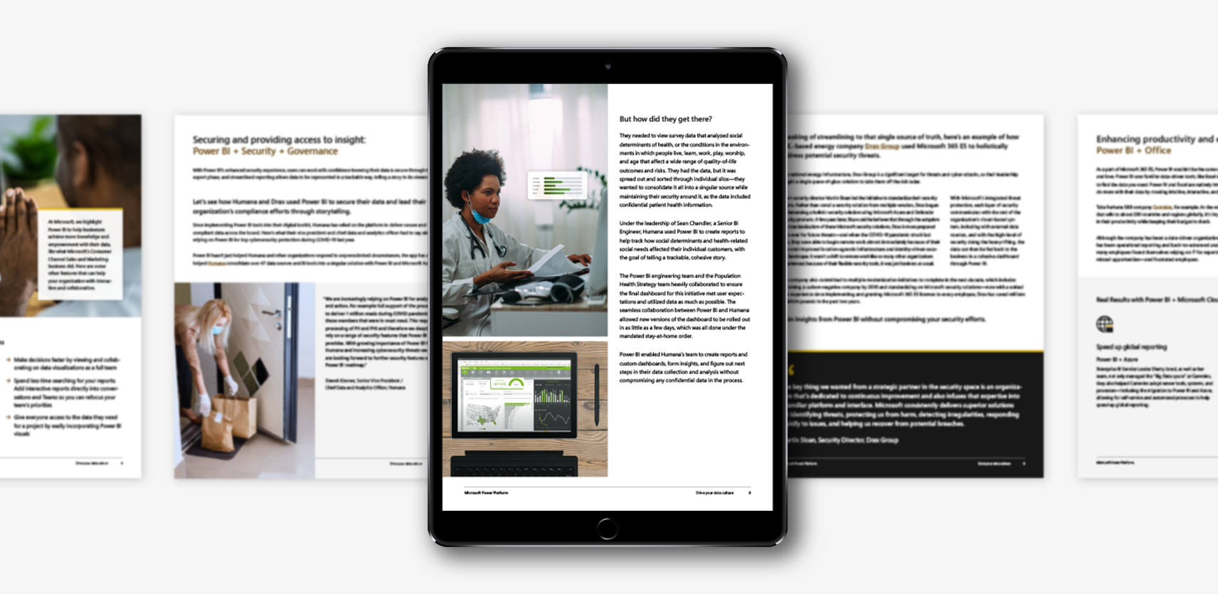
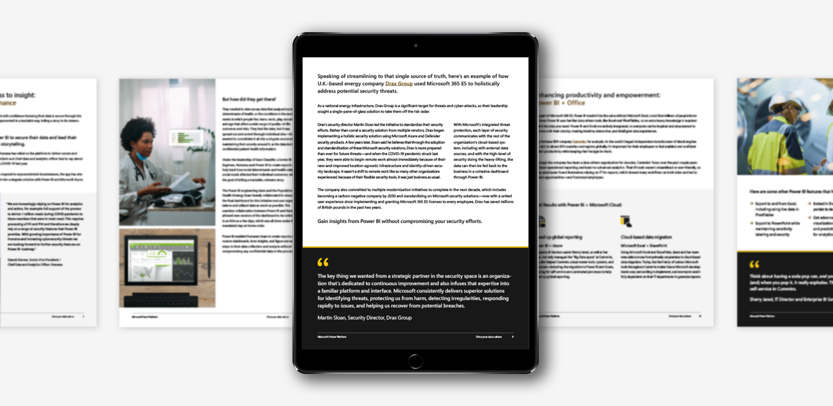
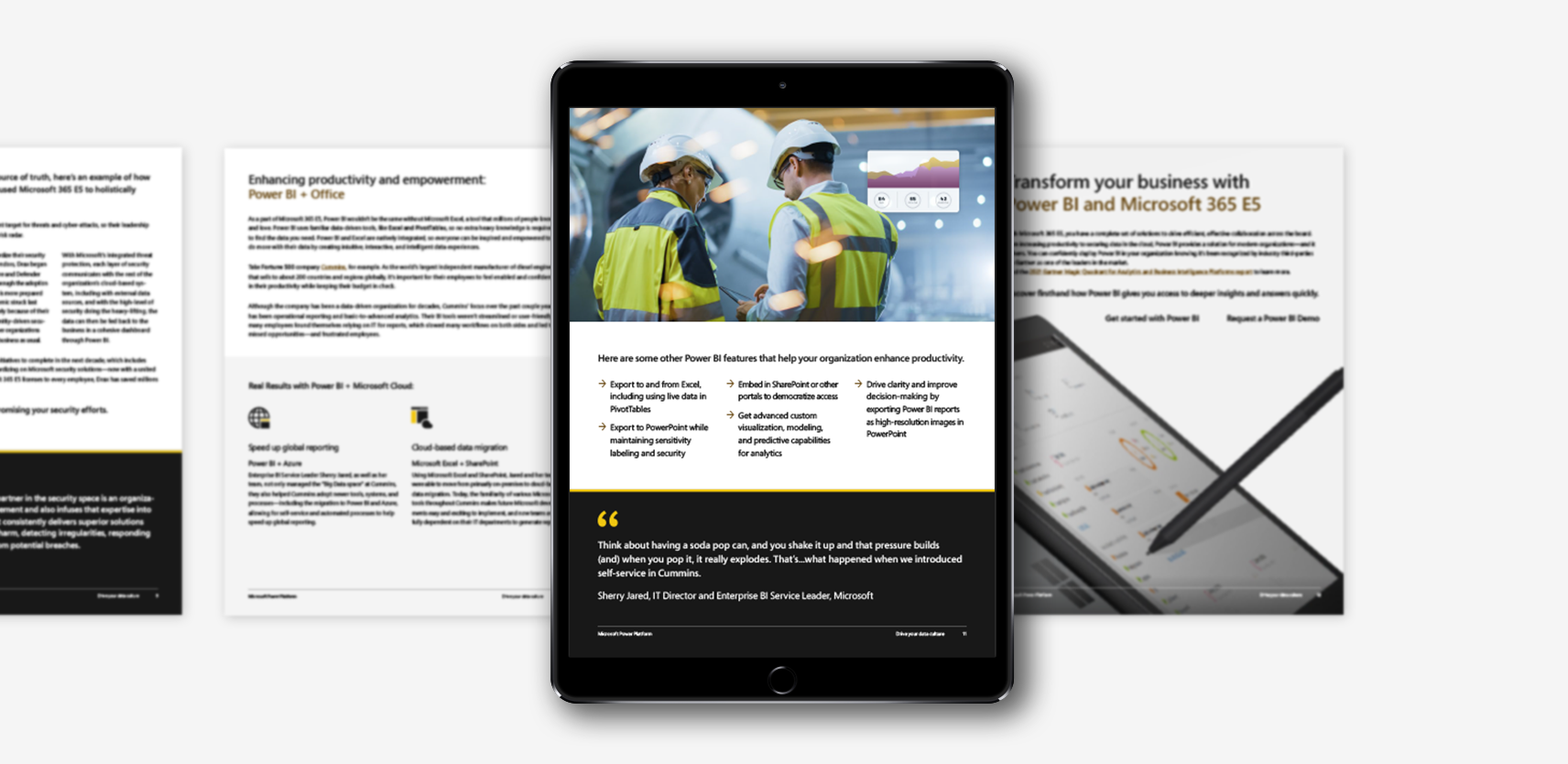
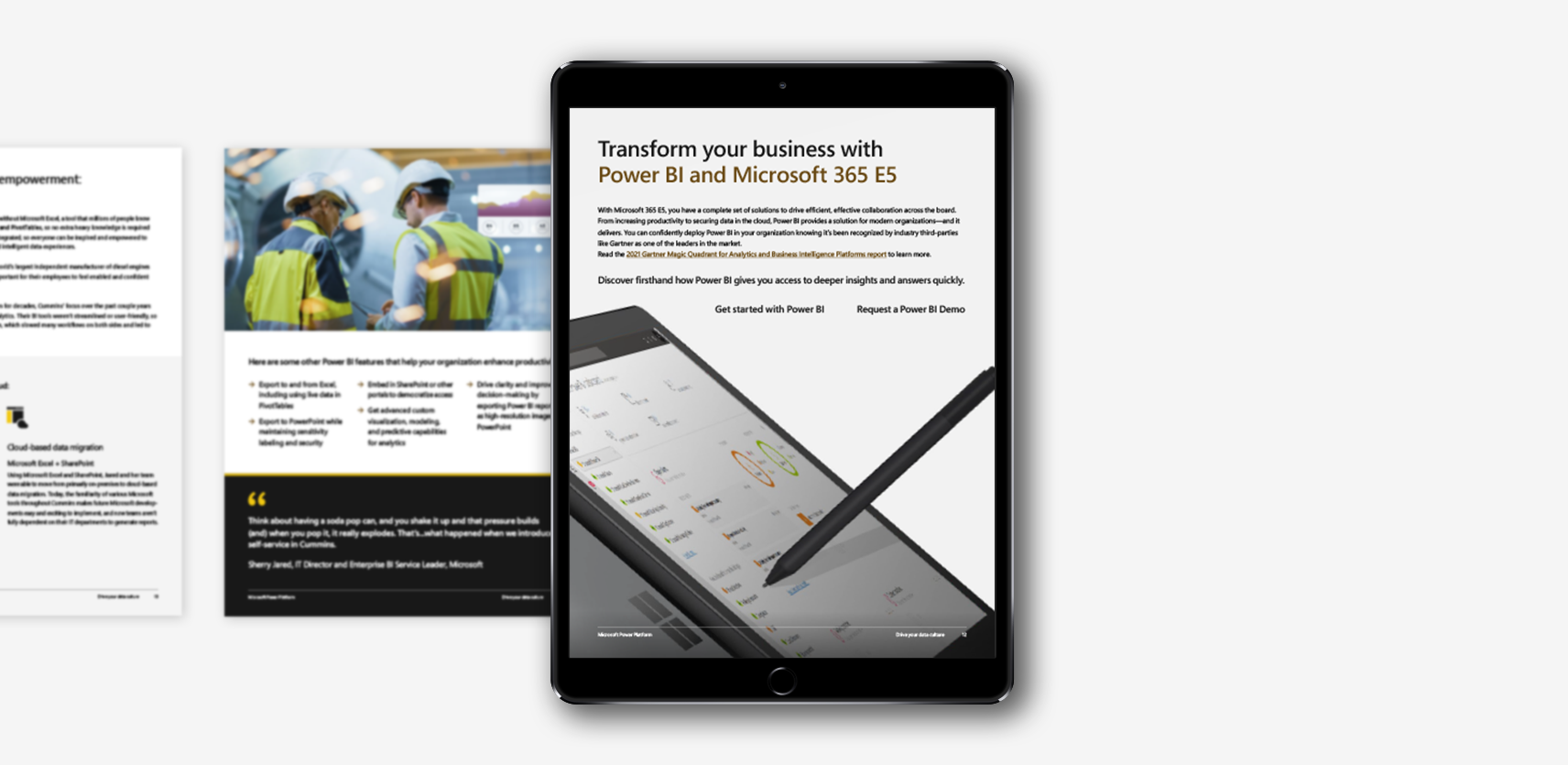
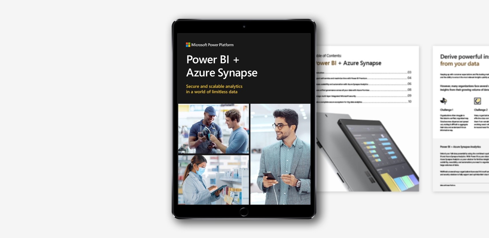
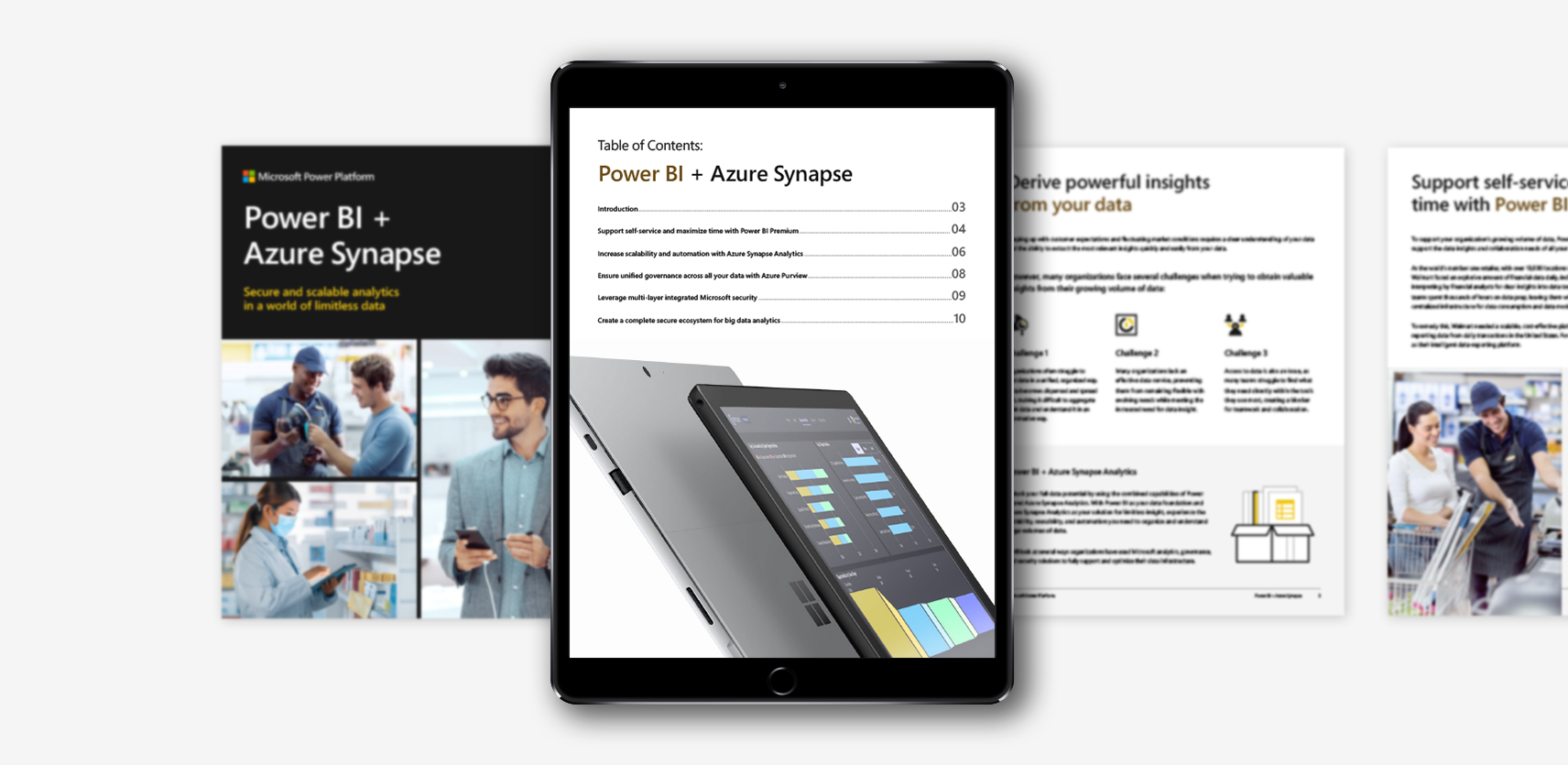
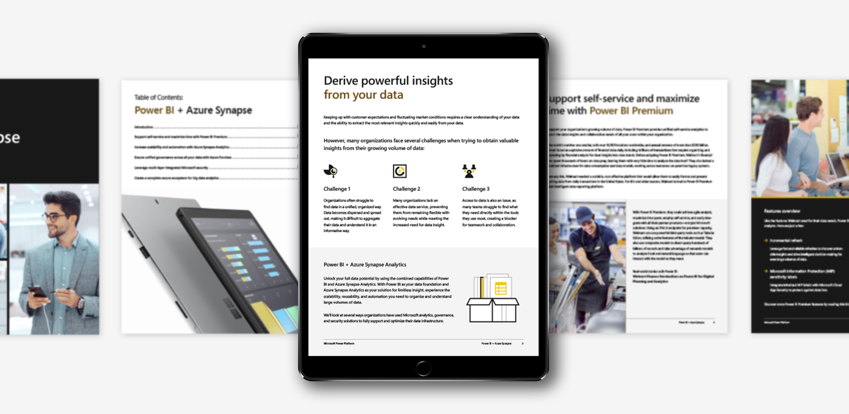
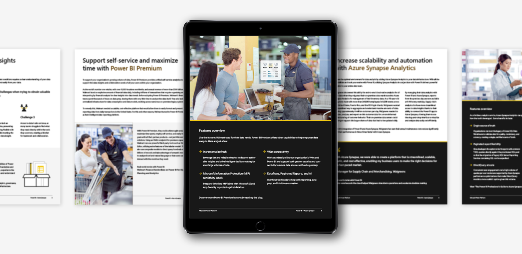
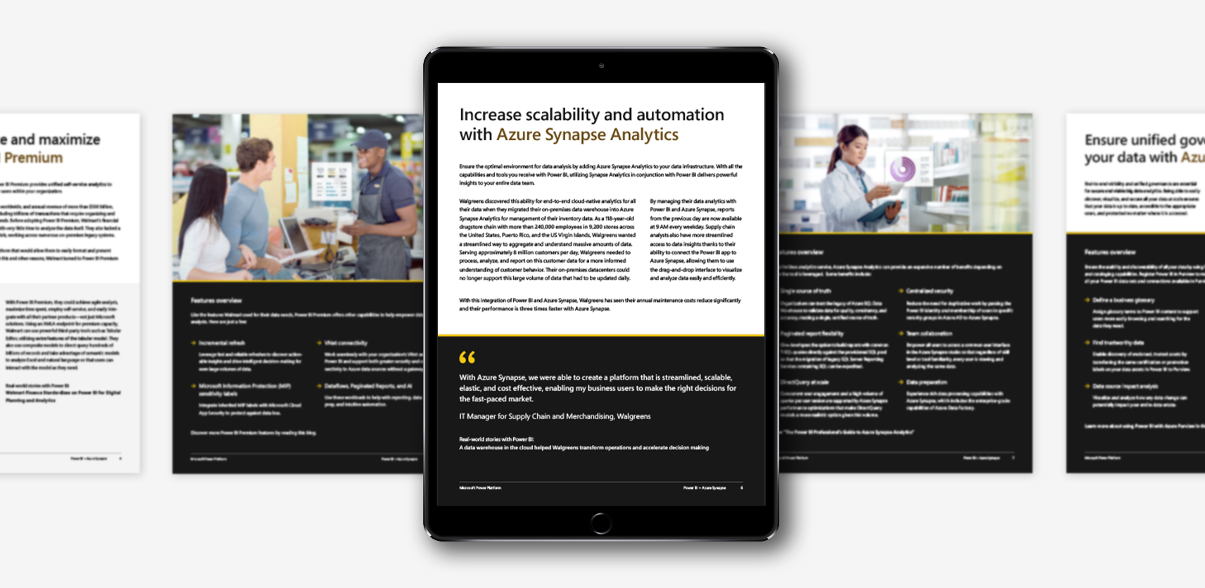
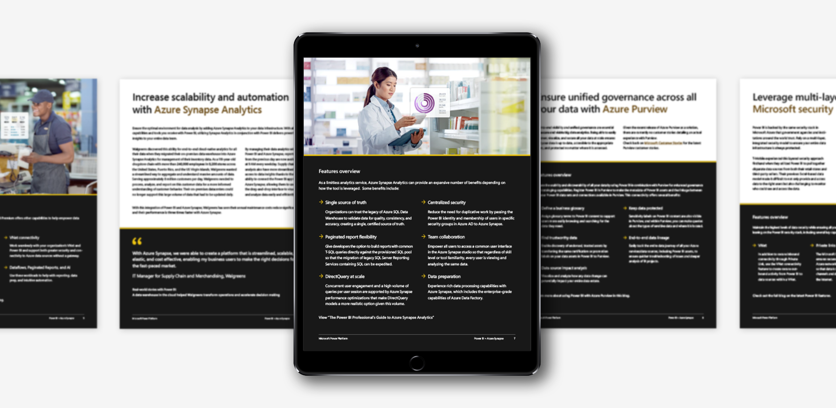
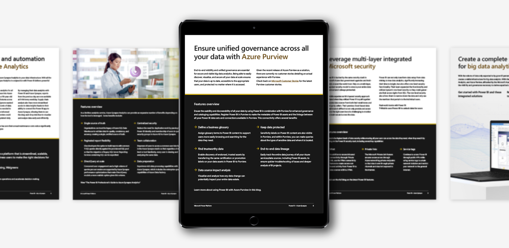
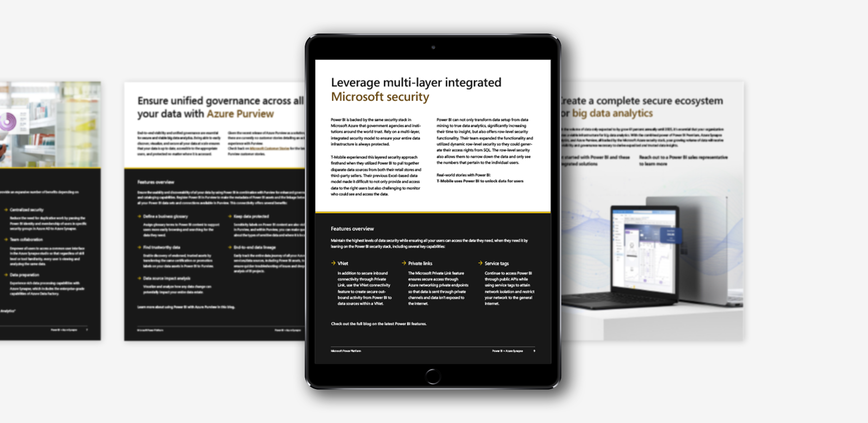
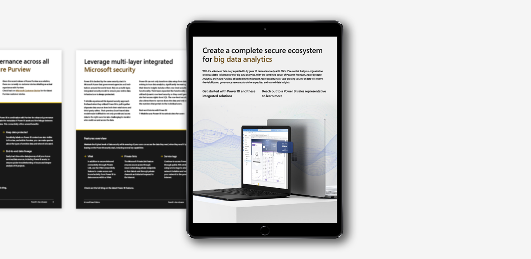
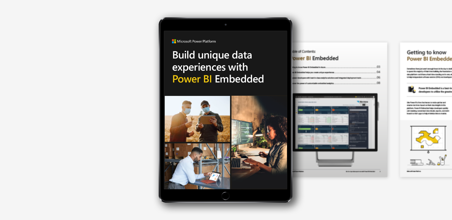
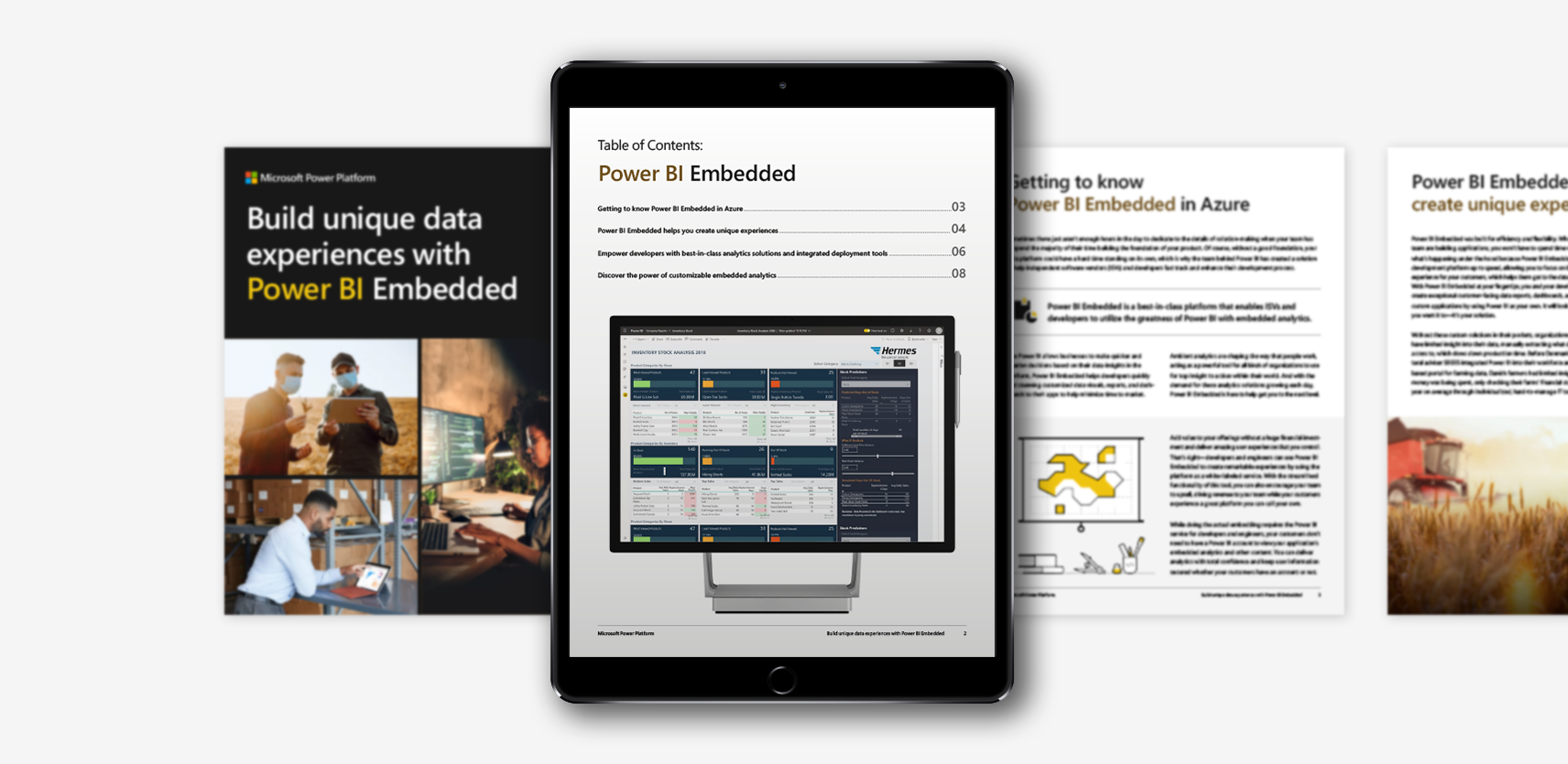
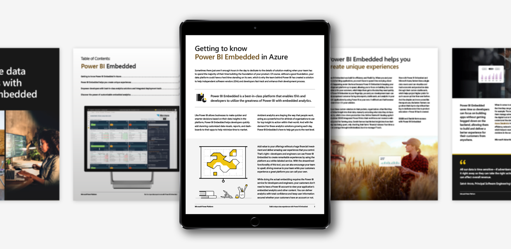
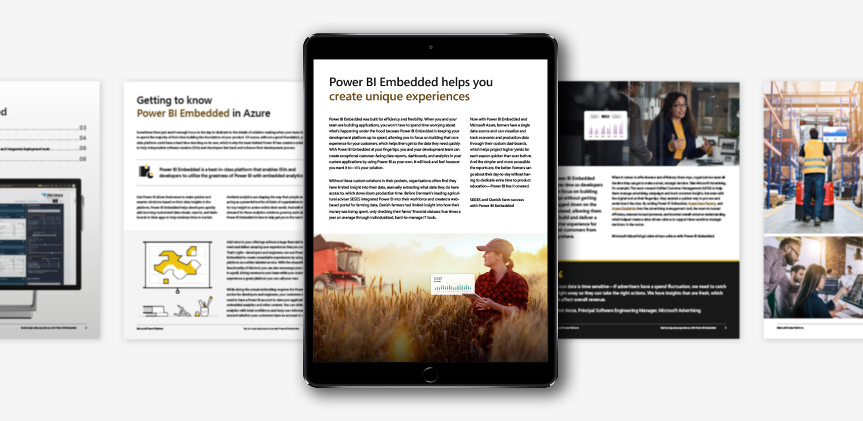
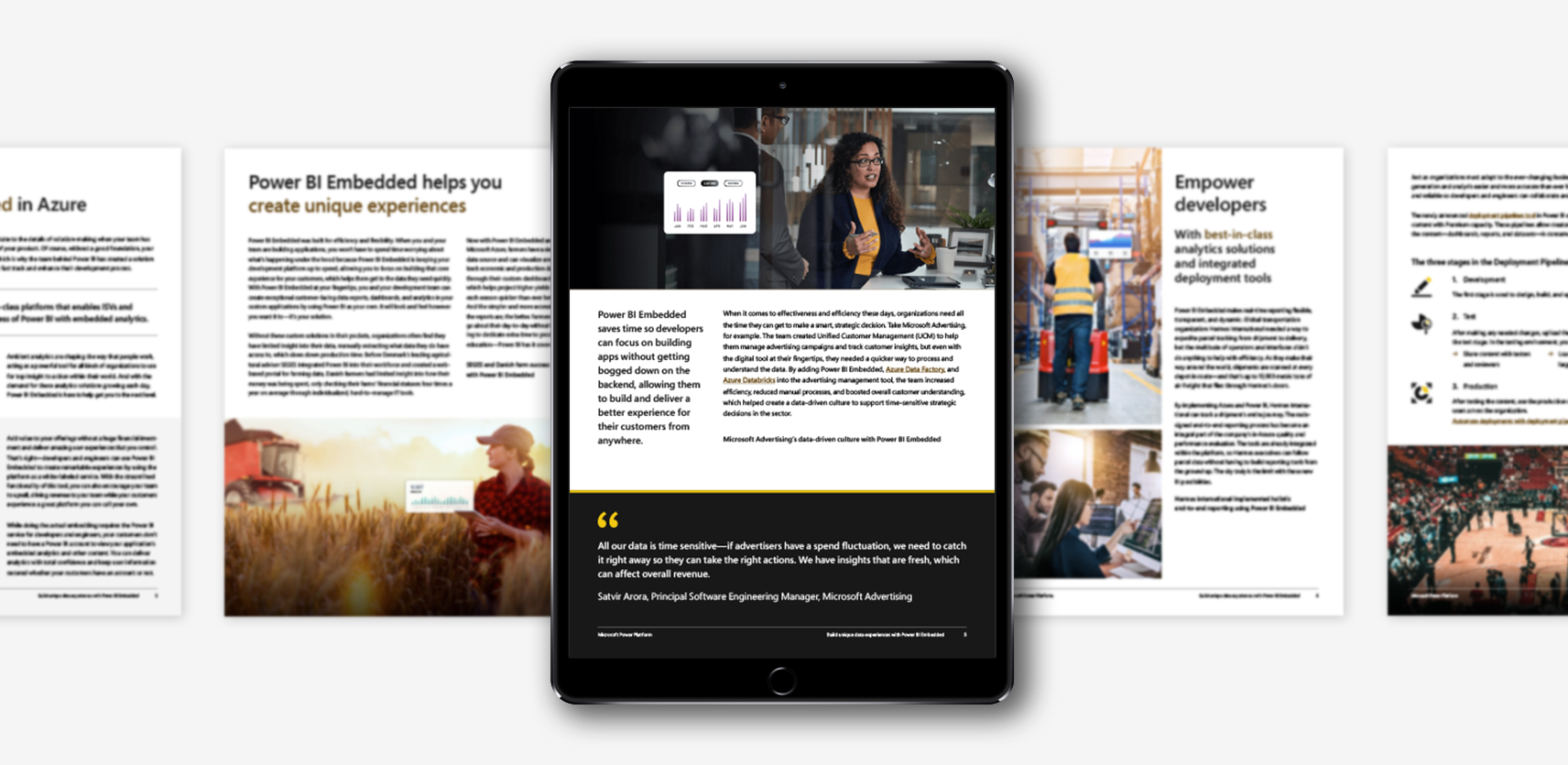
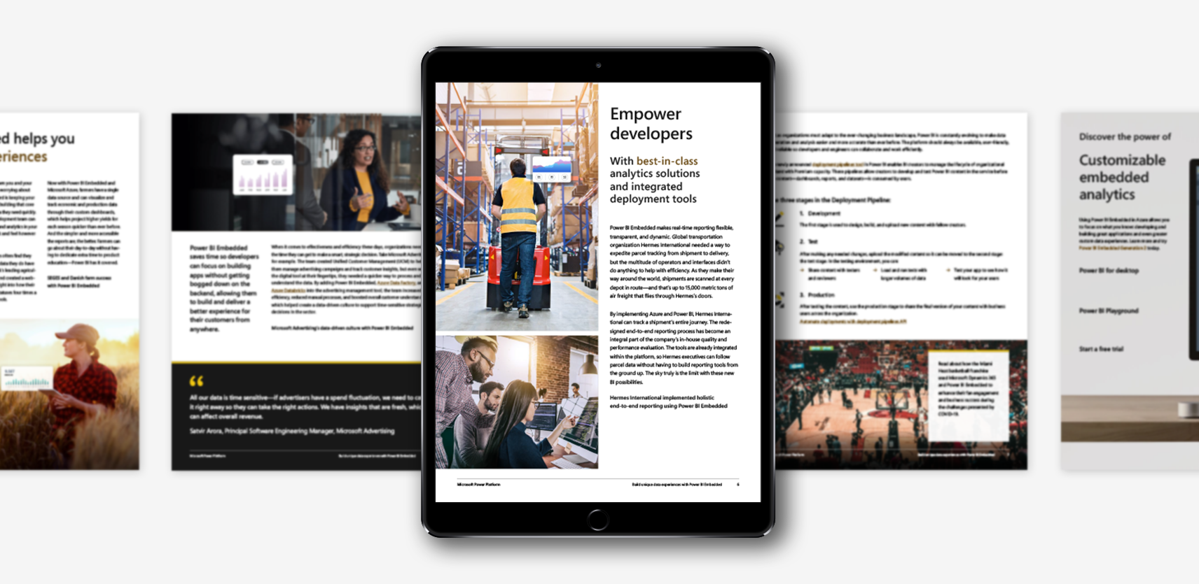
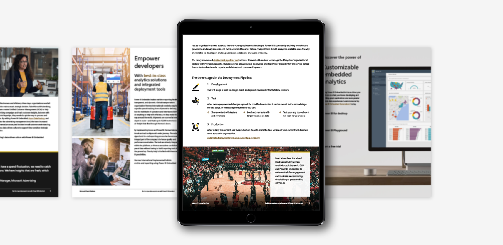
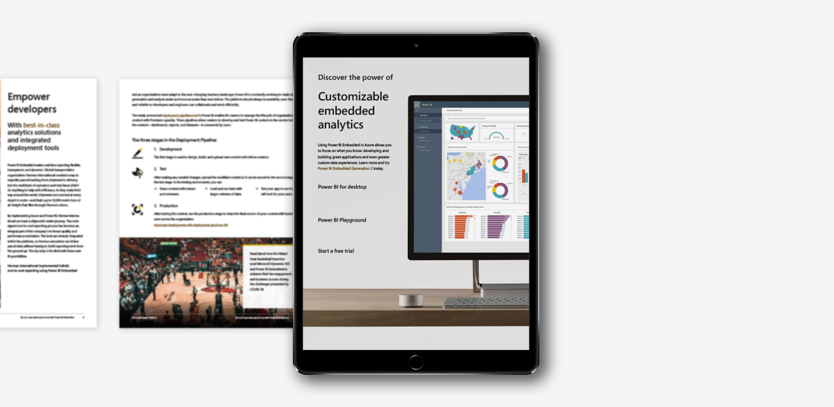
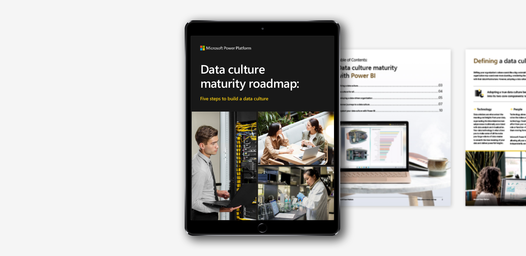
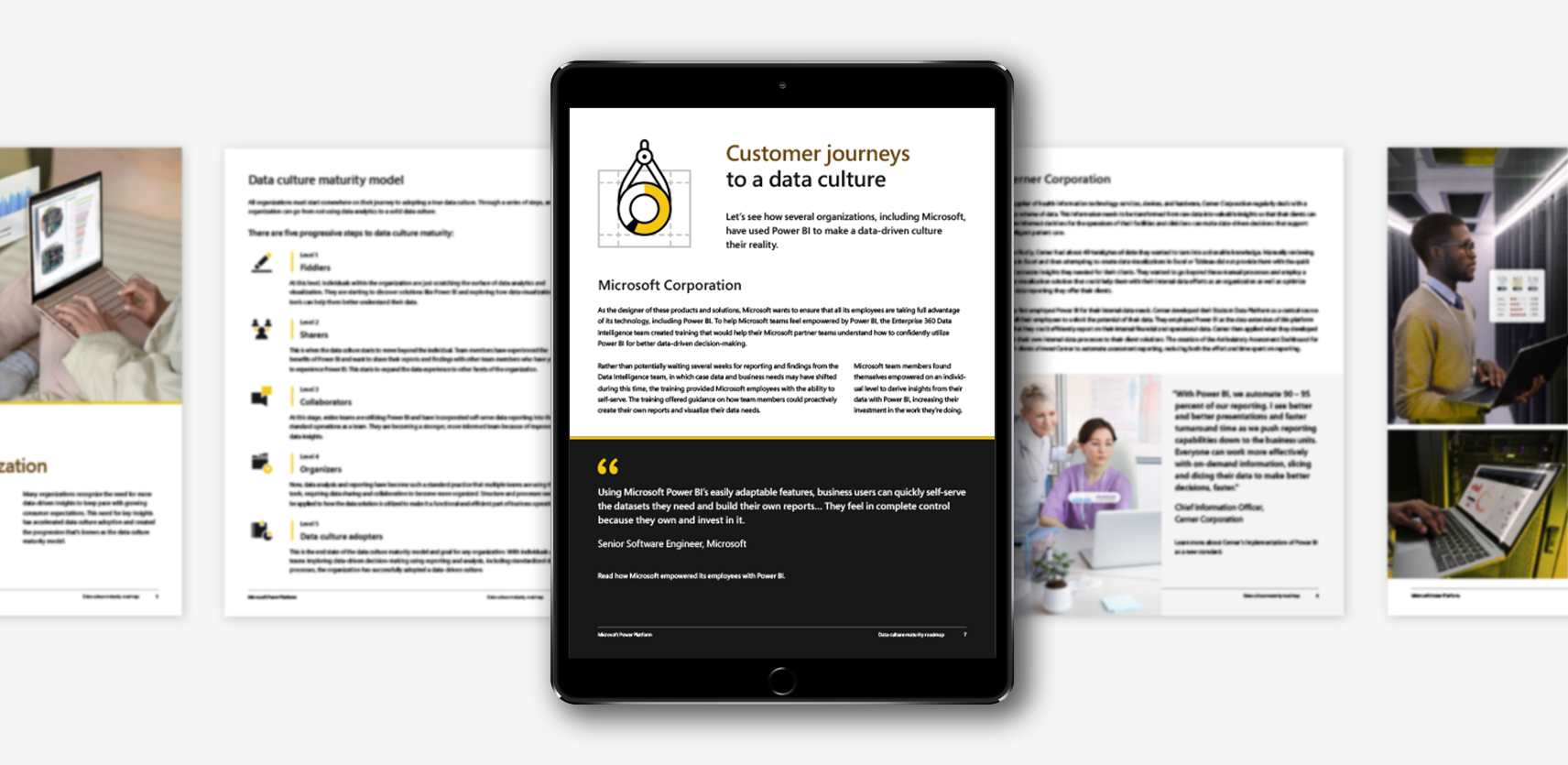
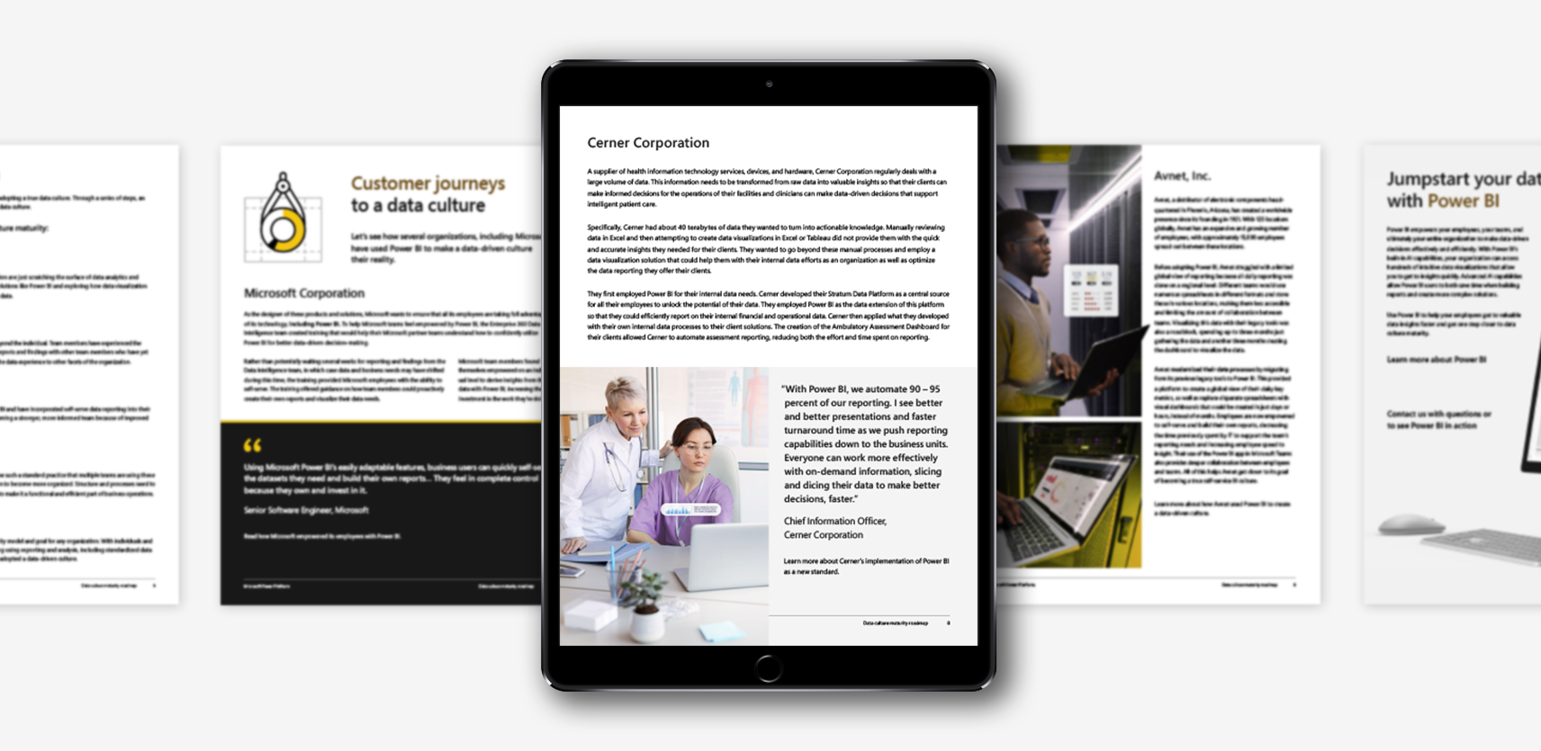
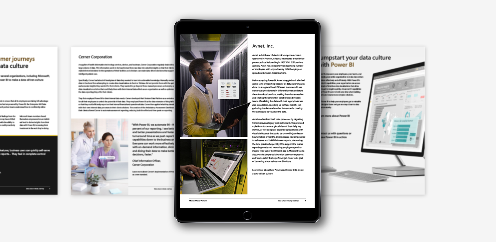
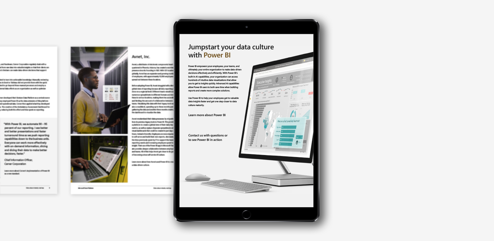
Microsoft approached Affirma Consulting looking for a series of five eBooks advertising different unique selling points of PowerBI—each speaking to independent user experiences. One of the main goals of the project was to develop final InDesign and PDF files that offered an interactive experience that was certified as entirely accessible.


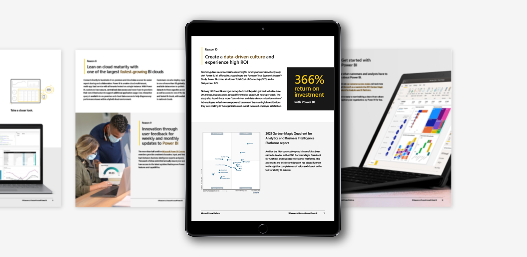
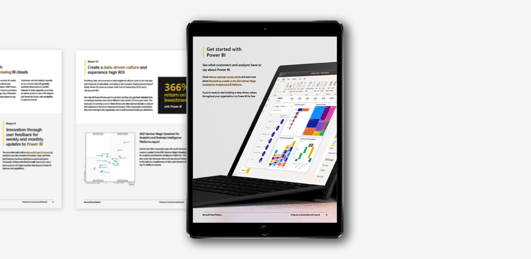
10 Reasons Customers Choose Power BI

VIEW ACCESSIBILITY REPORT

I considered it a great privilege to go through Microsoft’s Power Platform design standards and create this series with my Affirma team. It was a joy building an innovative design system for these eBooks off of Microsoft’s established regulations. Because my team wasn’t a group of Microsoft employees, I found that gathering resources to build the books was an interesting process. We weren’t given an excessive database of assets at our disposal. A large part of the design process was sourcing existing imagery from different nooks and crannies of Microsoft’s website. I found myself pulling iconography and illustrations from the PowerBI website and generating my own—mimicking the different styles. What I couldn’t pull from Microsoft, I sourced from licensed stock photography I Photoshopped to match the predetermined look and feel. By the end of the project, I had my own asset library of different photography, iconography, and illustrations. I felt it was important to have variety and not lean on one form of visual because the stakeholders were looking for something new, exciting, and inclusive—all while following brand standards.

Microsoft’s heavy emphasis on accessible content ensures everyone can interact with their brand. This practice opened my eyes to new ways of communicating with a broader audience. I found new marketing opportunities I hadn’t previously considered as a designer.

Designing in an interactive space that must be 100% accessible presents several challenges when it comes to layout and type design. Across all eBooks, I made type contrast, legibility, and flow a key priority. This was mostly to cater toward individuals that live with some sort of visual impairment. I spent additional time and care to provide alt. text describing images and infographics, as well. This practice opened my eyes to new ways of communicating with a broader audience. For example, in “10 Reasons Customers Choose Power BI,” I wrote alt. text for ‘2021 Gartner Magic Quadrant’ that interpreted the chart’s data and leveraged Microsoft’s positioning over their competitors. This offered a marketing opportunity the majority of the audience wouldn’t typically see. Additionally, I wanted a beautiful layout that could easily translate to a plain-reader view for those with cognitive impairments that have difficulty determining reading order. Microsoft’s heavy emphasis on accessible content ensures everyone can interact with their brand, not just a select few.

This project was an enriching learning experience for me as a designer. Initially, it was difficult maneuvering Adobe Acrobat’s recently established accessibility tools. As I familiarized myself with the program’s different capabilities, I found that I had the knowledge to troubleshoot any PDF and prepare it as 100% accessible–not just this series of eBooks.

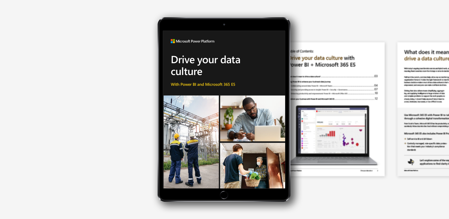
Drive Your Data Culture

VIEW ACCESSIBILITY REPORT


Power BI + Azure Synapse

VIEW ACCESSIBILITY REPORT


Build Unique Experiences with Power BI Embedded

VIEW ACCESSIBILITY REPORT


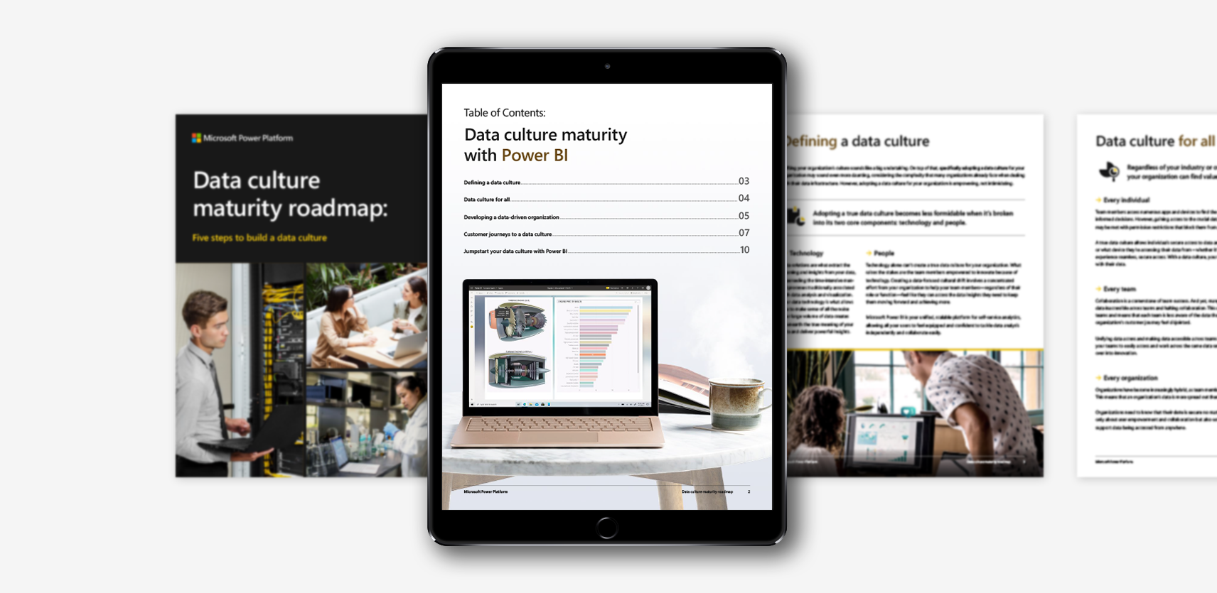
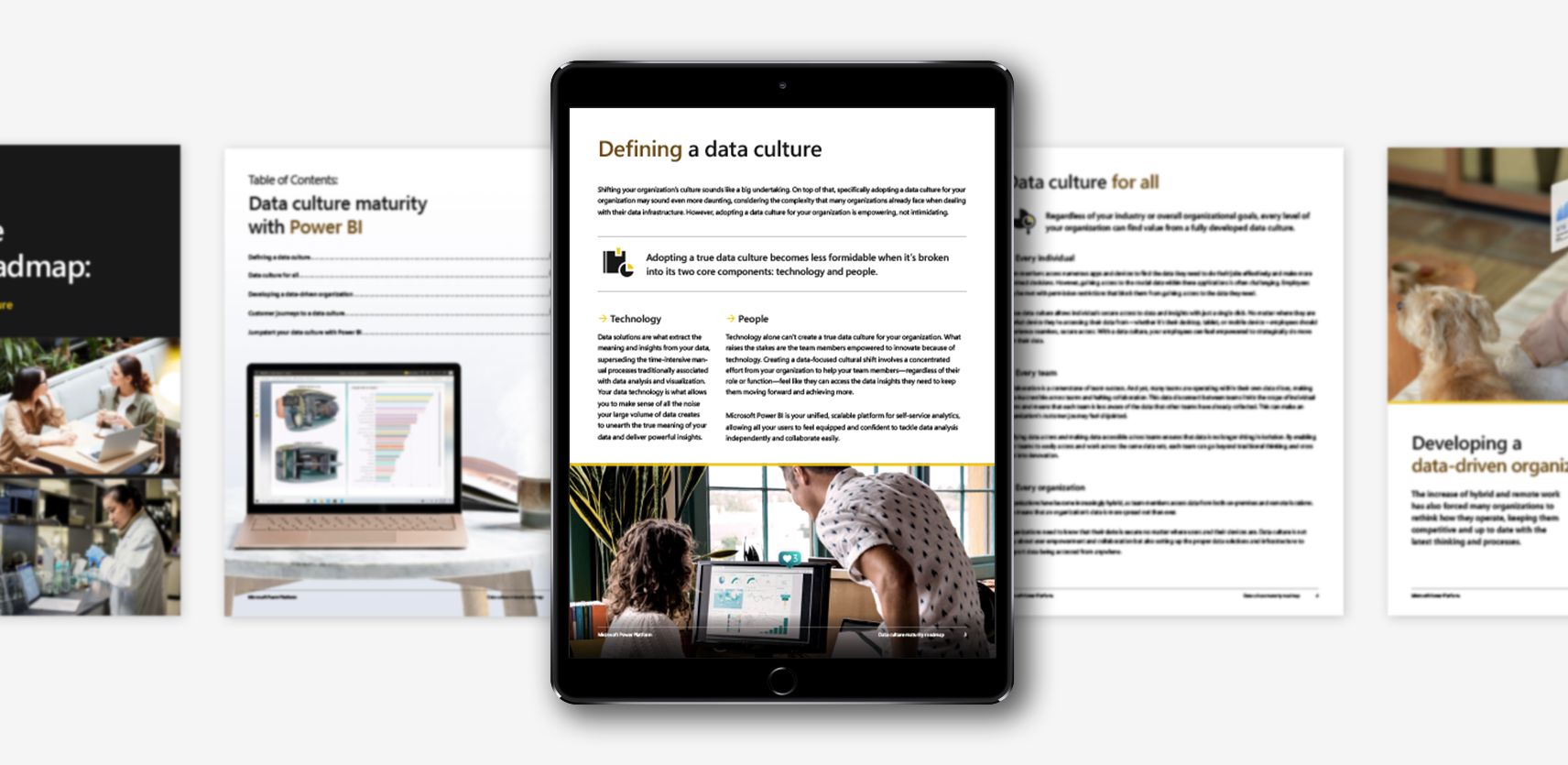
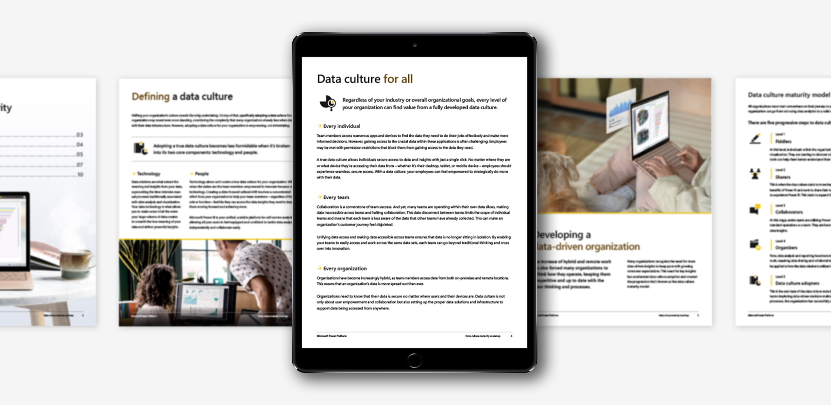
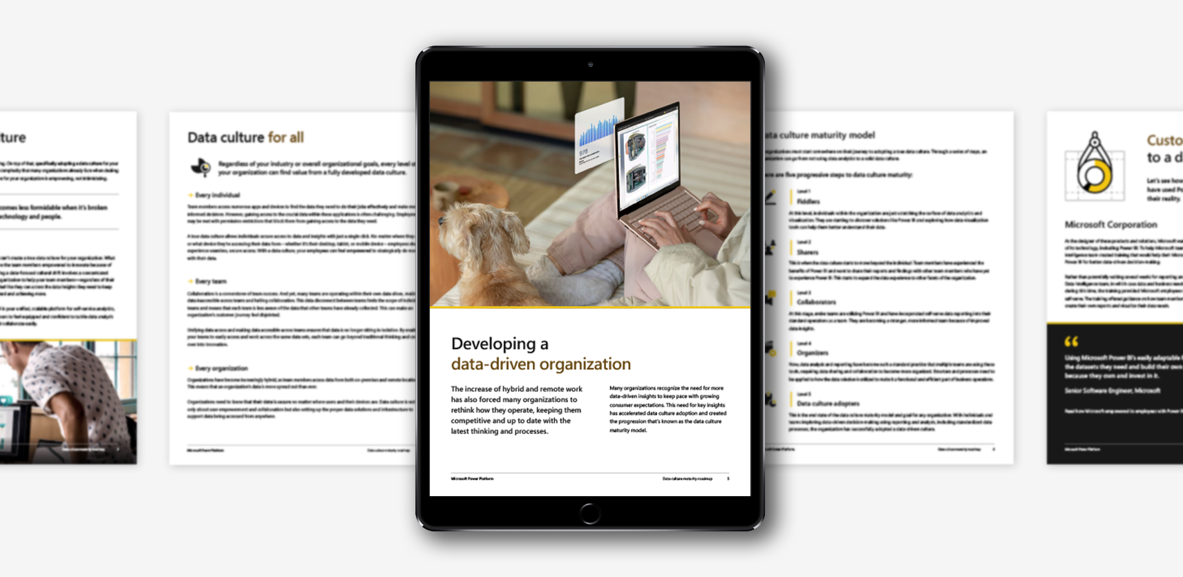
Data culture maturity roadmap: Five steps to build a data culture

VIEW ACCESSIBILITY REPORT