During our time in Philadelphia, my partner, Austin, worked at Julia R Masterman Laboratory and Demonstration School as their Computer Support Specialist. He worked as a part-time contractor repairing technology and maintaining the school’s website. In 2018, the Philadelphia School District ported all of their website work to WordPress with a visually restrictive template. In large part, this posed a problem because schools needed to entirely redesign their websites to work within a new system with a rigid template. I volunteered my graphic design services to the school to redesign the website and create a visual identity that could be implemented across the board in their collateral.
Expanding Masterman’s Branding
Before I could redesign their website, I had to refine and expand Masterman’s brand system. A few things were already set in stone: the school’s classic navy blue, and their established logo. Everything else was on the table: from color and typography to layout and iconography.
I chose to start with typography because Masterman’s logo already had a serif ‘M’ character in it. My first concern was accessibility. The school didn’t have a design budget, so getting them to purchase the rights to a type family wasn’t in the question. Austin informed me that the school was heavily reliant on the Google Suite. This meant that using a Google Font made the most sense (I can hear the collective groans of every graphic designer). In a perfect world, I would find another option; however, the school uses Mac, PC, and Chromebook operating systems. An easy-to-download and universally accessible typeface is the most realistic solution for this school. I settled on Merriweather as the primary typeface because the ‘M’ character had a stable form. Roboto’s geometric characters were the perfect complement to Merriweather’s classical serifs. It’s also incredibly versatile in that it comes in many weights.
After I created typesetting examples with my Merriweather-Roboto match, I focused on the school’s color story. I felt a monochromatic solution would be the least confusing and would be easier for faculty to work with. I kept the Masterman’s navy color and named it ‘Slate’ for its greyish tones. I chose a medium-toned blue, ‘Sky Blue,’ and a light grey, ‘Steel,’ to compliment it. I wanted a four-step progression from the greyish-navy to white, where the two colors in the middle highlight the overarching chromatic relationship.

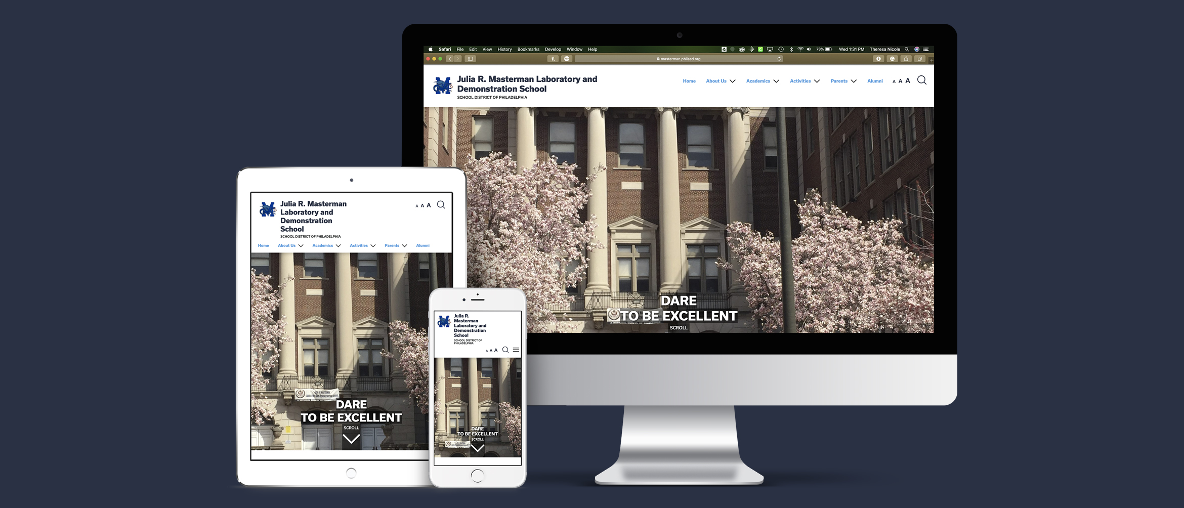
Building a Modern Responsive Website
Once I established the visual identity for the school, I could begin to plan the look and feel of their new website. My main priority was benchmarking what other schools around the world were doing with their websites. Rather than diving in and working only within the Philadelphia School District’s template guidelines, I wanted to get inspired by design excellence and find ways to adapt. I was particularly interested in the web design I saw from private schools in Japan. The typography felt crisp, and the layout and color palettes were clean and airy. I found that high school websites in Philadelphia were suffocating in content — packed wall to wall with words. There was an overwhelming contrast between the examples from America and Japan. I wanted to distinguish Masterman from its competitors and portray it in a new light. This design direction was the way to accomplish just that.
I started with a five-column system to keep the website airy. Adding visual cues to anchor information with a given hierarchy is the key to the redesign. I alternated section backgrounds between Masterman’s Steel and white to create visual breaks as you scroll. Icons and photography draw your eye and help distinguish important sections. Variation in typography keeps each page interesting, while also directing the visitor’s eye. By designing a few key pages, I was able to create a design system Austin and the Technology Teacher Leader could implement in the rest of the website. I stayed on as a design consultant to answer any layout questions that might come up moving forward, as well as any design integration that could help with the school’s digital switch during COVID-19.
To see the full design, visit Julia R. Masterman Laboratory and Demonstration School’s new website today.
It was so fulfilling volunteering to help Masterman firm up their branding and expand it digitally into their website. Working with the technology team and the administration was a joy, and gave me a new respect for the work Austin does. We were even more excited to find that the Philadelphia School District loved the Masterman website redesign so much, they implemented the stylistic decisions into their own website. I felt both flattered and humbled. I truly believe good design is powerful and has the ability to spread like wildfire. I love that I could help make the world just a little more beautiful with this volunteer project.