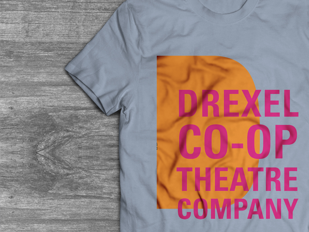
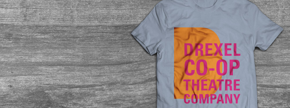
This is a compilation of the advertising designs I created for each of the performances within the Drexel Co-Op Theater Ensemble’s 2018 Season. They range from large banners and posters to small postcards. I also rebranded the Co-Op Theater Ensemble and incorporated this in their end-of-season tee-shirts.

Mutant Water Babies
In August I started my work on the Mutant Water Babies advertising campaign during my second year as the graphic designer for the Drexel Co-Op Theater Ensemble. After last season, I knew it was important to get a jump on the collateral so I could balance my senior year with their design work so I could produce solid designs. For this project in particular, I was inspired by the typography in the old Miracle Whip designs. I liked the light contrast the messy type had with the light background, and I wanted to incorporate that into my design.
Mutant Water Babies was a production written by Collaboration Town with input from the Drexel Co-Op Theater Ensemble. This was both a benefit and downside to my design work. The benefits were that my designs would set the tone for the show – since it was still in the writing and editing phases. I was so surprised to see the set design used my light blue motif throughout it. It was such a neat experience to see what an impact my concept had.
Unfortunately, the script didn’t have an ending by the time I started my concept. I chose to focus on the beginning of the performance and the imagery that comes along with it.
Mutant Water Babies takes place in a post-apocalyptic society where clean water is scarce due to, unregulated oil fracking. The people are forced to drink this water to survive and suffer visible mutations – some losing their genitals. It opens on a scene where a man sneaks into a hidden forest to collect a water sample in his mason jar but is stopped by a beautiful woman who toys with his emotions. To emulate this, I filled a mason jar with water, black and brown oil paint, and dirt and grass. I wasn’t sure what the dirty water was actually going to look like, so I chose to go to an extreme in its appearance. I also put a smoothie straw in it to show that it’s disgusting, but people HAD to drink it. The gross nature of it made it a more impactful design. It’s almost like a train wreck: it’s horrible, but hard to look away.
The vertical nature of the poster was practically made for my original composition. All of the elements fit seamlessly, and I didn’t have to worry too much about it. The postcard was a little more forced because I didn’t want to shrink the tall image of the cup and straw, but I still wanted the type to have a large impact. I solved this by cropping the image and bringing the Mutant Water Babies logo up in size.
The Diary of Anne Frank
The Diary of Anne Frank is a classic story that was modernized for the Drexel stage. I’ve had a lot of experience with Anne Frank’s story because I’ve studied it so much in middle and high school. When I started the project, I knew I wanted to use an incredibly simple color palette. I wanted it black, white, and yellow. I chose yellow because it was the color of the star Jewish people were forced to wear to identify themselves at the time. It’s such a strong visual symbol, despite the soft nature of the color. I wanted to add drama to the form by magnifying it and giving it less of a literal sense as a badge, but more of a mark.
The yellow star was used in the performance as a badge, and they chose to use my bright yellow, rather than the dingy light yellow used historically.
I started my process off by loosely sketching Anne. After a few meetings with the director, he communicated that he wanted the poster to be much less literal. Genocide isn’t a new concept to our world – it could happen to anyone. He was enticed by the idea of eyes floating in space. We all have them, and this atrocity could happen to any of us. He also shared that in modernizing the performance, he was going to hang monitors from the ceiling to create a dramatic background. I revisited my concept by loosely drawing Anne’s eyes but gave them a vibrating effect on the poster to make them look like they were glitching as a call back to this new modern twist.
I set the performance logo in Futura as more of a nod to the design community, mostly. I watched a short documentary on how Futura was the typeface that escaped the Nazi’s and it stuck with me. I loved that Nazi advertising was so stuck in the past by utilizing an outdated Fraktur typeface. While the rest of the world was embracing the straight lines and perfect circles that made up the careful geometry of Futura, they couldn’t move forward.
Godspell
Godspell was the season’s final performance that took place this Spring. This performance was particularly interesting to design for because of it’s strict copyright laws and guidelines. The title, tagline, and credits all had to take up a certain percentage of space in the posters and banners. This made my composition extremely difficult. I originally wanted to design the advertisements in the style of old psychedelic rock posters from the ’60s, but the director was looking for a hand painted, peaceful look. He wanted to give a twist to Godspell, where the heavenly phenomenon was taking place in Philadelphia specifically. In order to communicate this, he wanted to use the Philadelphia skyline specifically in the design. This wouldn’t have been an issue normally, but because of the strict copyright guidelines, it made my job a little more difficult. The skyline can be constraining because you have negative space above, and below it, but it’s hard to fit a title that takes up exactly 32% of the composition, while the directors’ names take up 20% of the title.
My new concept was hand-drawn with a watercolor texture. I wanted to use a muted, pastel color palette to call back to spring, but also to brighten the city. It gave the composition an organic feel, while still evoking the calm religious tone of the performance. I often worried that my dark, shaky written line and black text would interrupt the pastel nature of the collateral. Because I set certain pieces in a darker yellow to provide more of a harmony between the background and the information, I felt like I was able to combat this.
I was excited to find the painterly nature of my design found its way onto the stage. The actors were dressed in paint-stained clothes and in similar pastel colors that were originally in my design. To that point, the blonde nature of the wood also felt like a tie-in to the yellow in my design.