This is a compilation of the advertising designs I created for each of the performances within the Drexel Co-Op Theater Ensemble’s 2017 Season. They range from large banners and posters to small postcards.

The Red Bastard
In September I started my work on The Red Bastard advertising as the new graphic designer for the Drexel Co-Op Theater Ensemble. The motif that drove my design for the poster and postcard was primarily his signature color red. Other inspirations for the design came from past performances I watched on YouTube where he acted cheekily, and at times it looked like he was all over the place because of his audience interaction. The imagery I used was taken from a portion of The Red Bastard official website that was meant for advertising; however, I altered it and composed it differently depending on the format. The postcard and poster are an interesting vehicle to translate a design because they’re wildly different. For the postcard, I can add in small details like smaller forms and different facial expressions, because it’s more personal than a poster. It’s something you can hold in your hands closer to your face, while a poster is a lot larger. For the poster, because its orientation is more vertical and it’s viewed at a larger scale, I included fewer details and larger figures.
The Devil’s Auction
The Devil’s Auction is a performance written by the Drexel Co-Op Theater Ensemble. When it was time for me to start working on the advertising design, the performance wasn’t finished being written yet. The director asked for a type treatment that may be alluded to a fire that took place on campus to celebrate 125 years of Drexel University history. For my design, I photographed the reclaimed wood surface I used for Pincha Salt Magazine and used Photoshop to give the text a freshly branded effect. I wanted to make it look like the type was burned into the wood, so I gave it a weathered look and added small patches of smoke coming off the letters. I also added an orange and yellow glow to make it look like there’s a fire in the distance, without having to draw it. I wanted to hint toward the fire, without being too specific since the play was still being written. With the last performance, it took a little work to transition the design between postcard and poster, but with The Devil’s Auction, this wasn’t so much the case because the entire design was basically a background and the title of the performance.
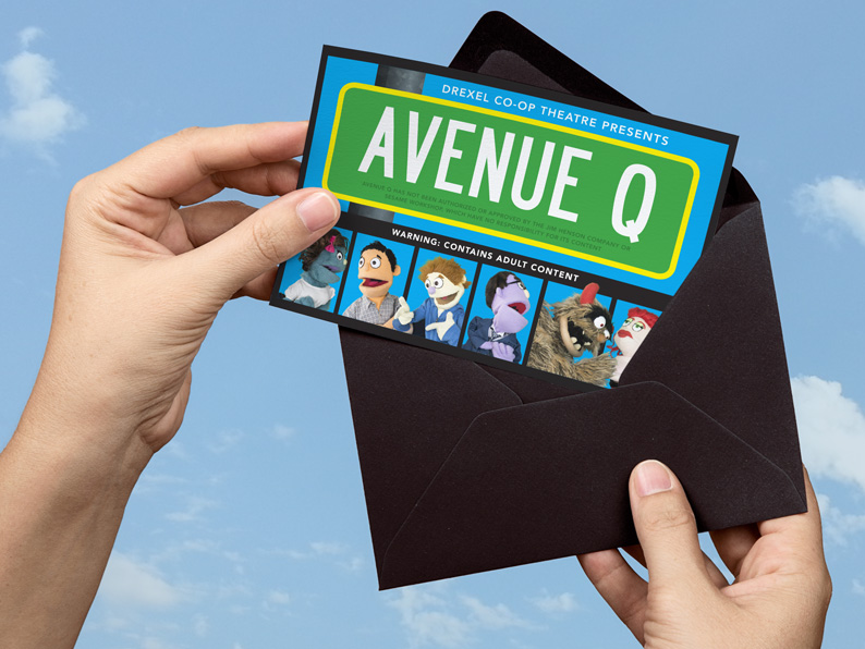
Avenue Q
Avenue Q was the season’s final performance that took place this Spring. This performance was particularly interesting to design for because of it’s strict copyright laws and guidelines. The photos of the puppets were taken internally within the Drexel Co-Op Theater Ensemble, but I altered them. The idea behind this set of advertising collateral was that there are so many different characters within the performance that it’s reminiscent of The Brady Bunch, while still having a Sesame Street vibe – despite the fact that the plot is so adult. I split the characters up into different cells with a cyan background to lightly reference the title sequence of The Brady Bunch, while my logo treatment ties in more with the idea of Sesame Street. The director thought it would also spike interest to the show if there was a portion of the design that says, “Warning: Contains Adult Content,” because the design appears so friendly and innocent. It’s a play on the fact that the performance is an adulterated version of something we’re used to seeing as innocent. This being said, there were a couple things I could and couldn’t do due to legal matters. I had to add extra copy that specifically referenced the original writers and composers of the actual performance word for word, and I also had a lot of disclaimer information I had to fit on both sides of my design. It was the first time I had to work under these guidelines during the season, and it was interesting to work under these constraints.