The following is a case study I built around Hillary Clinton’s 2016 logo and branding system to talk about the importance of design in elections, after interviewing Michael Bierut of Pentagram.
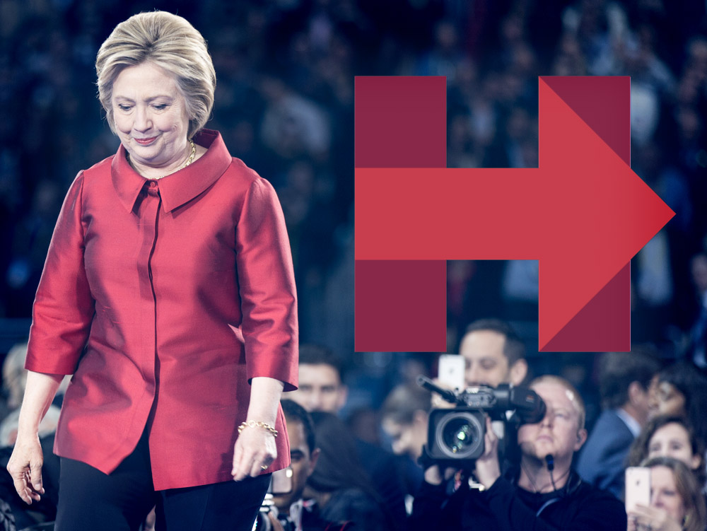
America has seen design, like poor typography, play a contributing role in the endgame of an election, and America often sees good design go unnoticed. In its most recent election, Hillary Clinton’s branding was progressive, strong, and modern, while President Donald Trump’s was clumsy and incohesive. Unfortunately, her opponent’s brand, supported by his associations with luxury and television, appealed more to the American people than successful design and sound reason. Good design and strong brand identity are instrumental in swaying the outcome of an election; however, in the 2016 election, Hillary Clinton’s strong design system proved to be insufficient compared to President Donald Trump’s years of brand building – costing her the election.
A BRIEF HISTORY OF DESIGN IN ELECTIONS
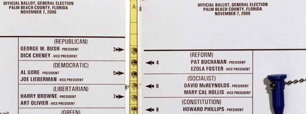
Design is powerful in that it can make the world more aesthetically pleasing, while simultaneously holding the power to shape the future. In 2000, design was one of the most influential factors that decided the outcome of the election. Theresa LePore, the supervisor of the elections in Palm Beach County, Florida had a problem every graphic designer frequently faces throughout their career. She had too much text and not enough space. Worst of all, she wasn’t a graphic designer. That year, there were too many candidates to fit into a single column ballot. LePore invented the butterfly ballot as a solution, but instead, it only led to more confusion.
Typography was the key issue with the butterfly ballot. If voters wanted to vote for George W. Bush, they would punch the first hole. If voters wanted Al Gore, they would have to punch the third hole even though Gore’s name was directly under Bush’s. In Florida, it’s estimated that 2,800 voters who intended to vote for Al Gore were confused by this ballot layout and accidentally punched the second hole. Instead of voting for the candidate they wanted, many unintentionally chose Pat Buchanan. Coincidently, the 2000 election ultimately ended up being decided by Florida. If the butterfly ballot wasn’t used, and 2,800 Americans voted for the candidate they preferred, the election’s results would have been wildly different. In 2000, layout design and typography helped decide the outcome, but in 2016, brand identity worked to sway the presidential election.
Designing for an election is frightening. Whether one is designing the ballot or the brand for one of the candidates, their design decisions will be scrutinized on a much larger level than they have been previously. Michael Bierut, a design partner at Pentagram, was tasked with designing Hillary Clinton’s logo and brand for the 2016 presidential election. “I was thrilled to be working on the project and my only worry was getting a solution everyone would be excited about,” Bierut shares. It speaks to a designer’s character when they can be so enthusiastic about a design that has the weight to potentially tip the scale of something as monumental as a presidential election.
INSPIRATION AND PREPARATION
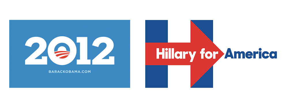
In January of 2015, Bierut was invited to design the logo for former Secretary of State Hillary Clinton. He worked closely with designer Jesse Reed and project manager Julia Lemle over the course of two months to build a brand and logo for their candidate. A problem they faced was that she had name recognition already. When President Obama first ran for office, he was a young, new Senator. He was a fresh face offering hope to the nation. In this case, people were used to her – she was familiar.
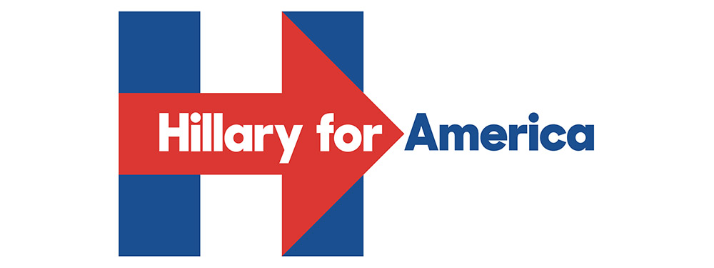
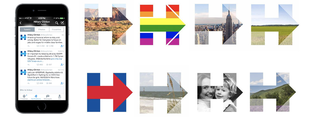
Raymond Loewy was an industrial designer with a knack for branding and logo design. He designed Coca-Cola’s vending machines, as well as BP and Shell’s logo designs. Michael Bierut faced a conundrum with Secretary Clinton’s familiarity, and he was inspired by Raymond Loewy’s reliable formula: “If something was familiar, make it surprising. If something was surprising, make it familiar.” Because of this, Bierut decided to make her brand stunning and compelling by building on her sense of familiarity. He chose the ‘H’ to represent her. The ‘H’ was a powerful decision in a mark because it represented the candidate as a person and as a woman. “The things we liked about the letter H – symmetry, stability, timelessness – also gave it a static quality.” Bierut worked to combat the static quality of the letter by adding the arrow. It added dynamism to the mark and represented progress. Metaphorically, it stood for a future where a woman could be the president of the United States of America.
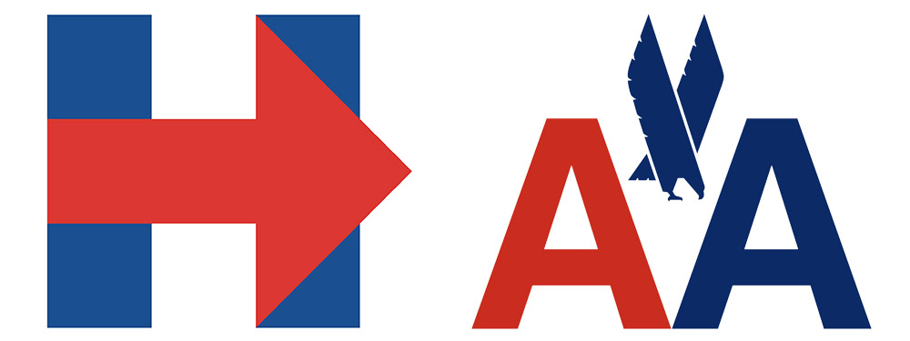
Michael Bierut’s first job was working under renowned designer, Massimo Vignelli. He writes, “I ended up staying 10 years [with Massimo Vignelli]. Having learned my earliest lessons about graphic design by copying from library books, I found it impossible not to imitate Massimo’s unmistakable style…sans serif typefaces on every page, modular grids underpinning every layout.” These design techniques were brought into the branding for Secretary Clinton’s logo. Her ‘H’ mark is built on a structural grid and uses a sans-serif typeface much like most of Massimo Vignelli’s work. It uses a reduced color palette in the mark as well; however, as the brand progresses, we see that color palette extend a bit. Massimo Vignelli handled American Airlines’ 1968 rebrand in a very similar fashion. In the AA mark, there’s a focus on symmetry, while also utilizing a two-color palette and using sans-serif type. Bierut’s discussed his inspiration from Loewy when it comes to the anthology of brand building in his Design Observer article but hasn’t mentioned how his history under Vignelli may have impacted design decisions that went into Hillary Clinton’s brand. There are unmistakable parallels in the American Airlines mark and Bierut’s ‘H’ design. It could be that the two designers have similar tastes, but it feels like Massimo Vignelli’s aesthetic has a brief influence on key design decisions in this campaign.
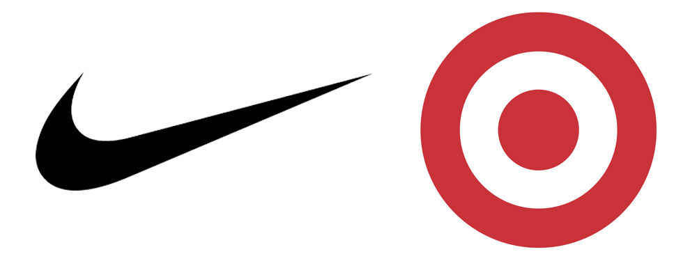
“I had been thinking about the enduring power of very simple, almost ‘undesigned’ symbols such as Target’s and Nike’s, and particularly the way that their simplicity made room for creative treatments by others. That seemed to be something that would be an asset in this particular situation,” Bierut comments. He wanted a mark that was strong with an immediate punch. The Nike Swoosh and Target mark are successful because they’re simple, recognizable, and minimalistic. They’re direct in what they illustrate – the Target logo physically looks like a target. Not only that, they also give their companies room to build campaigns and experiment with their identity because the logo in itself is more of a symbol than a picture or word on its own. In the case of Hillary’s ‘H,’ this is somewhat less direct in that it’s a typographic treatment. The ‘H’ doesn’t physically embody the idea of ‘Hillary,’ so the association is slightly looser in comparison to brands like Nike and Target.
In successfully creating a mark that was impactful and simplistic, it opened up different avenues to explore branding around it. It became a vehicle to advertise images associated with her political ideology. Used as a sort of clipping mask, the campaign could place the LGBTQ flag inside her mark to show her support for that community. On another level, it worked as an arrow directing people to messages the campaign posted on social media.
INTENTION VS. RECEPTION
In April of 2015, Secretary Clinton announced her candidacy for president of the United States. In doing so, Bierut’s logo was released to the world. Immediately, the design faced intense backlash on Twitter. Something so well-thought-out in brand and design was immediately hated. “She’ll be hearing from FedEx’s trademark attorney on Monday,” Jack Shafer posted. “Hillary opponents have turned her logo into the twin towers because of course, they have,” Olivia Nuzzi posted. These individuals are reporters. Jack Shafer works as a journalist from Politico, and Olivia Nuzzi is a political journalist covering President Donald Trump’s administration – these were hardly neutral observers. In fact, most of the backlash about the design was from those opposing Hillary Clinton, reporters, etc. Graphic designers, on average, came out in favor of the mark’s dynamic characteristics. At this point, it had become apparent that this backlash was targeted at the candidate, not the logo. Reporters were looking for a story that a ravenous audience would consume, and others were looking for a laugh. Neither party was concerned with the actual design decisions made. The criticism was misdirected, and Bierut chose not to redesign the logo because of this.
DESIGN VS. NON-DESIGN
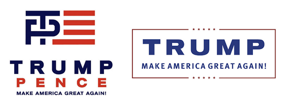
The Trump-Pence campaign’s design was clumsy and wasn’t thought-out. Their logo was long and incorporated a makeshift flag where a ‘T’ penetrates a ‘P’. Much like Bierut’s design, it featured a two-color system, but the colors weren’t used in a strategic way. Red or blue wasn’t used to emphasize a portion of the mark; rather, the colors flip-flop so there’s an equal spread of each. The type was placed with a heavy hand, and once the logo is shrunk down for application else were, one begins to lose elements of the slogan at the bottom. When the campaign faced backlash once the new logo was released, they immediately changed it. Bierut had the right idea in sticking by his initial design. Once the Trump-Pence campaign changed the mark, they lost recognition in the brand and made it appear unsure of itself. Yet, the design of the new logo isn’t much better than the old. It features the same heavy-handed typography from before, only the penetration flag was removed and replaced by a frame around the mark that looks decorative and unnecessary.
The type treatments in both logos don’t translate into the rest of the Trump-Pence campaign identity. Trump’s “Make America Great Again” hats used a generic serif typeface that doesn’t appear anywhere else in the system, and it ended up being one of the key icons for his campaign. “To the thousands of people who wore them to Trump’s rallies and day in and day out in their cities and towns, the hat was a beacon. It was this election’s Hope poster.” The hat was a generic design ordered online, but it helped create the Middle America persona Trump was aiming for that ultimately won him the election. People who stood against his campaign wore the hat ironically, and people who supported him wore it proudly. Either way, both parties added impact and recognition to the hat and made it his symbol. It was pervasive, potent, and deeply misunderstood. The hat became the unspoken logo for the Trump-Pence campaign. “Trump’s stuff happened to be really badly designed, but I [Michael Bierut] think it would have worked just as well if it were well-designed.” The campaign was driven by Trump himself, not good or bad design.
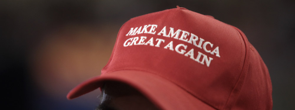
If anything, the 2016 presidential election brought up an interesting point: good design isn’t necessarily effective design. President Barack Obama’s past two campaigns, as well as Hillary Clinton’s 2016 campaign, featured bold and friendly typefaces, structured color palettes, and well-thought-out logos. Their systems took a modern approach that was meant to be shared and reacted to by the public. They utilized good design to spread their messages. Trump’s focus was more on creating a persona that could relate to Middle America’s working class problems. They felt ignored by the Democratic campaign, and Trump’s trucker hat was a way of reaching out and acknowledging them when no one else thought to. His design system didn’t translate across different mediums; in fact, his design system felt more like a hat and a Twitter handle more than anything. The clumsy nature of his design system made him appear to be an “Average Joe” and reinforced the idea that he was an outsider and not a jaded politician. The garish nature of his campaign design system ultimately made him more relatable and worked as an effective design rather than an aesthetically pleasing one.
The design of a Presidential campaign is supposed to be cohesive, representative of the candidate, and capable of reaching a broad target audience. Thorough thought and intention must be put into even the smallest details to contribute towards the overall vision. Michael Bierut commented that:
Trump had basically devoted the past 30 years to nothing but building a brand: a familiar name that could be simply attached to things. In the end, he simply attached his name to the Republican party (and now America).… [while] Hillary Clinton saw herself as is a public servant, not a brand. Her logo was part of her message, not the message itself.
A presidential candidate doesn’t solely represent themselves, but also their mission, ideals, and party. A single name shouldn’t dictate that, yet that is exactly what Trump’s brand had used. In juxtaposition, Bierut’s logo was able to connect to others and made the mark reach lengths beyond Hillary herself. That is what made it strong. However, her strong design and message simply weren’t effective enough.
CLINTON’S BRAND EXPANSION
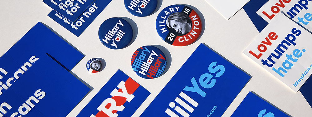
Jennifer Kinon took over designing the brand identity for Hillary Clinton after Pentagram’s contribution. Kinon works for Original Creators of Design (OCD), which “specializes in setting up and implementing cohesive visual systems that can be applied to all elements of a business: website, social advertising campaigns, merchandise, as well as various company divisions”. This experience helped her create the visual elements that humanized Hillary Clinton beyond a logo and an established type hierarchy. Her design for the Clinton campaign took the shape of banners on social media, commercials, T-shirts, buttons, and a myriad of other mediums. In addition, Kinon and her team were responsible for the initial “Love trumps hate.” social graphic as a reaction to Trump’s declaration to ban Muslims from entering the United States. The slogan inspired so many Americans that it took on a life of its own beyond its early inception. The type treatment and color palette of her design give emphasis to the important parts of the quote. While it’s a sentence so it would make sense to capitalize the first word and end it in a period, by capitalizing the L in love and making it red, Kinon gives love all the power in this phrase. Red is fiery and powerful, and she gives that meaning to love instead of hate. In placing “trumps hate.” in blue, she’s creating a relationship between the two terms visually while simultaneously removing power from each by keeping them in lowercase. The choice to incorporate the period is also a smart design decision because it feels like the hate stops at that moment. It’s decisive and wraps the piece up in a neat little bow.
LOOKING AHEAD
Strong design and well-thought-out brand identity are two instrumental factors in altering the outcome of an election; in the 2016 election, President Donald Trump’s years dedicated to building his personal brand outweighed Hillary Clinton’s carefully crafted design system – costing her the election. America has a history of design impacting elections. The country has seen it before in propaganda and poster design in the past, but more recently, it’s been about ballot design in 2000 or brand identity since 2008. Good design has always mattered in the past, but the 2016 presidential election challenged that concept and argued that a good design is wildly different than an effective one. Michael Bierut’s logo design for Hillary Clinton’s 2016 campaign was modern and bold, while Jennifer Kinon’s brand expansion was systematically considerate and moved across many platforms from T-shirts to signage. Their issue wasn’t design, but the message they were conveying. America’s Rust Belt felt ignored and overshadowed compared to coastal cities that were detached living in their own little bubble. Donald Trump’s “Make America Great Again” hats reminded Middle America of a time when they were the backbone of America’s workforce, and his middle-class targeted message resonated with them much more than Clinton’s identity as a Washington politician.
Though the hat neglected values of good design, it was effective because it served as a beacon of hope for Middle America. The design community’s only hope is that good design isn’t eradicated from the future of politics. Good design can be effective, as long as the message doesn’t get lost in translation. Trump’s anti-design stance in his campaign shouldn’t represent the beginning of design any longer playing a key factor in the future of elections. Instead, it should act as a lesson. Donald Trump won the 2016 election because of a strong brand, and designers should add more work and emphasis to that aspect of campaign design in the future.