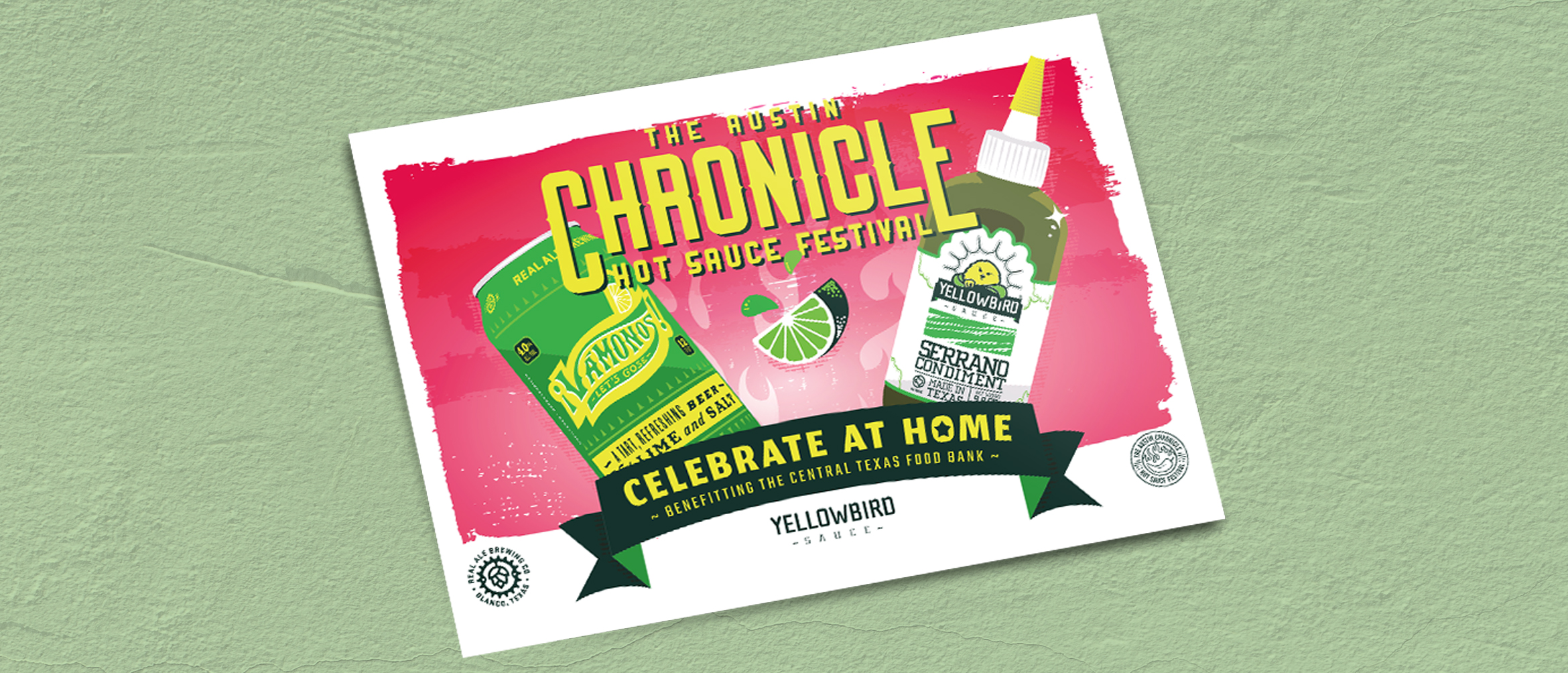
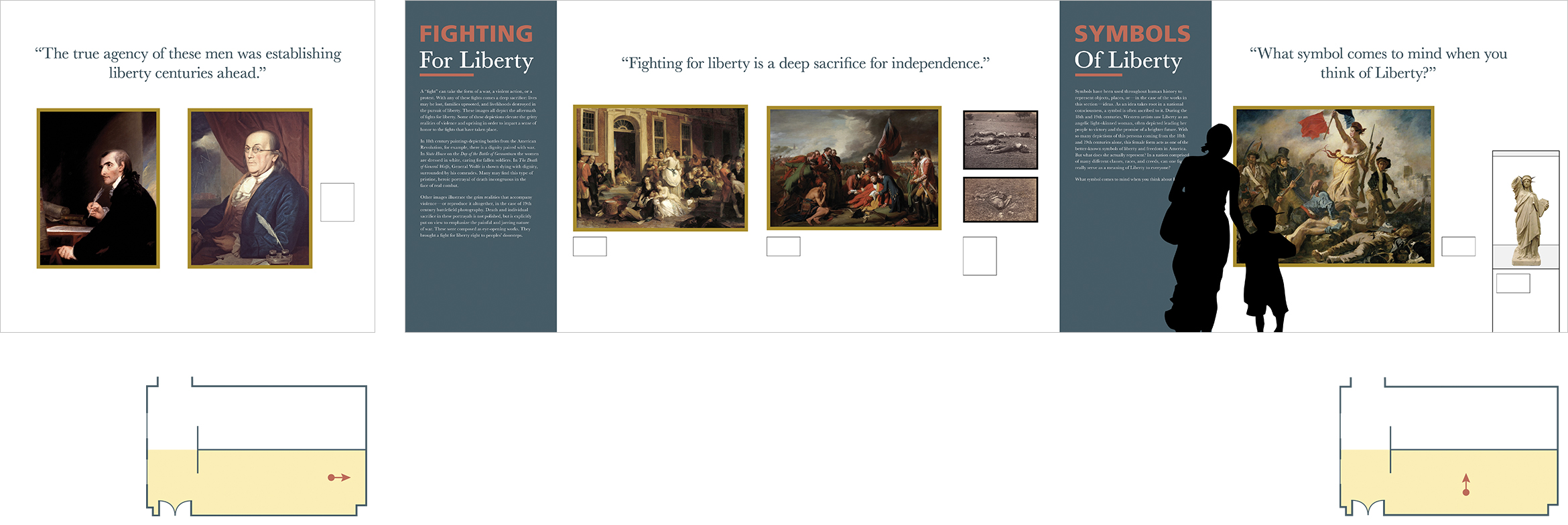
Author Archives: Theresa

Holiday Cards 2020

Holiday Cards 2020

As I finished up my master’s degree in December of 2019, I made a promise to myself. 2020 was going to be the year of new experiences! My family had just moved to Austin, and between work and finishing up my graduate thesis, exploring our new home was something that felt impossible. Ironically, it seems doing anything in 2020 is impossible. This year has been ridiculously difficult. COVID-19 has essentially flipped the world on its head and left us all in a passive state of constant anxiety. I’d spent the majority of my time working from home this year — feeling positively stir-crazy. Fortunately, it allowed me to get creative in my personal life. When I wasn’t working on home projects, I dreamt up an elaborate holiday photo.

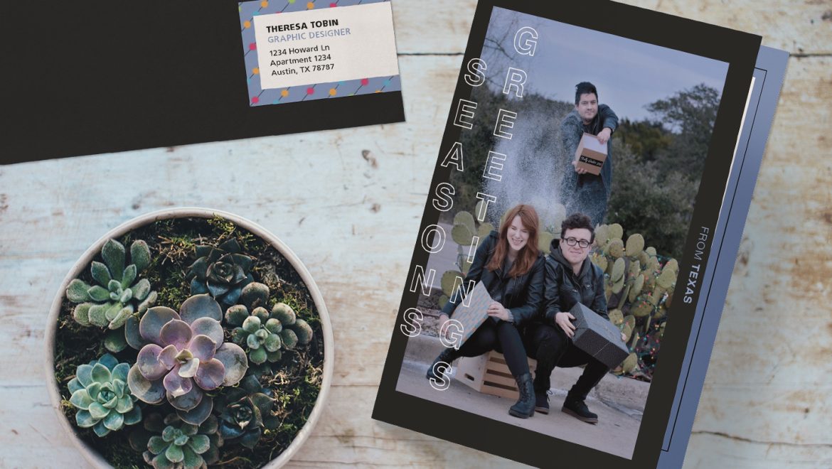
My family moved into a new apartment this summer, and we truly love it. We’re surrounded by lush greenery, nature, and wildlife. It’s beautiful and something I wanted to try and incorporate into our holiday card this year. Because we’re social distancing and trying to slow the spread of the virus, we couldn’t actually go anywhere to take our photo. We had to do the entire shoot from home (or at least within our apartment complex).

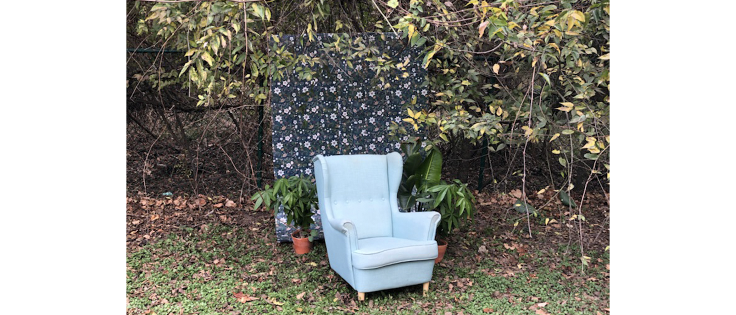
One rainy morning in October, the idea for our holiday photo popped into my head. I envisioned an outdoor study with three professors wearing glasses and smoking pipes. It seemed unique while being entirely ridiculous, and that reason alone sold the idea to me. Setting the scene would be laborious in that we’d have to build a backdrop and carry the furniture to our location, but my concerns were quelled remembering it’d all be within walking distance of our front door.

We decided to take the photo on Thanksgiving morning. Everyone would be home from work, and I’d have the weekend to edit the photos and get everything together. The boys and I sat on the floor that morning breaking down cardboard boxes from our Christmas shopping and duct-taping them all together. It looked like we were building a cardboard raft in our living room. We then wrapped it in wrapping paper Austin had brought home from IKEA, and the three of us carried it to a grassy area near our apartment dog park. We carried over the blue armchair in my office and a few plants from our porch and began to set the scene to the tune of barking puppies. It was windy, our backdrop fell several times, and I absolutely stepped in doggie doo. As glamourous as our struggle sounds, the photos came out beautifully. Our matching sweaters and pashmina scarves coordinated perfectly with the backdrop.

Photo setup

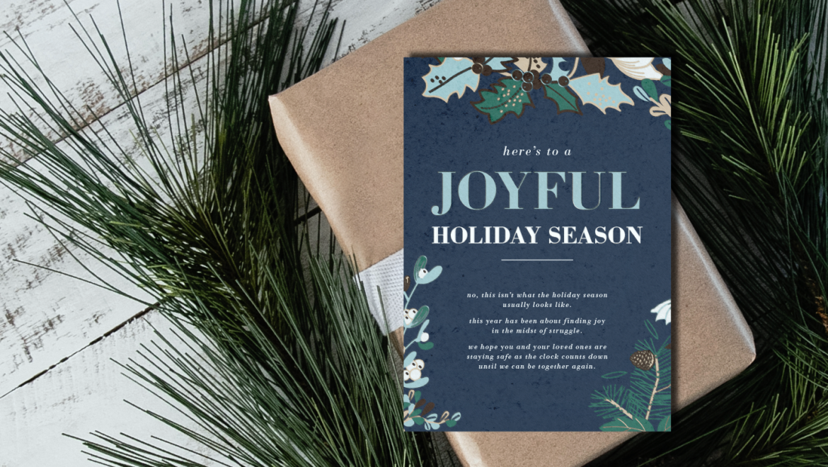
After some color correcting and light photo editing, I started to work with the card’s typography and layout. I decided to do a postcard layout this year because we were all feeling a little overwhelmed, and we still needed to print and send the cards out on time to our loved ones. Simplifying the design ended up working in our favor because it allowed the typography on the front to shine, while also making it easier for our relatives to hang our photo on the fridge.

2020 felt like an impossible year, but we made it through it. I’m proud that we were able to spread some holiday joy to our friends and family this year, despite the hardships that come along with the pandemic. Putting these cards together annually means so much to me, and accomplishing it this year in particular, makes things feel just a little more normal.

Julia R. Masterman Branding & Website

During our time in Philadelphia, my partner, Austin, worked at Julia R Masterman Laboratory and Demonstration School as their Computer Support Specialist. He worked as a part-time contractor repairing technology and maintaining the school’s website. In 2018, the Philadelphia School District ported all of their website work to WordPress with a visually restrictive template. In large part, this posed a problem because schools needed to entirely redesign their websites to work within a new system with a rigid template. I volunteered my graphic design services to the school to redesign the website and create a visual identity that could be implemented across the board in their collateral.

Expanding Masterman’s Branding

Before I could redesign their website, I had to refine and expand Masterman’s brand system. A few things were already set in stone: the school’s classic navy blue, and their established logo. Everything else was on the table: from color and typography to layout and iconography.

I chose to start with typography because Masterman’s logo already had a serif ‘M’ character in it. My first concern was accessibility. The school didn’t have a design budget, so getting them to purchase the rights to a type family wasn’t in the question. Austin informed me that the school was heavily reliant on the Google Suite. This meant that using a Google Font made the most sense (I can hear the collective groans of every graphic designer). In a perfect world, I would find another option; however, the school uses Mac, PC, and Chromebook operating systems. An easy-to-download and universally accessible typeface is the most realistic solution for this school. I settled on Merriweather as the primary typeface because the ‘M’ character had a stable form. Roboto’s geometric characters were the perfect complement to Merriweather’s classical serifs. It’s also incredibly versatile in that it comes in many weights.

After I created typesetting examples with my Merriweather-Roboto match, I focused on the school’s color story. I felt a monochromatic solution would be the least confusing and would be easier for faculty to work with. I kept the Masterman’s navy color and named it ‘Slate’ for its greyish tones. I chose a medium-toned blue, ‘Sky Blue,’ and a light grey, ‘Steel,’ to compliment it. I wanted a four-step progression from the greyish-navy to white, where the two colors in the middle highlight the overarching chromatic relationship.

Building a Modern Responsive Website

Once I established the visual identity for the school, I could begin to plan the look and feel of their new website. My main priority was benchmarking what other schools around the world were doing with their websites. Rather than diving in and working only within the Philadelphia School District’s template guidelines, I wanted to get inspired by design excellence and find ways to adapt. I was particularly interested in the web design I saw from private schools in Japan. The typography felt crisp, and the layout and color palettes were clean and airy. I found that high school websites in Philadelphia were suffocating in content — packed wall to wall with words. There was an overwhelming contrast between the examples from America and Japan. I wanted to distinguish Masterman from its competitors and portray it in a new light. This design direction was the way to accomplish just that.

I started with a five-column system to keep the website airy. Adding visual cues to anchor information with a given hierarchy is the key to the redesign. I alternated section backgrounds between Masterman’s Steel and white to create visual breaks as you scroll. Icons and photography draw your eye and help distinguish important sections. Variation in typography keeps each page interesting, while also directing the visitor’s eye. By designing a few key pages, I was able to create a design system Austin and the Technology Teacher Leader could implement in the rest of the website. I stayed on as a design consultant to answer any layout questions that might come up moving forward, as well as any design integration that could help with the school’s digital switch during COVID-19.

To see the full design, visit  Julia R. Masterman Laboratory and Demonstration School’s new website today.

It was so fulfilling volunteering to help Masterman firm up their branding and expand it digitally into their website. Working with the technology team and the administration was a joy, and gave me a new respect for the work Austin does. We were even more excited to find that the Philadelphia School District loved the Masterman website redesign so much, they implemented the stylistic decisions into their own website. I felt both flattered and humbled. I truly believe good design is powerful and has the ability to spread like wildfire. I love that I could help make the world just a little more beautiful with this volunteer project.

Austin Chronicle Hot Sauce Festival

2020 has been full of surprises. I don’t think anyone could’ve predicted all of this when we were toasting during New Year’s, but it doesn’t change the position we’re in, regardless. If anything, this year may be referred to as ‘The Year of Cancelations’. I was going to see Harry Styles live in San Antonio! I was also going to attend a number of food and hot sauce festivals this summer for work. I was really excited, to be honest. I’d get to learn more about Yellowbird’s devoted customers, and it’d get to try some interesting foods. Broaden my horizons overall! With all that being said, the Austin Chronicle Hot Sauce Festival was postponed…and then something strange happened. Society pivoted and learned that we don’t have to be together to be together. Hot Ones with Sean Evans switched to video interviews, and the rest of the hot sauce community followed suit. The Austin Chronicle Hot Sauce Festival delivered sauce kits and managed to bring the festival to its fans — socially distanced, that is.

With the festival back on, albeit in a totally new way, they needed a poster and postcard design last-minute including two vital partners of the festival: Yellowbird and Real Ale. This was a really fun project because I wasn’t beholden to Yellowbird’s brand standards. It was a neutral ground, of sorts, because Yellowbird and Real Ale’s new Vamonos! had to be equally represented.

I started with a series of sketches to brainstorm different layouts and aesthetics — really running the gambit to try everything. My art director and I were attracted to a few points of inspiration. We loved the harsh form-focused nature of Saul Bass’s work. It’s timeless, minimalistic, and striking. One issue I found with going this route was that we’d have to create minimalistic iconography for our brand as well as Vamonos! and I wasn’t sure if we had adequate time to ensure we were representing their brand properly. The timeline for this project was only two days, after all. We were also inspired by old grocery store posters that incorporated heavy typography and the classic sunburst effect. The latter ended up being the winner, but it was important that we didn’t fall into any old design clichés, when we could do better.

Texture and color were the driving forces that brought this piece to life once the composition was finalized. Two things were decided for me before I could create anything, though: the products used in the piece were both predominantly green. To make the piece colorful and eye-catching, I wanted to use red as my secondary color since it’s green’s direct compliment. I also didn’t want to give the work a ‘Christmas in summer’ look. I settled on pink because it’s an offshoot of red that’ll do much of what I’m looking for, without beckoning for Santa Claus. Balancing textures was my second hurdle once color was basically decided on. Yellowbird’s product photography didn’t share consistent lighting with Real Ale’s mockup of the Vamonos! can, so I had to create a vector representation for both products. This turned out nicely, but texturally, it looked smooth and computer-generated. This wasn’t a huge issue, but it was important that I balanced it out with something rougher. I hand-painted the background to add a grittiness that wouldn’t be there otherwise, and I originally masked a sunburst inside it.

A sunburst in a poster design? How original! Don’t worry, this didn’t make the final design. Even though I hand painted the background, it was still reading flat. I needed a visual anchor that wouldn’t obstruct the objects in the foreground. That’s when I settled on fire! A perfect harmony of gradients and blend settings subdued the flame in the background — the final element that tied the piece together.

From there, it was all polishing and typography. I can honestly say, I scrolled through so many typefaces that letters shifted into abstract shapes in my brain. The frustrating thing was that the solution was staring at me the entire time. What do the Austin Chronicle Hot Sauce Festival, Yellowbird, and Vamonos! have in common? Texas. More specifically the Southwest. Once I decided on a southwest typeface similar to what Real Ale used in their packaging for the product, everything fell in to place and my head could stop spinning.

The deadline for this project was tight. I didn’t have a lot of time, but the deliverable we presented was something I was truly proud of. A tight deadline isn’t an excuse for poor quality. It’s an opportunity to exercise brilliant time management and make something beautiful and unexpected.

A Saucy Unique Selling Proposition

This year, Yellowbird has made a concentrated effort to solidify its brand presence online. This doesn’t just include its online store and social media accounts; it also includes Amazon. As a frequent Amazon Prime shopper, I’d never considered the trials and tribulations a brand faces to list their products on the platform. So many different criteria must be met, and brands go out of their way to stand out amongst their compitition on the site. One way they accomplish this, is showcasing USPs (Unique Selling Propositions). What makes Yellowbird better than your everyday hot sauce? One reason is they stuff their sauces with delicious fruits and veggies you can feel good about. Another excellent reason is that their bottles allow you to control your squeeze — ensuring you don’t accidently dump a horrifying amount of spice on your food. Don’t believe me? Even Sean Evans of Hot Ones appreciates the ‘squeeze bottle technology‘.

I developed two photo series to show the incredible control the Yellowbird bottle gives you. I created nine dishes with a wide range of complexity — from take-out pizza to kimchi nachos, and everything in between. Every dish is accompanied by hand-sauced calligraphy of the key flavors and ingredients in each sauce used. It’s meant to be a double whammy: yummy looking recipes, and impressive sauce skills.

Yellowbird Original Condiments

Yellowbird’s Original Condiments taste great on everything. From a brand standard, the culinary images created using the original line tend to taste better than they are healthy. The idea is that you’d use them in your everyday life…and the only person I know that eats a kale salad daily for lunch is Yellowbird’s CEO. The rest of us love pizza. When designing this series, I wanted to create dishes that felt Texan: real food, for real people. Brisket tacos, hot slices of ‘za, and a good American breakfast are some of the key pieces that convey this message.

Yellowbird Organic Condiments

Yellowbird’s Organic Condiments have some differences when compared to the original line. The sauces are sweetened with dates and raisins because added sugar is tasty, but it’s not for everyone. It is PaleoVegan, Gluten-Free, and Whole30 certified. This sauce means business, and its visual identity knows it. Unlike the original line, Yellowbird’s Organic Condiments are much more health-centric. The culinary images created for this line tend to be beautiful and good for you. The recipes are often Whole30-friendly and have a lower calorie count. If you see meat, it’s probably plant-based. Developing this photo series was a little more difficult for me, because personally, I’m not the intended audience. It took a lot of research to create dishes that fit the creative guidelines the organic line sets. All of the final dishes are vegetarian, but not completely vegan. Here at Yellowbird, we enjoy a good omelet, and I couldn’t let that go underrepresented.

In the end, the hardest part of this photo series was developing it in the middle of a pandemic. I didn’t have access to our in-house studio, and I had to shoot the whole thing from the comfort of my home. Going to the grocery store to source ingredients was difficult with the social distancing guidelines put in place, and I was basically trashing my kitchen daily in an attempt to plow through these recipes. Food photography gives you a small window to shoot the dish while it still looks good. If you miss that window, it starts to sweat and bleed. No one wants a particularly wet slice of toast. Once I plated the dish, I took off running into the yard to shoot in the sunlight. Most days, it was fine; other days my kale salad was rained on. I will say it was the only dish weather rebelled on. Feels like it was a sign.

Branding a Product Line

Ever since I was little, I wanted to make art with food. There was something so fascinating about taking something that wasn’t paint or pastel and making art with it. I’d always wanted to design in the food industry, so I considered it was a dream come true to work at Yellowbird Foods as their Graphic Designer. Making art with fresh fruits and veggies, whether it be through photography or package design, scratched that designer-itch I’ve always had. When I first joined the team, all of my coworkers were excited about the upcoming launch of this product, Hot Dip. Apparently, it was this delicious velvety dip based on our sauce flavors. It wasn’t until the Christmas party that I got to try it. It lived up to the hype. We didn’t have packaging for it at that point, and it hadn’t really been branded. It was ambiguous and a totally clean slate. In January, I was amped to see it appear on my to-do list. I’d get to help brand a product line for the first time in my life…and actual human strangers will get to hold it in their hands.

Look and Feel

In the early stages, I created a few research collages to pinpoint what kind of look I was most attracted to. I looked at other competitors in the industry, and brands that didn’t really have anything to do with the food and beverage world. I even took a field trip to Whole Foods Market to see what was going on in the wondrous land of hummus and vegan cheese dips. Inspiration is everywhere, I just had to find an idea that was innately Yellowbird. I had a few ideas floating around, that led to me designing three loose concepts: a hand-drawn garden, a lava lamp, and a version utilizing our existing vector graphics. They were each very distinct, but I had a clear bias. The hand-drawn garden concepting was my favorite…and the thought of some stranger at a Whole Foods Market in Nebraska holding my drawings was mind-blowing. The team unanimously agreed on the first concept, and I moved forward building it out.

For a few weeks, I’d worked on and off sketching. I drew habaneros, jalapeños, tangerines, limes, flowers, etc. Any prominent flavors in the dips required a visual representation. I created as many assets as I could, so I wouldn’t feel like I was scraping the bottom of the barrel when it came to finalizing the label composition. I spent a while working in just black and white, moving sketches in a circular arrangement. Once I was happy with my sketch positioning, I addressed typography.

Yellowbird is beholden to the Cholla type family. Everything is typeset in Cholla Slab and Cholla Sans. Our bottle flavor names are typically set in Cholla Slab, Bold and tracked in tightly so the serifs connect. The tracking is iconic for the brand and something that was important to maintain in Hot Dip as well. However, just recently we’d learned that Cholla Slab updated to include a Heavy weight. We set the flavor and line name in Cholla Slab, Heavy to reference the rich nature of the dip. It felt appropriate because it’s thicker than both existing sauce lines.

Once the composition was set, and typography was carefully chosen, I couldn’t avoid it anymore. I had to address color. Honestly, I was dragging my feet when it came to developing color. Yellowbird Original is super minimal. The bottles are white, with black text, and an accent color relating to flavor. Conversely, Yellowbird Organic is ALL ABOUT COLOR. The labels feature colorful paintings on a colored background. They’re vibrant and completely different from the original line. I knew Hot Dip would fall under the Yellowbird Organic umbrella, so I knew it would be more color-forward than the original line. I struggled to find a way to make it feel unique though. If I colored the illustrations accurately, it would look too similar to the sauces. My first reference point was oilcloth designs. I loved the approach to shading, and it felt very reminiscent of our branding.

I changed the colors on Hot Dip Jalapeño one hundred times before stoping and reflecting on what I knew about color theory. I remembered a piece of surrealist installation art by Sandy Skoglund that immediatly brought everything into perspective. Her A Breeze At Work (1987) puts a forrest in the middle of a mundane office scene. That in itself is super creative, but her approach to color is what really stuck with me. The leaves on the trees were blue. There was this monochromatic scene that was visually disrupted by these large blue leaves. This was the exact approach I wanted to take to seperate Hot Dip from not only Yellowbird’s existing lines, but from other refrigerated dip competitors, as well.

Once the labels were designed, there was a slew of other collateral that needed to be ready for launch. We needed a new landing page for the website, product photography to advertise on social media, and animations. The labels were truly the tip of the iceberg, because below the surface of the water, our work was cut out for us. I worked with my art director to create a wireframe of the landing page we’d use as the base for Hot Dip. It’s a refrigerated dip, so we didn’t have to worry about e-commerce, luckily. We mostly had to address the who, what, where, and why of the new product. Once the wireframe was set, it was my job to get to coding.

Website Landing Page

The landing page was designed to be a one-page scroller filled with delicious product photography and helpful information about the new product. To spice it up (pun absolutely intended), we incorporated some marketing phrasing that speaks more to our branding. This is the first product Yellowbird has released that looks entirely different. It’s not packaged in the familiar plastic squeeze-bottle, and it’s the first product released that requires mandatory refrigeration. Communication on this product has to be direct and clear, but that does not mean it can’t be fun. The page sets the scene with a striking hero image of the full product line. As the visitor scrolls, they learn that the product is available nationwide at Whole Foods Market. Beneath that section, there’s a three-column call-out sharing the different ways you can use the product: dip it, dunk it, or drench it. A common issue with Yellowbird Sauce is that customers don’t realize that it tastes great on everything. Encouraging them and providing serving suggestions helps to quickly deepen their relationship with the product. The page ends with the Destiny Store Locator pointing customers in the direction of the dip, and a digital coupon to incentivize.

To see the full landing page design, visit Yellowbird Foods.

Animations

Something that’s always stuck with me is that ‘motion conveys emotion’. This design thinking prompted the animation campaign following the launch of Hot Dip. The animations were built in Adobe After Effects and later edited in Premiere Pro. This gave them a more fluid quality so their movements appeared less sharp and mechanical. Another key difference is that the animations use the updated version of the product labels. Due to printing errors and COVID, the first run of labels had some print quality issues. The animations were used in the second round of advertisements for Hot Dip, so they used the updated design.

The ads can be separated into two categories: flavor, and usage. The first run of animations focuses on the key ingredients in each flavor by incorporating the lush garden into a psychedelic kaleidoscope that ungulates and eventually dissolves into the marketing type mark, ‘Dip, Dunk, Drench’. The second animation takes the customer slowly through the graphics hidden on the inside of the lid, inspiring them with the different uses of the dip. The animation cycles through different color palettes according to flavor. All of the advertisements utilize composition and color to create a psychedelic look that’s unique to this product line. This was primarily inspired by the consistency of the dip. Hot Dip Jalapeño looks a lot like an old lava lamp I had in my childhood bedroom, and it was a driving factor in the aesthetics of this animation series.

The process as a whole was very intense, and there were a number of setbacks we needed to manage in order to meet our deadlines. The dielines on our labels changed three times, as did the nutrition facts information. We experienced printing difficulties, and hiccups in our timeline due to this year’s pandemic. I’m in love with how everything turned out looking back, though. We overcame so much in the design process, and watching strangers interact with my illustrations in places I’ve never visited is positively mindblowing. I’m so excited to watch the lifecycle of this product and continue to learn from this experience. The next time I brand a product line, it’ll be even better.

Holiday Cards 2019

Holiday Cards 2019

This was my little family’s first Christmas in Texas, and we were so excited. By this point, we’d all settled into a sense of stability. We each had jobs, our lives had worked their way into a routine, and we were exploring our new home inch by inch every weekend. Every year, I try to find a way to make our holiday cards seem special. In Philadelphia, we used to run out during the first snow of the season in matching outfits and take a group photo. That kind of turned into a ritual for us the last few winters; however, we moved to Austin to specifically escape the snow. I had to come up with something a little different this year.

In October, during my daily commute, I would think about the holiday card on and off. I wanted to acknowledge our major life transition to a new city and somehow also tie in the irony that we left the snow behind us. Out of nowhere, it came to me one morning. I rushed into work and took as many notes as I could so I’d remember it later. We needed to put Christmas lights on a prickly pear cactus and throw fake snow that we ‘brought with us from Philly’. I was immediately excited, and Jon and Austin were immediately exhausted. We had to find all of the props, buy A LOT of fake snow from Michael’s Crafts, and find prickly pear cactuses that were accessible, looked photogenic, and we could spend some time with.

Finding the cactus was weirdly the hardest part. We went driving down a road here in Austin and we just kept heading west. We had to find them somewhere, right? A lot of them were on private property, or were fenced off on busy roadways. Naturally, we ended up at an abandoned Sonic. Honestly, it was perfect. We weren’t in anyone’s way, we could connect our lights to the car at the perfect distance, and we didn’t have to walk out of our way. An abandoned Sonic Drive-In was the best case scenario for us.

We strung the cacti with colorful Christmas lights and posed with our presents. Our roommate, Jon, stood on top of a wooden crate with a box filled with ‘snow’ labeled “Philly Winter 2018,” and anxiously awaited my countdown. With the camera set to burst shutter, we had to get one good shot of Jon throwing the snow in the air. We had three bags of snow, yielding three total tries. He nailed it on the last attempt. The photos turned out super cute and I was excited to share this new set of cards with our families!

The holidays are always a little labor-intensive for us. I have to schlep the boys out for an over-elaborate photo, and then we spend the next three days held up in our walk-in closet fighting with the Epson printer in an attempt to make each of our loved ones a card. Getting them out in time takes some sort of magic, in itself. The process is hard, but hearing from our relatives that they look forward to it and that they love them year after year makes it worth it.

Moving to Austin, TX

I remember exactly what I was doing when I decided to move across the country…again. I woke up at 6:20 am on March 20th: the first day of spring. I was so excited because the winter, this year, was particularly cold. I got cleaned up, kissed my cat, grabbed my coffee and purse, and left for another day of work at URBN. I made it one step out of our front door and fell into 8 inches of packed in snow. It was spring, and I couldn’t go anywhere because the sky opened up and buried the city in snow. After five years of this, I decided I had enough. I walked back inside to immediately start complaining to my boyfriend. “Austin, why are we still here? I’m practically done with school and it’s FREEZING! We’re from Las Vegas. What are we thinking?!” Neither one of us were fans of Philadelphia’s frigidity, and growing up, we thought 6oº F was chilly.

That morning, we put our heads together and got to Googling. We needed a new home that was warm, had plenty of greenery, a bustling creative industry, decent property prices for our future…the list went on. Austin, TX fit all of the items on our wishlist.  We seemed satisfied and scared. Moving across the country for school was really hard in 2014. We left our family, friends, and most of our belongings behind. Was this really something we wanted to do again? Our roommate, Jon, burst through the front door. He was soaked from the snow. His car got stuck as he was driving to school and he looked miserable. After cluing him in on our plan, there wasn’t a moment of hesitation. We were ALL moving. It was going to be arduous and painful at first, but we couldn’t survive another snowy winter.

For months we pinched pennies and made a cohesive plan. We were all applying for work constantly, and I switched the rest of my schooling online to finish my master’s degree on-the-go. In July, we were packed up and the boys took off in the U-Haul. I stayed behind with the cat to finish some accounting and marketing homework. She and I would be flying into the city in a couple of days to meet up with our little family.

Leaving Philadelphia felt weird. There was so much I didn’t like, but there were some things I’d severely miss. Autumn was always beautiful, and driving next to the Schuylkill River on Martin Luther King Blvd. always felt so peaceful. I’d sit with my kitty in the yard and write essays while she chased birds and squierrls. This was the first real home Austin and I built together. Leaving was bittersweet, but I was amped for our new adventure.

After my kitty and I got off the plane, Jon picked us up at the airport. Looking out the window, this new city immediately felt like home. It was as though the best parts of Philadelphia combined with my childhood home. It was nearly 100º F and I was beaming from ear to ear. Adjusting won’t be easy — there’s a lot left that we have to do. We have to find work, explore, find a staple Chinese food restaurant… We have each other though, and we’ll make this place our new home. If anything, we won’t be shoveling snow any time soon. That, I can promise.

2019 Graduation Season

Much like last year, graduation season is a busy time! This year, two of my best friends walked with their diplomas in hand. Kelsea Arsenault, an amazing person who is basically my sister, finally graduated with her Bachelors in Film from UNLV. Jonathan Fabian, my roommate of five years and avid dog lover, graduated with his Bachelors in Biomedical Engineering from Drexel University. With Kelsea graduating in May, Jon graduating in June, and my graduate thesis starting up, I had my work cut out for me this year. While balancing my full-time job along with my school work, I had to make my special graduates cheesy tee-shirts to commemorate their achievements.

Kelsea’s Graduation

Austin and I were thrilled to fly home again. We’d been away from Las Vegas for so long. We missed our families and the unforgettable taste of a Double Double from In-N-Out Burger. For months Austin would turn to me and say, “I can’t wait to fly home.” It was a much-needed vacation for us. I was in the middle of a crazy spring term in school, and Austin was working extra hours to save for our move this summer. We couldn’t wait to spend a week in the Vegas heat celebrating Kelsea’s graduation and her 23rd birthday.

UNLV’s Commencement was held at the Thomas & Mack Center. That morning I tied Austin’s tie and watched Kelsea go through several outfit changes before we all climbed into our rental car. She tried on three olive green shirts that looked nearly identical before she settled on the winning blouse…that she then covered entirely with her red regalia. We were all so excited for her; I’m sure none of us were thinking very straight.

Kelsea separated from us and her family to prepare for the ceremony with her graduating class. We waddled through the crowd following her parents until we reached the arena. Arriving an hour early, we were able to find the perfect seats. Kelsea’s nephew crawled onto my lap, and we sat waiting to see our graduate walk!

Once her class started walking, we were all trying to get the perfect photo of her. We took some of her sitting down, the moment she walked across the stage and shook the president’s hand…and then we lost her. She completely disappeared—she wasn’t in her seat anymore! Our phones buzzed, and Kelsea’s brother leaned in to whisper, “She already left!” The group ran outside to see Kelsea standing there smiling. She didn’t want to stay for the whole ceremony, it was too long anyway. We all laughed.

Since my graduation last year, our friends have decided to make ‘graduation shirts’ a tradition. All this means is that Theresa spends a few weeks designing tee-shirts for everyone as a way of celebrating in the cheesiest way possible. It’s a labor of love though! After my rushed design last year, I’ve taken careful effort to make these shirts fun and specific to the person wearing them.

Kelsea’s shirt was inspired by Panic! At The Disco’s first album A Fever You Can’t Sweat Out. It was one of the first things we bonded over when we met in 6th grade, and she loves the album more today than she ever did in middle school. For a few days in April, we were batting around cringy sayings to go on the shirt. One night, Austin and I had come up with, “I Write Sins, Not Essays” after Panic! At The Disco’s 10th track, I Write Sins Not Tragedies. It was terrible and dorky and Kelsea immediately agreed.

Stylistically, there are a number of neat things going on within the album cover that I wanted to incorporate to the shirt design. I loved the vaudevillian aesthetic and it reminded me of the route I took for my undergraduate movie poster project. I used a half-tone effect on flower photos I’d taken in a flower shop while mixing legs in with the leaves. Kelsea felt legs were an iconic aspect in the album’s cover design. Personally, I thought it was cool they worked so well within the leaves. They didn’t stick out too much, but it was a cute nod to my inspiration. The shirt’s typography was directly influenced by the type from the album. I used an ornate typeface that resembled the type on the album cover and offset it with a lightweight sans-serif because I wanted to counteract its bold nature.

The shirt came out soft and lovely. Sure, it came in a few days late because the printer’s servers went down, but we still love the design all the same. It even worked out that the shirt was set in UNLV colors!

Jon’s Graduation

A few weeks after Kelsea walked with her diploma, it was Jon’s turn. It was so sweet: his parents and brother flew from California to support him. Austin and I were especially over the moon because we’d watched him perched at our dining room table for five years groaning at his computer as he pushed through lab write-ups and online quizzes.

The morning of his graduation, Austin and I picked up Dunkin Donuts. Jon was too excited to eat them. He wanted to make sure he had everything ready. I adjusted the hood on his regalia, and we left twenty minutes early to ease his nervous jitters. Much like at Kelsea’s graduation, Jon separated from us to join his graduating class and Austin and I found seats with Jon’s family.

Jon graduated in Drexel’s gym, as I did a year ago. Austin and I sat in the same exact spot my friends and family sat for my graduation. I thought it was poetic, but Austin insisted it was the best spot to get a photo of Jon. Either way, it was so cool to watch the ceremony as a guest, rather then a member of the graduating class. The graduation for The School of Biomedical Engineering was much shorter than my Westphal College of Media Arts & Design last year. After we listened to the guest speaker talk about the advances she’s made in her field for breast cancer screening, Jon stood to cross the stage. He was beaming, and we were all so proud. We took a thousand photos and it was over before we knew it. He did it!

Jon’s shirt was the second I’d designed for graduation season since he’d graduate nearly a full month after Kelsea. His shirt was inspired by his personality, as well as funny things I’ve observed from him as his roommate of five years.

If there’s one thing you need to know about Jon, he’s always wearing headphones. He’s been that way since we first met freshman year — it also explains why he only hears every other thing I say. I knew I had to incorporate that, but it wasn’t enough to build a design fully. I wanted it to have a cute quote like Kelsea’s shirt.

Austin, Jon, and I all settled on, “On a Roll,” as his quote. It was a clever nod to his unique habit of rolling every paper that comes in contact with his hands, contrasted by the visual of a rolled diploma. Jon rolls his receipts, gum wrappers, napkins, drier sheets, etc. It was the distinguishing factor that made this design special to him.

After I’d settled on the direction, I started to add elements that further solidify what I lovingly call a ‘Jon Puddle.’ It’s usually what emerges next to his computer while he’s studying for a midterm. It consists of a rolled napkin, a few rogue pumpkin seeds, tangled headphones (though he’s recently switched to cordless), and a couple discarded toothpicks. He always cleans up once the dust settles, but a new pile emerges once finals approach.

The color palette and execution of the design felt natural once I nailed my subject matter. Since Kelsea’s shirt had a palette that matched so seamlessly with her university’s branding, I wanted to do the same thing for Jon. I found a navy tri-blend shirt that was soft and blue enough to allude to Drexel University. From there, I sourced a white and goldenrod hue from the printer to ensure the colors appeared properly once the fabric was screen printed. I then started experimenting with line weight and illustrative styles to give the design a more ‘hand-made’ look. I wanted it to look sentimental and special rather than overly polished because the design is personal in nature. I referenced my stiff line drawing as a guide and transferred my drawing to Photoshop to merge my digital and illustrated typography.

In the end, I’m so happy with how my designs came out. I’m absolutely more proud of my friends’ monumental achievements, but these unique keepsakes are something we’ll hold close to our hearts for years to come. Not only that, but I’m thrilled that we’ll all have ample opportunities to wear matching outfits. We’ll be the coolest kids on the block with cheesy academic tee-shirts.

Paul Peck Gallery Exhibit

The Project Scope

My favorite course so far during my master’s degree has been my Exhibit Design class. When I was studying design during my undergraduate degree, I had taken an Environmental Graphic Design course that focused on exhibit design and placemaking. It was a lot of work, but I truly enjoyed it. Because the undergraduate course had such a heavy focus on design, we didn’t have the time to cover any of the logistics that go into getting the design approved and implemented, though. This master’s class gave me the opportunity to learn more about curating and storytelling—two things that were heavily lacking in my prior knowledge.

Over the course of the term, my class was tasked with an overarching project to design an exhibit about liberty. On week one, the scope seemed relatively simple. We’d define liberty, suggest a few works we felt connected to the theme, and we’d hang them in Drexel’s Paul Peck Gallery. By week seven, my class realized that the project was much more difficult than we had anticipated.

We all had different definitions of liberty, and each of us wanted to focus on a specific historic example. My professor was inspired by the American Revolution, while others of us were inspired by the Suffragettes and liberation on a global scale. The scope of the project was too wide, and we only had three weeks to finalize our pitch for the exhibit.

To fix this issue, our class was divided into two groups: 17–18th century, and 19th–21st century. Each group would have to create their own pitch for the space as the final project.

My group was tasked with designing an exhibit for the 17–18th centuries. We were given a few weeks to complete the project, meaning that we had to decide on our narrative, pick our pieces, write copy, and create a cohesive identity for the exhibit. The only thing we were given, was that both exhibits would be titled, “Art & The Concept of Liberty.” It was a tall order, but there were seven of us working on the project, so it felt feasible. We had five writers, an editor, and I acted as the designer. We weren’t given a budget for the project, so all existing pieces of art were considered fair game. The goal was to pitch an exhibit that could be edited to work for Drexel at a later date.

Drexel University's Paul Peck Gallery

We started the lengthy process by taking a long list of possible art pieces and categorizing them. We wanted to be very abstract with how we classified them as an effort to make the exhibit less controversial. Because everyone has a different concept of liberty, we didn’t want to place the art in a restricted metaphorical box that would only fuel argument. We settled on: Dreams Of Liberty, Agents Of Liberty, Fighting For Liberty, and Symbols Of Liberty (specifically in that order). These categories worked as a loose narrative for us. People dream of freedom, key agents fight for it, and once it’s achieved, we respect the symbols that represent freedom, and those who gave their lives for us to have it. From here, we narrowed our selection down to a few key pieces for each category, and our writers started to generate copy for the narrative that would be displayed among the chosen work.

As the writers and editor got to work on the copy, I decided to visit Drexel’s Paul Peck Gallery and work with its blueprints to fully understand our design options. I was given very little information, but there were a few things I knew. The gallery was small, and we had exactly half of the space to work with. Both groups were told we had to share the room, so I needed to figure out how the space should flow, and were I wanted to place the front. I knew that the Paul Peck Gallery could not be painted, and that temporary walls were used to hang temporary pieces, as well. These restrictions informed a lot of my design decisions.

Interactive Exhibit Entrance Facade

I was recently inspired by a speech I’d heard from Nina Simon, who expressed the importance of connecting and interacting with your audience when you build an exhibit. Still running off the high I got listening to her talk, I was inspired to add an interactive element to the space. This also influenced the way I divided the room. Because the Paul Peck Gallery uses temporary walls, I thought we could bisect the room laterally two walls creating a ‘T’ shape. This would give us a front end to the exhibit that would put the ‘Dreams Of Liberty’ section directly in our visitors’ sight lines. Once I settled on a typographic mark for our exhibit’s name, I brainstormed interactive solutions for the front end of the exhibit.

I kept thinking back to the fact that each student in my class had a different concept of liberty that was directly related to who they were and what their experiences were as an individual. My class isn’t an anomoly, however. Everyone has their own perception of what liberty and freedom is. What if we gave them a space to share their thoughts and start a larger conversation? After all, it’s what we’d been doing all term!

The front of the exhibit is a large temporary wall covered in a muted teal vinyl adhesive. This solution doesn’t damage the wall, but still gives our exhibit a pop of color. The wall would have a small desk placed in front of it that compliments the room’s original architecture. A 6×4″ pad of sticky notes and a marker will sit atop the desk, with extras inside its drawer. Each person will be prompted with the question, “What does liberty mean to you?” though not everyone will agree with all the answers placed on the wall, they will be aware of their communities thoughts and encouraged to have a larger conversation.

Exhibit South Wall
Exhibit East Wall (left), Exhibit North Wall (right)

Each section of the exhibit was separated by vinyl wall decals that extend the full height of the temporary walls. Once our writers finished creating content that tells the narrative of the story, our editor worked to put everything in one cohesive voice. I typeset the copy on the information panels and designed how they’d integrate within the space. It was important to communicate the narrative before looking at the pieces included, so I decided to treat them as section dividers. To break up the space and add further visual interest, I included vinyl die-cut quotes that were placed above the pieces. Some were thought-provoking quotes, and others were questions that could influence the conversation at the front of the exhibit on the interactive wall.

The Visual Identity

As I mentioned before, working with several restrictions influenced my design solutions greatly. My color palette was immediately taken from the colors already existing in the space. I didn’t want to use colors that weren’t appropriate for the pieces we included, and luckily for us, they shared common hues with Drexel’s Paul Peck Gallery. Due to this restriction, I worked to find other ways to add visual variation to our exhibit. I felt that typography was a great way to accomplish this.

In the exhibit, we focus on key events and figures like America’s liberation from Brittan, and our founding fathers. Though the writing we included for the narrative had more of a contemporary feel, I was itching to use Baskerville. How could I not?! The typeface invented by John Baskerville and embraced by Benjamin Franklin had to be featured in an exhibit celebrating liberty in America.

I did want to offset it with a more modern sans-serif typeface, though. The classical nature of Baskerville is absolutely lovely, but I worried about making the exhibit look dated to a certain extent. To offset this, I combined it with Frutiger. Because Frutiger is commonly used in the signage and wayfinding in airports and train stations, I consider it to be the official typeface of transportation. I thought it worked as a visual metaphor—speaking to America’s journey to a liberated future. Its geometric nature also compliments the delicate, friendly letterforms in Baskerville; ultimately, modernizing the typography.

Section Title Typesetting
Example of Exhibit Label, 6.7 x 3.8"

Though we didn’t have a lot of time to put our pitch together, I was proud of what we were able to accomplish. My knowledge from my undergraduate course on Environmental Graphic Design influenced my approach to this project greatly. I feel that it gave me the tools I needed to create a holistic final design that incorporated individual aspects of both courses. Moreover, I loved that I didn’t work with designers on this project. In my undergraduate course, it was so fun to hear the perspectives of other designers and watch our project elevate visually. In my graduate class, the process was different. It was rather interesting because my team’s primary focus was on the content. They were more concerned with the curating and logistics of the project than they were about any color decisions I made—let alone the typeface I chose. It required me to adapt to a team dynamic I’m not used to, and it gave me a different perspective as I moved through the design process.

Help Me Excel Logo Design

Following my graduation last spring, my Uncle Jamie approached me with a project. For a long time, he’d worked as a financial consultant, and he’d finally made the decision to launch his own website: Help Me Excel. There was one caveat, though. He needed a logo.

When we had started the project, there were a number of things we discussed. We wanted Help Me Excel to have a fresh appearance and feel different from its competitors. Taking a new visual approach is always risky, so I developed a number of concepts that felt relevant, but not always inspired by the financial nature of his business. First, I had experimented with cues I’d taken from Microsoft Excel since that’s Uncle Jamie’s go-to tool. I was particularly inspired by the rigid grid within the program and looked for ways to integrate its essence into a modern typographic design. I also went with an approach that was less obvious. Since the slogan for the website is, “Saving lives with Excel,” I wanted to create designs that speak to the helpful messaging, without seeming too tied to the idea of finances.

My first round of concepts focused on the idea that Help Me Excel is your ‘helping hand.’ I found that your hands could create an ‘x’ and ‘l’ shape which might act as a fun visual reference to the actual name. At this point, we were also inspired by tropical color palettes because it was unlike anything we had seen in this industry, and he was drawn to the bright nature of the colors.

Introducing a fresh color palette can differentiate you from your competition, or alienate you from your subject matter. It’s a fine line to walk, and it was important to me that we did it right.

Ultimately, there were a few issues with these designs. The pink and purple option didn’t provide a clear read on the hand gesture and its color palette felt more appropriate for a health care service, in my opinion. The yellow and teal option was funky and read more legibly, but it was at this point that we realized utilizing finance-driven imagery might convey the purpose of the company more effectively.

The second round of concepts was inspired by the grid in a Microsoft Excel document. It has a very distinctive form—made up of long cells that are immediately recognizable. These two designs were ultimately more contemporary in nature and gave the logotype a geometric modernism that was missing in the first round of concepts. It felt more masculine but still friendly.

The first design cut into the letters in a way that resembled the cells of an Excel document, without sacrificing the legibility of the name. Though I felt it was a successful design, Uncle Jamie was particularly drawn to the second option that featured an ‘XL’ shape. I integrated the grid pattern into the letters without interrupting their overall silhouette. It was a quick read, and we both felt strongly that this design had the most impact…but the color was all wrong.

During the revision phase, I worked to refine the type in the mark, tightening its overall presence. It was important to me that I made the logo versatile so that it could work within the website for any screen size. It had to be responsive — moving from a single mark, to a vertical, and then horizontal orientation.

I also fought with color palettes. I knew that the tropical color route wasn’t right for this project — it was random, and lacked any connection to the financial sector. I needed a strong green that wasn’t a carbon copy of what Google Sheets or Microsoft Excel had chosen. In the second round of concepting, I loved the jewel-toned purple I had chosen for the first logo. Obviously, I couldn’t make the Help Me Excel logo purple, but it drove me to pursue jewel-tones. In my research, it seemed that no one else had gone this route, so it felt unique to Help Me Excel. This path also helped me to develop a cohesive palette for the brand.

Once I had finalized the mark for Help Me Excel, I got into one of my favorite things: brand building. I love creating a story for the visual identity and supporting the logo with carefully chosen type living within a cohesive color system.

I’ve been saying for years that gradients are coming back to the design world—and for years my peers and coworkers called me crazy. The second Instragram rebranded and releaseed their new logo, gradients came flooding back into the mainstream. I was all too excited about this, and jumped on the opportunity to use them again.

For Help Me Excel’s brand identity, I used a deep navy and the green I worked so hard to decide on. The gradation between the two hues was beautiful, but I still wanted to integrate the grid into the color space. When I designed Uncle Jamie’s business cards, I used both the grid and gradient together. It created a high-contrast space that pushed his mark to the foreground.

I also typeset his brand in Gill Sans. The letters themselves have such a sturdy presence, and it’s honestly a classic. Not only that, but when I thought back to how this project started, Uncle Jamie made it a priority to communicate the helpful and friendly nature he wanted Help Me Excel to have. The humanist styling of Gill Sans makes his brand feel welcoming and helpful with its rounded geometry.

Developing the logo for Help Me Excel was one of the best early learning experiences I’ve had. I’m so lucky that one of my first freelancing projects was with someone I love and trust so much. It helped me understand the creative process between the designer and client much more intimately than I had experienced while working within a company. Now that I’m freelancing more, I feel comforted that I could figure the process out with my family before developing my business relationships.